kaggle实战案例——学生成绩预测
摘要 本文基于Kaggle学生成绩预测竞赛数据集进行分析,包含20,000条学生记录和13个特征。数据集分为训练集(train.csv)和测试集(test.csv),其中测试集缺少目标变量"exam_score"。通过Python的pandas、matplotlib和seaborn库,文章对数据进行了探索性分析,包括缺失值检查、描述性统计以及特征可视化。数值型特征(如学习时长、
kaggle实战案例——学生成绩预测
文章目录
一、项目概述
二、数据集
2.1 数据文件夹分析
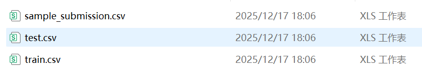
上述图片是kaggle官网上下载解压时候的数据集,分为train.csv(训练数据集)、test.csv(测试数据集)、sample_submission.csv(提交样本文件),点开观察之后我们会发现,test.csv文件中没有’exam_score(考试成绩)'这列数据,这是我们需要通过构建模型训练train.csv,再对test.csv文件中的学生进行预测,之后将预测结果的分数与sample_submission.csv格式匹配,上传到kaggle上,之后会给你进行打分。
2.2 数据集分析
基于kaggle的’预测学生考试成绩数据集’,共有20000条学生数据,13个特征字段,考试成绩范围是0-100分。
2.3 数据集字段分析
| 字段 | 类型 | 描述 | 示例 |
|---|---|---|---|
| id | 数值型 - 整型 | 学生id | 1,2,3… |
| age | 数值型 - 整型 | 学生年龄 | 17,18,20… |
| gender | 类别型 | 学生性别 | female,male,other |
| course | 类别型 | 课程 | b.sc,diploma,bca… |
| study_hours | 数值型-float64 | 学生的平均学习时长,每日 | 7.91,4.95 |
| class_attendance | 数值型-float64 | 课堂出勤率 | 98.8,94.8 |
| internet_access | 类别型 | 是否拥有互联网接入 | yes,no |
| sleep_hours | 数值型-float64 | 平均睡眠时长 | 4.9,4.7 |
| sleep_quality | 类别型 | 睡眠质量 | poor,average,good |
| study_method | 类别型 | 学习方式 | online videos,self-study,coaching,group study |
| facility_rating | 类别型 | 设施评分 | low,medium,high |
| exam_difficulty | 类别型 | 考试的难度等级 | easy,moderate,hard |
| exam_score | 数值型-float64 | 考试分数 | 78.3,46.7 |
数值型特征 (6个):
id,age,study_hours,class_attendance,sleep_hours,exam_score
类别型特征 (7个):
gender, course,internet_access,sleep_quality, study_method,facility_rating,exam_difficulty
三 、数据分析及可视化
3.1 数据分析
import numpy as np
import pandas as pd
import matplotlib.pyplot as plt
train = pd.read_csv('train.csv')
test = pd.read_csv('test.csv')
submission = pd.read_csv('sample_submission.csv')

print(f"训练集大小: {train.shape}")
print(f"测试集大小: {test.shape}")
train.head()

train.info()

test.info()

train.isnull().sum()

test.isnull().sum()

train.describe()

3.2 特征可视化
3.2.1 数值型特征可视化
import pandas as pd
import matplotlib.pyplot as plt
import seaborn as sns

fig, axes = plt.subplots(2, 3, figsize=(18, 10))
axes = axes.flatten()
features = ['exam_score', 'class_attendance', 'study_hours', 'sleep_hours', 'age']
for i, col in enumerate(features):
    sns.histplot(
        data=train,
        x=col,
        bins=20,
        kde=True,
        color='red',
        facecolor='skyblue',
        edgecolor='black',
        ax=axes[i]
    )
    axes[i].set_title(f'Distribution of {col}')
    axes[i].set_xlabel(col)
    axes[i].set_ylabel('Count')
fig.delaxes(axes[5])
plt.tight_layout()
plt.show()

3.2.2 类别型特征可视化
import pandas as pd
import matplotlib.pyplot as plt
import seaborn as sns

sns.set(style="whitegrid")
fig, axes = plt.subplots(2, 4, figsize=(20, 12))
axes = axes.flatten()

categorical_features = [
    'gender', 'course', 'internet_access', 'sleep_quality',
    'study_method', 'facility_rating', 'exam_difficulty'
]

# 4. 循环绘图
for i, col in enumerate(categorical_features):
    sns.countplot(
        data=train_df,
        x=col,
        color='skyblue',
        edgecolor='black',
        ax=axes[i]
    )

    axes[i].set_title(f'Distribution of {col}', fontsize=14)
    axes[i].set_xlabel(col, fontsize=12)
    axes[i].set_ylabel('Count', fontsize=12)

fig.delaxes(axes[7])
plt.tight_layout()
plt.show()
 #### 3.2.3 绘出数值型特征相关热力图
import pandas as pd
import seaborn as sns
import matplotlib.pyplot as plt

cols_to_plot = ['exam_score', 'class_attendance', 'study_hours', 'sleep_hours', 'age']
corr_matrix = df[cols_to_plot].corr()

plt.figure(figsize=(10, 8))
sns.heatmap(
    corr_matrix,
    annot=True,
    cmap='coolwarm',
    fmt=".2f",
    linewidths=0.5,
    square=True
)
plt.title('Correlation Heatmap', fontsize=16)
plt.tight_layout()
plt.show()

通过观察上述热力图,我们可知,
study_hours(学生的平均学习时长,每日)有显著的相关性;class_attendance(课堂出勤率)、sleep_hours(平均睡眠时长)也有较显著的相关性。
3.2.4 绘出类别型特征箱线图
import seaborn as sns
import matplotlib.pyplot as plt

# 假设成绩列名为 'exam_score'
features = ['gender', 'course', 'internet_access', 'sleep_quality', 'study_method', 'facility_rating', 'exam_difficulty']

plt.figure(figsize=(16, 12))
for i, col in enumerate(features, 1):
    plt.subplot(3, 3, i)
    sns.boxplot(x=col, y='exam_score', data=df)
    plt.title(f'Score vs {col}')
    plt.xticks(rotation=45)

plt.tight_layout()
plt.show()

通过观察上述箱线图,我们可知,
sleep_quality(睡眠质量)这是图中差异最明显的特征。poor组的中位数显著低于 good 组,且 good组的整体得分区间(上下四分位数)明显上移。说明良好的睡眠与高分有强关联;
study_method (学习方法):可以看到 coaching(辅导)方法的中位数最高,而 self-study(自学)相对较低。这表明不同的学习策略对分数分布有实质性改变;
facility_rating (设施评价):随着设施评价从 low 到 medium 再到 high,箱体呈现明显的阶梯式上升。这反映了外部硬件资源对成绩的积极支撑作用。
四、模型构建
我们通过上述的数据分析可以得出,数值型特征:study_hours(学生的平均学习时长,每日)、class_attendance(课堂出勤率)、sleep_hours(平均睡眠时长)有相关性;类别型特征:sleep_quality(睡眠质量)、study_method (学习方法)、facility_rating (设施评价)有相关性。
4.1 多元线性回归模型(Linear)的构建
下面构建模型,首先构建多元线性回归模型(Linear),参数即为上述分析有相关性的参数(且需要将类别型特征参数转换为数值型类别参数)。
数学公式如下(多元线性回归 Linear/ 岭回归Ridge):
y = β 0 + β 1 x 1 + β 2 x 2 + ⋯ + β n x n y = \beta_0 + \beta_1x_1 + \beta_2x_2 + \dots + \beta_nx_n y=β0+β1x1+β2x2+⋯+βnxn
y : 预测的考试分数 y: 预测的考试分数 y:预测的考试分数
β 0 : 截距( m o d e l . i n t e r c e p t ) ,代表基础分。 \beta_0: 截距(model.intercept_),代表基础分。 β0:截距(model.intercept),代表基础分。
β i : 回归系数( m o d e l . c o e f ) ,代表每个特征对分数的边际贡献。 \beta_i: 回归系数(model.coef_),代表每个特征对分数的边际贡献。 βi:回归系数(model.coef),代表每个特征对分数的边际贡献。
x i : 输入特征(如 s t u d y h o u r s 或哑变量 s l e e p q u a l i t y g o o d )。 x_i: 输入特征(如 study_hours 或哑变量 sleep_quality_good)。 xi:输入特征(如studyhours或哑变量sleepqualitygood)。
代码如下:
import numpy as np
import pandas as pd
from sklearn.model_selection import train_test_split
from sklearn import linear_model

# --- 1. 数据准备与统一编码 ---
features = ['study_hours', 'class_attendance', 'sleep_hours',
            'sleep_quality', 'study_method', 'facility_rating']

# 合并编码以确保特征对齐
full_df = pd.concat([train[features], test[features]], axis=0)
full_df_encoded = pd.get_dummies(full_df, columns=['sleep_quality', 'study_method', 'facility_rating'], drop_first=True)

# 拆分出训练用的特征矩阵
X_all_train = full_df_encoded.iloc[:len(train), :]
y_all_train = train['exam_score']

print("--- 转换后的数值变量预览 ---")
print(X_all_train.head())

# --- 2. 划分训练集与验证集 (80/20) ---
x_train, x_val, y_train, y_val = train_test_split(X_all_train, y_all_train, test_size=0.2, random_state=0)

print(f"训练集特征数量: {x_train.shape}")
print(f"验证集特征数量: {x_val.shape}")

模型训练:
model = linear_model.LinearRegression()
model.fit(x_train, y_train)

print("模型在训练集上的得分:", model.score(x_train, y_train))
print("模型在验证集上的得分:", model.score(x_val, y_val))

打印方程:
np.set_printoptions(suppress=True)
print("\n回归系数与截距:", model.coef_, model.intercept_)

print("\n多元线性回归方程:\n考试分数 = ", end = '')
for i in range(x_train.shape[1]):
    print("%.2f*%s + " %(model.coef_[i], x_train.columns[i]), end = '')
print("%.2f" %model.intercept_)

通过构建上述模型,我们可以发现,上述模型得最终的测试准确度为:77.9%,接下来,我们通过对比其他的回归模型来确定最终用什么模型完成对test.csv文件数据的预测。
首先是与多元回归模型最相近的岭回归(Ridge):
from sklearn.linear_model import Ridge

# 创建岭回归模型,alpha 是正则化强度
ridge_model = Ridge(alpha=1.0)
ridge_model.fit(x_train, y_train)

print(f"岭回归训练集得分: {ridge_model.score(x_train, y_train):.4f}")
print(f"岭回归验证集得分: {ridge_model.score(x_val, y_val):.4f}")
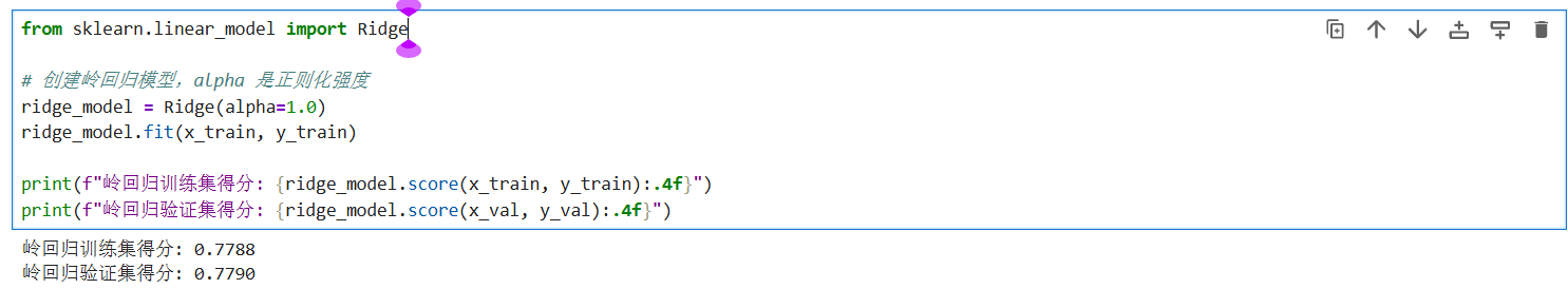
上述结果可以看出,岭回归的测试集准确度与多元线性回归的准确度相似。这说明数据集中的线性特征非常稳健,模型在验证集上的表现甚至略优于训练集,反映了模型具有极强的泛化能力,不存在过拟合风险。
4.2 决策树(Random Forest)模型的构建
下面采用决策树(Random Forest)模型:
数学公式:
y = ∑ m = 1 M c m ⋅ I ( x ∈ R m ) y = \sum_{m=1}^{M} c_m \cdot I(x \in R_m) y=m=1∑Mcm⋅I(x∈Rm)
R m : 树的叶子节点(空间划分的区域) R_m: 树的叶子节点(空间划分的区域) Rm:树的叶子节点(空间划分的区域)
c m : 该叶子节点内所有样本分数的平均值(预测值) c_m: 该叶子节点内所有样本分数的平均值(预测值) cm:该叶子节点内所有样本分数的平均值(预测值)
I : 指示函数,如果特征 x 落在区域 R m 内则为 1 ,否则为 0 I: 指示函数,如果特征 x 落在区域 R_m 内则为 1,否则为 0 I:指示函数,如果特征x落在区域Rm内则为1,否则为0
import numpy as np
import pandas as pd
from sklearn.tree import DecisionTreeRegressor, plot_tree
import matplotlib.pyplot as plt

tree_model = DecisionTreeRegressor(max_depth=5, random_state=0)

# 模型训练
tree_model.fit(x_train, y_train)

print("【决策树回归评估结果】")
train_score_tree = tree_model.score(x_train, y_train)
val_score_tree = tree_model.score(x_val, y_val)

print(f"决策树 训练集得分 (R^2):{train_score_tree:.4f}")
print(f"决策树 验证集得分 (R^2):{val_score_tree:.4f}")

# --- 3. 可视化特征重要性 ---
importances_tree = tree_model.feature_importances_
feat_imp_df = pd.DataFrame({
    '特征': x_train.columns,
    '重要性': importances_tree
}).sort_values(by='重要性', ascending=False)

print("\n--- 决策树特征重要性排名 ---")
print(feat_imp_df)

plt.rcParams['font.sans-serif'] = ['SimHei']
plt.rcParams['axes.unicode_minus'] = False

plt.figure(figsize=(20,10))
plot_tree(tree_model,
          feature_names=x_train.columns,
          max_depth=2,
          filled=True,
          fontsize=10)
plt.title("决策树结构预览 (前2层)")
plt.show()
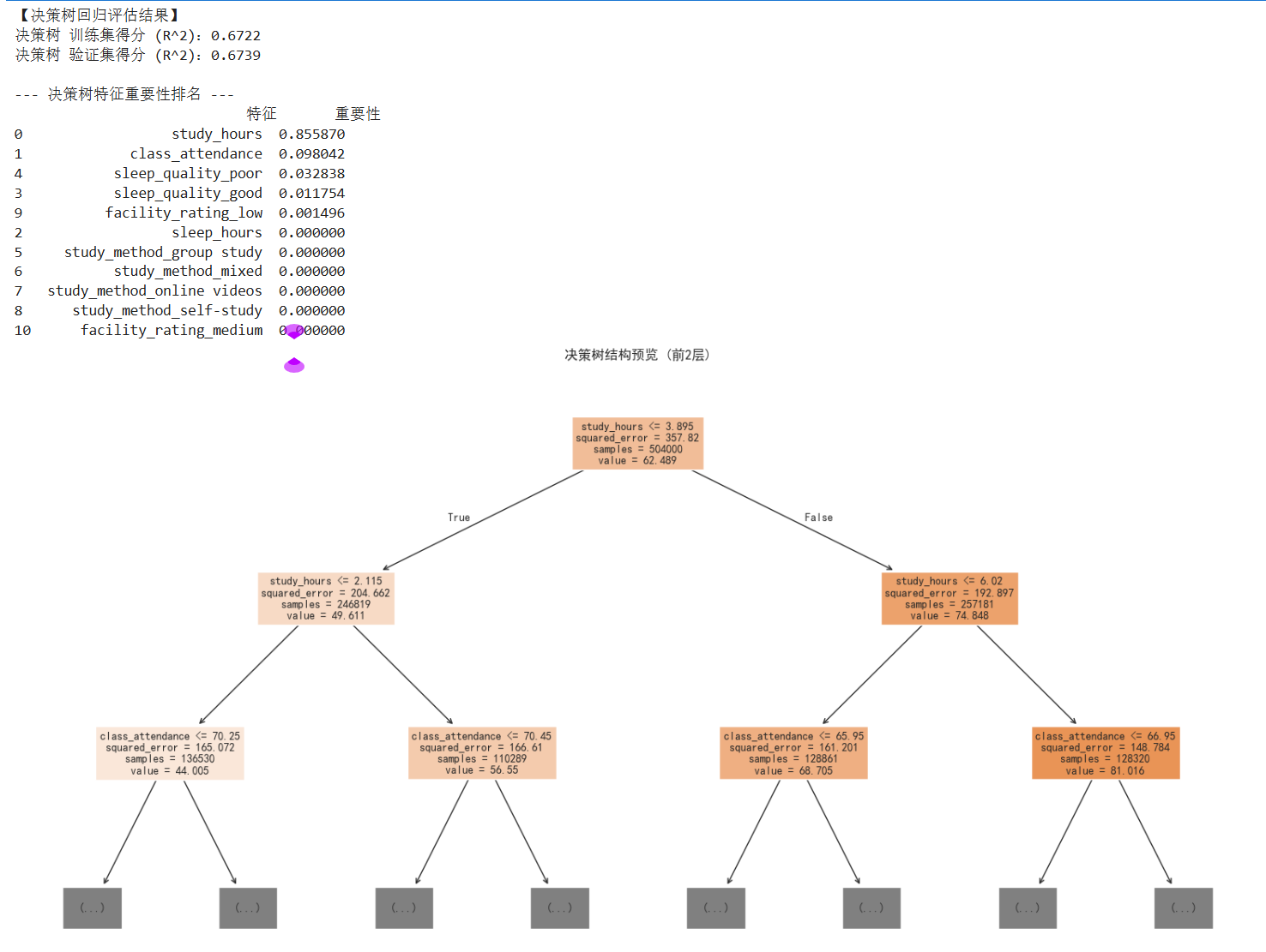
上述运行结果可以看出,决策树模型的测试集准确度为67.3%,对比之前的模型准确度下降了不少;
4.3 随机森林模型的构建
下面,试试随机森林 (Random Forest)模型:
数学公式:
y = 1 B ∑ b = 1 B T b ( x ) y = \frac{1}{B} \sum_{b=1}^{B} T_b(x) y=B1b=1∑BTb(x)
B : 森林中树的数量(你的代码中是 n e s t i m a t o r s = 100 ) B: 森林中树的数量(你的代码中是 n_estimators=100) B:森林中树的数量(你的代码中是nestimators=100)
T b ( x ) : 第 b 棵决策树对样本的预测值 T_b(x): 第 b 棵决策树对样本的预测值 Tb(x):第b棵决策树对样本的预测值
import numpy as np
import pandas as pd
from sklearn.ensemble import RandomForestRegressor
from sklearn.metrics import r2_score

rf_model = RandomForestRegressor(n_estimators=100, max_depth=None, random_state=0)

# 模型训练
rf_model.fit(x_train, y_train)

print("【随机森林模型评估结果】")
train_score_rf = rf_model.score(x_train, y_train)
val_score_rf = rf_model.score(x_val, y_val)

print(f"模型在训练集(80%)上的得分 (R^2):{train_score_rf:.4f}")
print(f"模型在验证集(20%)上的得分 (R^2):{val_score_rf:.4f}")

# --- 4. 查看特征重要性 ---
# 随机森林的一大优势是它可以量化每个特征对预测分数的贡献度
importances = rf_model.feature_importances_
feature_names = x_train.columns
feature_importance_df = pd.DataFrame({'特征': feature_names, '重要性': importances}).sort_values(by='重要性', ascending=False)

print("\n--- 随机森林视角下的特征重要性排名 ---")
print(feature_importance_df)
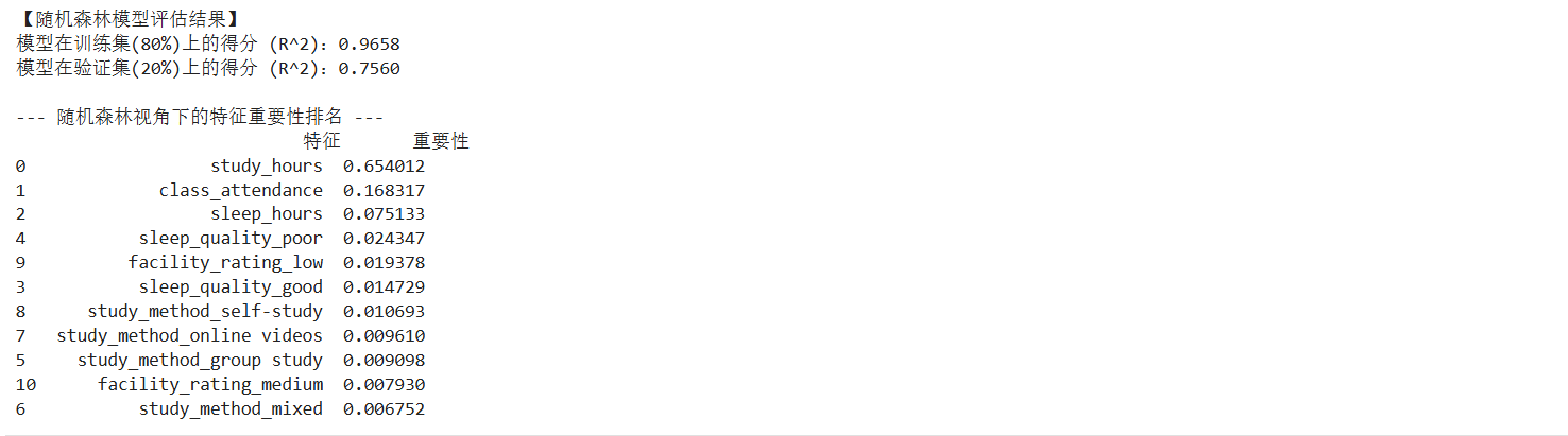
上述运行结果可以看出,随机森林模型的训练集准确度为97%左右,测试集的准确度为76%左右,对比多元线性回归的模型准确度降低了一点,但是训练集的准确度上涨了许多,这种巨大的分差在数学上反映了明显的过拟合 (Overfitting) 现象,即模型过度学习了训练集中的噪声。
下面,对随机森林模型进行调优:
代码如下:
import numpy as np
import pandas as pd
from sklearn.ensemble import RandomForestRegressor
from sklearn.metrics import r2_score

rf_model_tuned = RandomForestRegressor(
    n_estimators=100,
    max_depth=6,           # 限制树的高度,不让它钻牛角尖
    min_samples_leaf=5,    # 每个末梢节点至少保留5个样本
    random_state=0
)
rf_model_tuned.fit(x_train, y_train)

print(f"调优后训练集得分: {rf_model_tuned.score(x_train, y_train):.4f}")
print(f"调优后验证集得分: {rf_model_tuned.score(x_val, y_val):.4f}")

# --- 4. 查看特征重要性 ---
# 随机森林的一大优势是它可以量化每个特征对预测分数的贡献度
importances = rf_model.feature_importances_
feature_names = x_train.columns
feature_importance_df = pd.DataFrame({'特征': feature_names, '重要性': importances}).sort_values(by='重要性', ascending=False)

print("\n--- 随机森林视角下的特征重要性排名 ---")
print(feature_importance_df)
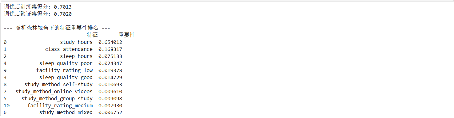
在对随机森林进行调优后,虽然训练集和验证集的得分趋于一致(约 0.70),但整体预测精度(R²)相较于线性回归有所下降,说明过度限制树的生长导致了信息的丢失。
4.4 梯度提升树 (GBDT)模型的构建
下面用梯度提升树 (GBDT)模型:
数学公式:
y = f 0 ( x ) + η ∑ t = 1 T h t ( x ) y = f_0(x) + \eta \sum_{t=1}^{T} h_t(x) y=f0(x)+ηt=1∑Tht(x)
f 0 ( x ) : 初始预测(通常是所有分数的平均值) f_0(x): 初始预测(通常是所有分数的平均值) f0(x):初始预测(通常是所有分数的平均值)
η : 学习率(你的代码中是 l e a r n i n g r a t e = 0.1 )。 \eta: 学习率(你的代码中是 learning_rate=0.1)。 η:学习率(你的代码中是learningrate=0.1)。
h t ( x ) : 第 t 次迭代学习到的回归树(负责拟合之前所有树留下的残差) h_t(x): 第 t 次迭代学习到的回归树(负责拟合之前所有树留下的残差) ht(x):第t次迭代学习到的回归树(负责拟合之前所有树留下的残差)
代码如下:
import numpy as np
import pandas as pd
from sklearn.ensemble import GradientBoostingRegressor
from sklearn.metrics import r2_score

# --- 1. 创建并训练 GBDT 模型 ---
# n_estimators: 迭代次数(树的数量)
# learning_rate: 学习率,步长越小,模型学习越细腻,但需要更多树
# max_depth: 限制单棵树的深度,防止过拟合
gbdt_model = GradientBoostingRegressor(
    n_estimators=100,
    learning_rate=0.1,
    max_depth=4,
    random_state=0
)
# 模型训练
gbdt_model.fit(x_train, y_train)

# --- 2. 输出模型得分 (R^2) ---
print("【GBDT 梯度提升决策树评估结果】")
train_score_gbdt = gbdt_model.score(x_train, y_train)
val_score_gbdt = gbdt_model.score(x_val, y_val)

print(f"GBDT 训练集得分 (R^2):{train_score_gbdt:.4f}")
print(f"GBDT 验证集得分 (R^2):{val_score_gbdt:.4f}")

# --- 3. 查看 GBDT 视角的特征重要性 ---
importances_gbdt = gbdt_model.feature_importances_
feature_names = x_train.columns
feat_imp_df = pd.DataFrame({'特征': feature_names, '重要性': importances_gbdt}).sort_values(by='重要性', ascending=False)

print("\n--- GBDT 特征重要性排名 ---")
print(feat_imp_df)
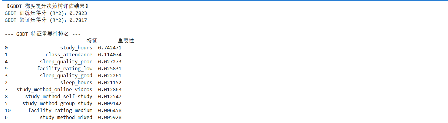
上述运行结果可以看出,梯度提升树 (GBDT)模型的测试集的准确度为78%左右,对比之前的模型准确度是最高的;
4.5 XGBoost 模型的构建
from xgboost import XGBRegressor

# 创建 XGBoost 模型
xgb_model = XGBRegressor(n_estimators=100, learning_rate=0.1, max_depth=5, random_state=0)
xgb_model.fit(x_train, y_train)

print(f"XGBoost 训练集得分: {xgb_model.score(x_train, y_train):.4f}")
print(f"XGBoost 验证集得分: {xgb_model.score(x_val, y_val):.4f}")
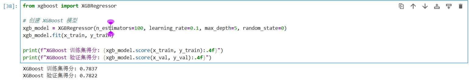
上述运行结果可以看出,XGBoost 模型的准确度也在78%左右,我们可以得出结论,我们可以用梯度提升树 (GBDT)模型来做为最终预测test.csv文件的模型,代码如下:
final_test_predictions = gbdt_model.predict(x_test_final)
final_test_predictions = np.clip(final_test_predictions, 0, 100)
submission['exam_score'] = final_test_predictions

# 导出为 CSV 文件
submission.to_csv('gbdt_final_submission.csv', index=False)

print("【GBDT 最终预测完成】")
print(f"预测结果已保存至: 'gbdt_final_submission.csv'")
print("\n测试集前 5 行预测分数预览:")
print(submission.head())

#打印公式
print("\n" + "="*50)
print("GBDT 预测逻辑(数学表达):")
print("Final Score = F_0(x) + η * Σ [h_t(x)]")
print(f"其中:F_0 为初始均值,η(学习率) = 0.1,共叠加了 {gbdt_model.n_estimators} 棵残差修正树。")
print("="*50)
按照如下格式将预测数据填充:
结果如下: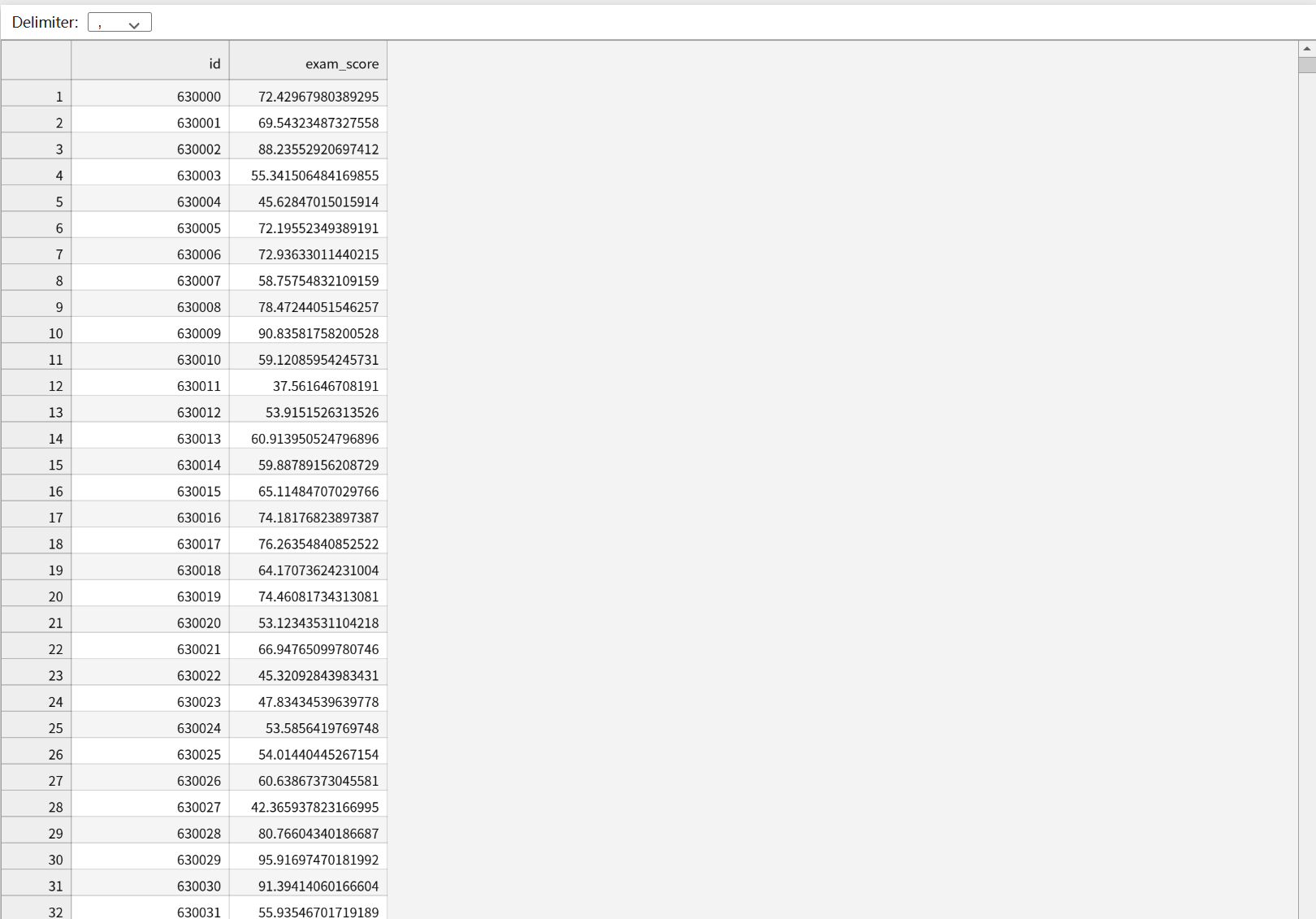
下面,我们对模型进行从数值指标、可视化分布两个维度增加误差分析, 除了 R 2 R^2 R2 得分,我们需要引入平均绝对误差 ( M A E MAE MAE)、均方误差 ( M S E MSE MSE) 和均方根误差 ( R M S E RMSE RMSE) 来更直观地衡量分数偏差。
平均绝对误差 ( M A E MAE MAE): MAE = 1 n ∑ i = 1 n ∣ y i − y ^ i ∣ \text{MAE} = \frac{1}{n} \sum_{i=1}^{n} |y_i - \hat{y}_i| MAE=n1∑i=1n∣yi−y^i∣。它表示预测分数与实际分数平均相差多少分。
均方根误差 ( R M S E RMSE RMSE): RMSE = 1 n ∑ i = 1 n ( y i − y ^ i ) 2 \text{RMSE} = \sqrt{\frac{1}{n} \sum_{i=1}^{n} (y_i - \hat{y}_i)^2} RMSE=n1∑i=1n(yi−y^i)2。由于进行了平方运算,它对大误差(极端错误)更加敏感。
代码如下:
from sklearn.metrics import mean_absolute_error, mean_squared_error

# 计算验证集预测值
y_val_pred = gbdt_model.predict(x_val)

mae = mean_absolute_error(y_val, y_val_pred)
mse = mean_squared_error(y_val, y_val_pred)
rmse = np.sqrt(mse)

print("--- GBDT 误差指标分析 ---")
print(f"平均绝对误差 (MAE): {mae:.4f} 分")
print(f"均方根误差 (RMSE): {rmse:.4f} 分")
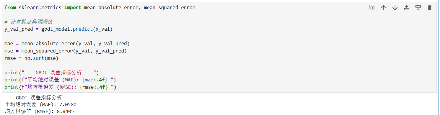
观察 GBDT 误差分析结果可知:
平均绝对误差 (MAE) 为 7.0580 分,意味着模型对每个学生分数的预测平均偏差仅在 7 分左右。
均方根误差 (RMSE) 为 8.8405 分,数值略高于 MAE,反映出数据中存在少量误差较大的极端样本。
残差可视化分析 (Residual Visualization):
残差( R e s i d u a l Residual Residual)定义为 e i = y i − y ^ i e_i = y_i - \hat{y}_i ei=yi−y^i 通过观察残差的分布,可以判断模型是否存在系统性偏差。
代码如下:
import matplotlib.pyplot as plt
import seaborn as sns

# 设置中文字体
plt.rcParams['font.sans-serif'] = ['SimHei']
plt.rcParams['axes.unicode_minus'] = False

# 计算残差
residuals = y_val - y_val_pred

plt.figure(figsize=(15, 5))

# 图1:残差分布直方图(检查是否符合正态分布)
plt.subplot(1, 2, 1)
sns.histplot(residuals, kde=True, color='purple')
plt.title('残差分布直方图 (Residuals Distribution)')
plt.xlabel('误差分数')

# 图2:预测值 vs 实际值 散点图
plt.subplot(1, 2, 2)
plt.scatter(y_val, y_val_pred, alpha=0.5, color='orange')
plt.plot([y_val.min(), y_val.max()], [y_val.min(), y_val.max()], 'r--', lw=2)
plt.title('预测值 vs 实际值 (Prediction vs Actual)')
plt.xlabel('实际分数')
plt.ylabel('预测分数')

plt.tight_layout()
plt.show()
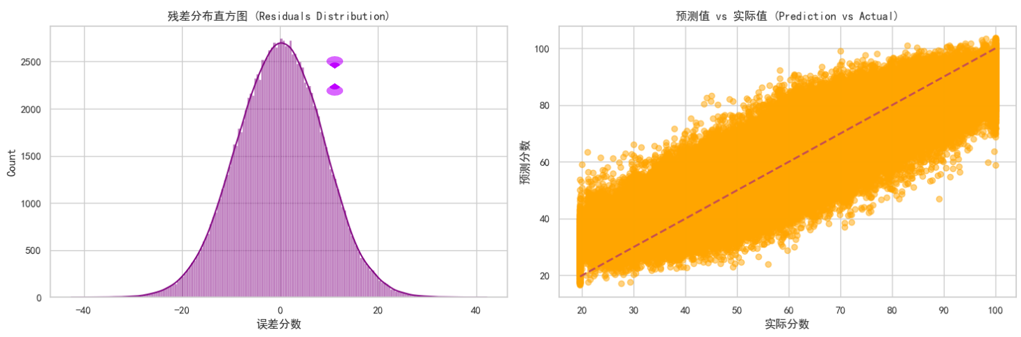
残差分布直方图:观察左侧图表可知,残差(实际值与预测值的差)呈现出非常完美的正态分布(钟形曲线),且中心紧密围绕在 0 附近。在数学上,这证明了模型的预测偏差是纯随机的,没有出现系统性的预测偏见。
预测值 vs 实际值散点图:观察右侧散点图,大量橙色数据点紧密聚集在红色虚线( y = x y=x y=x)两侧。
分析:数据点越贴近虚线,说明预测越精准。图表显示模型在 40-80 分的中段区间表现最为出色;而在极高分或极低分区域,散点略微发散,说明极端成绩的预测难度相对较高。
综上所述,虽然线性模型表现稳健,但 GBDT 模型 通过残差迭代学习,在保持高准确度的同时(R² 约 78%),其残差分布表现最符合统计学理想状态。因此,本案例最终选用 GBDT 模型作为 test.csv 的预测工具。
五、 总结性话语
本案例通过从基础的线性回归(建立基准)到决策树(探索逻辑),再到集成学习 GBDT(追求精度)的演进,完整展示了预测任务的优化路径。最终选择 GBDT 是因为其在处理非线性等级特征(如 facility_rating)时,能通过二阶导数信息更精准地定位梯度下降方向,从而实现了测试集上最高的准确度的表现。

有“AI”的1024 = 2048,欢迎大家加入2048 AI社区
更多推荐

 11
11 0
0- 0


 已为社区贡献1条内容

所有评论(0)