css+div网页布局大全
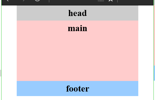
1.一列固定布局style>body{ margin:0; padding:0; font-size:30px}div{ text-align:center; font-weight:bold}.head, .main, .footer{ width:600px; margin:0 auto}.head{ height:50px; background:#ccc}.main{ h
·
1.一列固定布局
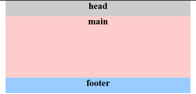
<style>
body{ margin:0; padding:0; font-size:30px}
div{ text-align:center; font-weight:bold}
.head, .main, .footer{ width:600px; margin:0 auto}
.head{ height:50px; background:#ccc}
.main{ height:200px; background:#FCC}
.footer{ height:50px; background:#9CF}
</style>

<body>
<div class="head">head</div>
<div class="main">main</div>
<div class="footer">footer</div>
</body>
2.一列宽度自适应布局
<style>
body{ margin:0; padding:0; font-size:30px; font-weight:bold}
div{ text-align:center; line-height:50px}
.head, .main, .footer{width:80%;margin:0 auto}
.head{ height:50px; background:#ccc}
.main{ height:200px; background:#FCC}
.footer{ height:50px; background:#9CF}
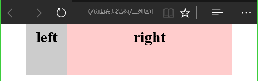
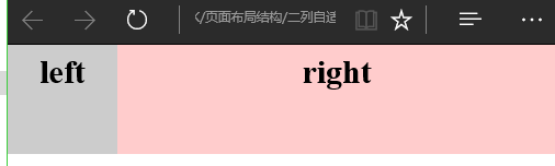
</style>3.两列居中固定布局
<style>
body{ margin:0; padding:0; font-size:30px; font-weight:bold}
div{ text-align:center; line-height:50px}
.main{ width:300px; height:100px; margin:0 auto}
.left{ width:150px; height:100px; background:#ccc; float:left}
.right{ width:150px; height:100px; background:#FCC; float:right}
</style>

<body>
<div class="main">
    <div class="left">left</div>
    <div class="right">right</div>
</div>
</body>
4.两列居中自适应布局
<style>
body{ margin:0; padding:0; font-size:30px; font-weight:bold}
div{ text-align:center; line-height:50px}
.main{ width:80%; height:100px; margin:0 auto}
.left{ width:20%; height:100px; background:#ccc; float:left}
.right{ width:80%; height:100px; background:#FCC; float:right}
</style>
5.两列自适应布局
<style>
body{ margin:0; padding:0; font-size:30px; font-weight:bold}
div{ text-align:center; line-height:50px}
.left{ width:20%; height:100px; background:#ccc; float:left}
.right{ width:80%; height:100px; background:#FCC; float:right}
</style>

<body>
<div class="left">left</div>
<div class="right">right</div>
</body>
6.三列自适应布局
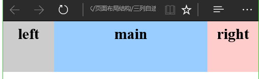
注意position要为绝对位置
<style>
body{ margin:0; padding:0; font-size:30px; font-weight:bold}
div{ text-align:center; line-height:50px}
.left{ width:20%; height:100px; background:#ccc; position:absolute; left:0; top:0}
.main{ height:100px; margin:0 20%; background:#9CF}
.right{ height:100px; width:20%; position:absolute; top:0; right:0; background:#FCC;}
</style>
<body>
<div class="left">left</div>
<div class="main">main</div>
<div class="right">right</div>
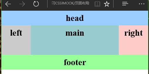
</body>7.三列左右固定布局
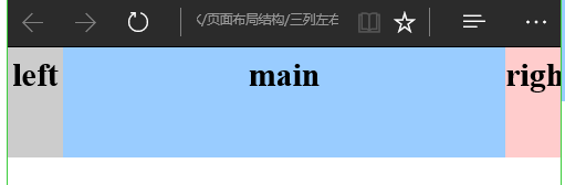
<style>
body{ margin:0; padding:0; font-size:30px; font-weight:bold}
div{ text-align:center; line-height:50px}
.left{ width:50px; height:100px; background:#ccc; position:absolute; left:0; top:0}
.main{ height:100px; margin:0 50px; background:#9CF}
.right{ height:100px; width:50px; position:absolute; top:0; right:0; background:#FCC;}
</style>

<body>

    <div class="left">left</div>
    <div class="main">main</div>
    <div class="right">right</div>
</body>
8.混合布局1
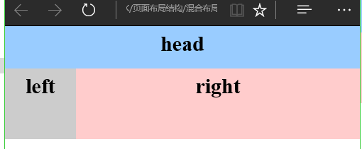
<style>
body{ margin:0; padding:0; font-size:30px; font-weight:bold}
div{ text-align:center; line-height:50px}
.head{ height:60px;background:#9CF}
.left{ width:20%; height:100px; background:#ccc; float:left}
.right{ width:80%; height:100px;background:#FCC; float:right}
</style>

<body>
<div class="head">head</div>
<div class="left">left</div>
<div class="right">right</div>
</body>
9.混合布局2
注意clear:both
<style>
body{ margin:0; padding:0; font-size:30px; font-weight:bold}
div{ text-align:center; line-height:50px}
.head, .main, .footer{ width:300px; margin:0 auto}
.head{ height:50px;background:#9CF}
.left{ width:100px; height:100px; background:#ccc; float:left}
.right{ width:200px; height:100px;background:#FCC; float:right}
.footer{ height:50px; background:#9F9; clear:both}
</style>
<body>
<div class="head">head</div>
<div class="main">
<div class="left">left</div>
<div class="right">right</div>
</div>
<div class="footer">footer</div>
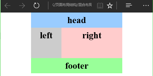
</body>10.混合布局3
<style>
body{ margin:0; padding:0; font-size:30px; font-weight:bold}
div{ text-align:center; line-height:50px}
.head, .main, .footer{ width:500px; margin:0 auto}
.head{ height:50px;background:#9CF}
.left{ width:200px; height:200px; background:#ccc; float:left}
.right{ width:300px; height:200px;background:#FCC; float:right}
.r_sub_left{ width:250px; height:200px; background:#9C3; float:left}
.r_sub_right{ width:50px; height:200px; background:#9FC; float:right}
.footer{ height:50px; background:#9F9; clear:both}
</style>
<body>
<div class="head">head</div>
<div class="main">
<div class="left">left</div>
<div class="right">
<div class="r_sub_left">sub_left
</div>
<div class=" r_sub_right">sub_right
</div>
</div>
</div>
<div class="footer">footer</div>
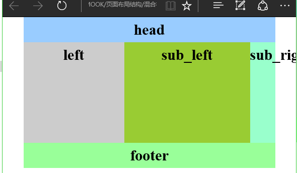
</body>11.混合布局4
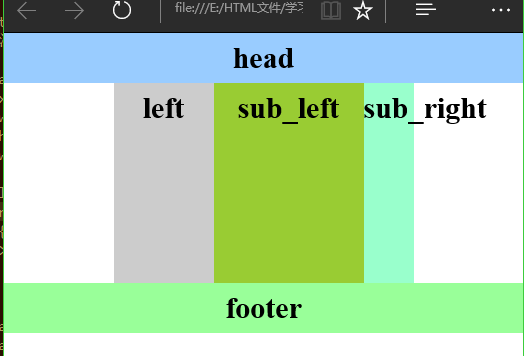
div代码和混合布局3一样,差别就在于css代码中的.main{ width:300px; margin:0 auto} 和 .head, .main, .footer{ width:500px; margin:0 auto}
<style>
body{ margin:0; padding:0; font-size:30px; font-weight:bold}
div{ text-align:center; line-height:50px}
.main{ width:300px; margin:0 auto}
.head{ height:50px;background:#9CF}
.left{ width:100px; height:200px; background:#ccc; float:left}
.right{ width:200px; height:200px;background:#FCC; float:right}
.r_sub_left{ width:150px; height:200px; background:#9C3; float:left}
.r_sub_right{ width:50px; height:200px; background:#9FC; float:right}
.footer{ height:50px; background:#9F9; clear:both}
</style>
</head>
12.混合布局自适应
其实和混合布局3看起来是差不多的,只是div和css都不同。
<style>
body{ margin:0; padding:0; font-size:30px; font-weight:bold}
div{ text-align:center; line-height:50px}
.head{ height:50px;background:#9CF}
.left{ width:20%; height:100px; background:#ccc; float:left}
.main{margin:0 20%;height:100px; background:#9CC }
.right{ width:20%; height:100px;background:#FCC; float:right}
.footer{ height:50px; background:#9F9; clear:both}
</style>

<body>
<div class="head">head</div>
<div class="left">left</div>
<div class="right">right</div>
<div class="main">main</div>
<div class="footer">footer</div>
</body>
13.总结
仔细看看是可以找出规律的。
现在把他们放这里了。

有“AI”的1024 = 2048,欢迎大家加入2048 AI社区
更多推荐


 73
73 0
0- 0


 已为社区贡献4条内容

所有评论(0)