智能出行新时代:Flutter × OpenHarmony 打车平台的“司机推荐”模块实现与解析
本文介绍了基于Flutter与OpenHarmony的跨端打车平台"司机推荐"模块实现方案。通过组件化设计,采用Container、BoxDecoration、Row、Column等布局组件,实现了响应式UI适配不同终端。重点解析了司机推荐卡片和地址输入组件的代码实现,包括阴影效果、自适应布局等关键细节。该方案充分利用Flutter的高性能UI框架和OpenHarmony的多设
文章目录
欢迎加入开源鸿蒙跨平台社区: https://openharmonycrossplatform.csdn.net
智能出行新时代:Flutter × OpenHarmony 打车平台的“司机推荐”模块实现与解析
在智慧城市与数字出行快速融合的今天,打车平台早已不只是“把人从 A 点送到 B 点”的工具,而正在演变为一个融合 数据智能、用户画像、跨端体验与实时调度 的综合服务系统。其中,“司机推荐”作为用户下单前最关键的决策入口,直接影响着平台的转化率与用户信任度。
随着 OpenHarmony 生态的成熟,以及 Flutter 在跨端 UI 领域的广泛应用,开发者终于可以用一套代码同时覆盖手机、平板、车机甚至智慧终端,实现真正意义上的多端一致体验。本文将结合一个实际的打车平台 UI 场景,深入解析基于 Flutter × OpenHarmony 的“司机推荐模块”实现方案,从布局结构、组件封装到自适应设计,带你理解一个看似简单的功能背后,如何通过跨端技术构建出高可扩展、高复用、强一致性的前端架构。
前言
随着移动互联网和智慧城市的发展,出行方式正变得越来越智能化、个性化。用户不仅希望快速叫车,还希望系统能推荐高评分、熟悉路线的司机,提高出行体验。本文将从技术实现角度,分享如何使用 Flutter 与 OpenHarmony 跨端开发打车平台中的 司机推荐模块,并对核心代码进行逐行分析,帮助开发者快速上手跨端 UI 构建。
背景
传统打车平台的司机推荐功能主要依赖后台算法,将符合条件的司机列表返回给用户,然后由客户端进行展示。在跨端应用开发中,我们不仅要保证 UI 的美观,还需要兼顾 移动端、鸿蒙终端和平板端 的统一体验。Flutter × OpenHarmony 跨端开发框架正好可以满足这一需求:
- Flutter:高性能 UI 框架,支持声明式布局,便于组件化开发。
- OpenHarmony:兼容多设备、多分辨率,支持 HarmonyOS 生态的特性,如多设备互联。
结合两者,我们可以用一套代码同时构建手机、平板和 IoT 设备的司机推荐模块,提升开发效率和用户体验。
Flutter × OpenHarmony 跨端开发介绍
Flutter × OpenHarmony 的跨端开发核心在于 组件化、响应式布局和平台适配:
- 组件化
将 UI 拆解为Widget组件,如司机卡片、服务卡片、历史行程卡片等,方便复用。 - 响应式布局
使用Expanded、Row、Column等布局组件,实现多终端自适应。 - 平台适配
OpenHarmony 提供的设备信息 API 可以获取屏幕尺寸、分辨率等参数,实现统一风格和动态布局。
在本文中,我们将用这些理念实现司机推荐模块。
开发核心代码详解
下面是 司机推荐模块的核心实现代码,我将分块进行逐行讲解。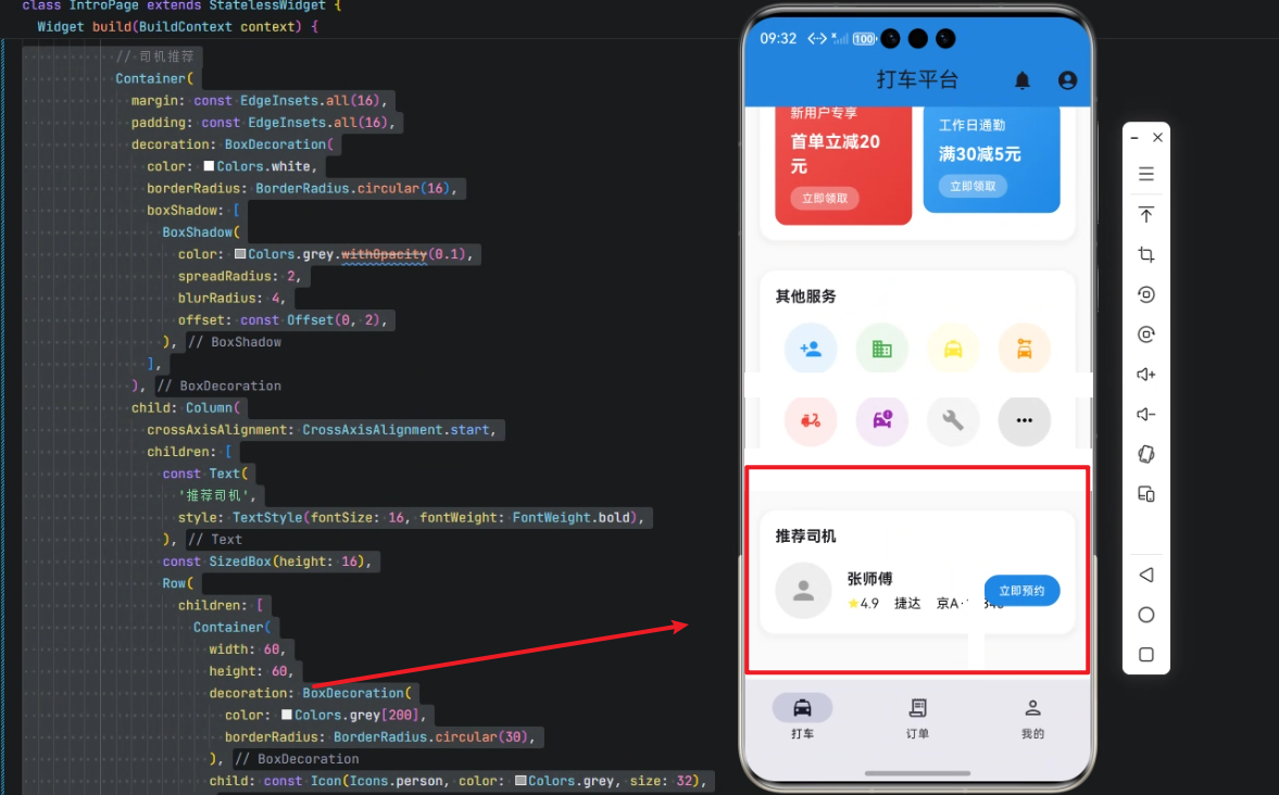
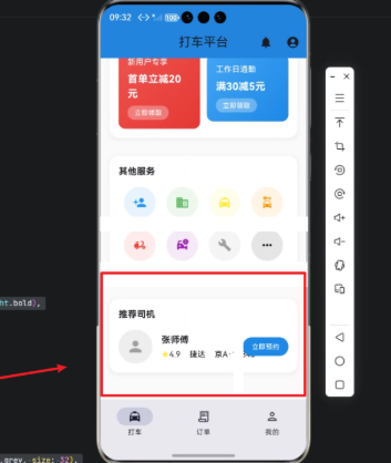
1️⃣ 司机推荐卡片 Container
Container(
  margin: const EdgeInsets.all(16),
  padding: const EdgeInsets.all(16),
  decoration: BoxDecoration(
    color: Colors.white,
    borderRadius: BorderRadius.circular(16),
    boxShadow: [
      BoxShadow(
        color: Colors.grey.withOpacity(0.1),
        spreadRadius: 2,
        blurRadius: 4,
        offset: const Offset(0, 2),
      ),
    ],
  ),
  child: Column(
    crossAxisAlignment: CrossAxisAlignment.start,
    children: [
      const Text(
        '推荐司机',
        style: TextStyle(fontSize: 16, fontWeight: FontWeight.bold),
      ),
      const SizedBox(height: 16),
      Row(
        children: [
          Container(
            width: 60,
            height: 60,
            decoration: BoxDecoration(
              color: Colors.grey[200],
              borderRadius: BorderRadius.circular(30),
            ),
            child: const Icon(Icons.person, color: Colors.grey, size: 32),
          ),
          const SizedBox(width: 16),
          Expanded(
            child: Column(
              crossAxisAlignment: CrossAxisAlignment.start,
              children: [
                const Text('张师傅', style: TextStyle(fontSize: 16, fontWeight: FontWeight.bold)),
                const SizedBox(height: 4),
                Row(
                  children: [
                    const Icon(Icons.star, color: Colors.yellow, size: 14),
                    const Text('4.9', style: TextStyle(fontSize: 14)),
                    const SizedBox(width: 16),
                    const Text('捷达', style: TextStyle(fontSize: 14, color: Colors.black)),
                    const SizedBox(width: 16),
                    const Text('京A·12345', style: TextStyle(fontSize: 14, color: Colors.black)),
                  ],
                ),
              ],
            ),
          ),
          Container(
            padding: const EdgeInsets.symmetric(horizontal: 16, vertical: 8),
            decoration: BoxDecoration(
              color: Colors.blue[600],
              borderRadius: BorderRadius.circular(16),
            ),
            child: const Text('立即预约', style: TextStyle(fontSize: 12, color: Colors.white)),
          ),
        ],
      ),
    ],
  ),
),
逐行解析:
-
Container
外层容器,定义 边距(margin) 和 内边距(padding),并设置白色背景和圆角,增加阴影效果,使卡片浮起感明显。 -
BoxDecorationcolor: Colors.white设置卡片背景为白色borderRadius.circular(16)设置圆角boxShadow设置轻微阴影,增加层次感
-
Column
垂直布局:- 顶部显示标题
推荐司机 - 中间通过
Row布局显示司机头像、信息和操作按钮
- 顶部显示标题
-
Row内部布局:- 左侧头像
Container+Icon - 中间
Expanded文字信息,包括司机名字、评分、车型和车牌号 - 右侧 “立即预约” 按钮
Container,蓝色背景,白色文字
- 左侧头像
💡 这种分层布局模式保证了在不同屏幕下元素自适应,
Expanded自动占据剩余空间。
2️⃣ 地址输入组件 _buildLocationInput
Widget _buildLocationInput(String label, String value) {
  return Container(
    child: Column(
      crossAxisAlignment: CrossAxisAlignment.start,
      children: [
        Text(label, style: TextStyle(fontSize: 12, color: Colors.grey[600])),
        const SizedBox(height: 8),
        Container(
          padding: const EdgeInsets.symmetric(horizontal: 16, vertical: 12),
          decoration: BoxDecoration(
            color: Colors.grey[50],
            borderRadius: BorderRadius.circular(12),
            border: Border.all(color: Colors.grey[200]!, width: 1),
          ),
          child: Row(
            children: [
              Icon(Icons.location_on, color: Colors.blue[600], size: 16),
              const SizedBox(width: 12),
              Expanded(
                child: Text(value, style: const TextStyle(fontSize: 16)),
              ),
              Icon(Icons.arrow_forward_ios, color: Colors.grey[400], size: 16),
            ],
          ),
        ),
      ],
    ),
  );
}
解析:
-
用于显示 出发地或目的地输入框
-
外层
Column纵向排列:- 上方文字标签
- 下方输入框样式
Container,带圆角和边框 - 内部
Row布局图标、文本和箭头,实现一致交互风格
-
Expanded确保文字占满剩余空间,适应不同终端
3️⃣ 服务卡片 _buildServiceCard
Widget _buildServiceCard(String title, String price, IconData icon, Color color) {
  return Container(
    padding: const EdgeInsets.all(16),
    decoration: BoxDecoration(
      color: Colors.white,
      borderRadius: BorderRadius.circular(12),
      border: Border.all(color: Colors.grey[200]!, width: 1),
    ),
    child: Column(
      children: [
        Container(
          width: 48,
          height: 48,
          decoration: BoxDecoration(
            color: color.withOpacity(0.1),
            borderRadius: BorderRadius.circular(24),
          ),
          child: Icon(icon, color: color, size: 24),
        ),
        const SizedBox(height: 8),
        Text(title, style: const TextStyle(fontSize: 12)),
        const SizedBox(height: 4),
        Text(price, style: TextStyle(fontSize: 14, fontWeight: FontWeight.bold, color: color)),
      ],
    ),
  );
}
解析:
-
用于展示打车服务类型(如快车、专车)
-
设计思路:
- 图标圆形背景,颜色半透明
- 服务名称 + 价格信息
- 卡片圆角 + 边框 + 内边距,保证视觉统一
4️⃣ 历史行程卡片 _buildHistoryCard
Widget _buildHistoryCard(String from, String to, String time, String price) {
  return Container(
    padding: const EdgeInsets.all(16),
    decoration: BoxDecoration(
      color: Colors.grey[50],
      borderRadius: BorderRadius.circular(12),
    ),
    child: Row(
      children: [
        Column(
          children: [
            Container(width: 12, height: 12, decoration: BoxDecoration(color: Colors.green, borderRadius: BorderRadius.circular(6))),
            Container(width: 2, height: 32, color: Colors.grey[300]),
            Container(width: 12, height: 12, decoration: BoxDecoration(color: Colors.red, borderRadius: BorderRadius.circular(6))),
          ],
        ),
        const SizedBox(width: 16),
        Expanded(
          child: Column(
            crossAxisAlignment: CrossAxisAlignment.start,
            children: [
              Text(from, style: const TextStyle(fontSize: 16, fontWeight: FontWeight.bold)),
              const SizedBox(height: 8),
              Text(to, style: const TextStyle(fontSize: 16, fontWeight: FontWeight.bold)),
              const SizedBox(height: 8),
              Text(time, style: TextStyle(fontSize: 12, color: Colors.grey[600])),
            ],
          ),
        ),
        Text(price, style: const TextStyle(fontSize: 16, fontWeight: FontWeight.bold, color: Colors.blue)),
      ],
    ),
  );
}
解析:
- 用于展示用户历史订单
- 左侧时间线:绿色起点 → 灰色线 → 红色终点
- 中间列显示出发地、目的地、时间
- 右侧价格显示
- 利用
Row + Column + Expanded保证多终端自适应
5️⃣ 服务图标 _buildServiceIcon
Widget _buildServiceIcon(String title, IconData icon, Color color) {
  return Column(
    children: [
      Container(
        width: 56,
        height: 56,
        decoration: BoxDecoration(
          color: color.withOpacity(0.1),
          borderRadius: BorderRadius.circular(28),
        ),
        child: Icon(icon, color: color, size: 24),
      ),
      const SizedBox(height: 8),
      Text(title, style: const TextStyle(fontSize: 12), textAlign: TextAlign.center),
    ],
  );
}
解析:
- 用于展示打车服务快捷入口
- 图标 + 标题组合,统一圆角设计
- 使用半透明颜色背景提高视觉层次
心得
在 Flutter × OpenHarmony 跨端开发中,我总结了几个关键点:
- 组件化设计
每个 UI 元素封装成 Widget,可复用性强,代码整洁。 - 自适应布局
利用Expanded、Flexible让 UI 在不同屏幕尺寸下保持美观。 - 统一设计语言
圆角、阴影、半透明背景、统一色彩,提高整体视觉体验。 - 跨端一致性
Flutter 负责 UI 构建,OpenHarmony 负责设备适配,实现一次开发,多端运行。

总结
本文展示了如何使用 Flutter × OpenHarmony 构建 打车平台司机推荐模块,从 UI 布局、组件化封装到多终端自适应进行了详细解析。通过这一模块,用户可以直观查看推荐司机信息、评分和车型,并快速预约,提高出行体验。同时,跨端开发模式大幅提升了开发效率,为智慧出行应用的构建提供了实用参考。

有“AI”的1024 = 2048,欢迎大家加入2048 AI社区
更多推荐


 9
9 0
0- 0


 已为社区贡献3条内容

所有评论(0)