flutter——帮助你构建多平台统一的界面和应用
本文介绍了Flutter中三个基础组件的使用方法。首先展示了Flutter的基本代码结构,然后详细讲解了Text组件的文本对齐、行数限制、样式设置等功能。接着介绍了Container组件的布局控制、尺寸设置、内外边距和装饰效果。最后讲解了Image组件的四种来源、图片适应模式和重复显示方式。这些组件是构建Flutter界面的基础元素,通过代码示例演示了各种常用属性的配置方法。
一、练习代码上手
掌握基本结构
import 'package:flutter/material.dart';
void main()=> runApp(MyApp());
class MyApp extends StatelessWidget{
Widget build (BuildContext context){
return MaterialApp(
title: 'Welcome to Flutter',
home: Scaffold(
appBar: AppBar(
title: Text('Welcome to Flutter'),
),
body: Center(
child: Text('Hello Worlds'),
),
),
);
}
}
二、组件讲解
(一)Text组件
完整代码:
import 'package:flutter/material.dart';
void main() => runApp( MyApp());
class MyApp extends StatelessWidget{
Widget build(BuildContext context){
return MaterialApp(
title:'Text Widget',
home:Scaffold(
body:Center(
child:Text(
'Flutter 是 Google 的便携式 UI 工具包,帮助你在移动、web、桌面端创造高质量的绝妙原生体验的应用。 Flutter 可以和世界上的开发人员和开发组织广泛使用的那些现存代码一起使用,并且是开源的、免费的。!',
textAlign:TextAlign.right,
maxLines:1,
overflow:TextOverflow.ellipsis,
style:TextStyle(
fontSize:25.0,
color:Color.fromARGB(255,255,125,125),
decoration:TextDecoration.underline,
decorationStyle:TextDecorationStyle.solid,
)
),
),
),
);
}
}
- 设置对齐方式:right、left、center
textAlign:TextAlign.right,
- 设置最大显示的行数,超出不显示
maxLines:1,
- 设置超出文本显示方式,ellipsis即显示省略号,fade即显示渐变色(默认从上往下变浅)
overflow:TextOverflow.ellipsis,
- 设置文本样式
style:TextStyle()
- 设置字体大小,最好浮点数
fontSize:25.0,
- 设置字体颜色,ARGB可以设置透明度
color:Color.fromARGB(255,255,125,125),
- 设置文本样式,underline 设置下划线
decoration:TextDecoration.underline,
- 设置Decoration的样式,这里即前面使用的下划线,设置为实线
decorationStyle:TextDecorationStyle.solid,
(二) container组件
完整代码:
imporimport 'package:flutter/material.dart';
void main() => runApp( MyApp());
class MyApp extends StatelessWidget{
Widget build(BuildContext context){
return MaterialApp(
title:'Text Widget',
home:Scaffold(
body:Center(
child:Container(
alignment:Alignment.topLeft,
width:500.0,
height: 400.0,
// color:Colors.lightBlue,
padding:const EdgeInsets.fromLTRB(10.0,200,0,0),
margin: const EdgeInsets.all(10.0) ,
decoration: new BoxDecoration(
  gradient: const LinearGradient(
    colors: [Colors.lightBlue,Colors.greenAccent,Colors.purple]
  ),
    border: Border.all(width: 5.0,color: Colors.red)
),
child:Text('Hello Leo',style:TextStyle(fontSize:40.0))
),
),
),
);
}
}t 'package:flutter/material.dart';
- 设置容器位置(center、centerLeft、centerRight、bottomCenter、bottomLeft、bottomRight、topCenter、topLeft、topRight)
alignment:Alignment.center,
- 设置容器宽度
width:500.0,
- 设置容器高度
height: 400.0,
- 设置容器底色
color:Colors.lightBlue,
- 设置边距
设置内边距:
padding:const EdgeInsets.fromLTRB(10.0,300,0,0),
设置外边距:
margin: const EdgeInsets.all(10.0),
EdgeInsets设置边距,all设置所有边距,all(10.0)设置上下左右都距离10.0,fromLTRB(10.0,300,0,0)设置距离左(Left)10.0,上(Top)300,右(Right)0,下(Bottom)0。
- 设置其他装饰
decoration: new BoxDecoration(
gradient: const LinearGradient(
colors: [Colors.lightBlue,Colors.greenAccent,Colors.purple]
),
border: Border.all(width: 5.0,color: Colors.red)
),
在LinearGradient中的colors设置从左到右渐变的颜色,设置前需要注释掉之前color部分;
在border中设置边框宽度、颜色等。
(三) image组件
来源:asset、file、memory、network
示例代码:
import 'package:flutter/material.dart';
void main() => runApp( MyApp());
class MyApp extends StatelessWidget{
Widget build(BuildContext context){
return MaterialApp(
title:'Text Widget',
home:Scaffold(
body:Center(
child:Container(
width: 300.0,
height: 300.0,
color: Colors.lightBlue,
child:new Image.network(
'URL',
//fit: BoxFit.scaleDown,
//color: Colors.greenAccent,
//colorBlendMode: BlendMode.lighten,
repeat: ImageRepeat.repeatY,
)
),
),
),
);
}
}
- 设置图片适应模式
fit: BoxFit.scaleDown
| BoxFit 值 | 行为描述 | 典型用途 |
|---|---|---|
BoxFit.fill |
拉伸图片以完全填充容器,不保持宽高比 | 需要铺满背景且允许变形时 |
BoxFit.contain |
缩放图片以完整显示在容器内,保持宽高比,可能留白 | 图片预览、图标等需完整显示 |
BoxFit.cover |
缩放图片以完全覆盖容器,保持宽高比,多余部分被裁剪 | 背景图、封面图(如头像、海报) |
BoxFit.fitWidth |
水平方向缩放至容器宽度,高度按比例缩放(可能超出容器) | 强调宽度匹配(如横幅) |
BoxFit.fitHeight |
垂直方向缩放至容器高度,宽度按比例缩放(可能超出容器) | 强调高度匹配 |
BoxFit.none |
保持图片原始尺寸,不缩放 | 显示原始大小图片(常配合 Alignment 使用) |
BoxFit.scaleDown |
与 contain 类似,但仅缩小,绝不放大(若图片比容器小,则保持原尺寸) |
防止低分辨率图被拉伸模糊 |
- 设置图片滤镜
color: Colors.greenAccent,//设置前景色
colorBlendMode: BlendMode.lighten,//设置模式
- 设置重复方式
repeat: ImageRepeat.repeatY,
| ImageRepeat 属性 | 描述 |
|---|---|
ImageRepeat.noRepeat |
背景图片不重复,仅展示一次。 |
ImageRepeat.repeatX |
背景图片沿水平方向(X轴)重复。 |
ImageRepeat.repeatY |
背景图片沿垂直方向(Y轴)重复。 |
ImageRepeat.repeat |
背景图片在水平和垂直方向都重复。 |
(四)ListView组件
静态列表
横向列表示例代码:
import 'package:flutter/material.dart';
void main() => runApp(MyApp());
class MyApp extends StatelessWidget {
Widget build(BuildContext context) {
return MaterialApp(
title: 'Flutter App Demo',
home: Scaffold(
appBar: AppBar(title: Text('ListView Widget')),
body: ListView(
children: <Widget>[
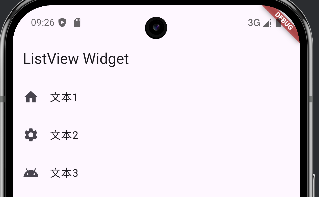
ListTile(leading: Icon(Icons.home), title: Text('文本1')),
ListTile(leading: Icon(Icons.settings), title: Text('文本2')),
ListTile(leading: Icon(Icons.android), title: Text('文本3')),
],
),
),
);
}
}
该代码实现类似设置页面的列表,左侧图标,右侧文字
横向列表示例代码:
import 'package:flutter/material.dart';
void main() => runApp(MyApp());
class MyApp extends StatelessWidget {
Widget build(BuildContext context) {
return MaterialApp(
title: 'Flutter App Demo',
home: Scaffold(
appBar: AppBar(title: Text('ListView Widget')),
body: Center(
child: Container(
height: 200.0,
child: ListView(
scrollDirection: Axis.horizontal, //横向
children: <Widget>[
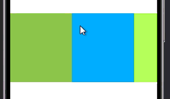
Container(width: 180.0, color: Colors.lightGreen),
Container(width: 180.0, color: Colors.lightBlue),
Container(width: 180.0, color: Colors.lightGreenAccent),
Container(width: 180.0, color: Colors.red),
],
),
),
),
),
);
}
}
该代码实现左右滑动列表,类似图库浏览单张图片
优化后可复用形式代码:
import 'package:flutter/material.dart';
void main() => runApp(MyApp());
class MyApp extends StatelessWidget {
Widget build(BuildContext context) {
return MaterialApp(
title: 'Flutter App Demo',
home: Scaffold(
appBar: AppBar(title: Text('ListView Widget')),
body: Center(child: Container(height: 200.0, child: MyList())),
),
);
}
}
class MyList extends StatelessWidget {
Widget build(BuildContext context) {
return ListView(
scrollDirection: Axis.horizontal, //横向
children: <Widget>[
Container(width: 180.0, color: Colors.lightGreen),
Container(width: 180.0, color: Colors.lightBlue),
Container(width: 180.0, color: Colors.lightGreenAccent),
Container(width: 180.0, color: Colors.red),
],
);
}
}
动态列表
示例代码:
import 'package:flutter/material.dart';
void main() =>
runApp(MyApp(items: List<String>.generate(1000, (i) => 'Items:$i')));
class MyApp extends StatelessWidget {
final List<String> items;
MyApp({Key? key, required this.items}) : super(key: key);
Widget build(BuildContext context) {
return MaterialApp(
title: 'Flutter App Demo',
home: Scaffold(
appBar: AppBar(title: Text('ListView Widget')),
body: ListView.builder(
itemCount: items.length,
itemBuilder: (context, index) {
return ListTile(title: Text('${items[index]}'));
},
),
),
);
}
}
- 传入动态List数组,在<>里指定数据类型,为了演示,调用Generate来生成字符串传入
items: List<String>.generate(1000, (i) => 'Items:$i')
2.定义 MyApp 的构造函数,接收一个可空的 Key? 和一个必需的 items 列表,并将 key 传递给父类 StatelessWidget 的构造函数。
MyApp({Key? key, required this.items}) : super(key: key);
3.这行代码使用 ListView.builder 高效地构建一个可滚动列表: 根据 items 的长度(items.length)动态生成列表项,每项显示对应字符串内容(${items[index]}),仅渲染可见区域的 item,节省内存和性能。
ListView.builder(
  itemCount: items.length,
  itemBuilder: (context, index) {
    return ListTile(title: Text('${items[index]}'));
  },
网格列表
示例代码1:
import 'package:flutter/material.dart';
void main() =>
runApp(MyApp(items: List<String>.generate(1000, (i) => 'Items:$i')));
class MyApp extends StatelessWidget {
final List<String> items;
MyApp({Key? key, required this.items}) : super(key: key);
Widget build(BuildContext context) {
return MaterialApp(
title: 'Flutter App Demo',
home: Scaffold(
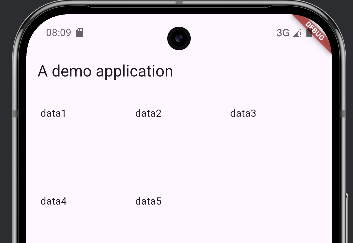
appBar: AppBar(title: Text('A demo application')),
body: GridView.count(
padding: const EdgeInsets.all(20.0),
crossAxisSpacing: 10.0, //每格距离
crossAxisCount: 3, //每行列数
children: <Widget>[
const Text('data1'),
const Text('data2'),
const Text('data3'),
const Text('data4'),
const Text('data5'),
],
),
),
);
}
}
结果:
- 这是 Flutter 中创建固定列数(或行数)网格布局的便捷构造方法。它内部使用了
SliverGridDelegateWithFixedCrossAxisCount作为默认的gridDelegate。
GridView.count(
- 设置交叉轴方向上相邻子项之间的间距。
如果你还想设置上下间距,需要使用
mainAxisSpacing参数
crossAxisSpacing: 10.0, // 每格距离
- 指定在交叉轴方向上显示的子项数量。
crossAxisCount: 3, // 每行列数
示例代码2:
import 'package:flutter/material.dart';
void main() =>
runApp(MyApp(items: List<String>.generate(1000, (i) => 'Items:$i')));
class MyApp extends StatelessWidget {
final List<String> items;
const MyApp({Key? key, required this.items}) : super(key: key);
Widget build(BuildContext context) {
return MaterialApp(
title: 'Flutter App Demo',
home: Scaffold(
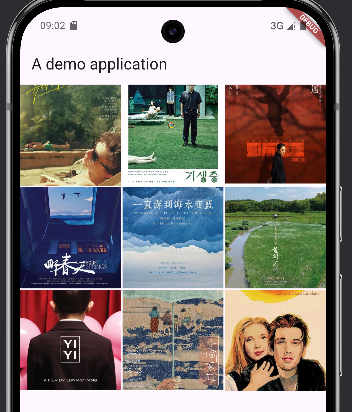
appBar: AppBar(title: Text('A demo application')),
body: GridView(
gridDelegate: SliverGridDelegateWithFixedCrossAxisCount(
crossAxisCount: 3,//列数
mainAxisSpacing: 2.0,//上下间距
crossAxisSpacing: 2.0,//左右间距
childAspectRatio: 1.0,//宽高比例
),
children: <Widget>[
Image.network(
'https://pic1.zhimg.com/v2-d15162bd3857af27785242957ac60d92_1440w.jpg',
fit: BoxFit.cover,
),
Image.network(
'https://pic3.zhimg.com/v2-0084dd60d97d70cb6bcd762e7699274a_1440w.jpg',
fit: BoxFit.cover,
),
Image.network(
'https://pic3.zhimg.com/v2-4a6ac348db1fd8e99b537e408ae3626c_1440w.jpg',
fit: BoxFit.cover,
),
Image.network(
'https://pic4.zhimg.com/v2-76c575cdf404b0e860d4b2f1858cf915_1440w.jpg',
fit: BoxFit.cover,
),
Image.network(
'https://pic3.zhimg.com/v2-af9b8a81df599a22ff4dd72cc3d7fb50_1440w.jpg',
fit: BoxFit.cover,
),
Image.network(
'https://pic3.zhimg.com/v2-2176e715376a4fe7aa6feb15e60d7cae_1440w.jpg',
fit: BoxFit.cover,
),
Image.network(
'https://pic1.zhimg.com/v2-77c15a0412cdd2d5e046213c4a620886_1440w.jpg',
fit: BoxFit.cover,
),
Image.network(
'https://pic4.zhimg.com/v2-1964aaac7710c4b784c5f6f419d88e0f_1440w.jpg',
fit: BoxFit.cover,
),
Image.network(
'https://pica.zhimg.com/v2-8fa8d813365df3cb4c47128584f8eaec_1440w.jpg',
fit: BoxFit.cover,
),
],
),
),
);
}
}
结果:
- 这行表示为一个
GridView(或其他支持网格布局的 widget)指定其子项的排列方式gridDelegate是GridView的一个属性,用于定义网格的布局规则。SliverGridDelegateWithFixedCrossAxisCount是一种内置的网格代理(delegate),它会将网格划分为固定列数或固定行数。
gridDelegate: SliverGridDelegateWithFixedCrossAxisCount()
crossAxisCount表示在交叉轴(cross axis)上显示的子项数量。
crossAxisCount: 3, // 列数
mainAxisSpacing表示在主轴方向(main axis)上,相邻子项之间的间距。
mainAxisSpacing: 2.0, // 上下间距
crossAxisSpacing表示在交叉轴方向上,相邻子项之间的间距。
crossAxisSpacing: 2.0, // 左右间距
childAspectRatio定义每个子项的宽高比(width / height)。
childAspectRatio: 1.0, // 宽高比例
(五)button组件
示例代码:
import 'package:flutter/material.dart';
void main() => runApp(MyApp());
class MyApp extends StatelessWidget {
Widget build(BuildContext context) {
return MaterialApp(
title: 'A application demo',
home: Scaffold(
appBar: AppBar(title: Text('标题')),
body: Row(
children: <Widget>[
Expanded(
child: ElevatedButton(
style: ElevatedButton.styleFrom(
  backgroundColor: Colors.redAccent,
  foregroundColor: Colors.white,
),
onPressed: () {},
child: Text('红色按钮'),
),
),
Expanded(
child: ElevatedButton(
style: ElevatedButton.styleFrom(
backgroundColor: Colors.orangeAccent,
foregroundColor: Colors.white,
),
onPressed: () {},
child: Text('橙色按钮'),
),
),
Expanded(
child: ElevatedButton(
style: ElevatedButton.styleFrom(
backgroundColor: Colors.blueAccent,
foregroundColor: Colors.white,
),
onPressed: () {},
child: Text('蓝色按钮'),
),
),
],
),
),
);
}
}
- 它的作用是让其子组件占据主轴(main axis)上所有可用的剩余空间,如果有多个
Expanded,它们会按flex属性(默认为 1)按比例分配剩余空间。
Expanded()
ElevatedButton是 Material Design 风格的一种常用按钮,带有阴影和点击反馈。必须提供onPressed回调(否则会禁用),以及一个child。
child: ElevatedButton()
3.自定义按钮的外观样式: 设置按钮的背景颜色为亮红色,设置按钮上前景内容的颜色为白色。
style: ElevatedButton.styleFrom(
backgroundColor: Colors.redAccent,
foregroundColor: Colors.white,
),
注意:
styleFrom还支持设置padding、shape(圆角)、elevation(阴影高度)等。
- 定义按钮被点击时的回调函数。
onPressed: () {},
三、布局讲解
(一)ColumnWidget布局和RowWidget布局
示例代码:
import 'package:flutter/material.dart';
void main() => runApp(MyApp());
class MyApp extends StatelessWidget {
Widget build(BuildContext context) {
return MaterialApp(
title: 'A application demo',
home: Scaffold(
appBar: AppBar(title: Text('标题')),
body: Center(
child: Column(
crossAxisAlignment: CrossAxisAlignment.center, //水平对齐方向
mainAxisAlignment: MainAxisAlignment.center, //垂直对齐方向
children: <Widget>[
Text('文本1哔哩哔哩'),
Text('文本2哈哈哈'),
Text('文本3嗡嗡嗡嗡嗡嗡嗡嗡嗡嗡嗡嗡嗡嗡嗡'),
Text('文本4呃呃呃'),
],
),
),
),
);
}
}
结果:
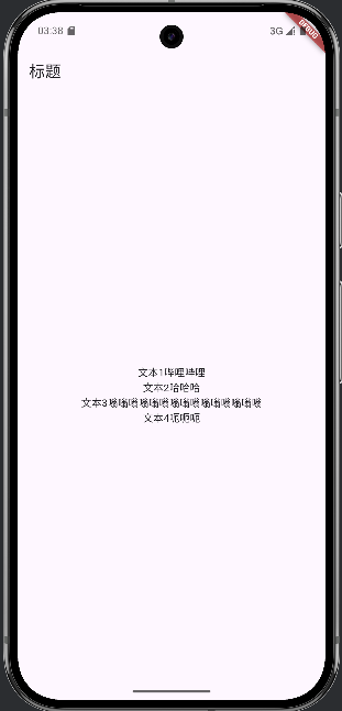
- 子项在水平方向居中(交叉轴)
crossAxisAlignment: CrossAxisAlignment.center, //水平对齐方向
- 子项在垂直方向居中(主轴)
mainAxisAlignment: MainAxisAlignment.center, //垂直对齐方向
- 让其子组件占据主轴(main axis)上所有可用的剩余空间,如果有多个
Expanded,它们会按比例分配剩余空间。
Expanded()
(二)StackWidget布局
示例代码:
import 'package:flutter/material.dart';
void main() => runApp(MyApp());
class MyApp extends StatelessWidget {
Widget build(BuildContext context) {
var stack = Stack(
alignment: FractionalOffset(0.5, 0.8),
children: <Widget>[
CircleAvatar(
backgroundImage: NetworkImage(
'https://vcg01.cfp.cn/creative/vcg/800/new/VCG211314119557.jpg',
),
radius: 100.0,
),
Container(
decoration: BoxDecoration(color: Colors.blueAccent),
padding: EdgeInsets.all(5.0),
child: Text('HELLO'),
),
],
);
return MaterialApp(
title: 'A application demo',
home: Scaffold(
appBar: AppBar(title: Text('标题')),
body: Center(child: stack),
),
);
}
}
结果:
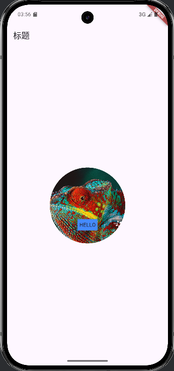
- 使用stack组件。
var stack = Stack()
- 设置
Stack中未使用Positioned包裹的子组件的默认对齐位置,水平方向0.5(0 = 左边,1 = 右边),垂直方向0.8即距离顶部 80% 的位置(0 = 顶部,1 = 底部),如果子组件被Positioned包裹,则不受此属性影响。
alignment: FractionalOffset(0.5, 0.8),
-
创建一个圆形头像控件。CircleAvatar()
-
从网络加载一张图片作为
CircleAvatar的背景图像。backgroundImage接收一个ImageProvider,这里使用NetworkImage从 URL 加载图片。
backgroundImage: NetworkImage('https://vcg01.cfp.cn/creative/vcg/800/new/VCG211314119557.jpg'),
(三)PositionedWidget布局
示例代码:
import 'package:flutter/material.dart';
void main() => runApp(MyApp());
class MyApp extends StatelessWidget {
Widget build(BuildContext context) {
var stack = Stack(
alignment: FractionalOffset(0.5, 0.8),
children: <Widget>[
CircleAvatar(
backgroundImage: NetworkImage(
'https://vcg01.cfp.cn/creative/vcg/800/new/VCG211314119557.jpg',
),
radius: 100.0,
),
Positioned(top: 10.0, left: 10.0, child: Text('变色龙')),
Positioned(bottom: 10.0, right: 10.0, child: Text('BIANSELONG')),
],
);
return MaterialApp(
title: 'A application demo',
home: Scaffold(
appBar: AppBar(title: Text('标题')),
body: Center(child: stack),
),
);
}
}
结果:
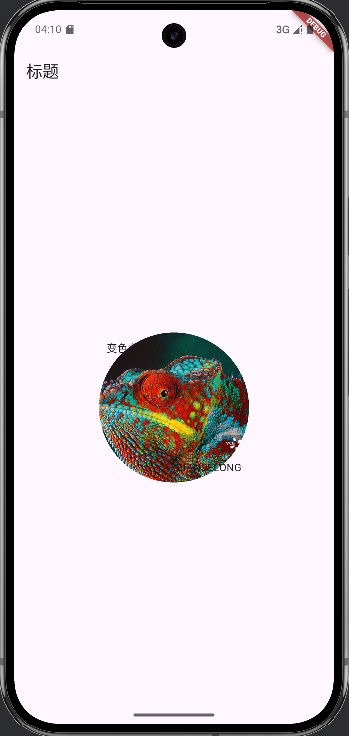
- 将文本
'变色龙'定位在 Stack 容器的左上角附近,距离顶部 10 像素,距离左边 10 像素。
Positioned(top: 10.0, left: 10.0, child: Text('变色龙')),
- 将英文文本
'BIANSELONG'定位在 Stack 容器的右下角附近,距离底部 10 像素,距离右边 10 像素。
Positioned(bottom: 10.0, right: 10.0, child: Text('BIANSELONG')),
不要在非
Stack父组件中使用 `Positioned避免只设置一个方向
(四)CardWidget布局
示例代码:
import 'package:flutter/material.dart';
void main() => runApp(MyApp());
class MyApp extends StatelessWidget {
Widget build(BuildContext context) {
var card = Card(
child: Column(
children: <Widget>[
ListTile(
title: Text(
'地址文本,中华人民共和国四川省',
style: TextStyle(fontWeight: FontWeight.w500),
),
subtitle: Text('成都市'),
leading: Icon(Icons.account_box, color: Colors.lightBlue),
),
ListTile(
title: Text(
'地址文本,中华人民共和国陕西省',
style: TextStyle(fontWeight: FontWeight.w500),
),
subtitle: Text('西安市'),
leading: Icon(Icons.account_box, color: Colors.lightBlue),
),
ListTile(
title: Text(
'地址文本,中华人民共和国黑龙江省',
style: TextStyle(fontWeight: FontWeight.w500),
),
subtitle: Text('哈尔滨市'),
leading: Icon(Icons.account_box, color: Colors.lightBlue),
),
],
),
);
return MaterialApp(
title: 'A application demo',
home: Scaffold(
appBar: AppBar(title: Text('标题')),
body: Center(child: card),
),
);
}
}
结果:
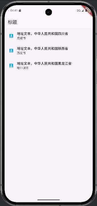
- 使用Card布局设置Card布局
var card = Card()
四、导航讲解
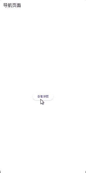
(一)父子页面跳转
示例代码:
import 'package:flutter/material.dart';
void main() {
runApp(MaterialApp(title: '导航演示', home: FirstScreen()));
}
class FirstScreen extends StatelessWidget {
const FirstScreen({super.key});
Widget build(BuildContext context) {
return Scaffold(
appBar: AppBar(title: Text('导航页面')),
body: Center(
child: ElevatedButton(
onPressed: () {
Navigator.push(
  context,
  MaterialPageRoute(builder: (context) => SecondScreen()),
);
},
child: Text('查看详情'),
),
),
);
}
}
class SecondScreen extends StatelessWidget {
const SecondScreen({super.key});
Widget build(BuildContext context) {
return Scaffold(
appBar: AppBar(title: Text('详情')),
body: Center(
child: ElevatedButton(
onPressed: () {
Navigator.pop(context);
},
child: Text('返回'),
),
),
);
}
}
结果:
-
将一个新的页面(Widget)推入到导航栈(Navigator stack)的顶部,从而跳转到新页面。参数:
context:当前 widget 的上下文,用于定位 Navigator。MaterialPageRoute:一种页面切换动画(遵循 Material Design),其builder返回要跳转的目标页面(如SecondScreen())。Navigator.push( context, MaterialPageRoute(builder: (context) => SecondScreen()), ); -
从导航栈中弹出当前页面,返回上一个页面。
context:用于找到当前的 Navigator。可以传入一个result参数(如pop(context, 'data')),将数据返回给前一个页面。Navigator.pop(context);
(二)参数传递
示例代码:
import 'package:flutter/material.dart';
class Product {
final String title;
final String description;
Product(this.title, this.description);
}
void main() {
runApp(
MaterialApp(
title: '导航数据传递',
home: ProductList(
products: List.generate(20, (i) => Product('商品$i', "商品的编号为$i")),
),
),
);
}
class ProductList extends StatelessWidget {
final List<Product> products;
ProductList({Key? key, required this.products}) : super(key: key);
Widget build(BuildContext context) {
return Scaffold(
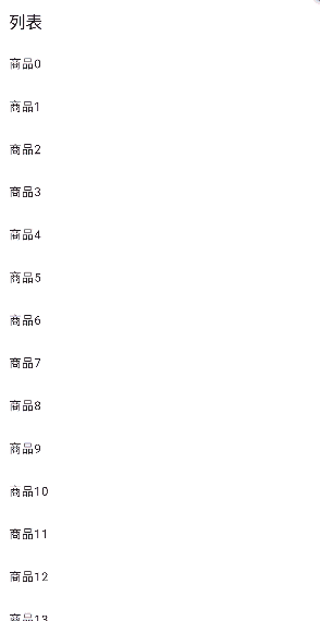
appBar: AppBar(title: Text('列表')),
body: ListView.builder(
itemCount: products.length,
itemBuilder: (context, index) {
return ListTile(
title: Text(products[index].title),
onTap: () {
Navigator.push(
context,
MaterialPageRoute(
builder: (context) => ProductDetail(product: products[index]),
),
);
},
);
},
),
);
}
}
class ProductDetail extends StatelessWidget {
final Product product;
ProductDetail({Key? key, required this.product}) : super(key: key);
Widget build(BuildContext context) {
return Scaffold(
appBar: AppBar(title: Text(product.title)),
body: Center(child: Text(product.description)),
);
}
}
结果:
示例代码2:
import 'package:flutter/material.dart';
void main() {
runApp(MaterialApp(title: '数据传递', home: FirstPage()));
}
class FirstPage extends StatelessWidget {
Widget build(BuildContext context) {
return Scaffold(
appBar: AppBar(title: Text('数据传递')),
body: RouteButton(),
);
}
}
class RouteButton extends StatelessWidget {
Widget build(BuildContext context) {
return ElevatedButton(
onPressed: () {
_navigateToPage(context);
},
child: Text('点一点'),
);
}
_navigateToPage(BuildContext context) async {
final result = await Navigator.push(
context,
MaterialPageRoute(builder: (context) => ShowPage()),
);
ScaffoldMessenger.of(
context,
).showSnackBar(SnackBar(content: Text('$result')));
}
}
class ShowPage extends StatelessWidget {
Widget build(BuildContext context) {
return Scaffold(
appBar: AppBar(title: Text('展示页面')),
body: Center(
child: Column(
children: <Widget>[
ElevatedButton(
onPressed: () {
Navigator.pop(context, '点击展示页面:007');
},
child: Text('展示页面007'),
),
ElevatedButton(
onPressed: () {
Navigator.pop(context, '点击展示页面:008');
},
child: Text('展示页面008'),
),
],
),
),
);
}
}
结果: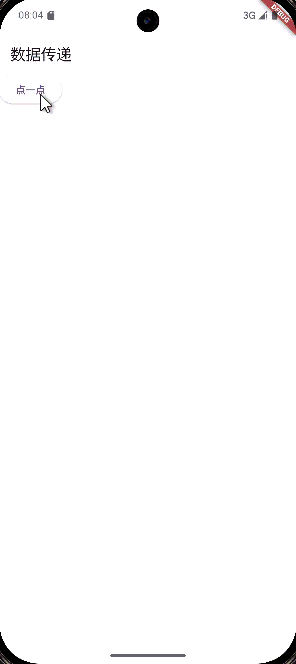
五、资源导入和使用
(一) 导入
-
在项目根目录下建立
asstes文件夹,和lib文件夹同级。 -
将资源文件复制到
assets文件夹中。 -
在项目目录下找到
pubspec.yaml文件,找到下面文字区域:
# The following section is specific to Flutter packages.
flutter:
添加资源信息,其中文件位置为以 assets 文件夹为根目录的相对位置:
# The following section is specific to Flutter packages.
flutter:
  assets:
   - assets/xxx.xxx
可以导入文件也可以直接导入文件夹
(二)使用
在代码中使用以下类似代码调用:
组件.asset('assets/xxx.xxx')
六、项目打包
按照Android 、iOS 、Linux 、Windows 、MacOS、Web的平台架构更改外层文件,例如:图标、软件名称……
然后根据不同平台运行:
1. Android
# 构建 APK(适用于大多数设备)
flutter build apk

# 构建拆分 APK(按 ABI 分包,减小体积)
flutter build apk --split-per-abi

# 构建 AAB(Google Play 推荐格式)
flutter build appbundle
2. iOS
# 构建 release 模式的 iOS 应用(生成 .app)
flutter build ios
3. Web
# 构建 Web 应用(release 模式)
flutter build web
4. macOS
# 构建 macOS 应用
flutter build macos
5. Windows
# 构建 Windows 桌面应用
flutter build windows
6. Linux
# 构建 Linux 桌面应用
flutter build linux
Flutter 支持三种构建模式:
| 模式 | 用途 | 命令示例 |
|---|---|---|
| Debug | 开发调试 | 默认 flutter run,也可通过flutter build [平台] --debug构建 |
| Profile | 性能分析(仅限真机) | flutter build --profile [平台] |
| Release | 正式发布 | flutter build [平台](也可加 -- release) |

有“AI”的1024 = 2048,欢迎大家加入2048 AI社区
更多推荐
 8
8 0
0- 0


 已为社区贡献2条内容

所有评论(0)