50天50个小项目 (React19 + Tailwindcss V4) ✨ | NetflixMobileNavigation(奈飞移动导航组件)
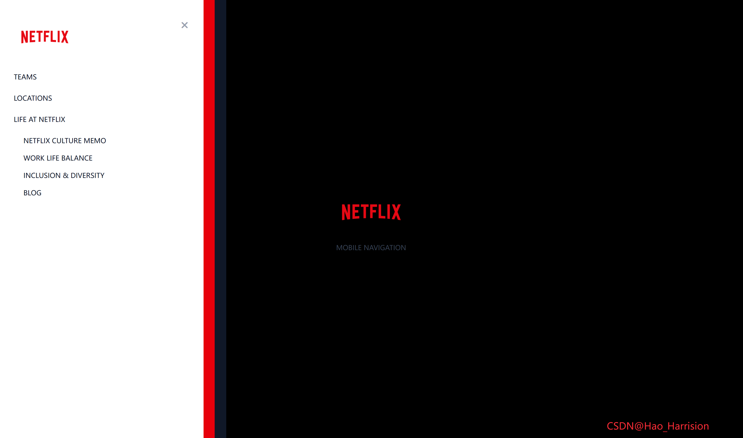
使用 React19 和 TailwindCSS实现一个具有三层嵌套滑动动画的移动端侧边导航菜单。该菜单通过transform和transition实现视觉冲击效果,当点击菜单按钮时,三个不同颜色的面板会依次滑入(深灰、红色、白色)。
📅 今天我们继续 50 个小项目挑战!——NetflixMobileNavigation组件
仓库地址:https://gitee.com/hhm-hhm/50days50projects.git
创建一个功能强大且视觉美观的实时用户搜索过滤组件。这个组件能够从远程 API 获取用户数据,并根据用户输入的关键词实时过滤并展示结果,非常适合用于构建用户目录、联系人列表或任何需要搜索功能的界面。
让我们开始吧!🚀
🌀 组件目标
- 实现基于姓名和/或位置的实时用户搜索过滤
- 展示加载状态和无结果状态
- 利用 Tailwind CSS 快速构建基础样式,并通过内联样式实现精确控制
- 优化用户体验,提供流畅的搜索反馈
🔧 NetflixMobileNavigation.tsx组件实现
import { useState } from 'react'

const NetflixMobileNavigation = () => {
    const [isNavVisible, setIsNavVisible] = useState(false)

    return (
        <div className="relative flex min-h-screen flex-col items-center justify-center font-sans">
            {/* 打开按钮 */}
            <button
                className="fixed top-3 left-3 z-50 cursor-pointer border-none bg-transparent text-2xl text-white"
                onClick={() => setIsNavVisible(true)}
                aria-label="Open navigation">
                <i className="fas fa-bars"></i>
            </button>

            {/* Logo 和标题 */}
            <img
                src="https://images.ctfassets.net/4cd45et68cgf/7LrExJ6PAj6MSIPkDyCO86/542b1dfabbf3959908f69be546879952/Netflix-Brand-Logo.png?w=684&h=456"
                alt="Netflix Logo"
                className="h-auto w-40"
            />
            <p className="mt-4 text-sm text-gray-700 uppercase">Mobile Navigation</p>

            {/* 导航菜单 (三层嵌套) */}
            <div
                className={`fixed top-0 left-0 h-full w-[60%] max-w-[480px] min-w-[320px] transform transition-transform duration-300 ease-in-out ${
                    isNavVisible ? 'translate-x-0' : '-translate-x-full'
                } bg-gray-900`}>
                <div
                    className={`h-full w-[95%] transform transition-transform duration-300 ease-in-out ${
                        isNavVisible ? 'translate-x-0 delay-100' : '-translate-x-full'
                    } bg-red-600`}>
                    <div
                        className={`relative h-full w-[95%] transform p-10 transition-transform duration-300 ease-in-out ${
                            isNavVisible ? 'translate-x-0 delay-200' : '-translate-x-full'
                        } bg-white`}>
                        {/* 关闭按钮 */}
                        <button
                            className="absolute top-10 right-8 cursor-pointer border-none bg-transparent text-xl text-gray-400"
                            onClick={() => setIsNavVisible(false)}
                            aria-label="Close navigation">
                            <i className="fas fa-times"></i>
                        </button>

                        {/* 导航 Logo */}
                        <img
                            src="https://images.ctfassets.net/4cd45et68cgf/7LrExJ6PAj6MSIPkDyCO86/542b1dfabbf3959908f69be546879952/Netflix-Brand-Logo.png?w=684&h=456"
                            alt="Netflix Logo"
                            className="mb-8 h-auto w-32"
                        />

                        {/* 导航菜单 */}
                        <ul className="list-none p-0">
                            <li className="mb-5">
                                <a
                                    href="#"
                                    className="text-sm text-gray-900 uppercase no-underline transition-colors hover:text-red-600">
                                    Teams
                                </a>
                            </li>
                            <li className="mb-5">
                                <a
                                    href="#"
                                    className="text-sm text-gray-900 uppercase no-underline transition-colors hover:text-red-600">
                                    Locations
                                </a>
                            </li>
                            <li className="mb-5">
                                <a
                                    href="#"
                                    className="text-sm text-gray-900 uppercase no-underline transition-colors hover:text-red-600">
                                    Life at Netflix
                                </a>
                            </li>
                            <li>
                                <ul className="mt-2 list-none pl-5">
                                    <li className="mb-3">
                                        <a
                                            href="#"
                                            className="text-sm text-gray-900 uppercase no-underline transition-colors hover:text-red-600">
                                            Netflix culture memo
                                        </a>
                                    </li>
                                    <li className="mb-3">
                                        <a
                                            href="#"
                                            className="text-sm text-gray-900 uppercase no-underline transition-colors hover:text-red-600">
                                            Work life balance
                                        </a>
                                    </li>
                                    <li className="mb-3">
                                        <a
                                            href="#"
                                            className="text-sm text-gray-900 uppercase no-underline transition-colors hover:text-red-600">
                                            Inclusion & diversity
                                        </a>
                                    </li>
                                    <li className="mb-3">
                                        <a
                                            href="#"
                                            className="text-sm text-gray-900 uppercase no-underline transition-colors hover:text-red-600">
                                            Blog
                                        </a>
                                    </li>
                                </ul>
                            </li>
                        </ul>
                    </div>
                </div>
            </div>
            <div className="fixed right-20 bottom-5 z-100 text-xl text-red-500">
                CSDN@Hao_Harrision
            </div>
        </div>
    )
}

export default NetflixMobileNavigation
🔄 转换说明(Vue → React)
| 特性 | Vue 3 实现 | React + TS 实现 | 说明 |
|---|---|---|---|
| 状态管理 | ref(false) → isNavVisible |
useState(false) → [isNavVisible, setIsNavVisible] |
Vue 的响应式 ref 对应 React 的 useState hook |
| 模板语法 | <template> + 插值/指令 |
JSX | Vue 的模板结构转为 React 的 JSX 语法 |
| 类绑定 | :class="[...]" 动态绑定 |
使用模板字符串或条件表达式拼接 className | React 不支持动态 class 对象写法,需手动拼接字符串 |
| 事件处理 | @click="isNavVisible = true" |
onClick={() => setIsNavVisible(true)} |
React 使用函数式更新状态 |
| 组件定义 | <script setup> |
函数组件 const Component = () => { ... } |
Vue 的组合式 API 对应 React 的函数组件 + hooks |
| TypeScript | .vue 文件中使用 <script setup lang="ts"> |
.tsx 文件天然支持 TS |
React + Vite 项目中直接使用 .tsx 即可启用 TS |
| 无障碍性 | 无显式 aria | 添加 aria-label |
建议在按钮上添加无障碍标签(最佳实践) |
| 样式 | 全部使用 Tailwind 类 | 同样全部使用 Tailwind 类 | 无需改动,Tailwind 在 React 中工作方式一致 |
🎨 TailwindCSS 样式重点讲解
| 类名 | 作用 |
|---|---|
relative / fixed |
定位方式,fixed 使元素脱离文档流并相对于视口定位 |
top-0 / left-0 / top-3 / right-8 / top-10 |
精确控制元素位置 |
h-full |
高度100% |
w-[60%] / w-[95%] / w-40 / w-32 |
宽度设置(支持任意值) |
max-w-[480px] / min-w-[320px] |
最大/最小宽度限制 |
flex / flex-col |
Flexbox 布局 |
items-center / justify-center |
Flex 项目对齐 |
min-h-screen |
最小高度为视口高度 |
font-sans |
无衬线字体 |
border-none / bg-transparent |
移除边框和背景 |
text-2xl / text-xl / text-sm / text-white / text-gray-700 / text-gray-900 / text-gray-400 / text-red-600 |
文字大小和颜色 |
uppercase |
文字大写 |
z-50 |
层级最高 |
transform |
启用 CSS 变换 |
transition-transform / transition-colors / transition-all |
指定需要过渡的CSS属性 |
duration-300 |
过渡持续时间为300ms |
ease-in-out |
过渡缓动函数 |
delay-100 / delay-200 |
过渡延迟100ms/200ms |
translate-x-0 / -translate-x-full |
X轴位移(0% / -100%) |
bg-gray-900 / bg-red-600 / bg-white |
背景颜色 |
p-10 / pl-5 / mb-5 / mb-3 / mb-8 / mt-2 |
内边距和外边距 |
list-none |
移除列表默认样式(项目符号) |
no-underline |
移除下划线 |
hover:text-red-600 |
悬停时文字变红 |
absolute |
绝对定位(用于关闭按钮) |
h-auto |
高度自适应 |
🦌 路由组件 + 常量定义
router/index.tsx 中 children数组中添加子路由
{
    path: '/',
    element: <App />,
    children: [
       ...
        {
                path: '/NetflixMobileNavigation',
                lazy: () =>
                    import('@/projects/NetflixMobileNavigation').then((mod) => ({
                        Component: mod.default,
                    })),
            },
    ],
 },
constants/index.tsx 添加组件预览常量
import demo45Img from '@/assets/pic-demo/demo-45.png'
省略部分....
export const projectList: ProjectItem[] = [
    省略部分....
      {
        id: 45,
        title: 'Netflix Mobile Navigation',
        image: demo45Img,
        link: 'NetflixMobileNavigation',
    },
]
🚀 小结
通过这篇文章,我们使用 React19 和 TailwindCSS 构建了一个功能完整、界面美观的实时用户搜索过滤组件,来实现高效的过滤逻辑, 快速搭建了现代化的 UI。
在这篇教程中,我们成功创建了一个视觉效果惊艳的移动端侧边导航菜单。我们巧妙地利用了 React19 和 Tailwind CSS 的 transform、transition 以及 delay 实用类,通过三层嵌套和延迟动画,实现了富有层次感和动感的交互效果。
这个导航组件已经很吸引人,但还可以进一步增强:
✅ 遮罩层:在菜单展开时,在菜单背后添加一个半透明的遮罩层 (<div class="fixed inset-0 bg-black bg-opacity-50"></div>),点击遮罩层也能关闭菜单。
✅ 键盘支持:监听 Escape 键来关闭菜单。
✅ 更复杂的动画:结合 scale 或 rotate 变换,创建更炫酷的展开/收起效果。
✅ 响应式优化:调整 w-[60%] 等宽度值,使其在不同设备上表现更佳。
✅ 动态内容:将导航菜单数据 (<li> 元素) 提取到一个 ref 或 reactive 对象中,便于管理和国际化。
📅 明日预告: 我们将完成QuizApp组件,一个适合问卷调查的问答组件。🚀
感谢阅读,欢迎点赞、收藏和分享 😊
原文链接:https://blog.csdn.net/qq_44808710/article/details/149783282
每天造一个轮子,码力暴涨不是梦!🚀

有“AI”的1024 = 2048,欢迎大家加入2048 AI社区
更多推荐


 31
31 0
0- 0


 已为社区贡献43条内容

所有评论(0)