88、【Ubuntu】【Hugo】搭建私人博客:侧边导航栏(二)
本文介绍了在Hugo博客中实现侧边导航栏的技术方案。作者首先解释了不应直接修改主题模板的原因,而是通过创建/layouts/_default/single.html文件来覆盖主题默认模板。文章详细分析了HTML语义标签<main>、<div>和<article>的区别与适用场景,其中<main>表示页面主要内容区,<article>用于独
【声明】本博客所有内容均为个人业余时间创作,所述技术案例均来自公开开源项目(如Github,Apache基金会),不涉及任何企业机密或未公开技术,如有侵权请联系删除
背景
上篇 blog
【Ubuntu】【Hugo】搭建私人博客:侧边导航栏(一)
分析了 single.html 模板中各个部分的具体内容,下面继续
搭建私人博客
OK,分析完 PaperMod 主题中的 single.html,下面开始布局侧边栏的功能
首先,主题中的 single.html 是不要随便动的,因为可能影响主题的更新,之前 blog 【Ubuntu】【Hugo】搭建私人博客:侧边导航栏(一) 提到过,Hugo 会按照模板查找顺序:
- 先找
/layouts/_default/single.html - 再找
/themes/PaperMod/layouts/_default/single.html
那么就可以在 /layouts/_default/single.html 进行布局,同时,为了不影响原来的 PaperMod 主题的风格,先把 PaperMod 主题拷贝过去,在 PaperMod 主题的基础上进行修改
复制 PaperMod 主题的 <article>...</article> 内容
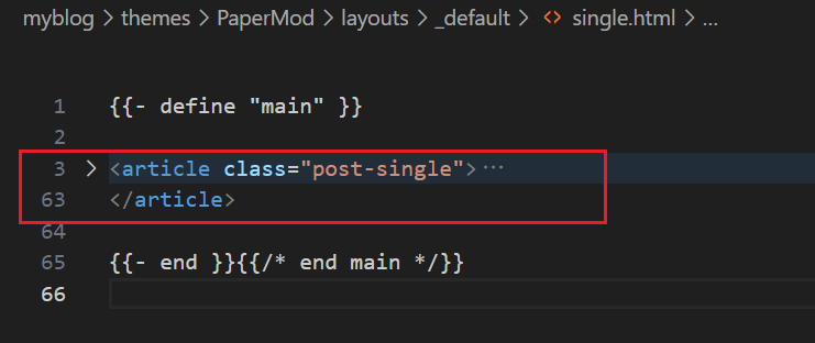
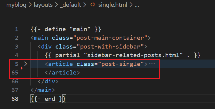
粘贴到 layouts/_default/single.html 中,整体 layouts/_default/single.html 模板如下
{{- define "main" }}
<main class="post-main-container">
  <div class="post-with-sidebar">
    {{ partial "sidebar-related-posts.html" . }}
    <article class="post-single">
      <header class="post-header">
        {{ partial "breadcrumbs.html" . }}
        <h1 class="post-title entry-hint-parent">
          {{ .Title }}
          {{- if .Draft }}
          <span class="entry-hint" title="Draft">
            <svg xmlns="http://www.w3.org/2000/svg" height="35" viewBox="0 -960 960 960" fill="currentColor">
              <path
                d="M160-410v-60h300v60H160Zm0-165v-60h470v60H160Zm0-165v-60h470v60H160Zm360 580v-123l221-220q9-9 20-13t22-4q12 0 23 4.5t20 13.5l37 37q9 9 13 20t4 22q0 11-4.5 22.5T862.09-380L643-160H520Zm300-263-37-37 37 37ZM580-220h38l121-122-18-19-19-18-122 121v38Zm141-141-19-18 37 37-18-19Z" />
            </svg>
          </span>
          {{- end }}
        </h1>
        {{- if .Description }}
        <div class="post-description">
          {{ .Description }}
        </div>
        {{- end }}
        {{- if not (.Param "hideMeta") }}
        <div class="post-meta">
          {{- partial "post_meta.html" . -}}
          {{- partial "translation_list.html" . -}}
          {{- partial "edit_post.html" . -}}
          {{- partial "post_canonical.html" . -}}
        </div>
        {{- end }}
      </header>
      {{- $isHidden := (.Param "cover.hiddenInSingle") | default (.Param "cover.hidden") | default false }}
      {{- partial "cover.html" (dict "cxt" . "IsSingle" true "isHidden" $isHidden) }}
      {{- if (.Param "ShowToc") }}
      {{- partial "toc.html" . }}
      {{- end }}

      {{- if .Content }}
      <div class="post-content">
        {{- if not (.Param "disableAnchoredHeadings") }}
        {{- partial "anchored_headings.html" .Content -}}
        {{- else }}{{ .Content }}{{ end }}
      </div>
      {{- end }}

      <footer class="post-footer">
        {{- $tags := .Language.Params.Taxonomies.tag | default "tags" }}
        <ul class="post-tags">
          {{- range ($.GetTerms $tags) }}
          <li><a href="{{ .Permalink }}">{{ .LinkTitle }}</a></li>
          {{- end }}
        </ul>
        {{- if (.Param "ShowPostNavLinks") }}
        {{- partial "post_nav_links.html" . }}
        {{- end }}
        {{- if (and site.Params.ShowShareButtons (ne .Params.disableShare true)) }}
        {{- partial "share_icons.html" . -}}
        {{- end }}
      </footer>

      {{- if (.Param "comments") }}
      {{- partial "comments.html" . }}
      {{- end }}
    </article>
  </div>
</main>
{{- end }}
可以看到,这里有三个重要标签 <main>,<div>,<article>, 它们都是 HTML 元素,但语义和用途完全不同,下面详细分析下
<div>:全称 division 分区,万能盒子,纯粹用于布局或样式分组,没有任何语义含义,浏览器,搜索引擎,阅读器等都不知道<div>代表什么内容,就像一个透明的塑料盒,拿这个盒子装东西,但盒子本身没有名字,使用场景一般是为了给 CSS 提供一个钩子,方便设置样式或 JavaScript 操作,但是要注意别滥用,比如<div> 这是一篇重要文章 </div>,这样就不对,应该用有语义的标签,比如<article><article>:独立内容块(有语义),表示一篇自包含,可独立分发的内容,典型内容包括博客文章,新闻报道,用户评论,论坛帖子等,其关键特性是内容脱离上下文也能被理解(比如 RSS 订阅只抓<article>),并且阅读器会识别到该处为一篇文章,而搜索引擎也知道这是主要内容,有助于 SEO,比如下面这种场景
<article>
  <h1>如何学习 HTML</h1>
  <p>HTML 是网页的基础...</p>
  <footer>作者:张三</footer>
</article>
注意,一篇文章里也可以嵌套其他的 <article>,比如评论区里每条评论本身也是一个 <article>
<main>:页面主干(有语义),表示当前页面最主要的内容区域,一个页面只能有一个<main>,不能包含和该页面主要内容的无关信息,<main>标签可以帮助辅助软件,比如搜索引擎,或者阅读器等快速识别页面核心内容
OK,解释完 <main>,<div>,<article> 三个标签的关系,下面来看详细内容
首先,<div class="post-with-sidebar"> 是布局容器,其主要结构如下
<main class="post-main-container">
  <div class="post-with-sidebar">        <!-- 布局容器 -->
    {{ partial "sidebar-related-posts.html" . }}   <!-- 侧边栏 -->
    <article class="post-single">...</article>     <!-- 主内容 -->
  </div>
</main>
可以看到,post-with-sidebar 是父容器,而侧边栏 <sidebar-related>(后面介绍) 和正文内容 <article> 是同级兄弟,这种结构是实现 Flex/Grid 布局的关键
再来看最初的诉求:希望侧边栏 + 文章正文并排显示(两栏布局)
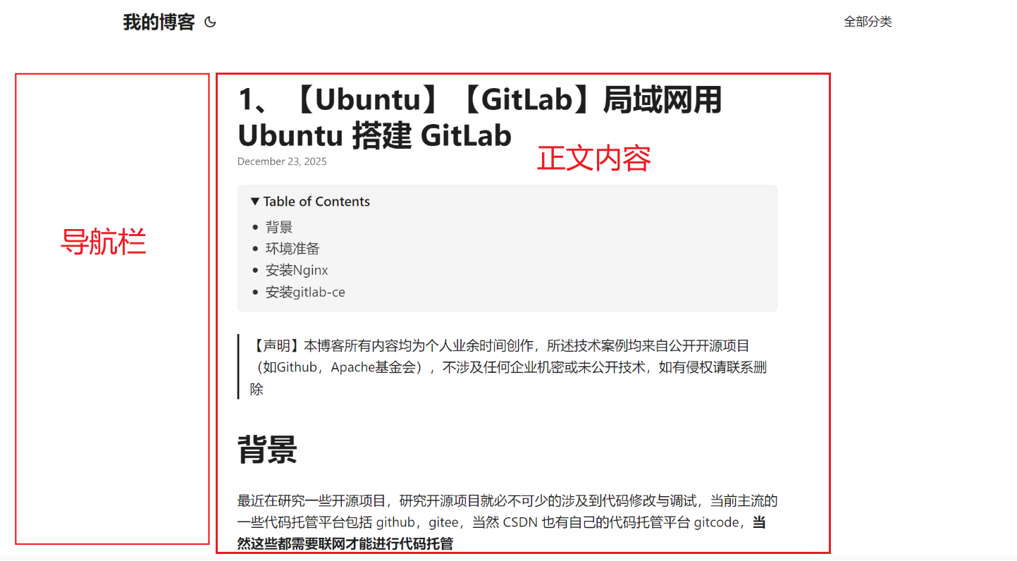
用 Flexbox 实现时,CSS 通常是这样的:
.post-with-sidebar {
  display: flex;
  gap: 2rem;
}

.post-with-sidebar > aside {
  width: 250px;
}

.post-with-sidebar > article {
  flex: 1;
}
**这里 CSS 会要求 <aside> 侧边栏和 <article> 正文内容必须是容器 .post-with-sidebar 的直接子元素,注意结构不能写成这样,不能用 <article> 作为 <sidebar> 的父容器
<article class="post-single">
  <div class="post-with-sidebar">
    <aside>...</aside>
    <div>content</div>
  </div>
</article>
如果结构是这样,那么 .post-with-sidebar 就成了 <article> 的子元素,从 CSS 上,就无法让 <sidebar> 和 <article> 并排,因为 <article> 变成了一个黑盒
OK,本篇先到这里,如有疑问,欢迎评论区留言讨论,祝各位功力大涨,技术更上一层楼!!!更多内容见下篇 blog
【Ubuntu】【Hugo】搭建私人博客:侧边导航栏(三)

有“AI”的1024 = 2048,欢迎大家加入2048 AI社区
更多推荐

 8
8 0
0- 0


 已为社区贡献1条内容

所有评论(0)