html+css基础:21、css3的新增背景相关属性(background-origin/clip/size或复合属性、多背景图)、新增边框相关属性(边框圆角、边框外轮廓)
CSS3新增了多个背景相关属性:background-origin控制背景定位区域(border-box/padding-box/content-box),background-clip控制背景裁剪区域,background-size调整背景图尺寸(cover/contain/具体值)。还引入了复合属性background,可一次性设置颜色、图片、位置等参数。同时支持多背景图叠加显示。在边框方面新
css3的新增背景相关属性的background-origin/clip/size、复合属性、多背景图及新增边框相关属性的边框圆角、边框外轮廓等:
Ⅰ、css3的新增背景相关属性:
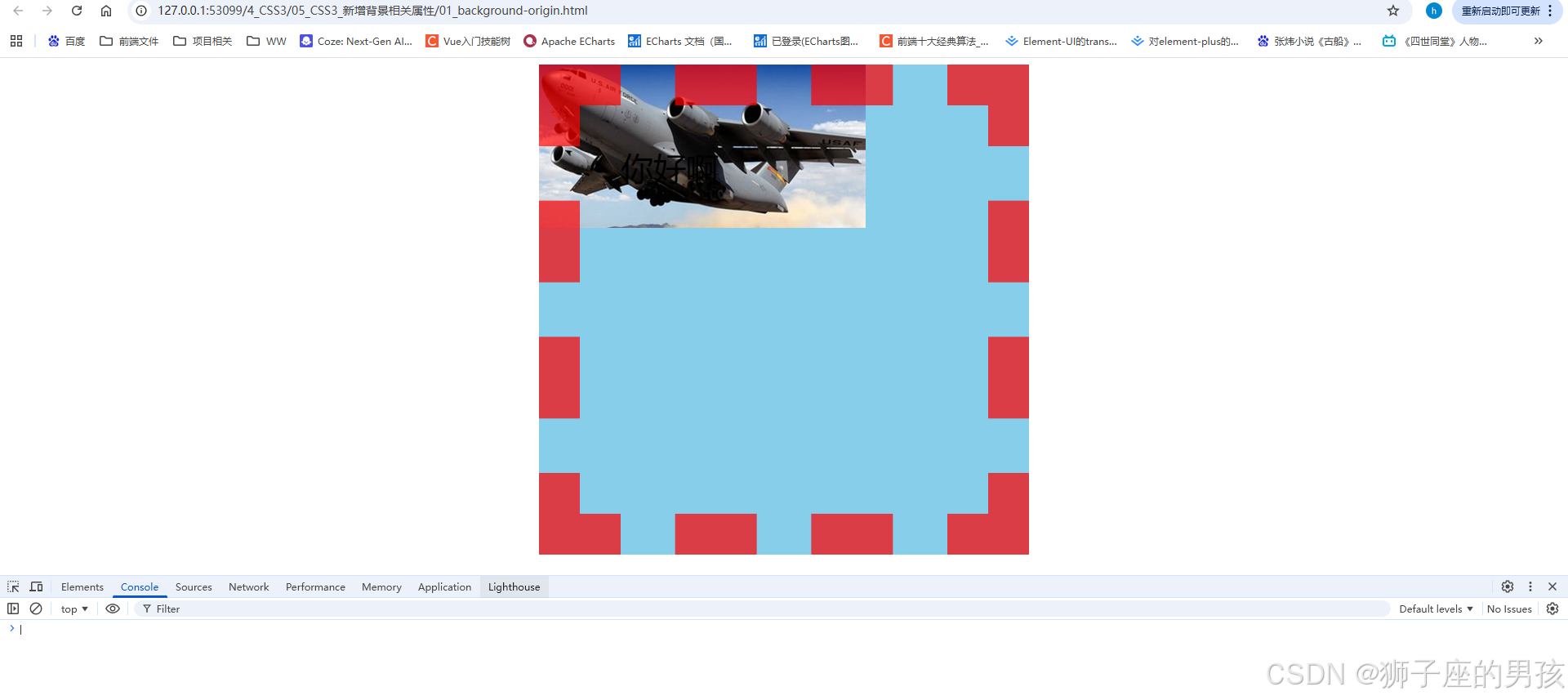
其一、background-origin 属性代码:
// 图片信息为:

<!DOCTYPE html>
<html lang="zh-CN">
<head>
    <meta charset="UTF-8">
    <title>01_background-origin</title>
    <style>
        .box1 {
            width: 400px;
            height: 400px;
            background-color: skyblue;
            margin: 0 auto;
            font-size: 40px;
            padding: 50px;
            border: 50px dashed rgba(255, 0, 0, 0.7);

            /*
                background-origin: padding-box|border-box|content-box;
                border-box 表示:背景图像相对于边框盒来定位(即:最外边框内,只要在 border 内就行,可以压住 border 的值)
                padding-box 表示:背景图像相对于内边距框来定位(即:最外内边距内,只要在 padding 内就行,可以压住 padding 的值)
                content-box 表示:背景图像相对于内容框来定位(即:在外内容内,只要在 content 内就行,可以压住 content 的值)
            */
            background-image: url('../images/bg01.jpg');
            background-repeat: no-repeat;
            background-origin: border-box;
        }
    </style>
</head>
<body>
    <div class="box1">你好啊</div>
</body>
</html>
其二、结果为:
// 一进入页面后的页面:
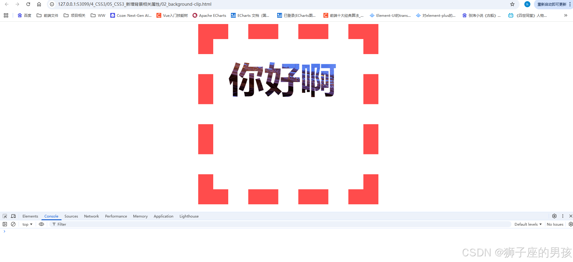
其三、background-clip 属性代码:
// 图片信息为:

<!DOCTYPE html>
<html lang="zh-CN">
<head>
    <meta charset="UTF-8">
    <title>02_background-clip</title>
    <style>
        .box1 {
            width: 400px;
            height: 400px;
            background-color: skyblue;
            margin: 0 auto;
            font-size: 120px;
            font-weight: bold;
            padding: 50px;
            border: 50px dashed rgba(255, 0, 0, 0.7);
            color: transparent;

            /*
                background-clip: border-box|padding-box|content-box;
                border-box 表示:背景被裁剪到边框盒(即:最外边框内,只要在 border 内就行,可以压住 border 的值)
                padding-box 表示:背景被裁剪到内边距框(即:最外内边距内,只要在 padding 内就行,可以压住 padding 的值)
                content-box 表示:背景被裁剪到内容框(即:在外内容内,只要在 content 内就行,可以压住 content 的值)
                text 表示:背景被裁剪到文字?(没看到具体官方标准用法)
            */
            background-image: url('../images/bg02.jpg');
            background-repeat: no-repeat;
            background-origin: border-box;
            /* -webkit-background-clip: text; */
            background-clip: text;
        }
    </style>
</head>
<body>
    <div class="box1">你好啊</div>
</body>
</html>
其四、结果为:
// 一进入页面后的页面:
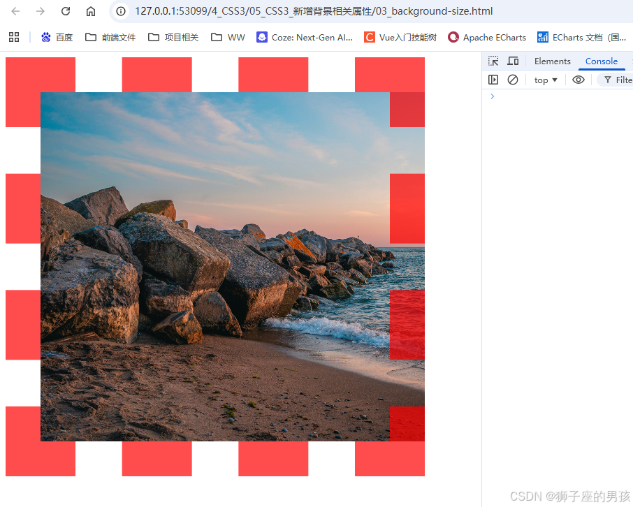
其五、background-size 属性代码:
// 图片信息为:

<!DOCTYPE html>
<html lang="zh-CN">
<head>
    <meta charset="UTF-8">
    <title>03_background-size</title>
    <style>
        div {
            width: 400px;
            height: 400px;
            padding: 50px;
            border: 50px dashed rgba(255, 0, 0, 0.7);
            background-image: url('../images/bg03.jpg');
            background-repeat: no-repeat;

            /*
              background-size: length|percentage|cover|contain;
              length 表示:设置背景图像的高度和宽度(第一个为宽,第二个为高,若只设一个值则第二个值会被设置成auto)
              percentage 表示:以父元素的百分比来设置背景图像的宽度和高度(第一个为宽,第二个为高,若只设一个值则第二个值会被设置成auto)
              cover 表示:把背景图像扩展至足够大,以使背景图像完全覆盖背景区域(背景图像的某些部分也许无法显示在背景定位区域中s)
              contain 表示:把图像图像扩展至最大尺寸,以使其宽度和高度完全适应内容区域(即:可能填不满背景)
            */

            /* background-size: 400px 400px; */
            /* background-size: 100% 100%; */
            /* background-size: contain; */
            background-size: cover;
        }
    </style>
</head>
<body>
    <div></div>
</body>
</html>
其六、结果为:
// 一进入页面后的页面:
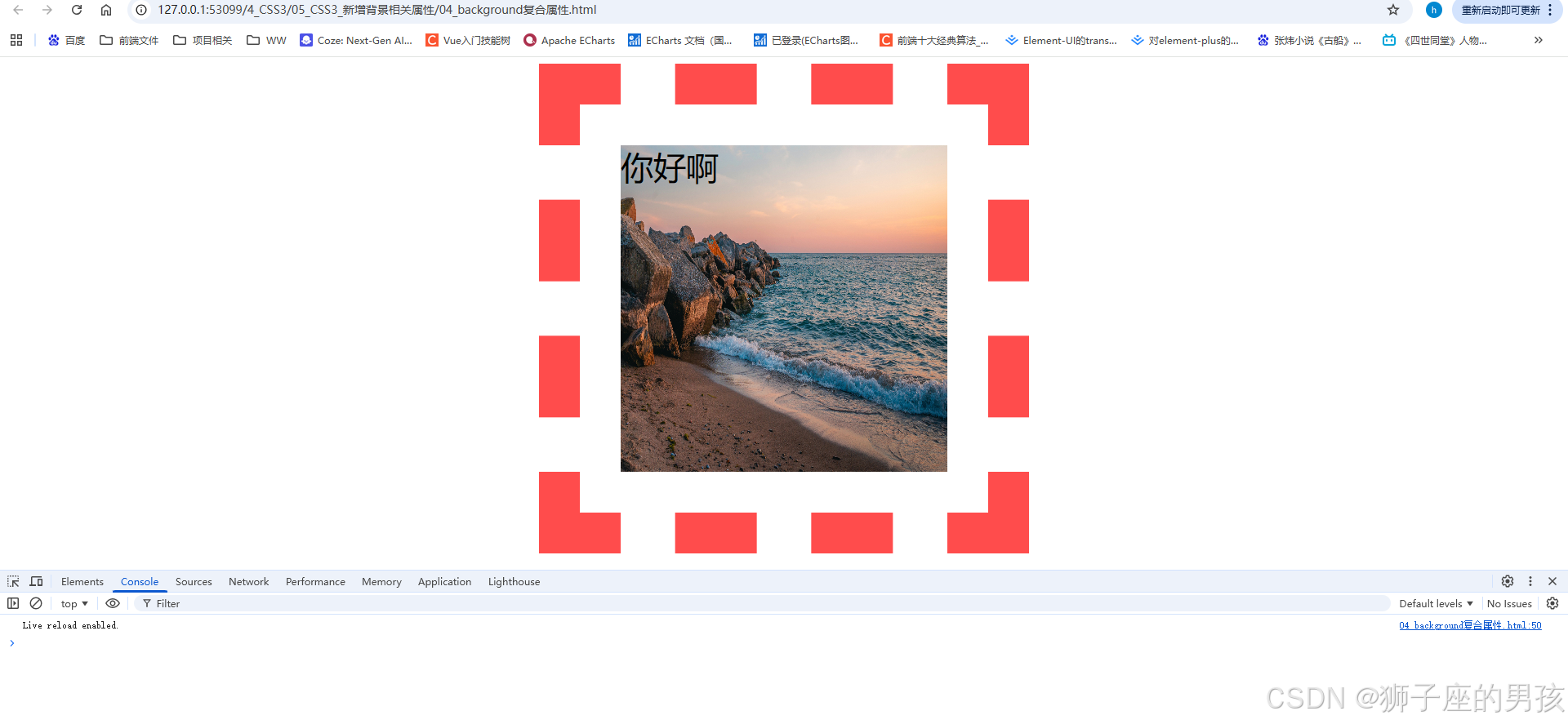
其七、background 复合属性代码:
// 图片信息为:

<!DOCTYPE html>
<html lang="zh-CN">
<head>
    <meta charset="UTF-8">
    <title>04_background复合属性</title>
    <style>
        .box1 {
            width: 400px;
            height: 400px;
            margin: 0 auto;
            font-size: 40px;
            padding: 50px;
            border: 50px dashed rgba(255, 0, 0, 0.7);

            /* background: 背景颜色 背景url 是否重复 位置 / 大小 原点 裁剪方式; */
            background:skyblue url('../images/bg03.jpg') no-repeat 10px 10px / 500px 500px border-box content-box;
        }
    </style>
</head>
<body>
    <div class="box1">你好啊</div>
</body>
</html>
其八、结果为:
// 一进入页面后的页面:
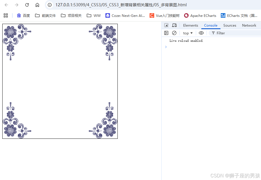
其九、多背景图代码:
// 图片信息为:


<!DOCTYPE html>
<html lang="zh-CN">
<head>
    <meta charset="UTF-8">
    <title>05_多背景图</title>
    <style>
        div {
            width: 400px;
            height: 400px;
            border: 1px solid black;
            background: url('../images/bg-lt.png') no-repeat left top,
                        url('../images/bg-rt.png') no-repeat right top,
                        url('../images/bg-lb.png') no-repeat left bottom,
                        url('../images/bg-rb.png') no-repeat right bottom;
        }
    </style>
</head>
<body>
    <div></div>
</body>
</html>
其十、结果为:
// 一进入页面后的页面:
Ⅱ、css3的新增边框相关属性:
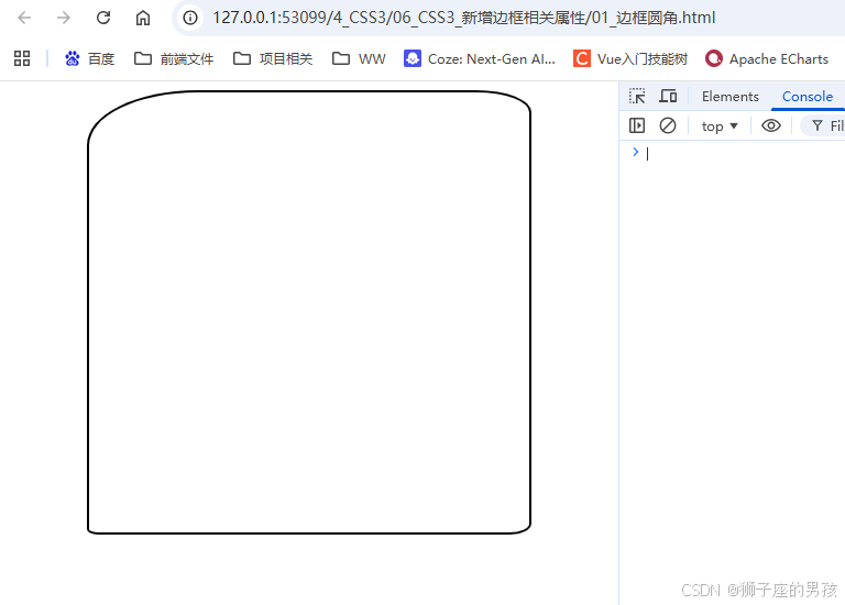
其一、边框圆角代码:border-radius
<!DOCTYPE html>
<html lang="zh-CN">
<head>
    <meta charset="UTF-8">
    <title>01_边框圆角</title>
    <style>
        div {
            width: 400px;
            height: 400px;
            border: 2px solid black;
            margin: 0 auto;

            /* border-radius: 200px; */
            /* border-radius: 50%; */

            /* border-top-left-radius: 100px; */
            /* border-top-right-radius: 50px; */
            /* border-bottom-right-radius: 20px; */
            /* border-bottom-left-radius: 10px; */

            /* border-top-left-radius: 100px 50px; */
            /* border-top-right-radius: 50px 20px; */
            /* border-bottom-right-radius: 20px 10px; */
            /* border-bottom-left-radius: 10px 5px; */

            border-radius:100px 50px 20px 10px / 50px 20px 10px 5px;

        }
    </style>
</head>
<body>
    <div></div>
</body>
</html>
其二、结果为:
// 一进入页面后的页面:
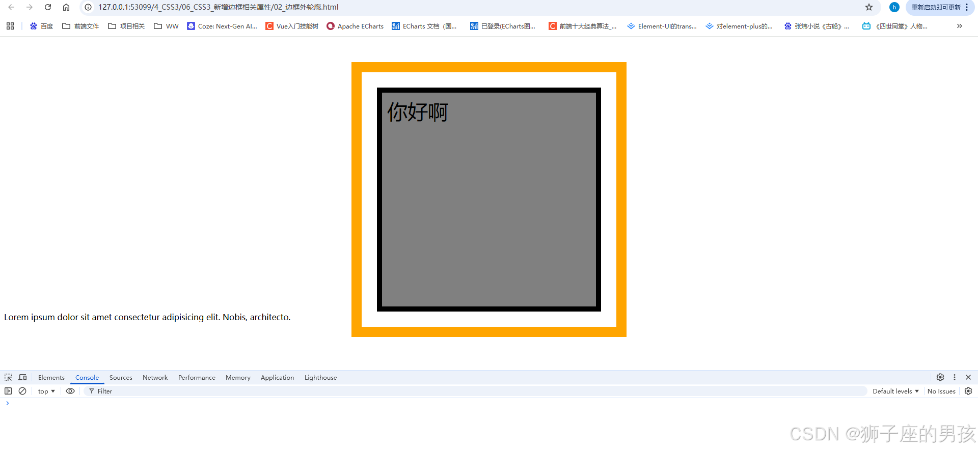
其三、边框外轮廓代码:outline、outline-offset
<!DOCTYPE html>
<html lang="zh-CN">
<head>
    <meta charset="UTF-8">
    <title>02_边框外轮廓</title>
    <style>
        .box1 {
            width: 400px;
            height: 400px;
            padding: 10px;
            border: 10px solid black;
            background-color: gray;
            font-size: 40px;
            margin: 0 auto;
            margin-top: 100px;

            /*
                outline: outline-width outline-style outline-color|initial|inherit;
                outline-color 表示:规定边框的颜色
                outline-style 表示:规定边框的样式
                outline-width 表示:规定边框的宽度
                inherit 表示:规定应该从父元素继承 outline 属性的设置

                outline-offset: length|inherit;
                length 表示:轮廓与边框边缘的距离
                inherit 表示:规定应从父元素继承 outline-offset 属性的值
            */

            /* outline-width: 20px; */
            /* outline-color: orange; */
            /* outline-style: solid; */
            outline-offset: 30px;

            outline:20px solid orange;

        }
    </style>
</head>
<body>
    <div class="box1">你好啊</div>
    <div>Lorem ipsum dolor sit amet consectetur adipisicing elit. Nobis, architecto.</div>
</body>
</html>
其四、结果为:
// 一进入页面后的页面:
Ⅲ、小结:
其一、哪里有不对或不合适的地方,还请大佬们多多指点和交流!
其二、若有转发或引用本文章内容,请注明本博客地址(直接点击下面 url 跳转) https://blog.csdn.net/weixin_43405300,创作不易,且行且珍惜!
其三、有兴趣的话,可以多多关注这个专栏(Vue(Vue2+Vue3)面试必备专栏)(直接点击下面 url 跳转):https://blog.csdn.net/weixin_43405300/category_11525646.html?spm=1001.2014.3001.5482
其四、再有兴趣的话,也可以多多关注这个专栏(Java)(直接点击下面 url 跳转):https://blog.csdn.net/weixin_43405300/category_12654744.html?spm=1001.2014.3001.5482

有“AI”的1024 = 2048,欢迎大家加入2048 AI社区
更多推荐


 42
42 0
0- 0


 已为社区贡献4条内容

所有评论(0)