学习:Tailwind CSS v4 (3)
* 在tailwind.config.js中自定义间距 */theme: {extend: {spacing: {theme: {extend: {// 自定义宽度width: {},// 自定义高度height: {},// 自定义最大宽度您还可以在theme: {extend: {// 自定义字体大小},// 自定义行高},// 自定义字体族},},},Tailwind CSS 的排版系统非常
·
Tailwind CSS 间距
1. 间距基础概念
Tailwind使用基于 rem 单位的间距比例系统,默认以 0.25rem (4px)为基准单位:
| 类名 | 实际值 | 像素值 |
|---|---|---|
p-0 |
0rem |
0px |
p-1 |
0.25rem |
4px |
p-2 |
0.5rem |
8px |
p-4 |
1rem |
16px |
p-8 |
2rem |
32px |
p-16 |
4rem |
64px |
2. 内边距 (Padding)
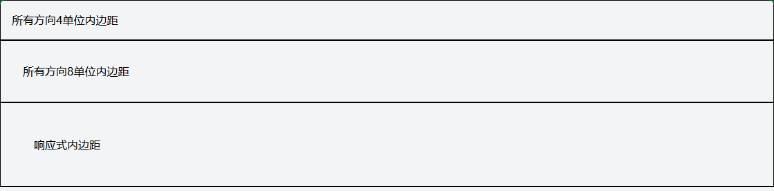
2.1 统一内边距
<!-- 四个方向相同内边距 -->
<div class="p-4">所有方向4单位内边距</div>
<div class="p-8">所有方向8单位内边距</div>

<!-- 响应式内边距 -->
<div class="p-4 md:p-8 lg:p-12">响应式内边距</div>
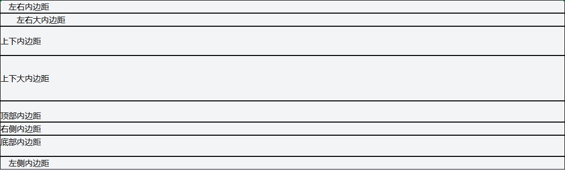
2.2 方向性内边距
<!-- 水平方向 -->
<div class="px-4">左右内边距</div>
<div class="px-8">左右大内边距</div>

<!-- 垂直方向 -->
<div class="py-4">上下内边距</div>
<div class="py-8">上下大内边距</div>

<!-- 单个方向 -->
<div class="pt-4">顶部内边距</div>
<div class="pr-4">右侧内边距</div>
<div class="pb-4">底部内边距</div>
<div class="pl-4">左侧内边距</div>
2.3 复杂内边距组合
<!-- 卡片内边距示例 -->
<div class="pt-6 pb-8 px-6">
<!-- 顶部6单位,底部8单位,左右6单位 -->
</div>
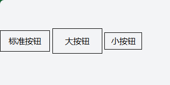
<!-- 按钮内边距 -->
<button class="px-4 py-2">标准按钮</button>
<button class="px-6 py-3">大按钮</button>
<button class="px-3 py-1">小按钮</button>
3. 外边距 (Margin)
3.1 统一外边距
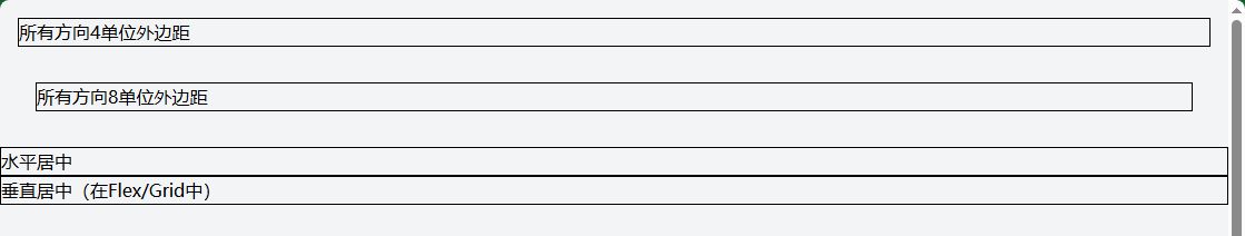
<!-- 四个方向相同外边距 -->
<div class="m-4">所有方向4单位外边距</div>
<div class="m-8">所有方向8单位外边距</div>

<!-- 自动外边距(居中) -->
<div class="mx-auto">水平居中</div>
<div class="my-auto">垂直居中(在Flex/Grid中)</div>
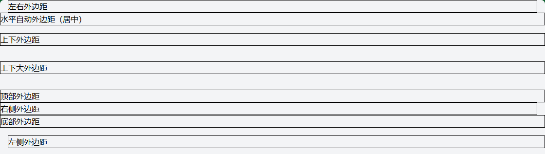
3.2 方向性外边距
<!-- 水平方向 -->
<div class="mx-4">左右外边距</div>
<div class="mx-auto">水平自动外边距(居中)</div>

<!-- 垂直方向 -->
<div class="my-4">上下外边距</div>
<div class="my-8">上下大外边距</div>

<!-- 单个方向 -->
<div class="mt-4">顶部外边距</div>
<div class="mr-4">右侧外边距</div>
<div class="mb-4">底部外边距</div>
<div class="ml-4">左侧外边距</div>
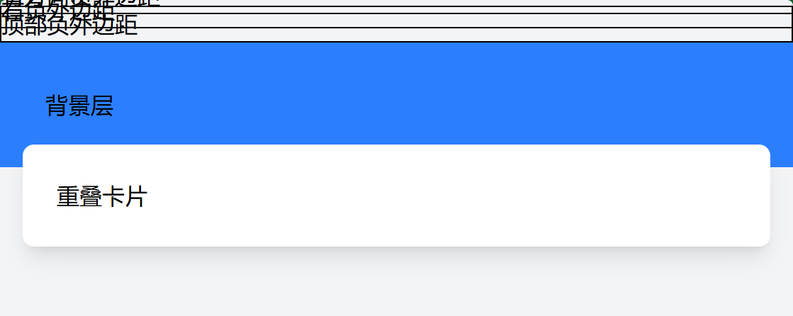
3.3 负外边距
<!-- 负外边距(用于重叠效果) -->
<div class="-m-4">所有方向负外边距</div>
<div class="-mx-4">左右负外边距</div>
<div class="-mt-4">顶部负外边距</div>

<!-- 实际应用:卡片重叠 -->
<div class="relative">
  <div class="bg-blue-500 p-8">背景层</div>
  <div class="bg-white p-6 -mt-4 mx-4 rounded-lg shadow-lg">重叠卡片</div>
</div>
4. 间距实用工具类
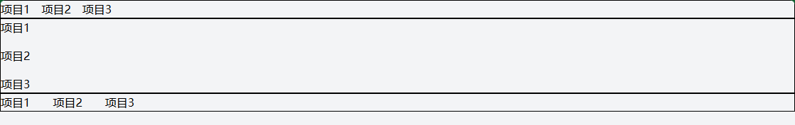
4.1 Space Between 类
用于在Flex/Grid子元素之间添加间距。
<!-- Flex布局中的子元素间距 -->
<div class="flex space-x-4">
  <div>项目1</div>
  <div>项目2</div>
  <div>项目3</div>
</div>

<div class="flex space-y-4 flex-col">
  <div>项目1</div>
  <div>项目2</div>
  <div>项目3</div>
</div>

<!-- 响应式间距 -->
<div class="flex space-x-2 md:space-x-4 lg:space-x-8">
  <div>项目1</div>
  <div>项目2</div>
  <div>项目3</div>
</div>
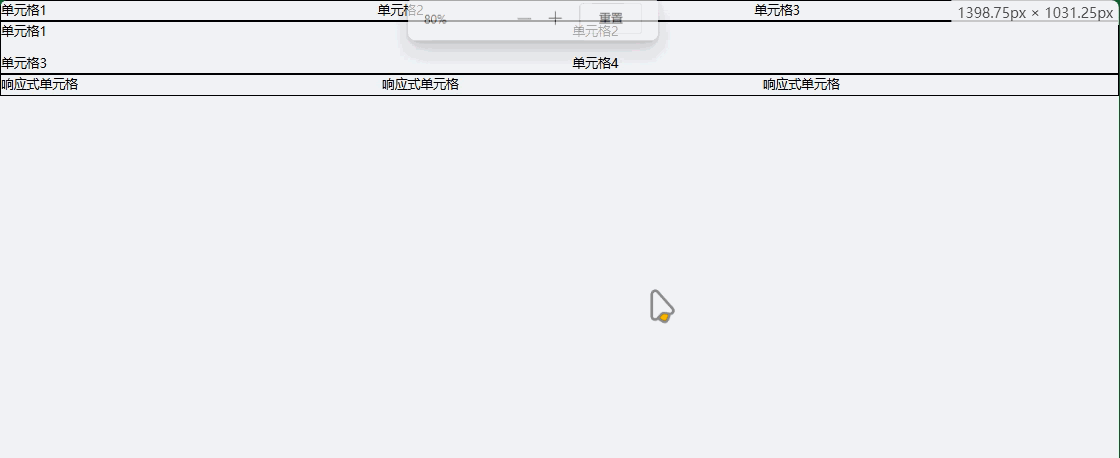
4.2 Gap 类 (Grid专用)
用于Grid布局中的单元格间距。
<!-- Grid间距 -->
<div class="grid grid-cols-3 gap-4">
  <div>单元格1</div>
  <div>单元格2</div>
  <div>单元格3</div>
</div>

<!-- 行列分别控制间距 -->
<div class="grid grid-cols-2 gap-x-8 gap-y-4">
  <div>单元格1</div>
  <div>单元格2</div>
  <div>单元格3</div>
  <div>单元格4</div>
</div>

<!-- 响应式Grid间距 -->
<div class="grid grid-cols-1 md:grid-cols-2 lg:grid-cols-3 gap-4 md:gap-6 lg:gap-8">
  <div>响应式单元格</div>
  <div>响应式单元格</div>
  <div>响应式单元格</div>
</div>
5. 实际应用示例
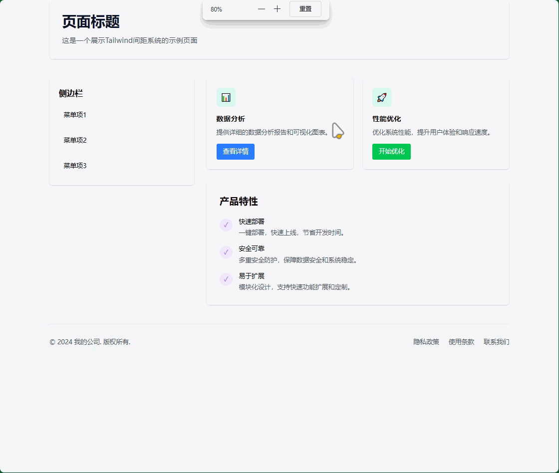
5.1 完整的页面布局间距
<!DOCTYPE html>
<html lang="zh-CN">
<head>
<meta charset="UTF-8">
<meta name="viewport" content="width=device-width, initial-scale=1.0">
<title>间距系统示例</title>
</head>
<body class="bg-gray-100 min-h-screen p-4 md:p-8">
<!-- 页面容器 -->
<div class="max-w-6xl mx-auto">
<!-- 页头区域 -->
<header class="mb-8 md:mb-12">
<div class="bg-white rounded-lg shadow-sm p-6 md:p-8">
<h1 class="text-3xl md:text-4xl font-bold text-gray-900 mb-4">页面标题</h1>
<p class="text-gray-600 text-lg">这是一个展示Tailwind间距系统的示例页面</p>
</div>
</header>
<!-- 主要内容区域 -->
<main class="grid grid-cols-1 lg:grid-cols-3 gap-6 md:gap-8">
<!-- 左侧边栏 -->
<aside class="lg:col-span-1">
<div class="bg-white rounded-lg shadow-sm p-6 space-y-4">
<h2 class="text-xl font-semibold mb-4">侧边栏</h2>
<div class="p-3 bg-gray-50 rounded hover:bg-gray-100 cursor-pointer">菜单项1</div>
<div class="p-3 bg-gray-50 rounded hover:bg-gray-100 cursor-pointer">菜单项2</div>
<div class="p-3 bg-gray-50 rounded hover:bg-gray-100 cursor-pointer">菜单项3</div>
</div>
</aside>
<!-- 主内容 -->
<section class="lg:col-span-2">
<!-- 卡片网格 -->
<div class="grid grid-cols-1 md:grid-cols-2 gap-6 mb-8">
<!-- 卡片1 -->
<div class="bg-white rounded-lg shadow-sm p-6">
<div class="w-12 h-12 bg-blue-100 rounded-lg flex items-center justify-center mb-4">
<span class="text-blue-500 text-xl">📊</span>
</div>
<h3 class="text-lg font-semibold mb-2">数据分析</h3>
<p class="text-gray-600 mb-4">提供详细的数据分析报告和可视化图表。</p>
<button class="px-4 py-2 bg-blue-500 text-white rounded hover:bg-blue-600 transition-colors">
查看详情
</button>
</div>
<!-- 卡片2 -->
<div class="bg-white rounded-lg shadow-sm p-6">
<div class="w-12 h-12 bg-green-100 rounded-lg flex items-center justify-center mb-4">
<span class="text-green-500 text-xl">🚀</span>
</div>
<h3 class="text-lg font-semibold mb-2">性能优化</h3>
<p class="text-gray-600 mb-4">优化系统性能,提升用户体验和响应速度。</p>
<button class="px-4 py-2 bg-green-500 text-white rounded hover:bg-green-600 transition-colors">
开始优化
</button>
</div>
</div>
<!-- 特性列表 -->
<div class="bg-white rounded-lg shadow-sm p-6 md:p-8">
<h2 class="text-2xl font-semibold mb-6">产品特性</h2>
<div class="space-y-4">
<div class="flex items-start space-x-4">
<div class="w-8 h-8 bg-purple-100 rounded-full flex items-center justify-center flex-shrink-0 mt-1">
<span class="text-purple-500">✓</span>
</div>
<div>
<h4 class="font-medium mb-1">快速部署</h4>
<p class="text-gray-600">一键部署,快速上线,节省开发时间。</p>
</div>
</div>
<div class="flex items-start space-x-4">
<div class="w-8 h-8 bg-purple-100 rounded-full flex items-center justify-center flex-shrink-0 mt-1">
<span class="text-purple-500">✓</span>
</div>
<div>
<h4 class="font-medium mb-1">安全可靠</h4>
<p class="text-gray-600">多重安全防护,保障数据安全和系统稳定。</p>
</div>
</div>
<div class="flex items-start space-x-4">
<div class="w-8 h-8 bg-purple-100 rounded-full flex items-center justify-center flex-shrink-0 mt-1">
<span class="text-purple-500">✓</span>
</div>
<div>
<h4 class="font-medium mb-1">易于扩展</h4>
<p class="text-gray-600">模块化设计,支持快速功能扩展和定制。</p>
</div>
</div>
</div>
</div>
</section>
</main>
<!-- 页脚 -->
<footer class="mt-8 md:mt-12 pt-8 border-t border-gray-200">
<div class="flex flex-col md:flex-row justify-between items-center space-y-4 md:space-y-0">
<div class="text-gray-600">
<p>© 2024 我的公司. 版权所有.</p>
</div>
<div class="flex space-x-6">
<a href="#" class="text-gray-600 hover:text-blue-500 transition-colors">隐私政策</a>
<a href="#" class="text-gray-600 hover:text-blue-500 transition-colors">使用条款</a>
<a href="#" class="text-gray-600 hover:text-blue-500 transition-colors">联系我们</a>
</div>
</div>
</footer>
</div>
</body>
</html>
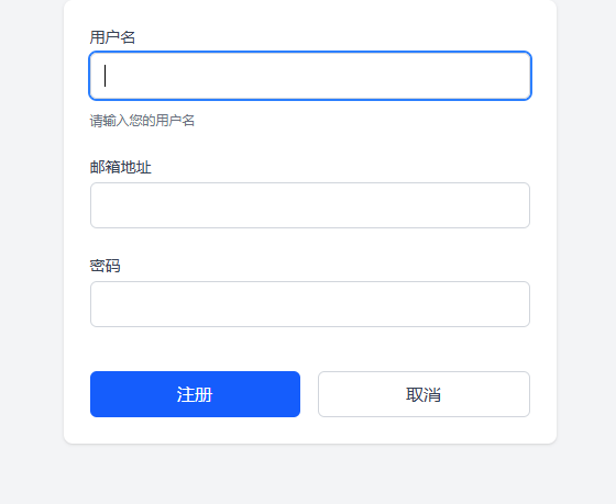
5.2 表单间距示例
<!-- 表单间距最佳实践 -->
<form class="max-w-md mx-auto bg-white p-6 rounded-lg shadow-sm">
  <div class="space-y-6">
    <!-- 表单组 -->
    <div class="space-y-2">
      <label class="block text-sm font-medium text-gray-700 mb-1">用户名</label>
      <input type="text" class="w-full px-3 py-2 border border-gray-300 rounded-md focus:outline-none focus:ring-2 focus:ring-blue-500">
      <p class="text-xs text-gray-500 mt-1">请输入您的用户名</p>
    </div>

    <div class="space-y-2">
      <label class="block text-sm font-medium text-gray-700 mb-1">邮箱地址</label>
      <input type="email" class="w-full px-3 py-2 border border-gray-300 rounded-md focus:outline-none focus:ring-2 focus:ring-blue-500">
    </div>

    <div class="space-y-2">
      <label class="block text-sm font-medium text-gray-700 mb-1">密码</label>
      <input type="password" class="w-full px-3 py-2 border border-gray-300 rounded-md focus:outline-none focus:ring-2 focus:ring-blue-500">
    </div>

    <!-- 按钮组 -->
    <div class="flex space-x-4 pt-4">
      <button type="submit" class="flex-1 px-4 py-2 bg-blue-500 text-white rounded-md hover:bg-blue-600 transition-colors">
        注册
      </button>
      <button type="button" class="flex-1 px-4 py-2 border border-gray-300 text-gray-700 rounded-md hover:bg-gray-50 transition-colors">
        取消
      </button>
    </div>
  </div>
</form>
6. 高级间距技巧
6.1 自定义间距值
/* 在tailwind.config.js中自定义间距 */
module.exports = {
  theme: {
    extend: {
      spacing: {
        '18': '4.5rem',    // 72px
        '72': '18rem',     // 288px
        '84': '21rem',     // 336px
        '96': '24rem',     // 384px
        '128': '32rem',    // 512px
      }
    }
  }
}
6.2 使用CSS变量
<style>
  :root {
    --spacing-unit: 1rem;
    --spacing-sm: calc(var(--spacing-unit) * 0.5);
    --spacing-lg: calc(var(--spacing-unit) * 2);
  }

  .custom-spacing {
    padding: var(--spacing-unit);
    margin: var(--spacing-sm);
  }
</style>
6.3 响应式间距模式
<!-- 渐进式间距 -->
<div class="p-4 sm:p-6 md:p-8 lg:p-12">
  <!-- 随屏幕增大而增加内边距 -->
</div>

<!-- 条件性间距 -->
<div class="space-y-4 md:space-y-8">
  <!-- 桌面端增加垂直间距 -->
</div>
7. 间距最佳实践
- 一致性:在整个项目中保持一致的间距比例
- 层次感:使用不同的间距值创建视觉层次
- 响应式:为不同屏幕尺寸调整间距
- 可读性:确保文字内容有足够的呼吸空间
- 性能:避免过度使用负外边距和复杂间距组合
Tailwind CSS 尺寸控制
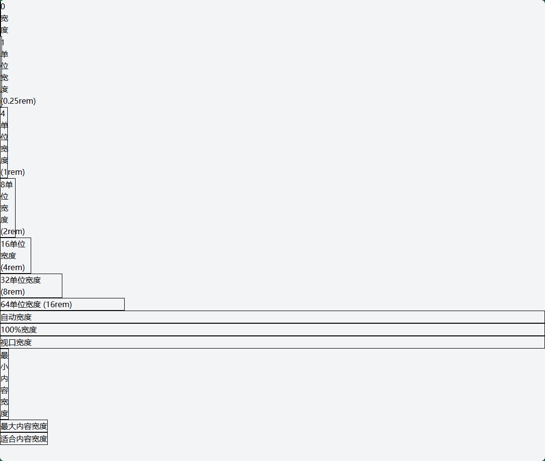
1. 宽度 (Width) 类
1.1 固定宽度
<!-- 基于间距系统的宽度 -->
<div class="w-0">0宽度</div>
<div class="w-1">1单位宽度 (0.25rem)</div>
<div class="w-4">4单位宽度 (1rem)</div>
<div class="w-8">8单位宽度 (2rem)</div>
<div class="w-16">16单位宽度 (4rem)</div>
<div class="w-32">32单位宽度 (8rem)</div>
<div class="w-64">64单位宽度 (16rem)</div>

<!-- 特殊宽度 -->
<div class="w-auto">自动宽度</div>
<div class="w-full">100%宽度</div>
<div class="w-screen">视口宽度</div>
<div class="w-min">最小内容宽度</div>
<div class="w-max">最大内容宽度</div>
<div class="w-fit">适合内容宽度</div>
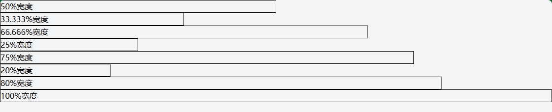
1.2 百分比宽度
<!-- 分数宽度 -->
<div class="w-1/2">50%宽度</div>
<div class="w-1/3">33.333%宽度</div>
<div class="w-2/3">66.666%宽度</div>
<div class="w-1/4">25%宽度</div>
<div class="w-3/4">75%宽度</div>
<div class="w-1/5">20%宽度</div>
<div class="w-4/5">80%宽度</div>
<div class="w-full">100%宽度</div>

<!-- 响应式百分比宽度 -->
<div class="w-full md:w-1/2 lg:w-1/3">
  <!-- 移动端全宽,平板半宽,桌面1/3宽 -->
</div>
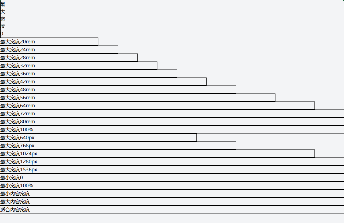
1.3 最大/最小宽度
<!-- 最大宽度 -->
<div class="max-w-0">最大宽度0</div>
<div class="max-w-xs">最大宽度20rem</div>
<div class="max-w-sm">最大宽度24rem</div>
<div class="max-w-md">最大宽度28rem</div>
<div class="max-w-lg">最大宽度32rem</div>
<div class="max-w-xl">最大宽度36rem</div>
<div class="max-w-2xl">最大宽度42rem</div>
<div class="max-w-3xl">最大宽度48rem</div>
<div class="max-w-4xl">最大宽度56rem</div>
<div class="max-w-5xl">最大宽度64rem</div>
<div class="max-w-6xl">最大宽度72rem</div>
<div class="max-w-7xl">最大宽度80rem</div>
<div class="max-w-full">最大宽度100%</div>
<div class="max-w-screen-sm">最大宽度640px</div>
<div class="max-w-screen-md">最大宽度768px</div>
<div class="max-w-screen-lg">最大宽度1024px</div>
<div class="max-w-screen-xl">最大宽度1280px</div>
<div class="max-w-screen-2xl">最大宽度1536px</div>

<!-- 最小宽度 -->
<div class="min-w-0">最小宽度0</div>
<div class="min-w-full">最小宽度100%</div>
<div class="min-w-min">最小内容宽度</div>
<div class="min-w-max">最大内容宽度</div>
<div class="min-w-fit">适合内容宽度</div>
2. 高度 (Height) 类
2.1 固定高度
<!-- 基于间距系统的高度 -->
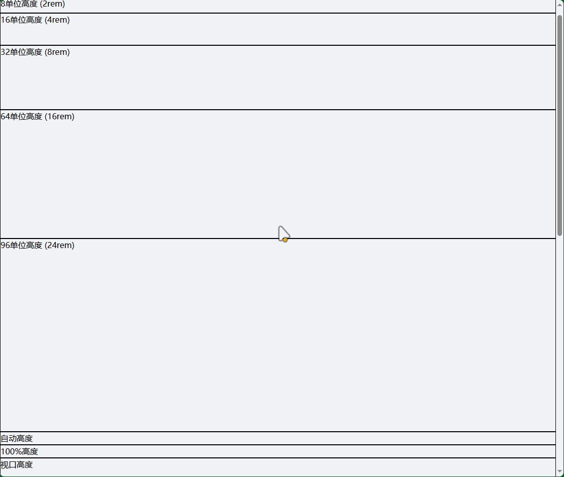
<div class="h-0">0高度</div>
<div class="h-1">1单位高度 (0.25rem)</div>
<div class="h-4">4单位高度 (1rem)</div>
<div class="h-8">8单位高度 (2rem)</div>
<div class="h-16">16单位高度 (4rem)</div>
<div class="h-32">32单位高度 (8rem)</div>
<div class="h-64">64单位高度 (16rem)</div>
<div class="h-96">96单位高度 (24rem)</div>
<!-- 特殊高度 -->
<div class="h-auto">自动高度</div>
<div class="h-full">100%高度</div>
<div class="h-screen">视口高度</div>
<div class="h-min">最小内容高度</div>
<div class="h-max">最大内容高度</div>
<div class="h-fit">适合内容高度</div>
2.2 百分比高度
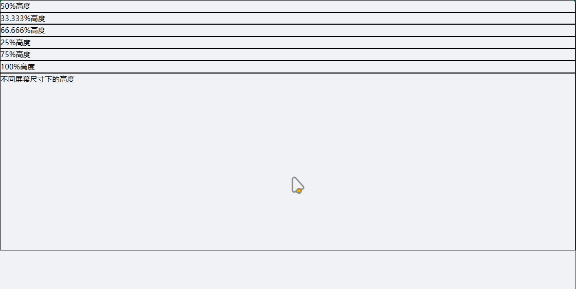
<!-- 需要父容器有明确高度 -->
<div class="h-1/2">50%高度</div>
<div class="h-1/3">33.333%高度</div>
<div class="h-2/3">66.666%高度</div>
<div class="h-1/4">25%高度</div>
<div class="h-3/4">75%高度</div>
<div class="h-full">100%高度</div>

<!-- 响应式高度 -->
<div class="h-48 md:h-64 lg:h-96">
  <!-- 不同屏幕尺寸下的高度 -->
</div>
2.3 最大/最小高度
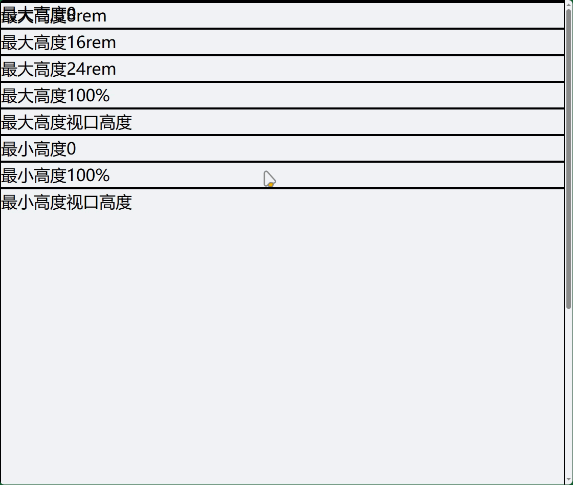
<!-- 最大高度 -->
<div class="max-h-0">最大高度0</div>
<div class="max-h-32">最大高度8rem</div>
<div class="max-h-64">最大高度16rem</div>
<div class="max-h-96">最大高度24rem</div>
<div class="max-h-full">最大高度100%</div>
<div class="max-h-screen">最大高度视口高度</div>

<!-- 最小高度 -->
<div class="min-h-0">最小高度0</div>
<div class="min-h-full">最小高度100%</div>
<div class="min-h-screen">最小高度视口高度</div>
<div class="min-h-min">最小内容高度</div>
<div class="min-h-max">最大内容高度</div>
<div class="min-h-fit">适合内容高度</div>
3. 尺寸实用示例
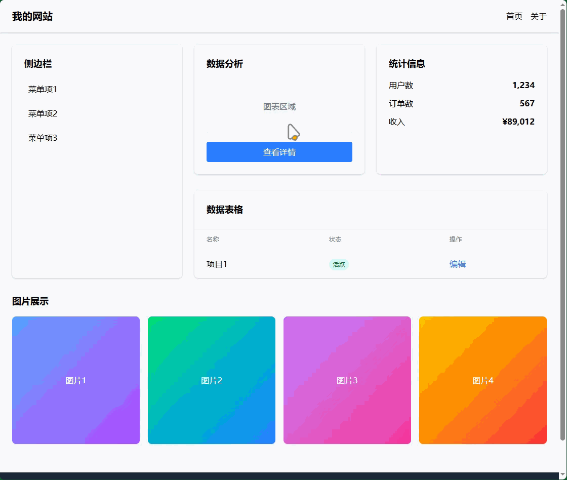
3.1 完整的页面布局
<!DOCTYPE html>
<html lang="zh-CN" class="h-full">
<head>
<meta charset="UTF-8">
<meta name="viewport" content="width=device-width, initial-scale=1.0">
<title>尺寸控制示例</title>
</head>
<body class="h-full bg-gray-100">
<!-- 全屏容器 -->
<div class="min-h-screen flex flex-col">
<!-- 固定高度导航栏 -->
<nav class="h-16 bg-white shadow-sm flex items-center px-6">
<div class="w-full max-w-6xl mx-auto flex justify-between items-center">
<div class="text-xl font-bold">我的网站</div>
<div class="flex space-x-4">
<a href="#" class="hover:text-blue-500">首页</a>
<a href="#" class="hover:text-blue-500">关于</a>
</div>
</div>
</nav>
<!-- 主要内容区域 - 自适应高度 -->
<main class="flex-1 p-6">
<div class="max-w-6xl mx-auto">
<!-- 响应式网格布局 -->
<div class="grid grid-cols-1 md:grid-cols-3 gap-6 mb-8">
<!-- 侧边栏 - 固定宽度 -->
<aside class="md:col-span-1">
<div class="bg-white rounded-lg shadow-sm p-6 h-full min-h-[200px]">
<h3 class="text-lg font-semibold mb-4">侧边栏</h3>
<div class="space-y-2">
<div class="p-2 hover:bg-gray-50 rounded cursor-pointer">菜单项1</div>
<div class="p-2 hover:bg-gray-50 rounded cursor-pointer">菜单项2</div>
<div class="p-2 hover:bg-gray-50 rounded cursor-pointer">菜单项3</div>
</div>
</div>
</aside>
<!-- 主内容区域 - 自适应宽度 -->
<section class="md:col-span-2">
<!-- 卡片组 -->
<div class="grid grid-cols-1 lg:grid-cols-2 gap-6 mb-8">
<!-- 固定高度卡片 -->
<div class="bg-white rounded-lg shadow-sm p-6 h-64 flex flex-col">
<h3 class="text-lg font-semibold mb-4">数据分析</h3>
<div class="flex-1 bg-gray-100 rounded flex items-center justify-center">
<span class="text-gray-500">图表区域</span>
</div>
<button class="mt-4 w-full py-2 bg-blue-500 text-white rounded hover:bg-blue-600">
查看详情
</button>
</div>
<!-- 自适应高度卡片 -->
<div class="bg-white rounded-lg shadow-sm p-6 min-h-[200px]">
<h3 class="text-lg font-semibold mb-4">统计信息</h3>
<div class="space-y-3">
<div class="flex justify-between">
<span>用户数</span>
<span class="font-semibold">1,234</span>
</div>
<div class="flex justify-between">
<span>订单数</span>
<span class="font-semibold">567</span>
</div>
<div class="flex justify-between">
<span>收入</span>
<span class="font-semibold">¥89,012</span>
</div>
</div>
</div>
</div>
<!-- 表格区域 -->
<div class="bg-white rounded-lg shadow-sm overflow-hidden">
<div class="p-6 border-b border-gray-200">
<h3 class="text-lg font-semibold">数据表格</h3>
</div>
<div class="max-h-96 overflow-y-auto">
<table class="w-full">
<thead class="bg-gray-50">
<tr>
<th class="px-6 py-3 text-left text-xs font-medium text-gray-500 uppercase tracking-wider">名称</th>
<th class="px-6 py-3 text-left text-xs font-medium text-gray-500 uppercase tracking-wider">状态</th>
<th class="px-6 py-3 text-left text-xs font-medium text-gray-500 uppercase tracking-wider">操作</th>
</tr>
</thead>
<tbody class="divide-y divide-gray-200">
<!-- 表格行 -->
<tr>
<td class="px-6 py-4 whitespace-nowrap">项目1</td>
<td class="px-6 py-4 whitespace-nowrap">
<span class="px-2 py-1 bg-green-100 text-green-800 rounded-full text-xs">活跃</span>
</td>
<td class="px-6 py-4 whitespace-nowrap">
<button class="text-blue-500 hover:text-blue-700">编辑</button>
</td>
</tr>
<!-- 更多行... -->
</tbody>
</table>
</div>
</div>
</section>
</div>
<!-- 图片展示区域 -->
<div class="mb-8">
<h3 class="text-lg font-semibold mb-4">图片展示</h3>
<div class="grid grid-cols-2 md:grid-cols-4 gap-4">
<!-- 正方形图片容器 -->
<div class="aspect-square bg-gray-200 rounded-lg overflow-hidden">
<div class="w-full h-full bg-gradient-to-br from-blue-400 to-purple-500 flex items-center justify-center text-white">
图片1
</div>
</div>
<div class="aspect-square bg-gray-200 rounded-lg overflow-hidden">
<div class="w-full h-full bg-gradient-to-br from-green-400 to-blue-500 flex items-center justify-center text-white">
图片2
</div>
</div>
<div class="aspect-square bg-gray-200 rounded-lg overflow-hidden">
<div class="w-full h-full bg-gradient-to-br from-purple-400 to-pink-500 flex items-center justify-center text-white">
图片3
</div>
</div>
<div class="aspect-square bg-gray-200 rounded-lg overflow-hidden">
<div class="w-full h-full bg-gradient-to-br from-yellow-400 to-red-500 flex items-center justify-center text-white">
图片4
</div>
</div>
</div>
</div>
</div>
</main>
<!-- 固定高度页脚 -->
<footer class="h-20 bg-gray-800 text-white flex items-center">
<div class="w-full max-w-6xl mx-auto px-6 text-center">
<p>© 2024 我的公司. 版权所有.</p>
</div>
</footer>
</div>
</body>
</html>
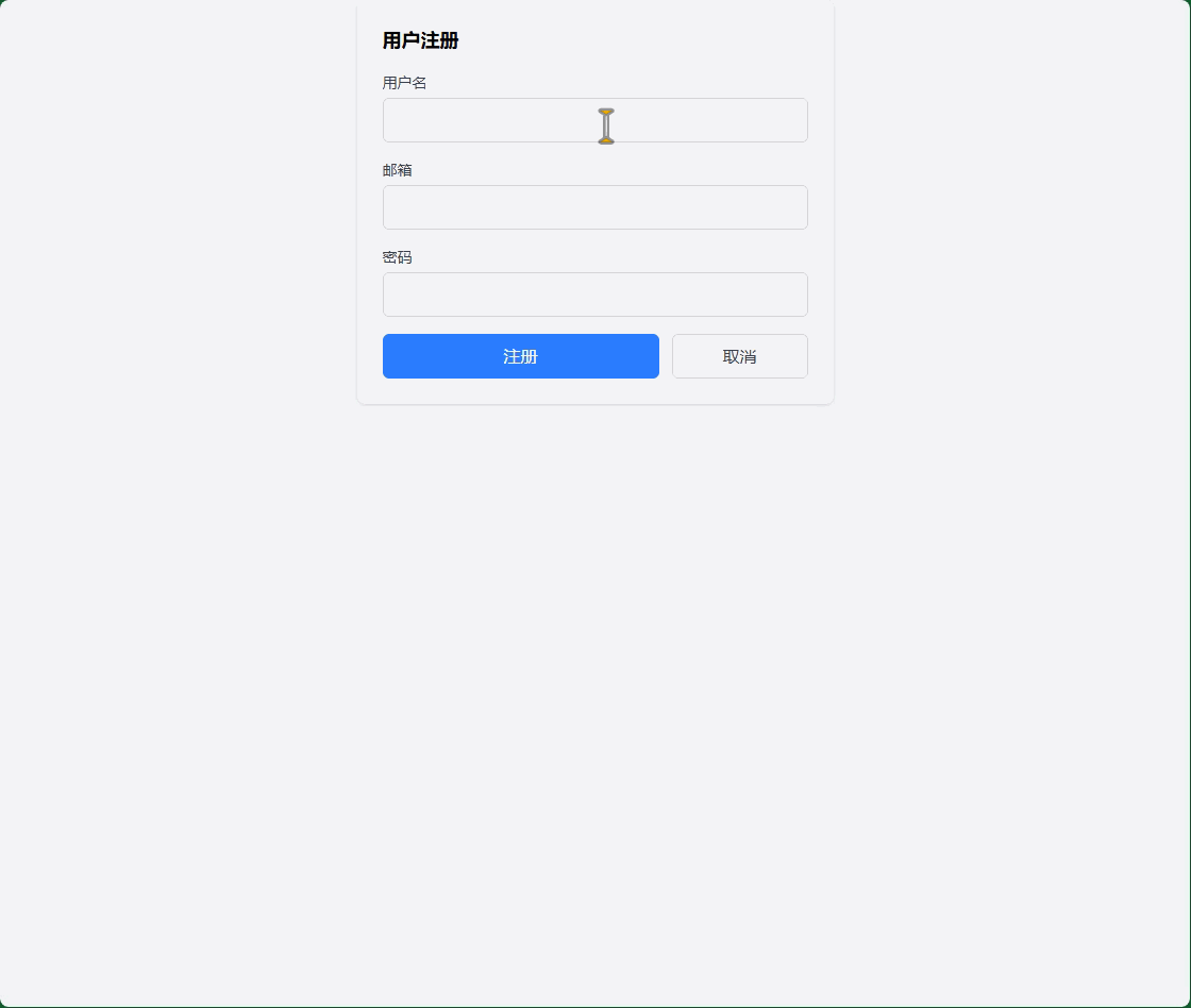
3.2 表单尺寸控制
<!-- 表单尺寸控制示例 -->
<div class="max-w-md mx-auto bg-white p-6 rounded-lg shadow-sm">
  <h3 class="text-lg font-semibold mb-4">用户注册</h3>

  <form class="space-y-4">
    <!-- 不同尺寸的表单控件 -->
    <div>
      <label class="block text-sm font-medium text-gray-700 mb-1">用户名</label>
      <input type="text" class="w-full px-3 py-2 border border-gray-300 rounded-md focus:outline-none focus:ring-2 focus:ring-blue-500">
    </div>

    <div>
      <label class="block text-sm font-medium text-gray-700 mb-1">邮箱</label>
      <input type="email" class="w-full px-3 py-2 border border-gray-300 rounded-md focus:outline-none focus:ring-2 focus:ring-blue-500">
    </div>

    <div>
      <label class="block text-sm font-medium text-gray-700 mb-1">密码</label>
      <input type="password" class="w-full px-3 py-2 border border-gray-300 rounded-md focus:outline-none focus:ring-2 focus:ring-blue-500">
    </div>

    <!-- 按钮组尺寸控制 -->
    <div class="flex space-x-3">
      <button type="submit" class="flex-1 py-2 bg-blue-500 text-white rounded-md hover:bg-blue-600 transition-colors">
        注册
      </button>
      <button type="button" class="w-32 py-2 border border-gray-300 text-gray-700 rounded-md hover:bg-gray-50 transition-colors">
        取消
      </button>
    </div>
  </form>
</div>
4. 高级尺寸技巧
4.1 自定义尺寸值
// tailwind.config.js
module.exports = {
  theme: {
    extend: {
      // 自定义宽度
      width: {
        '18': '4.5rem',     // 72px
        '72': '18rem',      // 288px
        '84': '21rem',      // 336px
        '96': '24rem',      // 384px
        '128': '32rem',     // 512px
      },
      // 自定义高度
      height: {
        '18': '4.5rem',
        '72': '18rem',
        '84': '21rem',
        '96': '24rem',
        '128': '32rem',
      },
      // 自定义最大宽度
      maxWidth: {
        '8xl': '88rem',
        '9xl': '96rem',
      }
    }
  }
}
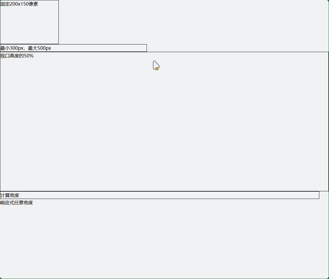
4.2 任意值尺寸
<!-- 使用任意值语法 -->
<div class="w-[200px] h-[150px]">固定200x150像素</div>
<div class="min-w-[300px] max-w-[500px]">最小300px,最大500px</div>
<div class="h-[50vh]">视口高度的50%</div>
<div class="w-[calc(100%-2rem)]">计算宽度</div>

<!-- 响应式任意值 -->
<div class="w-full md:w-[400px] lg:w-[600px]">
  响应式任意宽度
</div>
4.3 尺寸实用模式
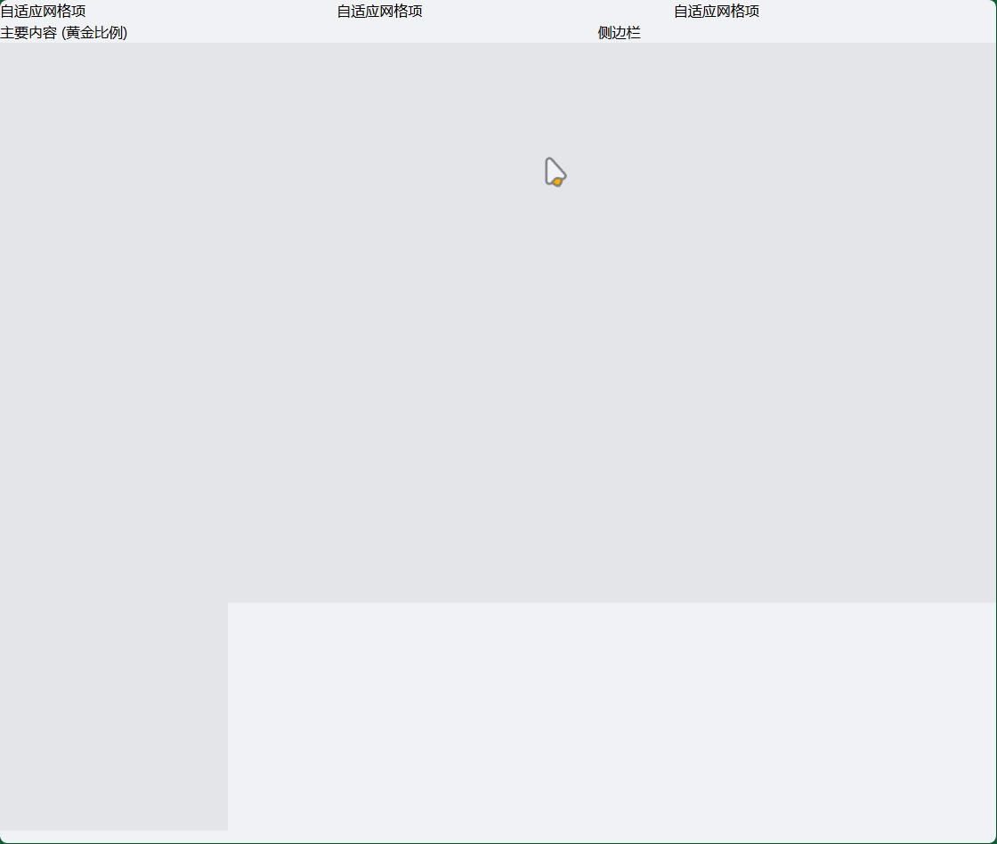
<!-- 等宽网格 -->
<div class="grid grid-cols-[repeat(auto-fit,minmax(250px,1fr))] gap-4">
  <div>自适应网格项</div>
  <div>自适应网格项</div>
  <div>自适应网格项</div>
</div>

<!-- 黄金比例布局 -->
<div class="flex">
  <div class="w-3/5">主要内容 (黄金比例)</div>
  <div class="w-2/5">侧边栏</div>
</div>

<!-- 固定比例容器 -->
<div class="aspect-video w-full bg-gray-200">
  <!-- 16:9 比例容器 -->
</div>

<div class="aspect-square w-64 bg-gray-200">
  <!-- 1:1 正方形容器 -->
</div>
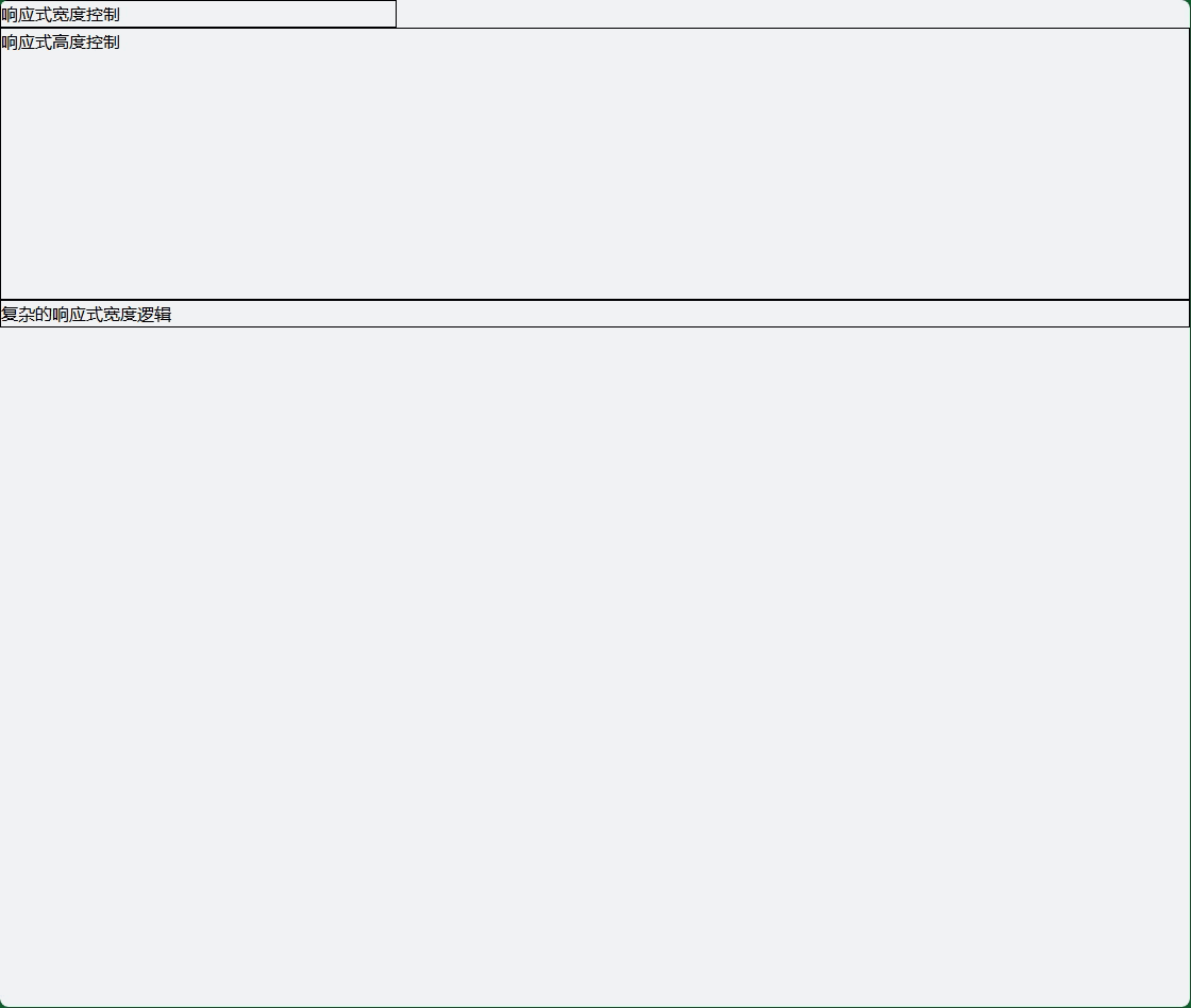
5. 响应式尺寸控制
5.1 断点尺寸
<!-- 响应式宽度 -->
<div class="w-full sm:w-3/4 md:w-1/2 lg:w-1/3 xl:w-1/4">
  响应式宽度控制
</div>

<!-- 响应式高度 -->
<div class="h-32 md:h-48 lg:h-64 xl:h-96">
  响应式高度控制
</div>

<!-- 条件性尺寸 -->
<div class="w-auto md:w-full lg:w-auto">
  复杂的响应式宽度逻辑
</div>
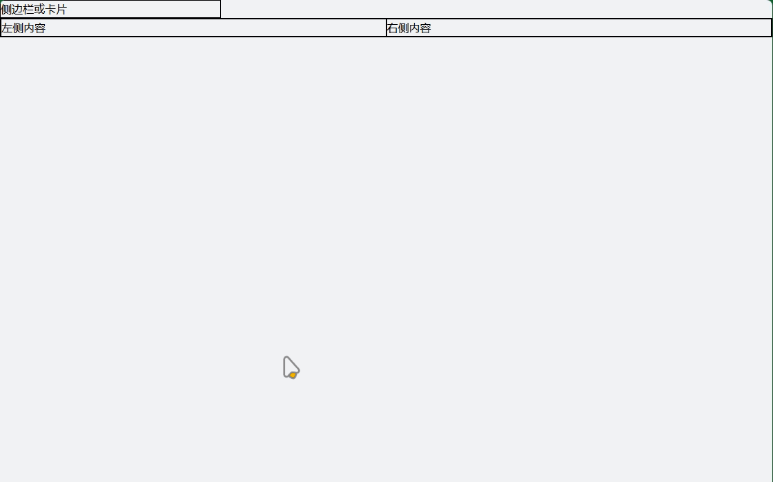
5.2 移动优先尺寸策略
<!-- 移动端全宽,桌面端固定宽度 -->
<div class="w-full lg:w-80">
  侧边栏或卡片
</div>

<!-- 移动端堆叠,桌面端并排 -->
<div class="flex flex-col md:flex-row">
  <div class="w-full md:w-1/2">左侧内容</div>
  <div class="w-full md:w-1/2">右侧内容</div>
</div>
6. 尺寸最佳实践
- 移动优先:从小尺寸开始设计,逐步增强
- 一致性:在整个项目中保持一致的尺寸比例
- 可访问性:确保尺寸适合不同设备和用户需求
- 性能:避免过度使用复杂的尺寸计算
- 可维护性:使用有意义的尺寸类名组合
Tailwind CSS 表格
1. 基础表格样式
1.1 最简单的表格
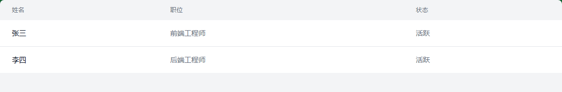
<!-- 基础表格 -->
<table class="min-w-full">
  <thead>
    <tr>
      <th class="px-6 py-3 text-left text-xs font-medium text-gray-500 uppercase tracking-wider">姓名</th>
      <th class="px-6 py-3 text-left text-xs font-medium text-gray-500 uppercase tracking-wider">职位</th>
      <th class="px-6 py-3 text-left text-xs font-medium text-gray-500 uppercase tracking-wider">状态</th>
    </tr>
  </thead>
  <tbody class="bg-white divide-y divide-gray-200">
    <tr>
      <td class="px-6 py-4 whitespace-nowrap text-sm font-medium text-gray-900">张三</td>
      <td class="px-6 py-4 whitespace-nowrap text-sm text-gray-500">前端工程师</td>
      <td class="px-6 py-4 whitespace-nowrap text-sm text-gray-500">活跃</td>
    </tr>
    <tr>
      <td class="px-6 py-4 whitespace-nowrap text-sm font-medium text-gray-900">李四</td>
      <td class="px-6 py-4 whitespace-nowrap text-sm text-gray-500">后端工程师</td>
      <td class="px-6 py-4 whitespace-nowrap text-sm text-gray-500">活跃</td>
    </tr>
  </tbody>
</table>
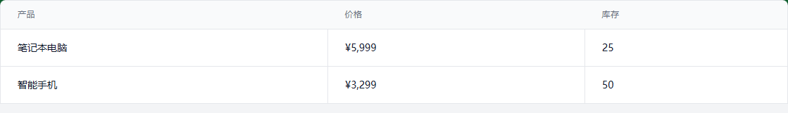
1.2 带边框的表格
<table class="min-w-full border border-gray-200">
  <thead class="bg-gray-50">
    <tr>
      <th class="px-6 py-3 text-left text-xs font-medium text-gray-500 uppercase tracking-wider border-b border-gray-200">产品</th>
      <th class="px-6 py-3 text-left text-xs font-medium text-gray-500 uppercase tracking-wider border-b border-gray-200">价格</th>
      <th class="px-6 py-3 text-left text-xs font-medium text-gray-500 uppercase tracking-wider border-b border-gray-200">库存</th>
    </tr>
  </thead>
  <tbody class="bg-white divide-y divide-gray-200">
    <tr>
      <td class="px-6 py-4 whitespace-nowrap text-sm text-gray-900 border-r border-gray-200">笔记本电脑</td>
      <td class="px-6 py-4 whitespace-nowrap text-sm text-gray-900 border-r border-gray-200">¥5,999</td>
      <td class="px-6 py-4 whitespace-nowrap text-sm text-gray-900">25</td>
    </tr>
    <tr>
      <td class="px-6 py-4 whitespace-nowrap text-sm text-gray-900 border-r border-gray-200">智能手机</td>
      <td class="px-6 py-4 whitespace-nowrap text-sm text-gray-900 border-r border-gray-200">¥3,299</td>
      <td class="px-6 py-4 whitespace-nowrap text-sm text-gray-900">50</td>
    </tr>
  </tbody>
</table>
2. 高级表格功能
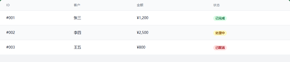
2.1 斑马纹表格
<table class="min-w-full divide-y divide-gray-200">
  <thead class="bg-gray-50">
    <tr>
      <th class="px-6 py-3 text-left text-xs font-medium text-gray-500 uppercase tracking-wider">ID</th>
      <th class="px-6 py-3 text-left text-xs font-medium text-gray-500 uppercase tracking-wider">客户</th>
      <th class="px-6 py-3 text-left text-xs font-medium text-gray-500 uppercase tracking-wider">金额</th>
      <th class="px-6 py-3 text-left text-xs font-medium text-gray-500 uppercase tracking-wider">状态</th>
    </tr>
  </thead>
  <tbody class="bg-white divide-y divide-gray-200">
    <!-- 偶数行使用不同背景色 -->
    <tr class="bg-white hover:bg-gray-50">
      <td class="px-6 py-4 whitespace-nowrap text-sm font-medium text-gray-900">#001</td>
      <td class="px-6 py-4 whitespace-nowrap text-sm text-gray-900">张三</td>
      <td class="px-6 py-4 whitespace-nowrap text-sm text-gray-900">¥1,200</td>
      <td class="px-6 py-4 whitespace-nowrap">
        <span class="px-2 inline-flex text-xs leading-5 font-semibold rounded-full bg-green-100 text-green-800">已完成</span>
      </td>
    </tr>
    <tr class="bg-gray-50 hover:bg-gray-100">
      <td class="px-6 py-4 whitespace-nowrap text-sm font-medium text-gray-900">#002</td>
      <td class="px-6 py-4 whitespace-nowrap text-sm text-gray-900">李四</td>
      <td class="px-6 py-4 whitespace-nowrap text-sm text-gray-900">¥2,500</td>
      <td class="px-6 py-4 whitespace-nowrap">
        <span class="px-2 inline-flex text-xs leading-5 font-semibold rounded-full bg-yellow-100 text-yellow-800">处理中</span>
      </td>
    </tr>
    <tr class="bg-white hover:bg-gray-50">
      <td class="px-6 py-4 whitespace-nowrap text-sm font-medium text-gray-900">#003</td>
      <td class="px-6 py-4 whitespace-nowrap text-sm text-gray-900">王五</td>
      <td class="px-6 py-4 whitespace-nowrap text-sm text-gray-900">¥800</td>
      <td class="px-6 py-4 whitespace-nowrap">
        <span class="px-2 inline-flex text-xs leading-5 font-semibold rounded-full bg-red-100 text-red-800">已取消</span>
      </td>
    </tr>
  </tbody>
</table>
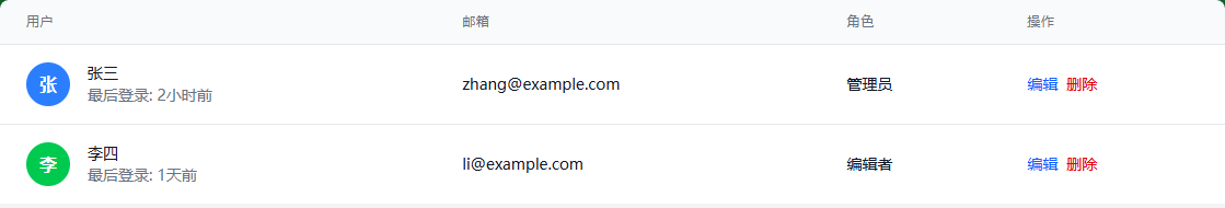
2.2 带操作按钮的表格
<table class="min-w-full divide-y divide-gray-200">
  <thead class="bg-gray-50">
    <tr>
      <th class="px-6 py-3 text-left text-xs font-medium text-gray-500 uppercase tracking-wider">用户</th>
      <th class="px-6 py-3 text-left text-xs font-medium text-gray-500 uppercase tracking-wider">邮箱</th>
      <th class="px-6 py-3 text-left text-xs font-medium text-gray-500 uppercase tracking-wider">角色</th>
      <th class="px-6 py-3 text-left text-xs font-medium text-gray-500 uppercase tracking-wider">操作</th>
    </tr>
  </thead>
  <tbody class="bg-white divide-y divide-gray-200">
    <tr class="hover:bg-gray-50">
      <td class="px-6 py-4 whitespace-nowrap">
        <div class="flex items-center">
          <div class="flex-shrink-0 h-10 w-10">
            <div class="h-10 w-10 rounded-full bg-blue-500 flex items-center justify-center text-white font-semibold">张</div>
          </div>
          <div class="ml-4">
            <div class="text-sm font-medium text-gray-900">张三</div>
            <div class="text-sm text-gray-500">最后登录: 2小时前</div>
          </div>
        </div>
      </td>
      <td class="px-6 py-4 whitespace-nowrap text-sm text-gray-900">zhang@example.com</td>
      <td class="px-6 py-4 whitespace-nowrap text-sm text-gray-900">管理员</td>
      <td class="px-6 py-4 whitespace-nowrap text-sm font-medium">
        <div class="flex space-x-2">
          <button class="text-blue-600 hover:text-blue-900">编辑</button>
          <button class="text-red-600 hover:text-red-900">删除</button>
        </div>
      </td>
    </tr>
    <tr class="hover:bg-gray-50">
      <td class="px-6 py-4 whitespace-nowrap">
        <div class="flex items-center">
          <div class="flex-shrink-0 h-10 w-10">
            <div class="h-10 w-10 rounded-full bg-green-500 flex items-center justify-center text-white font-semibold">李</div>
          </div>
          <div class="ml-4">
            <div class="text-sm font-medium text-gray-900">李四</div>
            <div class="text-sm text-gray-500">最后登录: 1天前</div>
          </div>
        </div>
      </td>
      <td class="px-6 py-4 whitespace-nowrap text-sm text-gray-900">li@example.com</td>
      <td class="px-6 py-4 whitespace-nowrap text-sm text-gray-900">编辑者</td>
      <td class="px-6 py-4 whitespace-nowrap text-sm font-medium">
        <div class="flex space-x-2">
          <button class="text-blue-600 hover:text-blue-900">编辑</button>
          <button class="text-red-600 hover:text-red-900">删除</button>
        </div>
      </td>
    </tr>
  </tbody>
</table>
3. 响应式表格设计
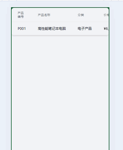
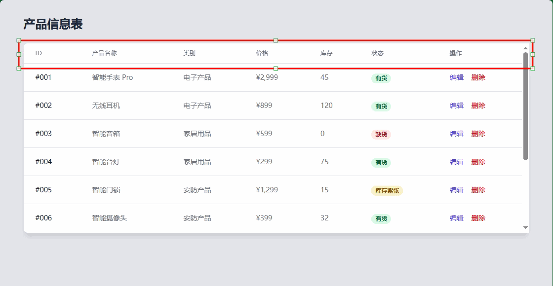
3.1 水平滚动表格(移动端友好)
<div class="overflow-x-auto shadow-md rounded-lg">
  <table class="min-w-full divide-y divide-gray-200">
    <thead class="bg-gray-50">
      <tr>
        <th class="px-6 py-3 text-left text-xs font-medium text-gray-500 uppercase tracking-wider">产品编号</th>
        <th class="px-6 py-3 text-left text-xs font-medium text-gray-500 uppercase tracking-wider">产品名称</th>
        <th class="px-6 py-3 text-left text-xs font-medium text-gray-500 uppercase tracking-wider">分类</th>
        <th class="px-6 py-3 text-left text-xs font-medium text-gray-500 uppercase tracking-wider">价格</th>
        <th class="px-6 py-3 text-left text-xs font-medium text-gray-500 uppercase tracking-wider">库存</th>
        <th class="px-6 py-3 text-left text-xs font-medium text-gray-500 uppercase tracking-wider">销量</th>
        <th class="px-6 py-3 text-left text-xs font-medium text-gray-500 uppercase tracking-wider">评分</th>
        <th class="px-6 py-3 text-left text-xs font-medium text-gray-500 uppercase tracking-wider">操作</th>
      </tr>
    </thead>
    <tbody class="bg-white divide-y divide-gray-200">
      <tr class="hover:bg-gray-50">
        <td class="px-6 py-4 whitespace-nowrap text-sm font-medium text-gray-900">P001</td>
        <td class="px-6 py-4 whitespace-nowrap text-sm text-gray-900">高性能笔记本电脑</td>
        <td class="px-6 py-4 whitespace-nowrap text-sm text-gray-900">电子产品</td>
        <td class="px-6 py-4 whitespace-nowrap text-sm text-gray-900">¥6,999</td>
        <td class="px-6 py-4 whitespace-nowrap text-sm text-gray-900">45</td>
        <td class="px-6 py-4 whitespace-nowrap text-sm text-gray-900">128</td>
        <td class="px-6 py-4 whitespace-nowrap text-sm text-gray-900">4.8</td>
        <td class="px-6 py-4 whitespace-nowrap text-sm font-medium">
          <button class="text-blue-600 hover:text-blue-900 mr-3">编辑</button>
          <button class="text-red-600 hover:text-red-900">删除</button>
        </td>
      </tr>
      <!-- 更多行... -->
    </tbody>
  </table>
</div>
3.2 卡片式表格(移动端优化)
<!-- 桌面端显示完整表格,移动端显示卡片 -->
<div class="hidden md:block">
<!-- 桌面端表格 -->
<table class="min-w-full divide-y divide-gray-200">
<thead class="bg-gray-50">
<tr>
<th class="px-6 py-3 text-left text-xs font-medium text-gray-500 uppercase tracking-wider">订单号</th>
<th class="px-6 py-3 text-left text-xs font-medium text-gray-500 uppercase tracking-wider">客户</th>
<th class="px-6 py-3 text-left text-xs font-medium text-gray-500 uppercase tracking-wider">日期</th>
<th class="px-6 py-3 text-left text-xs font-medium text-gray-500 uppercase tracking-wider">金额</th>
<th class="px-6 py-3 text-left text-xs font-medium text-gray-500 uppercase tracking-wider">状态</th>
</tr>
</thead>
<tbody class="bg-white divide-y divide-gray-200">
<!-- 表格内容 -->
</tbody>
</table>
</div>
<!-- 移动端卡片式显示 -->
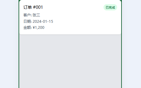
<div class="md:hidden space-y-4">
<div class="bg-white p-4 rounded-lg shadow">
<div class="flex justify-between items-start mb-2">
<div class="font-medium">订单 #001</div>
<span class="px-2 py-1 text-xs bg-green-100 text-green-800 rounded-full">已完成</span>
</div>
<div class="text-sm text-gray-600 space-y-1">
<div>客户: 张三</div>
<div>日期: 2024-01-15</div>
<div>金额: ¥1,200</div>
</div>
</div>
<!-- 更多卡片... -->
</div>
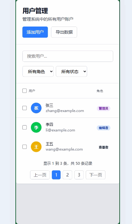
4. 完整的表格示例
4.1 数据管理表格
<!DOCTYPE html>
<html lang="zh-CN">
<head>
  <meta charset="UTF-8">
  <meta name="viewport" content="width=device-width, initial-scale=1.0">
  <title>数据表格示例</title>
</head>
<body class="bg-gray-100 min-h-screen p-6">
  <div class="max-w-7xl mx-auto">

    <!-- 表格头部 -->
    <div class="bg-white rounded-t-lg shadow-sm p-6 border-b border-gray-200">
      <div class="flex flex-col md:flex-row justify-between items-start md:items-center space-y-4 md:space-y-0">
        <div>
          <h1 class="text-2xl font-bold text-gray-900">用户管理</h1>
          <p class="text-gray-600 mt-1">管理系统中的所有用户账户</p>
        </div>
        <div class="flex space-x-3">
          <button class="px-4 py-2 bg-blue-500 text-white rounded-md hover:bg-blue-600 transition-colors">
            添加用户
          </button>
          <button class="px-4 py-2 border border-gray-300 text-gray-700 rounded-md hover:bg-gray-50 transition-colors">
            导出数据
          </button>
        </div>
      </div>
    </div>

    <!-- 搜索和筛选 -->
    <div class="bg-white p-6 border-b border-gray-200">
      <div class="flex flex-col md:flex-row space-y-4 md:space-y-0 md:space-x-4">
        <div class="flex-1">
          <input type="text" placeholder="搜索用户..." class="w-full px-4 py-2 border border-gray-300 rounded-md focus:outline-none focus:ring-2 focus:ring-blue-500">
        </div>
        <div class="flex space-x-2">
          <select class="px-4 py-2 border border-gray-300 rounded-md focus:outline-none focus:ring-2 focus:ring-blue-500">
            <option>所有角色</option>
            <option>管理员</option>
            <option>编辑者</option>
            <option>查看者</option>
          </select>
          <select class="px-4 py-2 border border-gray-300 rounded-md focus:outline-none focus:ring-2 focus:ring-blue-500">
            <option>所有状态</option>
            <option>活跃</option>
            <option>禁用</option>
            <option>待审核</option>
          </select>
        </div>
      </div>
    </div>

    <!-- 数据表格 -->
    <div class="bg-white rounded-b-lg shadow-sm overflow-hidden">
      <div class="overflow-x-auto">
        <table class="min-w-full divide-y divide-gray-200">
          <thead class="bg-gray-50">
            <tr>
              <th class="px-6 py-3 text-left text-xs font-medium text-gray-500 uppercase tracking-wider">
                <div class="flex items-center">
                  <input type="checkbox" class="h-4 w-4 text-blue-600 border-gray-300 rounded focus:ring-blue-500">
                  <span class="ml-2">用户</span>
                </div>
              </th>
              <th class="px-6 py-3 text-left text-xs font-medium text-gray-500 uppercase tracking-wider">角色</th>
              <th class="px-6 py-3 text-left text-xs font-medium text-gray-500 uppercase tracking-wider">状态</th>
              <th class="px-6 py-3 text-left text-xs font-medium text-gray-500 uppercase tracking-wider">最后活动</th>
              <th class="px-6 py-3 text-left text-xs font-medium text-gray-500 uppercase tracking-wider">注册时间</th>
              <th class="px-6 py-3 text-right text-xs font-medium text-gray-500 uppercase tracking-wider">操作</th>
            </tr>
          </thead>
          <tbody class="bg-white divide-y divide-gray-200">
            <!-- 用户1 -->
            <tr class="hover:bg-gray-50">
              <td class="px-6 py-4 whitespace-nowrap">
                <div class="flex items-center">
                  <input type="checkbox" class="h-4 w-4 text-blue-600 border-gray-300 rounded focus:ring-blue-500">
                  <div class="flex items-center ml-4">
                    <div class="flex-shrink-0 h-10 w-10">
                      <div class="h-10 w-10 rounded-full bg-blue-500 flex items-center justify-center text-white font-semibold">张</div>
                    </div>
                    <div class="ml-4">
                      <div class="text-sm font-medium text-gray-900">张三</div>
                      <div class="text-sm text-gray-500">zhang@example.com</div>
                    </div>
                  </div>
                </div>
              </td>
              <td class="px-6 py-4 whitespace-nowrap">
                <span class="px-2 inline-flex text-xs leading-5 font-semibold rounded-full bg-purple-100 text-purple-800">管理员</span>
              </td>
              <td class="px-6 py-4 whitespace-nowrap">
                <span class="px-2 inline-flex text-xs leading-5 font-semibold rounded-full bg-green-100 text-green-800">活跃</span>
              </td>
              <td class="px-6 py-4 whitespace-nowrap text-sm text-gray-900">2小时前</td>
              <td class="px-6 py-4 whitespace-nowrap text-sm text-gray-900">2024-01-15</td>
              <td class="px-6 py-4 whitespace-nowrap text-right text-sm font-medium">
                <div class="flex justify-end space-x-2">
                  <button class="text-blue-600 hover:text-blue-900">编辑</button>
                  <button class="text-gray-600 hover:text-gray-900">禁用</button>
                  <button class="text-red-600 hover:text-red-900">删除</button>
                </div>
              </td>
            </tr>

            <!-- 用户2 -->
            <tr class="hover:bg-gray-50">
              <td class="px-6 py-4 whitespace-nowrap">
                <div class="flex items-center">
                  <input type="checkbox" class="h-4 w-4 text-blue-600 border-gray-300 rounded focus:ring-blue-500">
                  <div class="flex items-center ml-4">
                    <div class="flex-shrink-0 h-10 w-10">
                      <div class="h-10 w-10 rounded-full bg-green-500 flex items-center justify-center text-white font-semibold">李</div>
                    </div>
                    <div class="ml-4">
                      <div class="text-sm font-medium text-gray-900">李四</div>
                      <div class="text-sm text-gray-500">li@example.com</div>
                    </div>
                  </div>
                </div>
              </td>
              <td class="px-6 py-4 whitespace-nowrap">
                <span class="px-2 inline-flex text-xs leading-5 font-semibold rounded-full bg-blue-100 text-blue-800">编辑者</span>
              </td>
              <td class="px-6 py-4 whitespace-nowrap">
                <span class="px-2 inline-flex text-xs leading-5 font-semibold rounded-full bg-green-100 text-green-800">活跃</span>
              </td>
              <td class="px-6 py-4 whitespace-nowrap text-sm text-gray-900">1天前</td>
              <td class="px-6 py-4 whitespace-nowrap text-sm text-gray-900">2024-01-10</td>
              <td class="px-6 py-4 whitespace-nowrap text-right text-sm font-medium">
                <div class="flex justify-end space-x-2">
                  <button class="text-blue-600 hover:text-blue-900">编辑</button>
                  <button class="text-gray-600 hover:text-gray-900">禁用</button>
                  <button class="text-red-600 hover:text-red-900">删除</button>
                </div>
              </td>
            </tr>

            <!-- 用户3 -->
            <tr class="hover:bg-gray-50">
              <td class="px-6 py-4 whitespace-nowrap">
                <div class="flex items-center">
                  <input type="checkbox" class="h-4 w-4 text-blue-600 border-gray-300 rounded focus:ring-blue-500">
                  <div class="flex items-center ml-4">
                    <div class="flex-shrink-0 h-10 w-10">
                      <div class="h-10 w-10 rounded-full bg-yellow-500 flex items-center justify-center text-white font-semibold">王</div>
                    </div>
                    <div class="ml-4">
                      <div class="text-sm font-medium text-gray-900">王五</div>
                      <div class="text-sm text-gray-500">wang@example.com</div>
                    </div>
                  </div>
                </div>
              </td>
              <td class="px-6 py-4 whitespace-nowrap">
                <span class="px-2 inline-flex text-xs leading-5 font-semibold rounded-full bg-gray-100 text-gray-800">查看者</span>
              </td>
              <td class="px-6 py-4 whitespace-nowrap">
                <span class="px-2 inline-flex text-xs leading-5 font-semibold rounded-full bg-red-100 text-red-800">禁用</span>
              </td>
              <td class="px-6 py-4 whitespace-nowrap text-sm text-gray-900">3天前</td>
              <td class="px-6 py-4 whitespace-nowrap text-sm text-gray-900">2024-01-05</td>
              <td class="px-6 py-4 whitespace-nowrap text-right text-sm font-medium">
                <div class="flex justify-end space-x-2">
                  <button class="text-blue-600 hover:text-blue-900">编辑</button>
                  <button class="text-green-600 hover:text-green-900">启用</button>
                  <button class="text-red-600 hover:text-red-900">删除</button>
                </div>
              </td>
            </tr>
          </tbody>
        </table>
      </div>

      <!-- 分页 -->
      <div class="bg-white px-6 py-4 border-t border-gray-200">
        <div class="flex flex-col md:flex-row justify-between items-center space-y-4 md:space-y-0">
          <div class="text-sm text-gray-700">
            显示 <span class="font-medium">1</span> 到 <span class="font-medium">3</span> 条,共 <span class="font-medium">50</span> 条记录
          </div>
          <div class="flex space-x-2">
            <button class="px-3 py-1 border border-gray-300 rounded-md text-gray-500 hover:bg-gray-50">上一页</button>
            <button class="px-3 py-1 bg-blue-500 text-white rounded-md hover:bg-blue-600">1</button>
            <button class="px-3 py-1 border border-gray-300 rounded-md text-gray-700 hover:bg-gray-50">2</button>
            <button class="px-3 py-1 border border-gray-300 rounded-md text-gray-700 hover:bg-gray-50">3</button>
            <button class="px-3 py-1 border border-gray-300 rounded-md text-gray-500 hover:bg-gray-50">下一页</button>
          </div>
        </div>
      </div>
    </div>
  </div>
</body>
</html>
5. 表格实用技巧
5.1 固定表头
<div class="h-96 overflow-y-auto">
  <table class="min-w-full divide-y divide-gray-200">
    <thead class="bg-gray-50 sticky top-0">
      <tr>
        <th class="px-6 py-3 text-left text-xs font-medium text-gray-500 uppercase tracking-wider">列1</th>
        <th class="px-6 py-3 text-left text-xs font-medium text-gray-500 uppercase tracking-wider">列2</th>
        <!-- 更多列... -->
      </tr>
    </thead>
    <tbody class="bg-white divide-y divide-gray-200">
      <!-- 表格内容,可以滚动 -->
    </tbody>
  </table>
</div>
5.2 可排序表格
<table class="min-w-full divide-y divide-gray-200">
  <thead class="bg-gray-50">
    <tr>
      <th class="px-6 py-3 text-left text-xs font-medium text-gray-500 uppercase tracking-wider cursor-pointer hover:bg-gray-100">
        <div class="flex items-center">
          姓名
          <svg class="ml-1 h-4 w-4" fill="none" stroke="currentColor" viewBox="0 0 24 24">
            <path stroke-linecap="round" stroke-linejoin="round" stroke-width="2" d="M7 16V4m0 0L3 8m4-4l4 4m6 0v12m0 0l4-4m-4 4l-4-4"></path>
          </svg>
        </div>
      </th>
      <!-- 更多可排序列... -->
    </tr>
  </thead>
  <!-- 表格内容... -->
</table>
6. 表格最佳实践
- 响应式设计:确保表格在移动设备上可正常使用
- 适当的间距:使用合理的内边距提高可读性
- 视觉层次:通过颜色和字体重量区分表头和内容
- 交互反馈:为可交互元素提供悬停状态
- 性能优化:对大量数据使用虚拟滚动或分页
Tailwind CSS 排版
Tailwind CSS 提供了丰富的工具来控制文本的样式、大小、间距和对齐等。
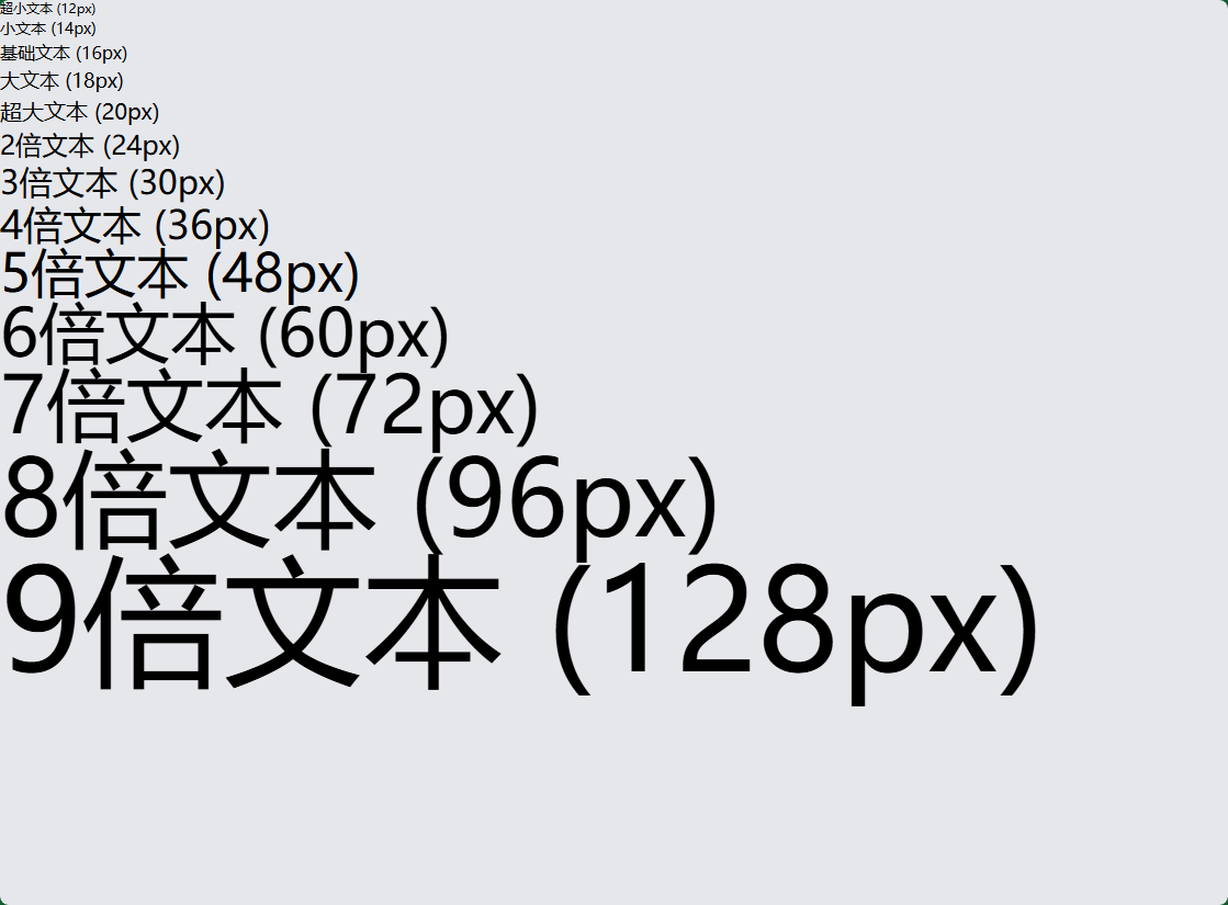
1. 字体大小 (Font Size)
<!-- 字体大小类 -->
<h1 class="text-xs">超小文本 (12px)</h1>
<h2 class="text-sm">小文本 (14px)</h2>
<p class="text-base">基础文本 (16px)</p>
<h3 class="text-lg">大文本 (18px)</h3>
<h4 class="text-xl">超大文本 (20px)</h4>
<h5 class="text-2xl">2倍文本 (24px)</h5>
<h6 class="text-3xl">3倍文本 (30px)</h6>
<div class="text-4xl">4倍文本 (36px)</div>
<div class="text-5xl">5倍文本 (48px)</div>
<div class="text-6xl">6倍文本 (60px)</div>
<div class="text-7xl">7倍文本 (72px)</div>
<div class="text-8xl">8倍文本 (96px)</div>
<div class="text-9xl">9倍文本 (128px)</div>
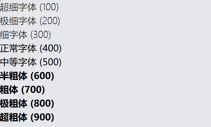
2. 字体粗细 (Font Weight)
<!-- 字体粗细 -->
<p class="font-thin">超细字体 (100)</p>
<p class="font-extralight">极细字体 (200)</p>
<p class="font-light">细字体 (300)</p>
<p class="font-normal">正常字体 (400)</p>
<p class="font-medium">中等字体 (500)</p>
<p class="font-semibold">半粗体 (600)</p>
<p class="font-bold">粗体 (700)</p>
<p class="font-extrabold">极粗体 (800)</p>
<p class="font-black">超粗体 (900)</p>
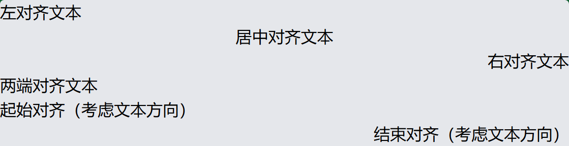
3. 文本对齐 (Text Alignment)
<!-- 文本对齐 -->
<p class="text-left">左对齐文本</p>
<p class="text-center">居中对齐文本</p>
<p class="text-right">右对齐文本</p>
<p class="text-justify">两端对齐文本</p>
<p class="text-start">起始对齐(考虑文本方向)</p>
<p class="text-end">结束对齐(考虑文本方向)</p>
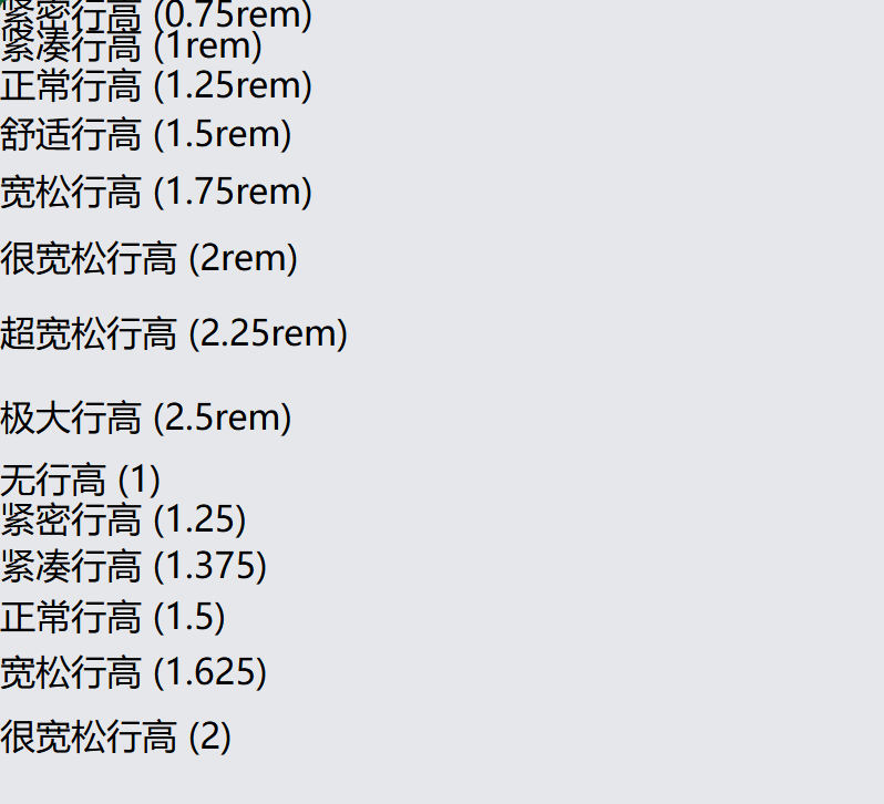
4. 行高 (Line Height)
<!-- 行高控制 -->
<p class="leading-3">紧密行高 (0.75rem)</p>
<p class="leading-4">紧凑行高 (1rem)</p>
<p class="leading-5">正常行高 (1.25rem)</p>
<p class="leading-6">舒适行高 (1.5rem)</p>
<p class="leading-7">宽松行高 (1.75rem)</p>
<p class="leading-8">很宽松行高 (2rem)</p>
<p class="leading-9">超宽松行高 (2.25rem)</p>
<p class="leading-10">极大行高 (2.5rem)</p>
<p class="leading-none">无行高 (1)</p>
<p class="leading-tight">紧密行高 (1.25)</p>
<p class="leading-snug">紧凑行高 (1.375)</p>
<p class="leading-normal">正常行高 (1.5)</p>
<p class="leading-relaxed">宽松行高 (1.625)</p>
<p class="leading-loose">很宽松行高 (2)</p>
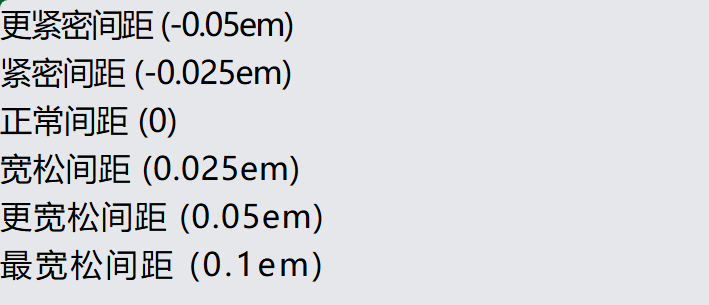
5. 字母间距 (Letter Spacing)
<!-- 字母间距 -->
<p class="tracking-tighter">更紧密间距 (-0.05em)</p>
<p class="tracking-tight">紧密间距 (-0.025em)</p>
<p class="tracking-normal">正常间距 (0)</p>
<p class="tracking-wide">宽松间距 (0.025em)</p>
<p class="tracking-wider">更宽松间距 (0.05em)</p>
<p class="tracking-widest">最宽松间距 (0.1em)</p>
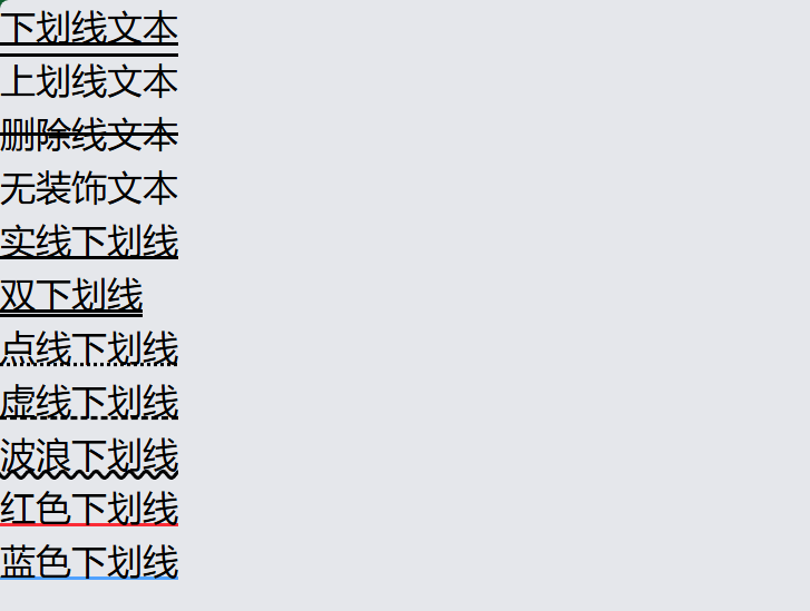
6. 文本装饰 (Text Decoration)
<!-- 文本装饰 -->
<p class="underline">下划线文本</p>
<p class="overline">上划线文本</p>
<p class="line-through">删除线文本</p>
<p class="no-underline">无装饰文本</p>

<!-- 装饰样式 -->
<p class="underline decoration-solid">实线下划线</p>
<p class="underline decoration-double">双下划线</p>
<p class="underline decoration-dotted">点线下划线</p>
<p class="underline decoration-dashed">虚线下划线</p>
<p class="underline decoration-wavy">波浪下划线</p>

<!-- 装饰颜色 -->
<p class="underline decoration-red-500">红色下划线</p>
<p class="underline decoration-blue-400">蓝色下划线</p>
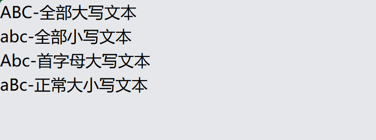
7. 文本变换 (Text Transform)
    <!-- 文本变换 -->
    <p class="uppercase">abc-全部大写文本</p>
    <p class="lowercase">ABC-全部小写文本</p>
    <p class="capitalize">abc-首字母大写文本</p>
    <p class="normal-case">aBc-正常大小写文本</p>
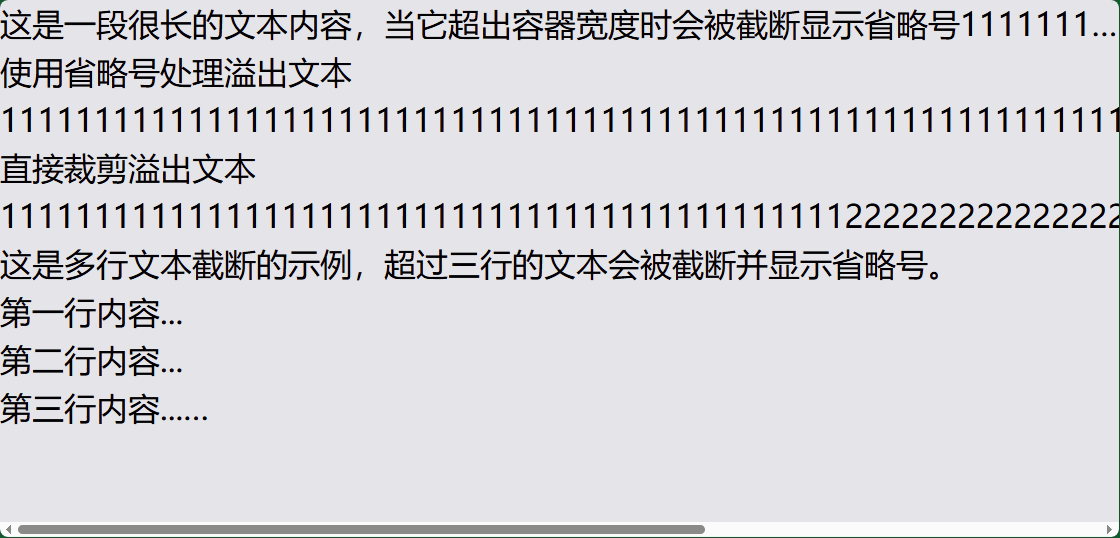
8. 文本溢出处理
    <!-- 文本溢出 -->
    <div class="truncate">这是一段很长的文本内容,当它超出容器宽度时会被截断显示省略号11111111111</div>
    <div class="overflow-ellipsis">使用省略号处理溢出文本 1111111111111111111111111111111111111111111111111111111111111111111111111111111111111111111111</div>
    <div class="overflow-clip">直接裁剪溢出文本111111111111111111111111111111111111111111111111111111111111111111111111111111111111111111111111111111111111111111111111111111111111111</div>

    <!-- 多行文本截断 -->
    <div class="line-clamp-4">
        这是多行文本截断的示例,超过四行的文本会被截断并显示省略号。<br>
        第一行内容...<br>
        第二行内容...<br>
        第三行内容...<br>
        第四行内容(会被截断)...<br>
    </div>
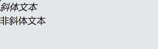
9. 字体样式 (Font Style)
<!-- 字体样式 -->
<p class="italic">斜体文本</p>
<p class="not-italic">非斜体文本</p>
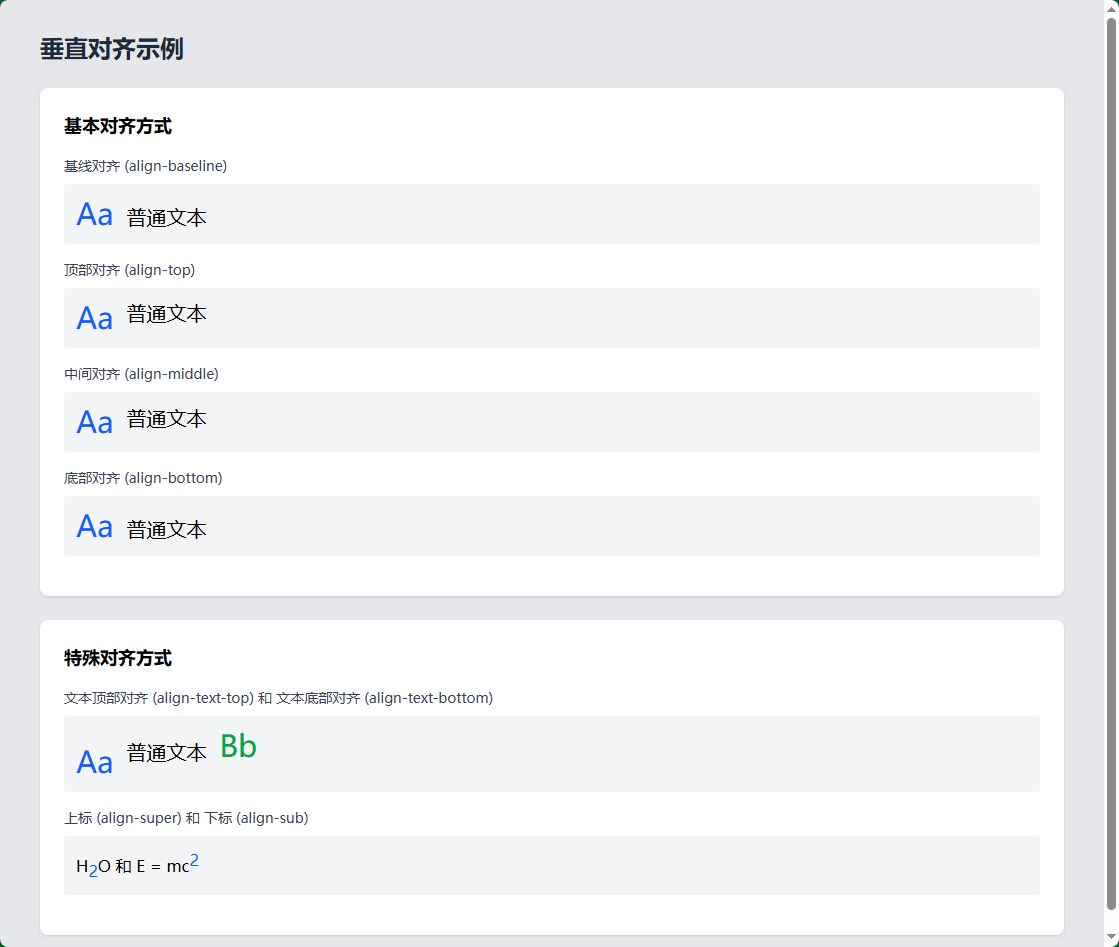
10. 垂直对齐 (Vertical Alignment)
<!-- 垂直对齐 -->
<div class="align-baseline">基线对齐</div>
<div class="align-top">顶部对齐</div>
<div class="align-middle">中间对齐</div>
<div class="align-bottom">底部对齐</div>
<div class="align-text-top">文本顶部对齐</div>
<div class="align-text-bottom">文本底部对齐</div>
<div class="align-sub">下标对齐</div>
<div class="align-super">上标对齐</div>
11. 文本颜色和透明度
<!-- 文本颜色 -->
<p class="text-black">黑色文本</p>
<p class="text-white bg-gray-800">白色文本(深色背景)</p>
<p class="text-gray-500">灰色文本</p>
<p class="text-red-600">红色文本</p>
<p class="text-blue-500">蓝色文本</p>
<p class="text-green-400">绿色文本</p>

    <!-- 元素透明度 -->
    <div class="bg-blue-500 p-4 rounded-lg mb-2 opacity-100">
        <p class="text-white">元素100% 不透明度</p>
    </div>
    <div class="bg-blue-500 p-4 rounded-lg mb-2 opacity-75">
        <p class="text-white">元素75% 不透明度</p>
    </div>
    <div class="bg-blue-500 p-4 rounded-lg mb-2 opacity-50">
        <p class="text-white">元素50% 不透明度</p>
    </div>
    <div class="bg-blue-500 p-4 rounded-lg mb-2 opacity-25">
        <p class="text-white">元素25% 不透明度</p>
    </div>
    <div class="bg-blue-500 p-4 rounded-lg mb-2 opacity-0">
        <p class="text-white">元素0% 不透明度</p>
    </div>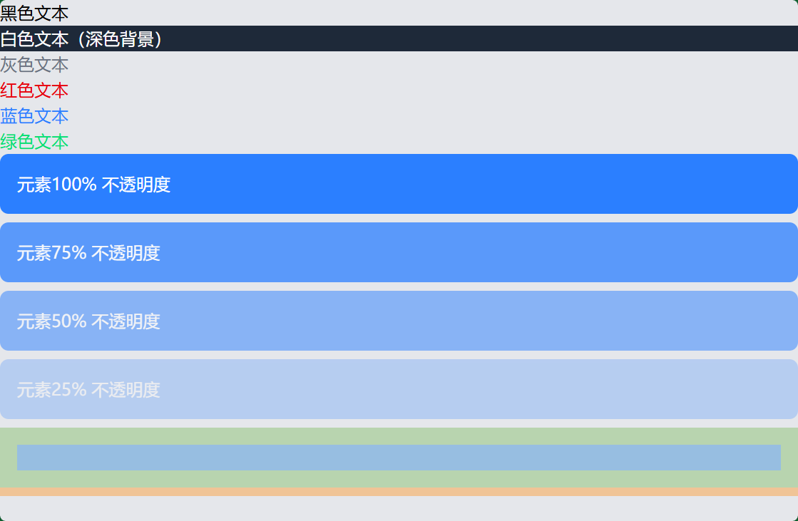
12. 响应式排版
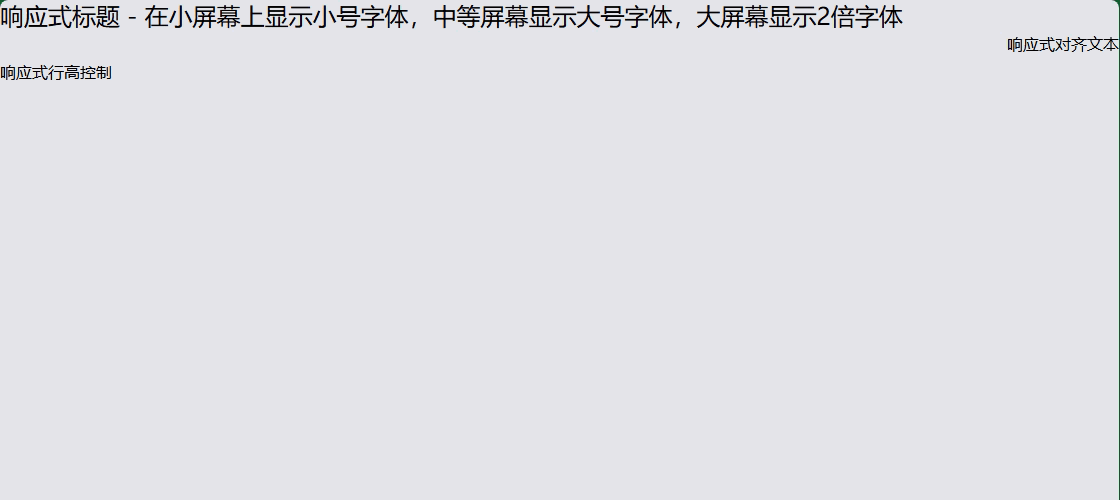
<!-- 响应式文本大小 -->
<h1 class="text-sm md:text-lg lg:text-2xl">
  响应式标题 - 在小屏幕上显示小号字体,中等屏幕显示大号字体,大屏幕显示2倍字体
</h1>

<!-- 响应式对齐 -->
<p class="text-left md:text-center lg:text-right">
  响应式对齐文本
</p>

<!-- 响应式行高 -->
<p class="leading-tight md:leading-normal lg:leading-loose">
  响应式行高控制
</p>
13. 完整的排版示例
<!DOCTYPE html>
<html lang="zh-CN">
<head>
<meta charset="UTF-8">
<meta name="viewport" content="width=device-width, initial-scale=1.0">
<title>Tailwind CSS 排版示例</title>
<script src="https://cdn.tailwindcss.com"></script>
</head>
<body class="p-8 bg-gray-50">
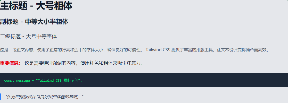
<!-- 标题排版 -->
<div class="space-y-6">
<h1 class="text-4xl font-bold text-gray-900 tracking-tight">
主标题 - 大号粗体
</h1>
<h2 class="text-2xl font-semibold text-gray-800 leading-relaxed">
副标题 - 中等大小半粗体
</h2>
<h3 class="text-xl font-medium text-gray-700">
三级标题 - 大号中等字体
</h3>
<!-- 正文排版 -->
<p class="text-base text-gray-600 leading-7">
这是一段正文内容,使用了正常的行高和适中的字体大小,确保良好的可读性。
Tailwind CSS 提供了丰富的排版工具,让文本设计变得简单而高效。
</p>
<!-- 强调文本 -->
<p class="text-lg text-gray-800 font-medium">
<span class="text-red-600 font-bold">重要信息:</span>
这是需要特别强调的内容,使用红色和粗体来吸引注意力。
</p>
<!-- 代码样式 -->
<div class="bg-gray-800 p-4 rounded">
<code class="text-sm text-green-400 font-mono">
const message = "Tailwind CSS 排版示例";
</code>
</div>
<!-- 引用样式 -->
<blockquote class="border-l-4 border-blue-500 pl-4 italic text-gray-700">
"优秀的排版设计是良好用户体验的基础。"
</blockquote>
</div>
</body>
</html>
14. 自定义配置
您还可以在 tailwind.config.js 中自定义排版设置:
// tailwind.config.js
module.exports = {
  theme: {
    extend: {
      // 自定义字体大小
      fontSize: {
        'xxs': '0.625rem',
        '10xl': '10rem',
      },
      // 自定义行高
      lineHeight: {
        '12': '3rem',
      },
      // 自定义字体族
      fontFamily: {
        'custom': ['Custom Font', 'sans-serif'],
      },
    },
  },
}
Tailwind CSS 的排版系统非常强大且灵活,通过组合不同的工具类。

有“AI”的1024 = 2048,欢迎大家加入2048 AI社区
更多推荐


 7
7 0
0- 0


 已为社区贡献5条内容

所有评论(0)