plt.imshow()将灰度图像进行彩色映射
前言
有网友在博文Tensorflow+VGG16实现卷积神经网络特征图可视化留言,表达了两个疑问:
- 在对第5层卷积层输出的特征图进行叠加可视化的时候,256个特征图的值叠加,肯定会超出图像的最高值255,为什么还能正常显示。
- 特征图都是灰度图像,为什么可视化的特征图都是彩色的。
关键在于 plt.imshow()
使用 plt.imshow() 方法进行画图,该方法有个非常实用的功能,可以将灰度图像按照灰度值的高低映射成彩色图像,这对于人类的视觉来说再友好不过了。既然要映射成彩色,那总得有一系列彩色映射表吧,这就是官方文档上说到的colormap。
先来看官方文档:官方文档传送门
matplotlib.pyplot.imshow(X, cmap=None, …(其他参数就省略了))
Parameters:
X : array-like or PIL image
The image data. Supported array shapes are:
(M, N): an image with scalar data. The data is visualized using a colormap.这句是今天的重点:使用一个colormap进行可视化
(M, N, 3): an image with RGB values (float or uint8).
(M, N, 4): an image with RGBA values (float or uint8), i.e. including transparency.
The first two dimensions (M, N) define the rows and columns of the image.
The RGB(A) values should be in the range [0 … 1] for floats or [0 … 255] for integers. Out-of-range values will be clipped to these bounds.这句也是重点:rgb图像的值超出了范围,将会被裁剪到0到255之内,虽然没有说灰度图怎么样,但我猜想应该是一个道理的吧。
cmap : str or Colormap, optional
A Colormap instance or registered colormap name. The colormap maps scalar data to colors. It is ignored for RGB(A) data. Defaults to rcParams[“image.cmap”].
由此,可以得到两个结论:
- 灰度图像可视化会使用到colormap。
- 值超出了边界,就被裁剪。
代码演示
以下代码不是我写的,是在官网抄的 😛
官方文档传送门
"""
==================
Colormap reference
==================

Reference for colormaps included with Matplotlib.

This reference example shows all colormaps included with Matplotlib. Note that
any colormap listed here can be reversed by appending "_r" (e.g., "pink_r").
These colormaps are divided into the following categories:

Sequential:
    These colormaps are approximately monochromatic colormaps varying smoothly
    between two color tones---usually from low saturation (e.g. white) to high
    saturation (e.g. a bright blue). Sequential colormaps are ideal for
    representing most scientific data since they show a clear progression from
    low-to-high values.

Diverging:
    These colormaps have a median value (usually light in color) and vary
    smoothly to two different color tones at high and low values. Diverging
    colormaps are ideal when your data has a median value that is significant
    (e.g.  0, such that positive and negative values are represented by
    different colors of the colormap).

Qualitative:
    These colormaps vary rapidly in color. Qualitative colormaps are useful for
    choosing a set of discrete colors. For example::

        color_list = plt.cm.Set3(np.linspace(0, 1, 12))

    gives a list of RGB colors that are good for plotting a series of lines on
    a dark background.

Miscellaneous:
    Colormaps that don't fit into the categories above.

"""
import numpy as np
import matplotlib.pyplot as plt


# Have colormaps separated into categories:
# http://matplotlib.org/examples/color/colormaps_reference.html
cmaps = [('Perceptually Uniform Sequential', [
            'viridis', 'plasma', 'inferno', 'magma']),
         ('Sequential', [
            'Greys', 'Purples', 'Blues', 'Greens', 'Oranges', 'Reds',
            'YlOrBr', 'YlOrRd', 'OrRd', 'PuRd', 'RdPu', 'BuPu',
            'GnBu', 'PuBu', 'YlGnBu', 'PuBuGn', 'BuGn', 'YlGn']),
         ('Sequential (2)', [
            'binary', 'gist_yarg', 'gist_gray', 'gray', 'bone', 'pink',
            'spring', 'summer', 'autumn', 'winter', 'cool', 'Wistia',
            'hot', 'afmhot', 'gist_heat', 'copper']),
         ('Diverging', [
            'PiYG', 'PRGn', 'BrBG', 'PuOr', 'RdGy', 'RdBu',
            'RdYlBu', 'RdYlGn', 'Spectral', 'coolwarm', 'bwr', 'seismic']),
         ('Qualitative', [
            'Pastel1', 'Pastel2', 'Paired', 'Accent',
            'Dark2', 'Set1', 'Set2', 'Set3',
            'tab10', 'tab20', 'tab20b', 'tab20c']),
         ('Miscellaneous', [
            'flag', 'prism', 'ocean', 'gist_earth', 'terrain', 'gist_stern',
            'gnuplot', 'gnuplot2', 'CMRmap', 'cubehelix', 'brg', 'hsv',
            'gist_rainbow', 'rainbow', 'jet', 'nipy_spectral', 'gist_ncar'])]


nrows = max(len(cmap_list) for cmap_category, cmap_list in cmaps)
gradient = np.linspace(0, 1, 256)
gradient = np.vstack((gradient, gradient))


def plot_color_gradients(cmap_category, cmap_list, nrows):
    fig, axes = plt.subplots(nrows=nrows)
    fig.subplots_adjust(top=0.95, bottom=0.01, left=0.2, right=0.99)
    axes[0].set_title(cmap_category + ' colormaps', fontsize=14)

    for ax, name in zip(axes, cmap_list):
        ax.imshow(gradient, aspect='auto', cmap=plt.get_cmap(name))
        pos = list(ax.get_position().bounds)
        x_text = pos[0] - 0.01
        y_text = pos[1] + pos[3]/2.
        fig.text(x_text, y_text, name, va='center', ha='right', fontsize=10)

    # Turn off *all* ticks & spines, not just the ones with colormaps.
    for ax in axes:
        ax.set_axis_off()


for cmap_category, cmap_list in cmaps:
    plot_color_gradients(cmap_category, cmap_list, nrows)

plt.show()
以上代码输出呢,就是这些colormap: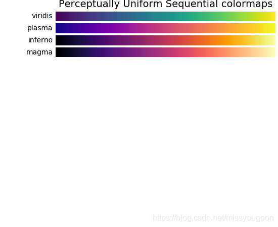
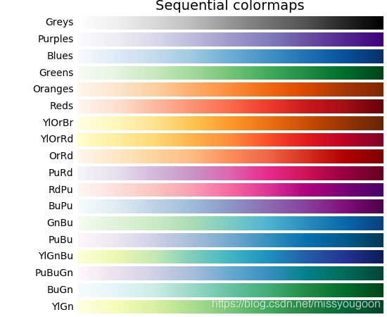
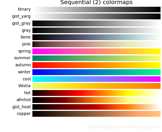
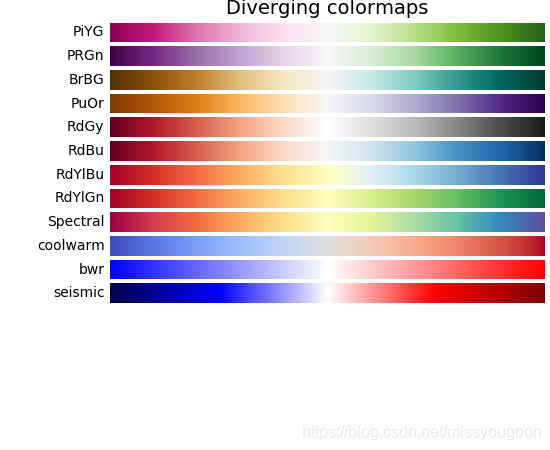
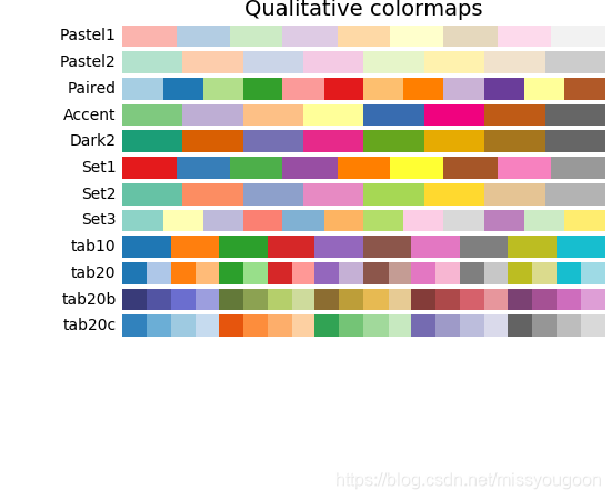
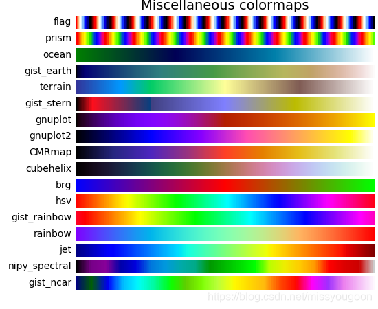
从中挑选自己喜欢的颜色吧 😄

有“AI”的1024 = 2048,欢迎大家加入2048 AI社区
更多推荐
 12
12 0
0- 0


 已为社区贡献11条内容

所有评论(0)