antd tab右键菜单renderTabBar
最近在写tab的时候,要加上右键菜单,baidu和google似乎搜不到满意的结果。然后在antd的issue找,有个例子:const menu = (<Menu><Menu.Item key="1">1st menu item</Menu.Item><Menu.Item key="2">2nd menu item<...
-----2021年12月16日
我看还有问,这东西可以不从renderTabBar出发的,换个思路用css修改头部tab就好了,2019-11月补的就是这个思路,我补个codesandbox吧,get不到我就没办法了:
codesandbox
-----2019年11月05日
最近突然又想起来这个东西,可以用绝对定位解决:
首先把tabTitle块设为相对定位,close图标也设为绝对定位
.ant-tabs-bar .ant-tabs-tab{
   position: relative;
 }
.ant-tabs-bar .ant-tabs-tab > div > .ant-tabs-close-x{
   position: absolute;
   top: 14px;
   right: 16px;
}
可以看到,label是用来撑空间的,div相对于tabTitle绝对定位铺满了整个TabTitle,效果和最后一张图一致
 const tabTitles = (title)=>{
   return (
     <div style={{display:'inline-block'}}>
       <Dropdown overlay={menuItems(item)} trigger={['contextMenu']}>
         <div style={{display:'inline-block',position:'absolute',left:0,right:0,textAlign:'left',padding: '0 16px' }}>
           {title}
         </div>
       </Dropdown>
       <label style={{visibility:'hidden'}}>{title}<div style={{width:14,height:1,display:'inline-block'}} /></label>
     </div>
   );
 };

<TabPane tab={<span title={item.title} className={sty.tabTitle}>{tabTitles('Tab1')}</span>} closable>
  // 内容
</TabPane>
-----2019年09月16日
发现这样改,当tab超出总宽度时,不能进行拖动,所以还是得固定tab使用,或者另加样式去适应了
-----2019年09月04日
最近在写tab的时候,要加上右键菜单,baidu和google似乎搜不到满意的结果。
然后在antd的issue找,有个例子:
const menu = (
  <Menu>
    <Menu.Item key="1">1st menu item</Menu.Item>
    <Menu.Item key="2">2nd menu item</Menu.Item>
    <Menu.Item key="3">3rd menu item</Menu.Item>
  </Menu>
);

const title = (
  <Dropdown overlay={menu} trigger={["contextMenu"]}>
    <span style={{ userSelect: "none" }}>Right Click on Me</span>
  </Dropdown>
);

ReactDOM.render(
  <Tabs defaultActiveKey="1" onChange={callback}>
    <TabPane tab={title} key="1">
      Content of Tab Pane 1
    </TabPane>
    <TabPane tab="Tab 2" key="2">
      Content of Tab Pane 2
    </TabPane>
    <TabPane tab="Tab 3" key="3">
      Content of Tab Pane 3
    </TabPane>
  </Tabs>,
  document.getElementById("container")
);
这种如果type='card’时,我们对tab头边缘地方进行右键点击时,是无效的,因为菜单只裹住了文字。
然后去提问了说用renderTabBar,在antd中的备注我们可以看到是: 替换 TabBar,用于二次封装标签头
我们在renderTabBar中提取key&title,样式拿antd(具体自调):
Css:
.activeTab {
  height: 40px;
  color: #1890ff !important;
  background: #fff !important;
  border-color: #e8e8e8 !important;
  border-bottom: 1px solid #fff !important;
}
.normalTab{
  height: 40px;
  margin: 0;
  margin-right: 2px;
  line-height: 38px;
  background: #fafafa;
  border: 1px solid #e8e8e8;
  border-radius: 4px 4px 0 0;
  -webkit-transition: all .3s cubic-bezier(.645, .045, .355, 1);
  transition: all .3s cubic-bezier(.645, .045, .355, 1);
  cursor: pointer;
}
Code:
class Demo extends React.Component{

  state ={
     activeKey: '1'
  };

  render(){
    const menuItems = (
      <Menu>
        <Menu.Item>
          <div>关闭当前标签页</div>
        </Menu.Item>
        <Menu.Item>
          <div>关闭其他标签页</div>
        </Menu.Item>
        <Menu.Item>
          <div >关闭全部标签页</div>
        </Menu.Item>
      </Menu>
  )
  const renderTabBar = (props, DefaultTabBar) => {
    // 提取tab信息
    const tabInfo = [];
    props.panels.forEach(item => {
      tabInfo.push({
        key: item.key,
        title: item.props.tab
      })
    });
    return (
      <Dropdown overlay={menuItems} trigger={['contextMenu']}>
        <div style={{display: 'flex',marginBottom:16}}>
          {
            tabInfo.map((item,index)=>(
	          <div>
	            key={item.key}
	            onClick={()=>this.setState({activeKey:item.key})}
	            className={props.activeKey===item.key?'activeTab normalTab':'normalTab'}
	          >
	            <div style={{padding:'0 16px'}}>{item.title}</div>
	          </div>
           )
         }
        </div>
      </Dropdown>
    )
  };
  return (
    <Tabs activeKey={this.state.activeKey} renderTabBar={renderTabBar}>
      <TabPane tab="Tab 1" key="1" style={{ height: 200 }}>
        Content of Tab Pane 1
      </TabPane>
      <TabPane tab="Tab 2" key="2">
        Content of Tab Pane 2
      </TabPane>
      <TabPane tab="Tab 3" key="3">
        Content of Tab Pane 3
      </TabPane>
    </Tabs>
  )
}
    }
Result(边缘地方也可以点到了):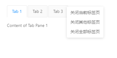

有“AI”的1024 = 2048,欢迎大家加入2048 AI社区
更多推荐


 5
5 0
0- 0


 已为社区贡献2条内容

所有评论(0)