Flutter-UI-Button大全
一直觉得自己写的不是技术,而是情怀,一个个的教程是自己这一路走来的痕迹。靠专业技能的成功是最具可复制性的,希望我的这条路能让你们少走弯路,希望我能帮你们抹去知识的蒙尘,希望我能帮你们理清知识的脉络,希望未来技术之巅上有你们也有我。RawMaterialButton 原始按键原始的Material按键,按键界的幕后大佬。可接受点击,长按,高亮变化事件,可指定颜色,形状。影深,内边距等属性。属性注释h
一直觉得自己写的不是技术,而是情怀,一个个的教程是自己这一路走来的痕迹。靠专业技能的成功是最具可复制性的,希望我的这条路能让你们少走弯路,希望我能帮你们抹去知识的蒙尘,希望我能帮你们理清知识的脉络,希望未来技术之巅上有你们也有我。

注意:
说明:很多按键都有自己的sytle,类型 buttonStyle下面针对他的使用,每个属性都说一下.
| 属性 | 注释 |
|---|---|
| backgroundColor | 背景颜色 |
| foregroundColor | 字体颜色 |
| overlayColor | 高亮色 |
| shadowColor | 阴影颜色 |
| surfaceTintColor | 表面颜色 |
| elevation | 阴影值(海拔高度) |
| padding | 内边距 |
| minimumSize | 最小尺寸 |
| maximumSize | 最大尺寸 |
| fixedSize | 固定尺寸 |
| iconColor | 图标颜色 |
| iconSize | 图标大小 |
| visualDensity | 视觉密度 |
| tapTargetSize | 点击的可视区域的大小 |
| animationDuration | 动画持续时间 |
| enableFeedback | 控制按钮是否提供触摸反馈(例如震动) |
| alignment | 对齐方式 |
| splashFactory | 使用自定义的工厂(点击后的博文效果不一样) |
| side | 边框 |
| shape | 圆角弧度 |
| textStyle | 文本样式 |
| mouseCursor | (未知怎么使用)光标形状 |
ButtonStyle(// 按键样式
  backgroundColor: MaterialStateProperty.all(Color(0xffffffff)),      //背景颜色
  foregroundColor: MaterialStateProperty.all(Color(0xff5E6573)),      //字体颜色
  overlayColor: MaterialStateProperty.all(Color(0xffffaaaa)),         //高亮色
  shadowColor: MaterialStateProperty.all( Color(0xffff00a9)),         //阴影颜色
  surfaceTintColor: MaterialStateProperty.all(Colors.green),          //表面颜色
  elevation: MaterialStateProperty.all(4.0),                          //阴影值(海拔高度)
  padding: MaterialStateProperty.all(EdgeInsets.all(16.0)),           //内边距
  minimumSize: MaterialStateProperty.all(Size(150.0, 50.0)),          //最小尺寸
  maximumSize: MaterialStateProperty.all(Size(300.0, 80.0)),          //最大尺寸
  fixedSize: MaterialStateProperty.all(Size(200.0, 60.0)),            //固定尺寸
  iconColor: MaterialStateProperty.all(Colors.red),                   //图标颜色
  iconSize: MaterialStateProperty.all(24.0),                          //图标大小
  visualDensity: VisualDensity(horizontal: 0.0, vertical: 0.0),       //视觉密度
  tapTargetSize: MaterialTapTargetSize.shrinkWrap,                    //点击的可视区域的大小
  animationDuration: Duration(milliseconds: 500),                     //动画持续时间
  enableFeedback: true,                                               //控制按钮是否提供触摸反馈(例如震动)
  alignment: Alignment.center,                                        //对齐方式
  splashFactory: NoSplash.splashFactory,                              //使用自定义的工厂(点击后的博文效果不一样)
  side: MaterialStateProperty.all(                                    //边框
      BorderSide(
        color: Colors.black,//颜色
        width: 2.0,//宽度
      )
  ),
  shape: MaterialStateProperty.all(                                   //圆角弧度
      CircleBorder(
          side: BorderSide(     //设置 界面效果
            color: Colors.green,//
            width: 280.0,//圆弧直径
            style: BorderStyle.none,
          )
      )
  ),
  textStyle: MaterialStateProperty.all(                               //文本样式
      TextStyle(
          fontSize: 12,
          fontWeight: FontWeight.bold,
          color: Colors.white,
      )
  ),
  // mouseCursor:  //(未知怎么使用)光标形状
)
RawMaterialButton 原始按键
原始的Material按键,按键界的幕后大佬。可接受点击,长按,高亮变化事件,可指定颜色,形状。影深,内边距等属性。
该按键的重点属性是:shape,可以设置你想要的形状,例如圆形按键,圆角按键
| 属性 | 注释 |
|---|---|
| onPressed | 点击事件【Function()】 |
| onLongPress | 长按事件【Function】 |
| shape | 形状【ShapeBorder】 |
| child | 子组件【Widget】 |
| elevation | 影深【double】 |
| highlightElevation | 点击时的阴影高度【double】 |
| disabledElevation | 未点击时的阴影高度【double】 |
| fillColor | 填充色【Color】 |
| textStyle | 文字样式【TextStyle】 |
| onLongPress | 长按事件【Function()】 |
| padding | 设置按钮的内边距【EdgeInsets.all(10)】 |
| constraints | 设置按钮的大小约束 |
| animationDuration | 设置按钮动画的持续时间 |
| splashColor | 水波纹色【Color】 |
| highlightColor | 设置按钮被点击时的高亮颜色【Color】 |
| focusColor | 设置按钮获得焦点时的颜色 【Color】 |
| hoverColor | 设置按钮悬停时的颜色 【Color】 |
| focusNode | 用于控制按钮的焦点行为 |
| autofocus | 是否自动聚焦到按钮上 |
| clipBehavior | 设置按钮的裁剪行为 |
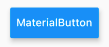
详细代码
import 'package:flutter/material.dart';

void main() {
  runApp(HomePage());
}

class HomePage extends StatelessWidget {
  @override
  Widget build(BuildContext context) {
    // TODO: implement build
    return Scaffold(
      //手脚架组件
      appBar: AppBar(
        title: const Text('Hello Flutter'),
        backgroundColor: Colors.red,
      ),
      body: Center(
        // 设置剧中对齐
        child: RawMaterialButton(
          //背景颜色
          fillColor: Colors.blue[400],
          //阴影高度
          elevation: 5,
          //内边距
          padding: EdgeInsets.all(10),
          //子组件
          child: Text("MaterialButton"),
          // constraints: BoxConstraints(// 设置按键的宽高范围
          //   minWidth: 100,  // 设置按钮的最小宽度为 100
          //   maxWidth: 200,  // 设置按钮的最大宽度为 200
          //   minHeight: 50,  // 设置按钮的最小高度为 50
          //   maxHeight: 100,  // 设置按钮的最大高度为 100
          // ),
          // 设置动画持续时间为 1 秒(没有效果,有待研究)
          animationDuration: Duration(seconds: 1),
          //水波纹颜色
          splashColor: Colors.orange[200],
          //高亮颜色(长按看到效果)
          highlightColor: Colors.green,
          //获得焦点时的颜色
          focusColor: Colors.brown,
          //悬停时的颜色
          hoverColor: Colors.deepPurple,
          // 点击事件
          onPressed: () {},
        ),
      ),
    );
  }
}
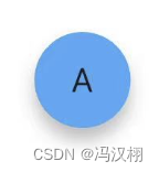
圆形按键代码
class HomePage extends StatelessWidget {

  @override
  Widget build(BuildContext context) {
    // TODO: implement build
    return Scaffold(
      //手脚架组件
      appBar: AppBar(
        title: const Text('Hello Flutter'),
        backgroundColor: Colors.red,
      ),
      body: Center(
        // 设置剧中对齐
        child: RawMaterialButton(
          shape: CircleBorder(),//圆角
          fillColor: Colors.blue[400],//背景颜色
          elevation: 5,//阴影高度
          padding: EdgeInsets.all(10),//内边距
          child: Text("A"),
          // 点击事件
          onPressed: () {
            print('object');
          },
        ),
      ),
    );
  }
}
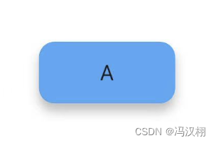
圆角按键代码
class HomePage extends StatelessWidget {

  @override
  Widget build(BuildContext context) {
    // TODO: implement build
    return Scaffold(
      //手脚架组件
      appBar: AppBar(
        title: const Text('Hello Flutter'),
        backgroundColor: Colors.red,
      ),
      body: Center(
        // 设置剧中对齐
        child: RawMaterialButton(
          shape: RoundedRectangleBorder(
            borderRadius: BorderRadius.circular(10),
          ),
          fillColor: Colors.blue[400],//背景颜色
          elevation: 5,//阴影高度
          padding: EdgeInsets.all(10),//内边距
          child: Text("A"),
          // 点击事件
          onPressed: () {
            print('object');
          },
        ),
      ),
    );
  }
}
MaterialNutton 材料按键
基于RawMaterialButton实现的通用Material按键,可盛放一个子组件,能定义颜色,形状等表现,可接受点击和长按键事件。
| 属性 | 注释 |
|---|---|
| highilghtColor | 长按高亮色【Color】 |
| onLongPress | 长按事件【Function】 |
| color | 颜色【Color】 |
| splashColor | 水波颜色【Color】 |
| height | 高度 【double】 |
| elevation | 影深【doubel】 |
| child | 子组件【Widget】 |
| textColor | 子组件文字颜色【Color】 |
| highlightColor | 长按高亮色【Color】 |
| padding | 内边距【EdgeinsetsGeometry】 |
| onPressed | 点击事件 【Function】 |
| shape | 形状【ShapeBorder】 |
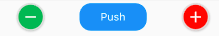
class LongPressMaterialButton extends StatelessWidget {
  @override
  Widget build(BuildContext context) {
    return MaterialButton(
        height: 40,
        elevation: 5,
        color: Colors.blue,
        highlightColor: Colors.green,
        textColor: Colors.white,
        padding: EdgeInsets.all(8),
        child: Text("MaterialButton"),
        onLongPress: () =>  Navigator.of(context).pushNamed('AboutMePage'),
        onPressed: () => Navigator.of(context).pushNamed('AboutMePage'));
  }
}
shape: CircleBorder(
  side: BorderSide(width: 2.0, color: Color(0xFFFFDFDFDF)),
),

shape: RoundedRectangleBorder(
    borderRadius: BorderRadius.all(Radius.circular(15)
)

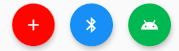
FloatingActionButton 浮动按键
浮动按键,一般用于Scaffold中,可摆放在特定位置。可城防一个子组件,接收点击,可定义颜色,形状等
| 属性 | 注释 |
|---|---|
| mini | 是否是迷你【bool】 |
| child | 子组件【Widget】 |
| tooltip | 长按时提示文字【String】 |
| backgroundColor | 背景颜色 【Color】 |
| foregroundColor | 前景色【Color】 |
| elevation | 影深 【double】 |
| opPressed | 点击事件【Function】 |
| shape | 形状【ShapeBorder】 |
class CustomFAB extends StatelessWidget {
  @override
  Widget build(BuildContext context) {
    var data = {
      Colors.red: Icons.add,
      Colors.blue: Icons.bluetooth,
      Colors.green: Icons.android,
    };
    return Wrap(
        spacing: 20,
        children: data.keys
            .map((e) => FloatingActionButton(
          heroTag: e.toString()+"a",
          onPressed: () {},
          backgroundColor: e,
          foregroundColor: Colors.white,
          child: Icon(data[e]),
          tooltip: "android",
          elevation: 5, //z-阴影盖度
        ))
            .toList());
  }
}
RaisedButton 浮起按钮(3.0.0废弃)
有阴影的浮起按钮,基于MaterialButton实现,所有属性和MaterialButton类似
| 属性 | 注释 |
|---|---|
| color | 颜色【Color】 |
| splashColor | 水波颜色【Color】 |
| elevation | 影深【doubel】 |
| child | 子组件【Widget】 |
| textColor | 子组件文字颜色【Color】 |
| highlightColor | 长按高亮色【Color】 |
| padding | 内边距【EdgeinsetsGeometry】 |
| onPressed | 点击事件 【Function】 |
class CustomRaisedButton extends StatelessWidget {
  @override
  Widget build(BuildContext context) {
    return RaisedButton(
      color: Colors.blue,
      splashColor: Colors.green,
      onPressed: () {},
      child: Text("RaisedButton"),
      textColor: Color(0xffFfffff),
      padding: EdgeInsets.all(8),
      elevation: 5,
      highlightColor: Color(0xffF88B0A),
    );
  }
}

RaisedButton 按键+图标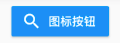
RaisedButton.icon(
    color: Colors.blue,
    textColor: Colors.white,
    onPressed: () {
      print('点击图标按钮');
    },
    icon: Icon(Icons.search),
    label: Text('图标按钮’)
),
RaisedButton 自适应按键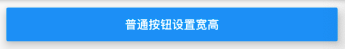
//按键自适应宽度  宽度等于屏幕的宽度
Row(
  mainAxisAlignment: MainAxisAlignment.center,
  children: <Widget>[
    Expanded(
        child: Container(
          //通过控件包裹设置按键的宽高
          width: 160,
          height: 40,
          margin: EdgeInsets.all(10),
          child: RaisedButton(
              child: Text('普通按钮设置宽高'),
              color: Colors.blue,
              //背景颜色
              textColor: Colors.white,
              //文字颜色
              elevation: 10,
              //阴影效果
              onPressed: () {
                print('普通按钮');
              }),
        )
    )
  ],
)
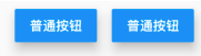
RaisedButton 按键圆角
RaisedButton(//圆角按键
    child: Text('普通按钮'),
    color: Colors.blue,
    //背景颜色
    textColor: Colors.white,
    //文字颜色
    elevation: 10,
    shape: RoundedRectangleBorder(
      borderRadius: BorderRadius.circular(10),
    ),
    //阴影效果
    onPressed: () {
      print('普通按钮');
 }),
RaisedButton 圆形按键
Container(//圆形按钮
  height: 80,
  child: RaisedButton(//圆角按键
      child: Text('普通按钮'),
      color: Colors.blue,
      //背景颜色
      textColor: Colors.white,
      //文字颜色
      elevation: 10,
      splashColor:Color.red,
      shape: CircleBorder(
          side: BorderSide(
            color: Colors.white,
          )
      ),
      //阴影效果
      onPressed: () {
        print('普通按钮');
      }),
),
CustomButton 自定义按键
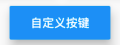
//自定义按钮组件
class MyButton extends StatelessWidget {

  final text;
  final pressed;
  final double width;
  final double height;

  const MyButton({this.text='',this.pressed=null,this.width=80.0,this.height=30.0});

  @override
  Widget build(BuildContext context) {
    // TODO: implement build
    return Container(
      height: this.height,
      width: this.width,
      child: RaisedButton(
          child: Text(this.text),
          color: Colors.blue,
          //背景颜色
          textColor: Colors.white,
          //文字颜色
          elevation: 10,
          //阴影效果
          onPressed: this.pressed
      ),
    );
  }
}

//使用
MyButton(text: '自定义按键',width: 120.0, height: 40.0,pressed: (){
  print('自定义按键');
},)
ButtonBar 按钮栏
接收组件列表,常用于城防若干个按钮,可指定对齐方式。边距等信息。
| 属性 | 注释 |
|---|---|
| buttonPadding | 内边距 【EdgeinsetsGeometry】 |
| buttonHeight | 高【double】 |
| alignment | 对齐方式【MainAxisAlignment】例如:MainAxisAlignment.center |
| children | 子组件集【List】 |
Row(
  children: <Widget>[
		ButtonBar(
      children: [
        MaterialButton(
          color: Colors.blue[400],//背景颜色
          elevation: 5,//阴影高度
          padding: EdgeInsets.all(10),//内边距
          child: Text("A"),
          onPressed: () {
            print('A');
          },
        ),
        MaterialButton(
          color: Colors.blue[400],//背景颜色
          elevation: 5,//阴影高度
          padding: EdgeInsets.all(10),//内边距
          child: Text("B"),
          onPressed: () {
            print('B');
          },
        ),
      ],
    )
  ],
),
IconButton 图标按键
可点击的图标按钮,可指定图标信息,内边距,大小没颜色,接收事件。
| 属性 | 注释 |
|---|---|
| child | 子组件【Widget】 |
| icon | 内边距【Widget】 |
| topltip | 长按提示文字【String】 |
| highlightColor | 长按高亮色【Color】 |
| splashColor | 水波颜色【Color】 |
| onPressed | 点击事件 【Function】 |
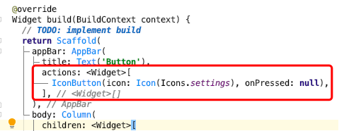
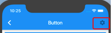
class CustomIconButton extends StatelessWidget {
  @override
  Widget build(BuildContext context) {
    return Padding(
      padding: const EdgeInsets.all(8.0),
      child: IconButton(
        padding: EdgeInsets.only(),
        onPressed: () {},
        icon: Icon(Icons.android, size: 40, color: Colors.green),
        tooltip: "android",
        highlightColor: Colors.orangeAccent,
        splashColor: Colors.blue,
      ),
    );
  }
}

OutLineButton 边框按钮
Material风格的边线按键,表现和outlineButton类似,可通过样式更改边框,颜色,阴影等属性。
| 属性 | 注释 |
|---|---|
| sytle | 按钮样式【ButtonStyle】 |
| focusNode | 焦点【FocusNode】 |
| clipBehavior | 裁切行为【Clip】 |
| autofocus | 自动聚焦【bool】 |
| child | 是否具有滚动主体【Widget】 |
| onPressed | 点击事件 【Function】 |
| onLongPress | 长按事件【Function】 |
| sytle | 按钮样式【ButtonStyle】的属性使用 |
style: TextButton.styleFrom(
    backgroundColor: Colors.orange,
    primary: Colors.white,
    elevation: 2,
    shadowColor: Colors.orangeAccent
),

class OutlinedButtonStyleDemo extends StatelessWidget {
@override
Widget build(BuildContext context) {
return Container(
alignment: Alignment.center,
child: Wrap(
spacing: 10,
children: [
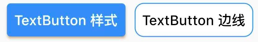
OutlinedButton(
style: TextButton.styleFrom(
backgroundColor: Colors.orange,
primary: Colors.white,
elevation: 2,
shadowColor: Colors.orangeAccent),
child: Text('ElevatedButton样式'),
onPressed: _onPressed,
onLongPress: _onLongPress,
),
OutlinedButton(
style: TextButton.styleFrom(
backgroundColor: Colors.white,
primary: Colors.black,
side: BorderSide(color: Colors.blue,width: 1),
shape: RoundedRectangleBorder(
borderRadius: BorderRadius.all(Radius.circular(10))
),
// elevation: 2,
shadowColor: Colors.orangeAccent),
child: Text('ElevatedButton边线'),
autofocus: false,
onPressed: _onPressed,
onLongPress: _onLongPress,
),
],
),
);
}
_onPressed() {}
_onLongPress() {}
}
FlatButton 扁平按钮 (3.0.0废弃)
无阴影的平按钮,基于MaterialButton实现,所有属性和MaterialButton类似
FlatButton 扁平按钮 比凸起按钮小格阴影 (扁平按钮的属性跟按键的用法一样,属性一样的)
| 属性 | 注释 |
|---|---|
| color | 颜色【Color】 |
| padding | 内边距【EdgeinsetsGeometry】 |
| highlightColor | 长按高亮色【Color】 |
| textColor | 子组件文字颜色【Color】 |
| child | 子组件【Widget】 |
| splashColor | 水波颜色【Color】 |
| onPressed | 点击事件 【Function】 |
class CustomFlatButton extends StatelessWidget {
  @override
  Widget build(BuildContext context) {
    return FlatButton(
      onPressed: ()=>{},
      padding: EdgeInsets.all(8),
      splashColor: Colors.green,
      child: Text("FlatButton"),
      textColor: Color(0xffFfffff),
      color: Colors.blue,
      highlightColor: Color(0xffF88B0A),
    );
  }
}

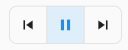
ToggleButtons 切换按键组
接收组件列表,可指定边线,圆角颜色等属性根据具体逻辑,可以实现多个按键单选或多选的需求。
| 属性 | 注释 |
|---|---|
| onPressed | 点击事件 【Function】 |
| children | 子组件集【List】 |
| borderWidth | 边线宽【double】 |
| isSelected | 是否选中集【list】 |
| mouseCursor | xxxx |
| textStyle | 文本样式 |
| constraints | 宽高最大最小限制 |
| color | 未选中颜色【Color】 |
| selectedColor | 选中时组件色【Color】 |
| disabledColor | 不可选中颜色【Color】 |
| fillColor | 选中时填充色【Color】 |
| focusColor | 有输入焦点时颜色 【Color】 |
| highlightColor | 选中时高亮颜色 【Color】 |
| hoverColor | 初始水波纹颜色【Color】 |
| splashColor | 选中时水波纹颜色 【Color】 |
| focusNodes | 接受对应于每个切换按钮焦点列表 |
| renderBorder | 是否绘制边框 |
| borderColor | 边线色【Color】 |
| selectedBorderColor | 选中边线色【Color】 |
| disabledBorderColor | 不可选中边框颜色【Color】 |
| borderRadius | 圆角【BorderRadius】 |
| borderWidth | 边框宽度 【double】 |
| direction | Axis.horizontal 默认 |
| verticalDirection | VerticalDirection.down 默认 |
class CustomToggleButtons extends StatefulWidget {
@override
_CustomToggleButtonsState createState() => _CustomToggleButtonsState();
}
class _CustomToggleButtonsState extends State<CustomToggleButtons> {
var _isSelectedList = [true, false, false];
@override
Widget build(BuildContext context) {
return Scaffold(//手脚架组件
appBar: AppBar(
title: const Text('Hello Flutter'),
backgroundColor: Colors.red,
centerTitle: true,//标题居中显示
elevation: 1,//影深
),
body: Center(// 设置剧中对齐
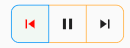
child: ToggleButtons(
children: <Widget>[
Icon(Icons.skip_previous),
Icon(Icons.pause),
Icon(Icons.skip_next),
],
borderWidth: 1,
borderRadius: BorderRadius.circular(10),
isSelected: _isSelectedList,
onPressed: (value) => setState(() {
_isSelectedList = _isSelectedList.map((e) => false).toList();
_isSelectedList[value] = true;
}),
)
),
);
}
}
ToggleButtonTheme 滑块样式
说明: ToggleButton的样式设置可以用下面的设置方法,但是在开发中也可以不用这么写,因为ToggleButtons本身自带了这些样式的属性,可以直接点出来进行设置,例如看下面的图片.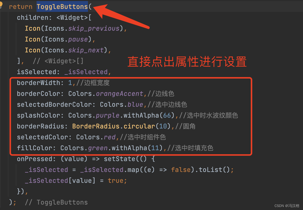
主要用于为后代的ToggleButton组件同意设置默认属性,也可以通过该组件获取默认ToggleButtons的属性。
可指定ToggleButtonThemeData数据属性后代的ToggleButtons组件设默认样式,如边框样式,颜色,装饰等,也可以用ToggleButtonsTheme.of获取ToggleButtons的主题数据。
class ToggleButtonsThemeDemo extends StatelessWidget {
  @override
  Widget build(BuildContext context) {
    return ToggleButtonsTheme(
      data: ToggleButtonsTheme.of(context).copyWith(
        borderWidth: 1,
        borderColor: Colors.orangeAccent,
        selectedBorderColor: Colors.blue,
        splashColor: Colors.purple.withAlpha(66),
        borderRadius: BorderRadius.circular(10),
        selectedColor: Colors.red,
        fillColor: Colors.green.withAlpha(11),
      ),
      child: _ToggleButtonsSimple(),
    );
  }
}


class _ToggleButtonsSimple extends StatefulWidget {
  @override
  _ToggleButtonsSimpleState createState() => _ToggleButtonsSimpleState();
}

class _ToggleButtonsSimpleState extends State<_ToggleButtonsSimple> {
  var _isSelected = [true, false, false];

  @override
  Widget build(BuildContext context) {
    return ToggleButtons(
      children: <Widget>[
        Icon(Icons.skip_previous),
        Icon(Icons.pause),
        Icon(Icons.skip_next),
      ],
      isSelected: _isSelected,
      onPressed: (value) => setState(() {
        _isSelected = _isSelected.map((e) => false).toList();
        _isSelected[value] = true;
      }),
    );
  }
}
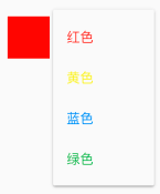
DropdownButton 下拉按键
用于下拉选中的按键,可指定图标,影深,只是等属性,接收选中变化的事件。
| 属性 | 注释 |
|---|---|
| value | 当前值【T】 |
| items | 下拉选择框【List】 |
| icon | 图标【Widget】 |
| elevation | 影深【double】 |
| onChanged | 选择条目事件【Function(T)】 |
| backgroundColor | 背景色【Color】 |
| isDense | 是否紧排【bool】 |
| iconSize | 图标大小【double】 |
| hint | 提示组件【Widget】 |
| iconEnabledColor | 图标颜色【Color】 |
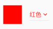
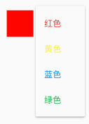
class CustomDropDownButton extends StatefulWidget {
  @override
  _CustomDropDownButtonState createState() => _CustomDropDownButtonState();
}

class _CustomDropDownButtonState extends State<CustomDropDownButton> {
  Color _color = Colors.red;
  final _colors = [Colors.red, Colors.yellow, Colors.blue, Colors.green];
  final _info = ["红色", "黄色", "蓝色", "绿色"];

  @override
  Widget build(BuildContext context) {
    return Wrap(
      children: <Widget>[
        Container(
          margin: EdgeInsets.symmetric(horizontal: 20),
          width: 50,
          height: 50,
          color: _color,
        ),
        DropdownButton<Color>(
            value: _color,
            elevation: 1,
            icon: Icon(
              Icons.expand_more,
              size: 20,
              color: _color,
            ),
            items: _buildItems(),
            onChanged: (v) => setState(() => _color = v)),
      ],
    );
  }

  List<DropdownMenuItem<Color>> _buildItems() => _colors
      .map((e) => DropdownMenuItem<Color>(
          value: e,
          child: Text(
            _info[_colors.indexOf(e)],
            style: TextStyle(color: e),
          )))
      .toList();
}
DropdownButtonFormField 表单下拉框
底层依赖DropdownButton实现,所以基本属性类似,但拥有FormField的特性,可以回调 onSaved, validator方法。
| 属性 | 注释 |
|---|---|
| item | List<DropdownMenuItem> |
| validator | FormFieldValidator |
| onSaved | 表单保存回调【formFieldSetter】 |
class DropdownButtonFormFieldDemo extends StatefulWidget {
  @override
  _DropdownButtonFormFieldDemoState createState() => _DropdownButtonFormFieldDemoState();
}

class _DropdownButtonFormFieldDemoState extends State<DropdownButtonFormFieldDemo> {
  Color _color;
  final _colors = [Colors.red, Colors.yellow, Colors.blue, Colors.green];
  final _info = ["红色", "黄色", "蓝色", "绿色"];

  @override
  Widget build(BuildContext context) {
    return Wrap(
      children: <Widget>[
        Container(
          margin: EdgeInsets.symmetric(horizontal: 20),
          width: 50,
          height: 50,
          color: _color??_colors[0],
        ),

        SizedBox(
          width: 80,
          child: DropdownButtonFormField<Color>(
              value: _color,
              elevation: 1,
              hint: Text('选择颜色',style: TextStyle(fontSize: 12),),
              icon: Icon(
                Icons.expand_more,
                size: 20,
                color: _color,
              ),
              items: _buildItems(),
              onChanged: (v) => setState(() => _color = v)
          ),
        )

      ],
    );
  }

  List<DropdownMenuItem<Color>> _buildItems() => _colors
      .map((e) => DropdownMenuItem<Color>(
      value: e,
      child: Text(
        _info[_colors.indexOf(e)],
        style: TextStyle(color: e),
      )))
      .toList();
}
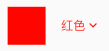
DropdownButtonHideUnderline 下拉按键隐藏线
用于去除DropdownButton的下划线,本身没有什么应用价值
| 属性 | 注释 |
|---|---|
| child | 子组件【Widget】 |
class CustomDropDownButtonHideUnderline extends StatefulWidget {
  @override
  _CustomDropDownButtonHideUnderlineState createState() =>
      _CustomDropDownButtonHideUnderlineState();
}

class _CustomDropDownButtonHideUnderlineState
    extends State<CustomDropDownButtonHideUnderline> {
  Color _color = Colors.red;
  final _colors = [Colors.red, Colors.yellow, Colors.blue, Colors.green];
  final _info = ["红色", "黄色", "蓝色", "绿色"];

  @override
  Widget build(BuildContext context) {
    return Wrap(
      children: <Widget>[
        Container(
          margin: EdgeInsets.symmetric(horizontal: 20),
          width: 50,
          height: 50,
          color: _color,
        ),
        DropdownButtonHideUnderline(
          child: DropdownButton<Color>(
              value: _color,
              elevation: 1,
              icon: Icon(
                Icons.expand_more,
                size: 20,
                color: _color,
              ),
              items: _buildItems(),
              onChanged: (v) => setState(() => _color = v)),
        ),
      ],
    );
  }

  List<DropdownMenuItem<Color>> _buildItems() => _colors
      .map((e) => DropdownMenuItem<Color>(
          value: e,
          child: Text(
            _info[_colors.indexOf(e)],
            style: TextStyle(color: e),
          )))
      .toList();
}
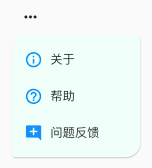
PopupMenuButton 菜单按键
弹出菜单栏,可指定偏移,颜色,影深,形状等属性,接收item选中的时间和取消选择事件。
| 属性 | 注释 |
|---|---|
| itemBuilder | 构造器 |
| offset | 偏移【Offset】 |
| color | 背景颜色【Color】 |
| shape | 形状【ShapeBorder】 |
| elevation | 影深【double】 |
| onCanceled | 取消事件【Function()】 |
| onSelected | 选择事件【Function(T)】 |
class CustomPopupMenuButton extends StatefulWidget {
  @override
  _CustomPopupMenuButtonState createState() => _CustomPopupMenuButtonState();
}

class _CustomPopupMenuButtonState extends State<CustomPopupMenuButton> {
  final map = {
    "关于": Icons.info_outline,
    "帮助": Icons.help_outline,
    "问题反馈": Icons.add_comment,
  };

  @override
  Widget build(BuildContext context) {
    return PopupMenuButton<String>(
      itemBuilder: (context) => buildItems(),
      offset: Offset(0, 50),
      color: Color(0xffF4FFFA),
      elevation: 1,
      shape: RoundedRectangleBorder(
          borderRadius: BorderRadius.only(
            topLeft: Radius.circular(20),
            bottomRight: Radius.circular(20),
            topRight: Radius.circular(5),
            bottomLeft: Radius.circular(5),
          )),
      onSelected: (e) {
        print(e);
        if (e == '关于') {
          // DialogAbout.show(context);
        }
      },
      onCanceled: () => print('onCanceled'),
    );
  }

  List<PopupMenuItem<String>> buildItems() {
    return map.keys
        .toList()
        .map((e) => PopupMenuItem<String>(
        value: e,
        child: Wrap(
          spacing: 10,
          children: <Widget>[
            Icon(
              map[e],
              color: Colors.blue,
            ),
            Text(e),
          ],
        )))
        .toList();
  }
}
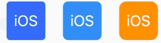
CupertinoButton iOS按键
iOS风格的按键。可指定颜色,点击是透明度,内边框,圆角等,可接收点击事件。
| 属性 | 注释 |
|---|---|
| color | 颜色【Color】 |
| child | 子组件【Widget】 |
| padding | 内边距【EdgeinsetsGeometry】 |
| borderRadius | 圆角【BorderRadius】 |
| onPressed | 点击事件 【Function】 |
| pressedOpacity | 按下时透明度【double】 |
class CustomCupertinoButton extends StatelessWidget {
  @override
  Widget build(BuildContext context) {
    var data = {
      CupertinoColors.activeBlue:4.0,
      Colors.blue:6.0,
      CupertinoColors.activeOrange:8.0,
    };
    return Wrap(
      spacing: 20,
      children:data.keys.map((e)=> CupertinoButton(
        padding: EdgeInsets.zero,
        onPressed: () => Navigator.of(context).pushNamed('AboutMePage'),
        color: e,
        pressedOpacity: 0.4,
        borderRadius:  BorderRadius.all(Radius.circular(data[e])),
        child: Text("iOS"),
      )).toList()
    );
  }
}
TextButton 文字样式
Material风格的文字按钮,默认只有问题,点击时有水波纹,可通过样式更改边框,颜色,阴影等属性。
| 属性 | 注释 |
|---|---|
| style | 按键样式【ButtonStyle】 |
| focusNode | 焦点 【FocusNode】 |
| clipBehavior | 裁切行为【Clip】 |
| autofocus | 自动聚焦【bool】 |
| child | 是否具有滚动主体【Widget】 |
| onPressed | 点击事件 【Function】 |
| onLongPress | 长按事件 【Function】 |
代码1
class TextButtonDemo extends StatelessWidget {
  @override
  Widget build(BuildContext context) {
    return Container(
        alignment: Alignment.center,
        height: 60,
        child: Wrap(
          spacing: 20,
          children: [
            TextButton(
              child: Text('TextButton 文字'),
              onPressed: _onPressed,
              onLongPress: _onLongPress,
            ),
            TextButton(
              child: Text('TextButton 禁用'),
              onPressed: null,
              onLongPress: null,
            ),
          ],
        ));
  }

  _onPressed() {}

  _onLongPress() {}
}
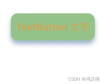
代码2
TextButton(
  child: Text('TextButton 文字'),
  autofocus: false,//自动聚焦
  style: TextButton.styleFrom(
    backgroundColor: Colors.green[300],//背景颜色
    padding: EdgeInsets.symmetric(horizontal: 8),//内边距
    primary: Colors.orange,//文本颜色
    elevation: 5,//影深
    shadowColor: Colors.blue[300],//阴影颜色
    shape: RoundedRectangleBorder(//如果不设置,默认圆的半径,注释代码就能看到效果
      borderRadius: BorderRadius.all(Radius.circular(10))//设置圆角半径
    )
  ),
  onPressed: () { print('object'); },
  // onLongPress: _onLongPress,//长按点击方法
),
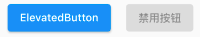
ElevatedButton 高架按键
Material风格的生气按钮,表现和RaisedButton类似,可通过样式更改边框,颜色,阴影等属性。
| 属性 | 注释 |
|---|---|
| sytle | 按钮样式【buttonStyle】 |
| focusNode | 焦点【FocusNode】 |
| clipBehavior | 裁切行为【Clip】 |
| autofocus | 自动聚焦【bool】 |
| child | 是否具有滚动主体【Widget】 |
| onPressed | 点击事件【Function】 |
| onLongPress | 长按事件【Function】 |
说明:很多按键都有自己的sytle,类型 buttonStyle下面针对他的使用,每个属性都说一下.
ButtonStyle(// 按键样式
  backgroundColor: MaterialStateProperty.all(Color(0xffffffff)),      //背景颜色
  foregroundColor: MaterialStateProperty.all(Color(0xff5E6573)),      //字体颜色
  overlayColor: MaterialStateProperty.all(Color(0xffffaaaa)),         //高亮色
  shadowColor: MaterialStateProperty.all( Color(0xffff00a9)),         //阴影颜色
  surfaceTintColor: MaterialStateProperty.all(Colors.green),          //表面颜色
  elevation: MaterialStateProperty.all(4.0),                          //阴影值(海拔高度)
  padding: MaterialStateProperty.all(EdgeInsets.all(16.0)),           //内边距
  minimumSize: MaterialStateProperty.all(Size(150.0, 50.0)),          //最小尺寸
  maximumSize: MaterialStateProperty.all(Size(300.0, 80.0)),          //最大尺寸
  fixedSize: MaterialStateProperty.all(Size(200.0, 60.0)),            //固定尺寸
  iconColor: MaterialStateProperty.all(Colors.red),                   //图标颜色
  iconSize: MaterialStateProperty.all(24.0),                          //图标大小
  visualDensity: VisualDensity(horizontal: 0.0, vertical: 0.0),       //视觉密度
  tapTargetSize: MaterialTapTargetSize.shrinkWrap,                    //点击的可视区域的大小
  animationDuration: Duration(milliseconds: 500),                     //动画持续时间
  enableFeedback: true,                                               //控制按钮是否提供触摸反馈(例如震动)
  alignment: Alignment.center,                                        //对齐方式
  splashFactory: NoSplash.splashFactory,                              //使用自定义的工厂(点击后的博文效果不一样)
  side: MaterialStateProperty.all(                                    //边框
      BorderSide(
        color: Colors.black,//颜色
        width: 2.0,//宽度
      )
  ),
  shape: MaterialStateProperty.all(                                   //圆角弧度
      CircleBorder(
          side: BorderSide(     //设置 界面效果
            color: Colors.green,//
            width: 280.0,//圆弧直径
            style: BorderStyle.none,
          )
      )
  ),
  textStyle: MaterialStateProperty.all(                               //文本样式
      TextStyle(
          fontSize: 12,
          fontWeight: FontWeight.bold,
          color: Colors.white,
      )
  ),
  side: MaterialStateProperty.all(                                    //边框
      BorderSide(
          width: 1,
          color: Color(0xffCAD0DB)
      )
  ),
  // mouseCursor:  //(未知怎么使用)光标形状
)
按键使用详情
class CustomDropDownButton extends StatefulWidget {
  @override
  _CustomDropDownButtonState createState() => _CustomDropDownButtonState();
}

class _CustomDropDownButtonState extends State<CustomDropDownButton> {

  final map = {
    "关于": Icons.info_outline,
    "帮助": Icons.help_outline,
    "问题反馈": Icons.add_comment,
  };

  @override
  Widget build(BuildContext context) {
    return Scaffold( //手脚架组件
      appBar: AppBar(
        title: const Text('Hello Flutter'),
        backgroundColor: Colors.blue[300],
        centerTitle: true, //标题居中显示
        elevation: 1, //影深
      ),
      body: Center( // 设置剧中对齐
        child: ElevatedButton(
          style: ButtonStyle(// 按键样式
            backgroundColor: MaterialStateProperty.all(Color(0xffffffff)),      //背景颜色
            foregroundColor: MaterialStateProperty.all(Color(0xff5E6573)),      //字体颜色
            overlayColor: MaterialStateProperty.all(Color(0xffffaaaa)),         //高亮色
            shadowColor: MaterialStateProperty.all( Color(0xffff00a9)),         //阴影颜色
            surfaceTintColor: MaterialStateProperty.all(Colors.green),          //表面颜色
            elevation: MaterialStateProperty.all(4.0),                          //阴影值(海拔高度)
            padding: MaterialStateProperty.all(EdgeInsets.all(16.0)),           //内边距
            minimumSize: MaterialStateProperty.all(Size(150.0, 50.0)),          //最小尺寸
            maximumSize: MaterialStateProperty.all(Size(300.0, 80.0)),          //最大尺寸
            fixedSize: MaterialStateProperty.all(Size(200.0, 60.0)),            //固定尺寸
            iconColor: MaterialStateProperty.all(Colors.red),                   //图标颜色
            iconSize: MaterialStateProperty.all(24.0),                          //图标大小
            visualDensity: VisualDensity(horizontal: 0.0, vertical: 0.0),       //视觉密度
            tapTargetSize: MaterialTapTargetSize.shrinkWrap,                    //点击的可视区域的大小
            animationDuration: Duration(milliseconds: 500),                     //动画持续时间
            enableFeedback: true,                                               //控制按钮是否提供触摸反馈(例如震动)
            alignment: Alignment.center,                                        //对齐方式
            splashFactory: NoSplash.splashFactory,                              //使用自定义的工厂(点击后的博文效果不一样)
            side: MaterialStateProperty.all(                                    //边框
                BorderSide(
                  color: Colors.black,//颜色
                  width: 2.0,//宽度
                )
            ),
            shape: MaterialStateProperty.all(                                   //圆角弧度
                CircleBorder(
                    side: BorderSide(     //设置 界面效果
                      color: Colors.green,//
                      width: 280.0,//圆弧直径
                      style: BorderStyle.none,
                    )
                )
            ),
            textStyle: MaterialStateProperty.all(                               //文本样式
                TextStyle(
                    fontSize: 12,
                    fontWeight: FontWeight.bold,
                    color: Colors.white,
                )
            ),
            side: MaterialStateProperty.all(                                    //边框
                BorderSide(
                    width: 1,
                    color: Color(0xffCAD0DB)
                )
            ),
            // mouseCursor:  //(未知怎么使用)光标形状
          ),
          child: Icon(Icons.star),
          //child: Text('带图标的按钮'),
          onPressed: () {},
          onLongPress: _onLongPress,
        ),
      ),
    );
  }

  _onLongPress() {

  }

}
CupertionNavigationBarBackButton iOS风格返回按键
Cupertino风格的导航栏返回按键,可指定颜色和点击事件,一般不单独使用。
| 属性 | 注释 |
|---|---|
| onPressed | 点击事件 【Function】 |
| color | 颜色【Color】 |
import 'package:flutter/cupertino.dart';
CupertinoNavigationBarBackButton(
  color: Colors.deepPurpleAccent,
  onPressed: ()=>Navigator.of(context).pop(),
)

BackButton 返回按键
一个具有发挥功能的IconButton,返回图标不可更改。在iOS和Android中表现不同。
| 属性 | 注释 |
|---|---|
| color | 颜色【Color】 |
| onPressed | 点击事件 【Function】 |
class CustomBackButton extends StatelessWidget {
  @override
  Widget build(BuildContext context) {
    var data = [Colors.red,Colors.yellow,Colors.blue,Colors.green];
    return Wrap(
        spacing: 10,
        children: data.map((e)=>BackButton(
          color: e,
        )).toList()
    );
  }
}
CloseButton 关闭按键
一个具有关闭功能的IconButton,关闭图标不可更改。
| 属性 | 注释 |
|---|---|
| onPressed | 点击事件 【Function】 |
 Center(
  child: CloseButton(),
)

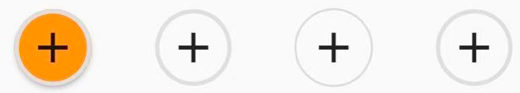
ButtonTheme 按键样式
主要用于为后代的按键类型组件同意设置默认属性,也可以通过该组件获取默认按键属性。
属性参数ButtonTheme.of获取按钮主题数据,也可以未ButtonTheme【后代】的俺就组件设置默认样式,包括颜色,形状,尺寸等。
class ButtonThemeDemo extends StatelessWidget {
  @override
  Widget build(BuildContext context) {
    return ButtonTheme(
      buttonColor: Colors.orange,
      splashColor: Colors.blue,
      minWidth: 40,
      shape: CircleBorder(
        side: BorderSide(width: 2.0, color: Color(0xFFFFDFDFDF)),
      ),
      child: Wrap(
        spacing: 10,
        children: <Widget>[
          RaisedButton(onPressed: (){},child: Icon(Icons.add)),
          FlatButton(onPressed: (){},child: Icon(Icons.add)),
          OutlineButton(onPressed: (){},child: Icon(Icons.add)),
          MaterialButton(onPressed: (){},child: Icon(Icons.add)),
        ],
      ),
    );
  }
}

有“AI”的1024 = 2048,欢迎大家加入2048 AI社区
更多推荐
 2
2 0
0- 0


 已为社区贡献2条内容

所有评论(0)