关于红酒品质的python数据分析
import pandas as pdimport numpy as npimport matplotlib.pyplot as pltimport seaborn as sns# 颜色color = sns.color_palette()print(color)# 数据精度pd.set_option('precision', 3)[(0.8862745098039215, 0.290196078
import pandas as pd
import numpy as np
import matplotlib.pyplot as plt
import seaborn as sns

# 颜色
color = sns.color_palette()
print(color)
# 数据精度
pd.set_option('precision', 3)
[(0.8862745098039215, 0.2901960784313726, 0.2), (0.20392156862745098, 0.5411764705882353, 0.7411764705882353), (0.596078431372549, 0.5568627450980392, 0.8352941176470589), (0.4666666666666667, 0.4666666666666667, 0.4666666666666667), (0.984313725490196, 0.7568627450980392, 0.3686274509803922), (0.5568627450980392, 0.7294117647058823, 0.25882352941176473), (1.0, 0.7098039215686275, 0.7215686274509804)]
df=pd.read_csv('winequality-red.csv',sep = ';')
df.head()

#  字段含义
#"fixed acidity";"volatile acidity";"citric acid";"residual sugar";"chlorides";"free sulfur dioxide";"total sulfur dioxide";"density";"pH";"sulphates";"alcohol";"quality"
# “固定酸度”;“挥发性酸度”;    “柠檬酸”;     “残糖”;    氯化物”;“游离二氧化硫”;       “总二氧化硫”;     “密度”;“pH”;“硫酸盐”;“酒精”;“质量”
| fixed acidity | volatile acidity | citric acid | residual sugar | chlorides | free sulfur dioxide | total sulfur dioxide | density | pH | sulphates | alcohol | quality | |
|---|---|---|---|---|---|---|---|---|---|---|---|---|
| 0 | 7.4 | 0.70 | 0.00 | 1.9 | 0.076 | 11.0 | 34.0 | 0.998 | 3.51 | 0.56 | 9.4 | 5 |
| 1 | 7.8 | 0.88 | 0.00 | 2.6 | 0.098 | 25.0 | 67.0 | 0.997 | 3.20 | 0.68 | 9.8 | 5 |
| 2 | 7.8 | 0.76 | 0.04 | 2.3 | 0.092 | 15.0 | 54.0 | 0.997 | 3.26 | 0.65 | 9.8 | 5 |
| 3 | 11.2 | 0.28 | 0.56 | 1.9 | 0.075 | 17.0 | 60.0 | 0.998 | 3.16 | 0.58 | 9.8 | 6 |
| 4 | 7.4 | 0.70 | 0.00 | 1.9 | 0.076 | 11.0 | 34.0 | 0.998 | 3.51 | 0.56 | 9.4 | 5 |
df.info()
df.describe()
<class 'pandas.core.frame.DataFrame'>
RangeIndex: 1599 entries, 0 to 1598
Data columns (total 12 columns):
fixed acidity           1599 non-null float64
volatile acidity        1599 non-null float64
citric acid             1599 non-null float64
residual sugar          1599 non-null float64
chlorides               1599 non-null float64
free sulfur dioxide     1599 non-null float64
total sulfur dioxide    1599 non-null float64
density                 1599 non-null float64
pH                      1599 non-null float64
sulphates               1599 non-null float64
alcohol                 1599 non-null float64
quality                 1599 non-null int64
dtypes: float64(11), int64(1)
memory usage: 150.0 KB
| fixed acidity | volatile acidity | citric acid | residual sugar | chlorides | free sulfur dioxide | total sulfur dioxide | density | pH | sulphates | alcohol | quality | |
|---|---|---|---|---|---|---|---|---|---|---|---|---|
| count | 1599.000 | 1599.000 | 1599.000 | 1599.000 | 1599.000 | 1599.000 | 1599.000 | 1599.000 | 1599.000 | 1599.000 | 1599.000 | 1599.000 |
| mean | 8.320 | 0.528 | 0.271 | 2.539 | 0.087 | 15.875 | 46.468 | 0.997 | 3.311 | 0.658 | 10.423 | 5.636 |
| std | 1.741 | 0.179 | 0.195 | 1.410 | 0.047 | 10.460 | 32.895 | 0.002 | 0.154 | 0.170 | 1.066 | 0.808 |
| min | 4.600 | 0.120 | 0.000 | 0.900 | 0.012 | 1.000 | 6.000 | 0.990 | 2.740 | 0.330 | 8.400 | 3.000 |
| 25% | 7.100 | 0.390 | 0.090 | 1.900 | 0.070 | 7.000 | 22.000 | 0.996 | 3.210 | 0.550 | 9.500 | 5.000 |
| 50% | 7.900 | 0.520 | 0.260 | 2.200 | 0.079 | 14.000 | 38.000 | 0.997 | 3.310 | 0.620 | 10.200 | 6.000 |
| 75% | 9.200 | 0.640 | 0.420 | 2.600 | 0.090 | 21.000 | 62.000 | 0.998 | 3.400 | 0.730 | 11.100 | 6.000 |
| max | 15.900 | 1.580 | 1.000 | 15.500 | 0.611 | 72.000 | 289.000 | 1.004 | 4.010 | 2.000 | 14.900 | 8.000 |
# 获取所有的自带样式
print(plt.style.available)

#  使用plt自带的样式美化
plt.style.use('ggplot')
['bmh', 'classic', 'dark_background', 'fast', 'fivethirtyeight', 'ggplot', 'grayscale', 'seaborn-bright', 'seaborn-colorblind', 'seaborn-dark-palette', 'seaborn-dark', 'seaborn-darkgrid', 'seaborn-deep', 'seaborn-muted', 'seaborn-notebook', 'seaborn-paper', 'seaborn-pastel', 'seaborn-poster', 'seaborn-talk', 'seaborn-ticks', 'seaborn-white', 'seaborn-whitegrid', 'seaborn', 'Solarize_Light2', 'tableau-colorblind10', '_classic_test']
#  获取每个字段
# 方法1
colnm = df.columns.to_list()
print(colnm)
print(len(colnm))
# 方法2
print()
print(list(df))
['fixed acidity', 'volatile acidity', 'citric acid', 'residual sugar', 'chlorides', 'free sulfur dioxide', 'total sulfur dioxide', 'density', 'pH', 'sulphates', 'alcohol', 'quality']
12

['fixed acidity', 'volatile acidity', 'citric acid', 'residual sugar', 'chlorides', 'free sulfur dioxide', 'total sulfur dioxide', 'density', 'pH', 'sulphates', 'alcohol', 'quality']
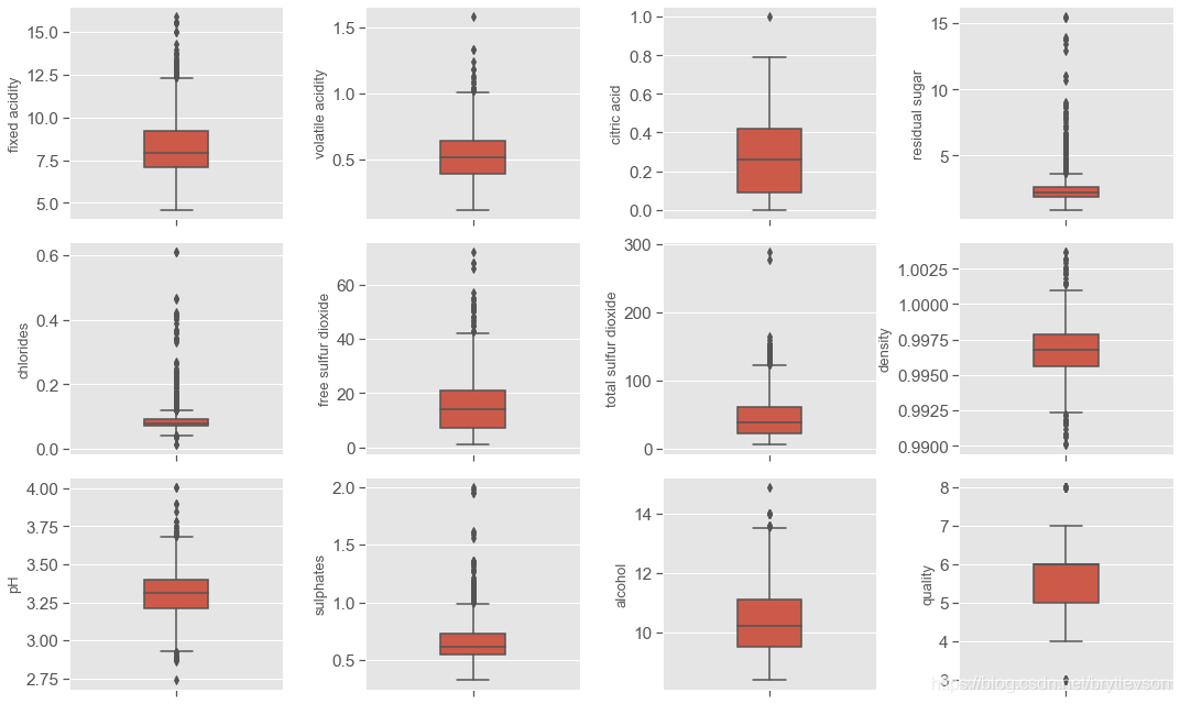
#  绘制箱线图1
fig = plt.figure(figsize=(15,9))
for i in range(12):
    plt.subplot(3,4,i+1)  # 三行四列 位置是i+1的子图
    # orient:"v"|"h" 用于控制图像使水平还是竖直显示(这通常是从输入变量的dtype推断出来的,此参数一般当不传入x、y,只传入data的时候使用)
    sns.boxplot(df[colnm[i]], orient="v", width = 0.3, color = color[0])
    plt.ylabel(colnm[i],fontsize = 13)
    # plt.xlabel('one_pic')
#  图形调整
plt.subplots_adjust(left=0.2, wspace=0.8, top=0.9, hspace=0.1)  #  子图的左侧 子图之间的宽度间隔   子图的高   子图之间的高度间隔
# tight_layout会自动调整子图参数,使之填充整个图像区域
plt.tight_layout()
print('箱线图')
箱线图
# 绘制直方图
fig = plt.figure(figsize=(15, 9))
for i in range(12):
    plt.subplot(3,4,i+1)  # 3行4列 位置是i+1的子图
    df[colnm[i]].hist(bins=80, color=color[1])  # bins 指定显示多少竖条
    plt.xlabel(colnm[i], fontsize=13)
    plt.ylabel('Frequency')
# tight_layout会自动调整子图参数,使之填充整个图像区域
plt.tight_layout()
# plt.savefig('hist.png')
print('直方图')
直方图

结论
根据箱线图和直方图,这个数据集主要研究红酒品质和理化性质之间的关系,品质质量评价范围是0-10,这个数据集的评价范围是3-8,其中82%的品质是5和6.
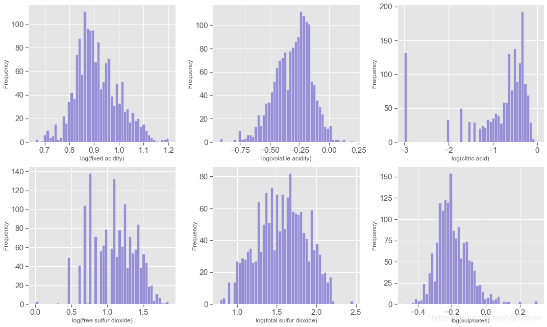
“fixed acidity”;“volatile acidity”;“citric acid”;“free sulfur dioxide” ;total sulfur dioxide; “sulphates”; PH
“固定酸度”; “挥发性酸度”; “柠檬酸”; “游离二氧化硫” “总二氧化硫”; “硫酸盐”;
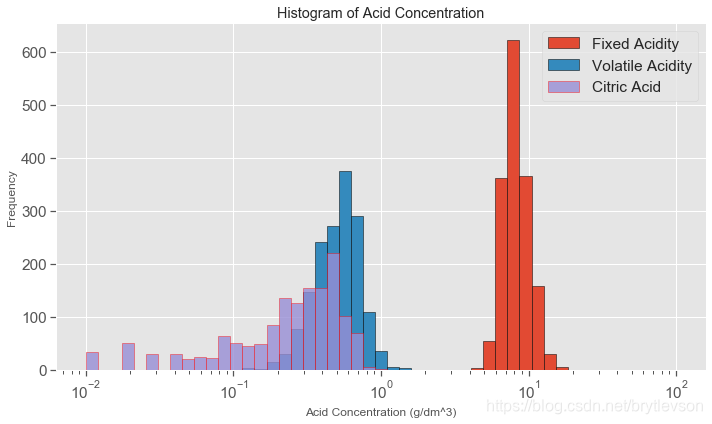
这个数据集总共有七个和酸度有关系的;前六个特征都是与酸度ph有关系的, pH是在对数的尺度,下面对前6个特征取对数然后作histogram。另外,pH值主要是与fixed acidity有关,fixed acidity比volatile acidity和citric acid高1到2个数量级(Figure 4),比free sulfur dioxide, total sulfur dioxide, sulphates高3个数量级。一个新特征total acid来自于前三个特征的和。
acidityFeat = ['fixed acidity', 'volatile acidity', 'citric acid',
               'free sulfur dioxide', 'total sulfur dioxide', 'sulphates']
fig = plt.figure(figsize=(15, 9))
for i in range(6):
    plt.subplot(2,3,i+1)
    v = np.log10(np.clip(df[acidityFeat[i]].values, a_min = 0.001, a_max = None))  # clip这个函数将将数组中的元素限制在a_min, a_max之间,大于a_max的就使得它等于 a_max,小于a_min,的就使得它等于a_min
    plt.hist(v, bins = 50, color = color[2])
    plt.xlabel('log(' + acidityFeat[i] + ')',fontsize = 12)

    plt.ylabel('Frequency')
plt.tight_layout()
print('\nFigure 3: Acidity Features in log10 Scale')
Figure 3: Acidity Features in log10 Scale
plt.figure(figsize=(10,6))
# print(np.linspace(-2, 2))
bins = 10**(np.linspace(-2, 2))  #  间隔采样 默认stop=True  可以取到最后
# bins= 20
plt.hist(df['fixed acidity'], bins = bins, edgecolor = 'k', label = 'Fixed Acidity')  # edgecolor 直方图边框颜色
plt.hist(df['volatile acidity'], bins = bins, edgecolor = 'black', label = 'Volatile Acidity')
plt.hist(df['citric acid'], bins = bins, edgecolor = 'red', alpha = 0.8, label = 'Citric Acid')
plt.xscale('log')  #  把当前的图形x轴设置为对数坐标。
plt.xlabel('Acid Concentration (g/dm^3)')
plt.ylabel('Frequency')
plt.title('Histogram of Acid Concentration')
plt.legend()
plt.tight_layout()
print('Figure 4')
Figure 4
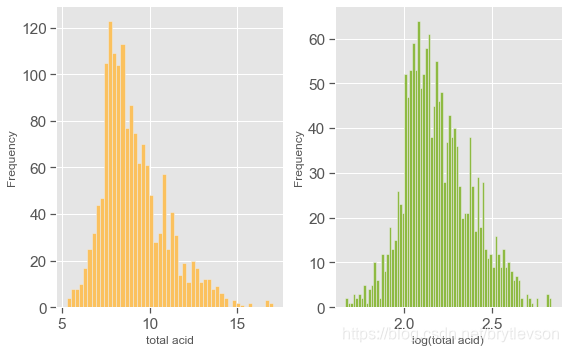
# 总酸度
df['total acid'] = df['fixed acidity'] + df['volatile acidity'] + df['citric acid']
# print(df)
plt.figure(figsize = (8,5))

plt.subplot(121)  #  # 第一张图中中图片排列方式为1行2列第一张图
plt.hist(df['total acid'], bins = 50, color = color[4])
plt.xlabel('total acid')
plt.ylabel('Frequency')

plt.subplot(122)
plt.hist(np.log(df['total acid']), bins = 80 , color = color[5])
plt.xlabel('log(total acid)')
plt.ylabel('Frequency')

plt.tight_layout()
print("Figure 5: Total Acid Histogram")

#  不设置plt.subplot 的话就是一张图了
# plt.hist(df['total acid'], bins = 50, color = color[4])
# plt.xlabel('total acid')
# plt.ylabel('Frequency')
# plt.hist(np.log(df['total acid']), bins = 80 , color = color[5])
# plt.xlabel('log(total acid)')
# plt.ylabel('Frequency')
Figure 5: Total Acid Histogram
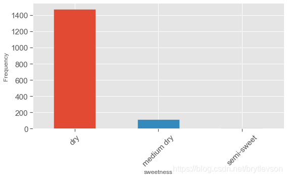
甜度
Residual sugar “残糖” 与酒的甜度相关,通常用来区别各种红酒,干红(<=4 g/L), 半干(4-12 g/L),半甜(12-45 g/L),和甜(>45 g/L)。 这个数据中,主要为干红,没有甜葡萄酒。
# 构建新的dataframe ['Residual sugar']   0,4  dry  4,12 medium dry 12,45 semi-sweet
df['sweetness'] = pd.cut(df['residual sugar'], bins = [0, 4, 12, 45],
                         labels=["dry", "medium dry", "semi-sweet"])
# print(df.head(10))
print()
print(df['sweetness'].value_counts())
dry           1474
medium dry     117
semi-sweet       8
Name: sweetness, dtype: int64
plt.figure(figsize = (8,5))

df['sweetness'].value_counts().plot(kind='bar', color=color)
plt.xticks(rotation=45)
plt.xlabel('sweetness', fontsize = 12)
plt.ylabel('Frequency', fontsize = 12)
plt.tight_layout()
print("Figure 6: Sweetness")
Figure 6: Sweetness
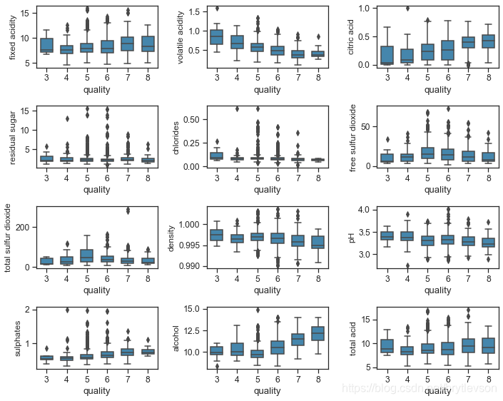
双变量分析
红酒品质和理化特征的关系
下面Figure 7和8分别显示了红酒理化特征和品质的关系。其中可以看出的趋势有:
品质好的酒有更高的柠檬酸,硫酸盐,和酒精度数。硫酸盐(硫酸钙)的加入通常是调整酒的酸度的。其中酒精度数和品质的相关性最高。
品质好的酒有较低的挥发性酸类,密度,和pH。
残留糖分,氯离子,二氧化硫似乎对酒的品质影响不大。
# set_style 有五种预设的seaborn主题:暗网格(darkgrid),白网格(whitegrid),全黑(dark),全白(white),全刻度(ticks)。
# 样式控制  set_style(), set_context()会设置matplotlib的默认参数。
sns.set_style('ticks')
sns.set_context("notebook", font_scale= 1.1)


# s = df.columns.tolist()
# print(s)
# colnm = df.columns.tolist()[:11] + ['total acid']
# print(colnm)

#  获取指定的列
colnm = df.columns.to_list()[:11] + ['total acid']
# print(df)
# print(colnm)
# final_df = df[colnm]
# print(final_df)

plt.figure(figsize = (10, 8))

for i in range(12):
    plt.subplot(4,3,i+1)
    sns.boxplot(x ='quality', y = colnm[i], data = df, color = color[1], width = 0.6)
    plt.ylabel(colnm[i],fontsize = 12)
plt.tight_layout()
print("\nFigure 7: Physicochemical Properties and Wine Quality by Boxplot")
Figure 7: Physicochemical Properties and Wine Quality by Boxplot
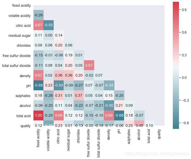
sns.set_style("dark")

plt.figure(figsize = (10,8))
colnm = df.columns.to_list()[:11] + ['total acid', 'quality']
# 不满足连续数据,正态分布,线性关系,用spearman相关系数是最恰,当两个定序测量数据之间也用spearman相关系数
# pearson:Pearson相关系数来衡量两个数据集合是否在一条线上面,即针对线性数据的相关系数计算,针对非线性数据便会有误差。
# kendall:用于反映分类变量相关性的指标,即针对无序序列的相关系数,非正太分布的数据
# spearman:非线性的,非正太分析的数据的相关系数
# mcorr = df[colnm].corr(method='spearman')

#  如果不是数字   get_dummies   one_hot 编码之后 计算相关系数

mcorr = df[colnm].corr()
# print(mcorr)

# zeros_like函数主要是想实现构造一个矩阵W_update,其维度与矩阵W一致,并为其初始化为全0;这个函数方便的构造了新矩阵,无需参数指定shape大小
# mask = np.zeros_like(mcorr, dtype=None)   #  0 0 0 0

mask = np.zeros_like(mcorr, dtype=np.bool)
# print(mask)

mask[np.triu_indices_from(mask)] = True   # 1
# print(mask)
# 调色盘 对图表整体颜色、比例进行风格设置,包括颜色色板等  调用系统风格进行数据可视化
cmap = sns.diverging_palette(220, 10, as_cmap=True)
#  热力图
g = sns.heatmap(mcorr, mask=mask, cmap=cmap, square=True, annot=True, fmt='0.2f')
print("\nFigure 8: Pairwise Correlation Plot")
Figure 8: Pairwise Correlation Plot
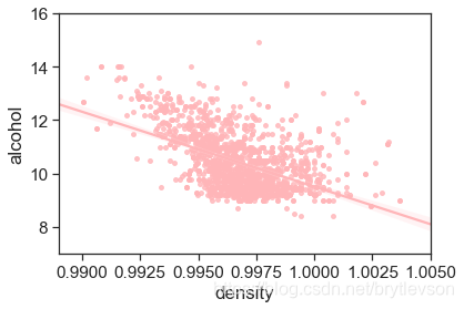
密度和酒精的关系
密度和酒精浓度是相关的,物理上,两者并不是线性关系。Figure 9展示了两者的关系。另外密度还与酒中其他物质的含量有关,但是关系很小。
sns.set_style('ticks')
sns.set_context("notebook", font_scale= 1.4)

# plot figure
plt.figure(figsize = (6,4))
#  scatter_kws 设置点的大小 density
sns.regplot(x='density', y = 'alcohol', data = df, scatter_kws = {'s':15}, color = color[6])
# 设置y轴刻度
plt.xlim(0.989, 1.005)
plt.ylim(7,16)
print('Figure 9: Density vs Alcohol')
Figure 9: Density vs Alcohol
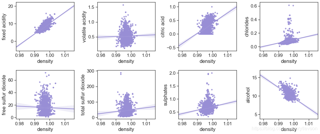
密度和其他特征的关系
由图10可以看出来 密度与固定酸度和酒精的相关性最好
otherFeat = ['fixed acidity', 'volatile acidity', 'citric acid',"chlorides",
               'free sulfur dioxide', 'total sulfur dioxide', 'sulphates', 'alcohol']
fig = plt.figure(figsize=(15, 9))
for i in range(8):
    plt.subplot(3,4,i+1)
    sns.regplot(x='density', y = otherFeat[i], data = df, scatter_kws = {'s':15}, color = color[2])
plt.tight_layout()
print('Figure 10: Density vs Other')
Figure 10: Density vs Other
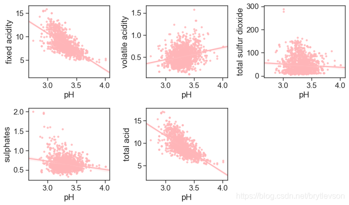
酸性物质含量和pH
pH和非挥发性酸性物质有-0.683的相关性。因为非挥发性酸性物质的含量远远高于其他酸性物质,总酸性物质(total acidity)这个特征并没有太多意义。
acidity_related = ['fixed acidity', 'volatile acidity', 'total sulfur dioxide',
                   'sulphates', 'total acid']

plt.figure(figsize = (10,6))

for i in range(5):
    plt.subplot(2,3,i+1)
    sns.regplot(x='pH', y = acidity_related[i], data = df, scatter_kws = {'s':10}, color = color[6])
plt.tight_layout()
print("Figure 11: pH vs acid")
Figure 11: pH vs acid
多变量分析
与品质相关性最高的三个特征是酒精浓度,挥发性酸度,和柠檬酸。下面图中显示的酒精浓度,挥发性酸和品质的关系。
酒精浓度,挥发性酸和品质:
对于好酒(7,8)以及差酒(3,4),关系很明显。但是对于中等酒(5,6),酒精浓度的挥发性酸度有很大程度的交叉。
根据下图可以得到 质量较好的酒含的酒精量较高, 质量不好的酒的挥发性酸较高。
plt.style.use('ggplot') #  样式美化

#  绘制回归模型
# lmplot  hue, col, row #定义数据子集的变量,并在不同的图像子集中绘制
# col_wrap: int, #设置每行子图数量            order: int, optional #多项式回归,设定指数         markers: 定义散点的图标

sns.lmplot(x = 'alcohol', y = 'volatile acidity', hue = 'quality',
           data = df, fit_reg = True, scatter_kws={'s':10}, height = 5)
print("Figure 12-1: Scatter Plots of Alcohol, Volatile Acid and Quality")
plt.show()

sns.lmplot(x = 'alcohol', y = 'volatile acidity', hue = 'quality',
           data = df, fit_reg = False, scatter_kws={'s':10}, height = 5)
print("Figure 12-2: Scatter Plots of Alcohol, Volatile Acid and Quality")
plt.show()
Figure 12-1: Scatter Plots of Alcohol, Volatile Acid and Quality
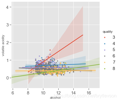
Figure 12-2: Scatter Plots of Alcohol, Volatile Acid and Quality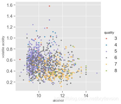
# hue, col, row #定义数据子集的变量,并在不同的图像子集中绘制    col 列表示的元素   显示格式:col=1
# col_wrap: int, #设置每行子图数量,即限制列         order: int, optional #多项式回归,设定指数         markers: 定义散点的图标
sns.lmplot(x = 'alcohol', y = 'volatile acidity', col='quality', hue = 'quality',
           data = df,fit_reg = False, height = 3,  aspect = 0.8, col_wrap=3,
           scatter_kws={'s':20})
print("Figure 12-3: Scatter Plots of Alcohol, Volatile Acid and Quality")
print()
plt.show()
sns.lmplot(x = 'alcohol', y = 'volatile acidity', col='quality', hue = 'quality',
           data = df,fit_reg = True, height = 3,  aspect = 0.9, col_wrap=3,
           scatter_kws={'s':20})
print("Figure 12-4: Scatter Plots of Alcohol, Volatile Acid and Quality")
Figure 12-3: Scatter Plots of Alcohol, Volatile Acid and Quality
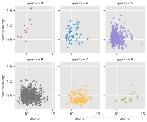
Figure 12-4: Scatter Plots of Alcohol, Volatile Acid and Quality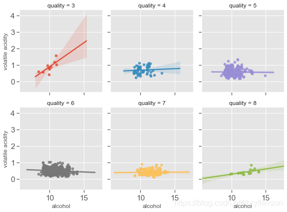
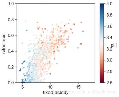
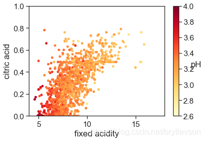
pH,非挥发性酸,和柠檬酸
pH和非挥发性的酸以及柠檬酸有相关性。整体趋势也很合理,浓度越高,pH越低,酒越酸。
# style
sns.set_style('ticks')
sns.set_context("notebook", font_scale= 1.4)

plt.figure(figsize=(6,5))
#get_cmap中取值可为:Possible values are: Accent, Accent_r, Blues, Blues_r, BrBG, BrBG_r, BuGn, BuGn_r, BuPu, BuPu_r,
# CMRmap, CMRmap_r, Dark2, Dark2_r, GnBu, GnBu_r, Greens, Greens_r, Greys, Greys_r, OrRd, OrRd_r, Oranges, Oranges_r,
# PRGn, PRGn_r, Paired, Paired_r, Pastel1, Pastel1_r, Pastel2, Pastel2_r, PiYG, PiYG_r, PuBu, PuBuGn, PuBuGn_r, PuBu_r,
# PuOr, PuOr_r, PuRd, PuRd_r, Purples, Purples_r, RdBu, RdBu_r, RdGy, RdGy_r, RdPu, RdPu_r, RdYlBu, RdYlBu_r, RdYlGn,
# RdYlGn_r, Reds, Reds_r, Set1, Set1_r, Set2, Set2_r, Set3, Set3_r, Spectral, Spectral_r, Wistia, Wistia_r, YlGn,
# YlGnBu, YlGnBu_r, YlGn_r, YlOrBr, YlOrBr_r, YlOrRd, YlOrRd_r...其中末尾加r是颜色取反。

cm = plt.cm.get_cmap('RdBu')
sc = plt.scatter(df['fixed acidity'], df['citric acid'], c=df['pH'], vmin=2.6, vmax=4, s=15, cmap=cm)
bar = plt.colorbar(sc)
bar.set_label('pH', rotation = 0)
plt.xlabel('fixed acidity')
plt.ylabel('citric acid')
plt.xlim(4,18)
plt.ylim(0,1)
print('Figure 12-1: pH with Fixed Acidity and Citric Acid')
Figure 12: pH with Fixed Acidity and Citric Acid
cm = plt.cm.get_cmap('YlOrRd')
sc = plt.scatter(x=df['fixed acidity'], y=df['citric acid'], c=df['pH'], vmin=2.6, vmax=4, s=15, cmap=cm)
bar = plt.colorbar(sc)
bar.set_label('pH', rotation = 0)
plt.xlabel('fixed acidity')
plt.ylabel('citric acid')
plt.xlim(4,18)
plt.ylim(0,1)
print('Figure 12-2: pH with Fixed Acidity and Citric Acid')
Figure 12-2: pH with Fixed Acidity and Citric Acid
总结:
整体而言,红酒的品质主要与酒精浓度,挥发性酸,和柠檬酸有关。对于品质优于7,或者劣于4的酒,直观上是线性可分的。但是品质为5,6的酒很难线性区分。
参考:阿里天池

有“AI”的1024 = 2048,欢迎大家加入2048 AI社区
更多推荐


 23
23 0
0- 0


 已为社区贡献3条内容

所有评论(0)