基于 Flutter × OpenHarmony 的智能打车平台 UI 设计与数据结构解析
本文基于Flutter和OpenHarmony跨端开发框架,设计了一个智能打车平台的UI界面与数据结构。文章详细解析了核心代码实现,包括主界面Scaffold构建、位置输入组件、服务卡片组件和历史行程卡片等模块。通过Flutter的Widget组件实现统一UI风格,结合OpenHarmony的跨端适配能力,实现一次开发多端运行的效果。代码解析部分展示了如何利用Container、Column、Ro
文章目录
欢迎加入开源鸿蒙跨平台社区: https://openharmonycrossplatform.csdn.net
基于 Flutter × OpenHarmony 的智能打车平台 UI 设计与数据结构解析
前言
随着移动出行需求的爆发式增长,打车平台的用户体验设计显得尤为重要。用户在选择出行方式时,界面直观、操作简便、信息清晰是核心竞争力。本篇文章将基于 Flutter × OpenHarmony 跨端开发框架,深入讲解一个打车平台应用的 数据结构设计与整体 UI 构建。
本文不仅提供实现代码,还会对每一部分进行 详细逐行解析,帮助读者理解 Flutter 与 OpenHarmony 跨端开发的优势与应用场景。
背景
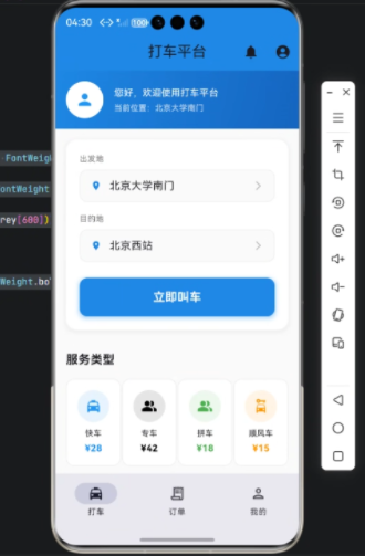
传统的打车应用通常涉及以下核心功能:
- 位置输入与选择:用户需要输入或选择起点和终点。
- 服务选择:不同的车类型及价格展示,如快车、专车等。
- 历史记录:显示用户的历史行程信息。
- 操作图标与快捷服务入口:如支付、通知、个人中心等。
在实现跨端应用时,Flutter 提供了统一的 UI 构建方式,而 OpenHarmony 提供了面向多终端的系统适配能力,使得同一套代码可以在手机、平板甚至 IoT 设备上运行。
Flutter × OpenHarmony 跨端开发介绍
Flutter 是 Google 推出的跨平台 UI 框架,使用 Dart 语言,通过 Widget 构建界面,支持热重载和高度自定义的 UI。
OpenHarmony 是华为的开源分布式操作系统,面向手机、平板、IoT 设备。通过 Flutter 与 OpenHarmony 结合,我们可以实现:
- 一次开发,多端运行
- 统一的 UI 风格与交互体验
- 高效的数据处理与网络调用
在本项目中,我们使用 Flutter 构建界面,OpenHarmony 提供底层系统支持,实现跨端一致体验。
开发核心代码解析
以下是完整的核心 UI 代码,我们将 拆分模块逐行解析。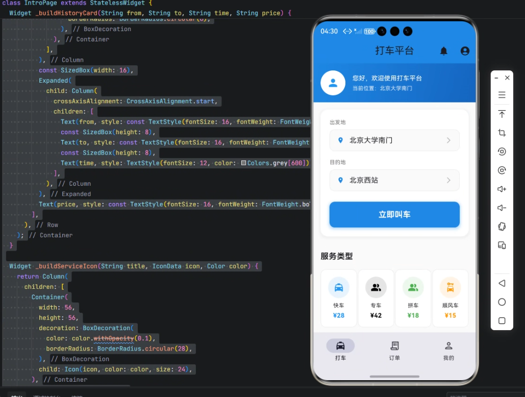
import 'package:flutter/material.dart';
import 'package:gitcode_pocket_tool/core/app_theme.dart';
解析:
flutter/material.dart提供 Material 风格的 UI 组件。app_theme.dart是自定义主题文件,用于统一应用色彩与样式。
主界面 Scaffold
class IntroPage extends StatelessWidget {
const IntroPage({Key? key}) : super(key: key);
Widget build(BuildContext context) {
return Scaffold(
backgroundColor: Colors.grey[50],
appBar: AppBar(
title: const Text('打车平台'),
backgroundColor: Colors.blue[600],
elevation: 0,
actions: [
IconButton(
icon: const Icon(Icons.notifications),
onPressed: () {},
),
IconButton(
icon: const Icon(Icons.account_circle),
onPressed: () {},
),
],
),
body: SingleChildScrollView(
child: Column(
children: [
解析:
Scaffold提供基本页面结构,包括顶部 AppBar 和内容区域。backgroundColor设置整体背景色。AppBar包含标题、背景色和操作按钮。SingleChildScrollView用于页面滚动,避免内容溢出。Column用于垂直排列页面元素。
位置输入组件
Widget _buildLocationInput(String label, String value) {
  return Container(
    child: Column(
      crossAxisAlignment: CrossAxisAlignment.start,
      children: [
        Text(label, style: TextStyle(fontSize: 12, color: Colors.grey[600])),
        const SizedBox(height: 8),
        Container(
          padding: const EdgeInsets.symmetric(horizontal: 16, vertical: 12),
          decoration: BoxDecoration(
            color: Colors.grey[50],
            borderRadius: BorderRadius.circular(12),
            border: Border.all(color: Colors.grey[200]!, width: 1),
          ),
          child: Row(
            children: [
              Icon(Icons.location_on, color: Colors.blue[600], size: 16),
              const SizedBox(width: 12),
              Expanded(
                child: Text(
                  value,
                  style: const TextStyle(fontSize: 16),
                ),
              ),
              Icon(Icons.arrow_forward_ios, color: Colors.grey[400], size: 16),
            ],
          ),
        ),
      ],
    ),
  );
}
解析:
- 使用
Column垂直排列 标签 + 输入框。 Container设置圆角、边框和内边距,实现卡片式输入框效果。Row实现图标、文本与箭头排列。Expanded保证文本占满剩余空间。
服务卡片组件
Widget _buildServiceCard(String title, String price, IconData icon, Color color) {
  return Container(
    padding: const EdgeInsets.all(16),
    decoration: BoxDecoration(
      color: Colors.white,
      borderRadius: BorderRadius.circular(12),
      border: Border.all(color: Colors.grey[200]!, width: 1),
    ),
    child: Column(
      children: [
        Container(
          width: 48,
          height: 48,
          decoration: BoxDecoration(
            color: color.withOpacity(0.1),
            borderRadius: BorderRadius.circular(24),
          ),
          child: Icon(icon, color: color, size: 24),
        ),
        const SizedBox(height: 8),
        Text(title, style: const TextStyle(fontSize: 12)),
        const SizedBox(height: 4),
        Text(price, style: TextStyle(fontSize: 14, fontWeight: FontWeight.bold, color: color)),
      ],
    ),
  );
}
解析:
- 卡片背景白色,圆角 12,带边框。
- 上部圆形图标使用半透明背景色,增强视觉层次感。
- 下方显示服务名称与价格信息。
历史行程卡片
Widget _buildHistoryCard(String from, String to, String time, String price) {
  return Container(
    padding: const EdgeInsets.all(16),
    decoration: BoxDecoration(
      color: Colors.grey[50],
      borderRadius: BorderRadius.circular(12),
    ),
    child: Row(
      children: [
        Column(
          children: [
            Container(
              width: 12,
              height: 12,
              decoration: BoxDecoration(
                color: Colors.green,
                borderRadius: BorderRadius.circular(6),
              ),
            ),
            Container(
              width: 2, height: 32, color: Colors.grey[300]),
            Container(
              width: 12,
              height: 12,
              decoration: BoxDecoration(
                color: Colors.red,
                borderRadius: BorderRadius.circular(6),
              ),
            ),
          ],
        ),
        const SizedBox(width: 16),
        Expanded(
          child: Column(
            crossAxisAlignment: CrossAxisAlignment.start,
            children: [
              Text(from, style: const TextStyle(fontSize: 16, fontWeight: FontWeight.bold)),
              const SizedBox(height: 8),
              Text(to, style: const TextStyle(fontSize: 16, fontWeight: FontWeight.bold)),
              const SizedBox(height: 8),
              Text(time, style: TextStyle(fontSize: 12, color: Colors.grey[600])),
            ],
          ),
        ),
        Text(price, style: const TextStyle(fontSize: 16, fontWeight: FontWeight.bold, color: Colors.blue)),
      ],
    ),
  );
}
解析:
- 左侧圆点和连线表示行程起点到终点。
- 中间显示起点、终点和时间。
- 右侧显示价格信息。
- 使用
Expanded保证中间列自适应布局。
服务图标组件
Widget _buildServiceIcon(String title, IconData icon, Color color) {
  return Column(
    children: [
      Container(
        width: 56,
        height: 56,
        decoration: BoxDecoration(
          color: color.withOpacity(0.1),
          borderRadius: BorderRadius.circular(28),
        ),
        child: Icon(icon, color: color, size: 24),
      ),
      const SizedBox(height: 8),
      Text(title, style: const TextStyle(fontSize: 12), textAlign: TextAlign.center),
    ],
  );
}
解析:
- 用于首页或快捷服务入口。
- 图标圆形背景,下面显示文字。
textAlign: TextAlign.center保证文字居中显示。
心得
在本项目开发中,我总结了几点经验:
- 模块化设计:每个 UI 元素拆成单独 Widget,提高复用性和可维护性。
- 统一风格:通过自定义主题文件
app_theme.dart,确保颜色和字体在多端一致。 - Flutter + OpenHarmony 跨端优势:一次开发,多端运行,减少重复开发成本。
- 数据与 UI 解耦:位置输入、服务卡片、历史行程等组件独立设计,便于后续接入后端接口。

总结
本文介绍了一个基于 Flutter × OpenHarmony 的智能打车平台 UI 与数据结构设计,从位置输入、服务选择到历史行程展示,完整拆解了各个组件的实现细节。
通过模块化 Widget 构建、统一主题管理和跨端布局设计,我们实现了 界面美观、操作流畅、跨端适配 的打车应用。
这种方法不仅适用于打车平台,也可推广到其他需要跨端展示复杂列表和服务入口的移动应用场景中。

有“AI”的1024 = 2048,欢迎大家加入2048 AI社区
更多推荐


 9
9 0
0- 0


 已为社区贡献2条内容

所有评论(0)