React Native鸿蒙跨平台实现了简单的商品图片轮播功能,为用户提供了直观的商品图片浏览体验,帮助用户全面了解商品外观
在移动应用开发中,商品详情页是电商和二手交易应用的核心页面之一,需要考虑图片展示、信息呈现、用户交互等多个方面。本文将深入分析一个功能完备的 React Native 二手商品详情应用实现,探讨其架构设计、状态管理、用户交互以及跨端兼容性策略。
架构设计
该实现采用了清晰的单组件架构,主要包含以下部分:
- 主应用组件 (
ProductDetailApp) - 负责整体布局和状态管理 - 商品图片轮播 - 展示商品的多张图片,支持轮播和指示器
- 商品信息 - 展示商品的名称、价格、成色、分类、位置等信息
- 卖家信息 - 展示卖家的名称、位置等信息
- 商品描述 - 展示商品的详细描述
- 互动信息 - 展示商品的浏览量和收藏量
- 交易须知 - 展示交易相关的注意事项
- 功能按钮 - 提供收藏、联系卖家、分享等功能
这种架构设计使得代码结构清晰,易于维护。主应用组件负责管理全局状态和业务逻辑,而各个UI部分则负责具体的展示,实现了关注点分离。
状态管理
ProductDetailApp 组件使用 useState 钩子管理两个关键状态:
const [isFavorite, setIsFavorite] = useState<boolean>(false);
const [currentIndex, setCurrentIndex] = useState<number>(0);
这种状态管理方式简洁高效,通过状态更新触发组件重新渲染,实现了收藏状态的切换和图片轮播的控制。
商品图片轮播
应用实现了简单的商品图片轮播功能:
- 图片展示 - 显示当前选中的商品图片
- 指示器 - 显示图片总数和当前位置
- 手动切换 - 可以通过点击指示器切换图片
这种实现方式为用户提供了直观的商品图片浏览体验,帮助用户全面了解商品外观。
收藏功能
应用实现了商品收藏功能:
// 切换收藏状态
const toggleFavorite = () => {
  setIsFavorite(!isFavorite);
  Alert.alert('', isFavorite ? '已取消收藏' : '已收藏');
};
这种实现方式允许用户快速收藏或取消收藏商品,提高了用户体验。
联系卖家
应用实现了联系卖家的功能:
// 联系卖家
const contactSeller = () => {
  Alert.alert('联系卖家', `是否联系卖家 ${product.seller}?`, [
    { text: '取消', style: 'cancel' },
    { text: '拨打电话', onPress: () => Alert.alert('拨打电话', '正在拨打...') },
    { text: '发送消息', onPress: () => Alert.alert('发送消息', '跳转到聊天界面') }
  ]);
};
这种实现方式为用户提供了多种联系卖家的方式,包括拨打电话和发送消息,提高了交易的便捷性。
分享功能
应用实现了商品分享功能:
// 分享商品
const shareProduct = () => {
  Alert.alert('分享', '分享功能即将推出', [{ text: '确定' }]);
};
这种实现方式为用户提供了分享商品的入口,便于用户将感兴趣的商品分享给朋友或社交媒体。
商品数据结构
应用使用了一个模拟的商品数据结构:
// 模拟商品数据
const product = {
  id: '1',
  name: 'iPhone 13 Pro Max 256GB',
  category: '电子产品',
  price: 5800,
  originalPrice: 9999,
  condition: '九成新',
  seller: '张先生',
  location: '北京市朝阳区',
  publishTime: '2天前',
  description: 'iPhone 13 Pro Max 256GB 石墨色,屏幕无划痕,电池健康度89%,配件齐全,发票保修卡都有。',
  images: [
    ' `https://via.placeholder.com/300x300?text=iPhone+Front` ',
    ' `https://via.placeholder.com/300x300?text=iPhone+Back` ',
    ' `https://via.placeholder.com/300x300?text=iPhone+Side` ',
  ],
  views: 128,
  favorites: 15,
};
这个数据结构包含了商品的完整信息,包括基本信息、价格信息、卖家信息、图片信息和互动信息。这种数据结构设计使得商品信息的管理更加清晰,易于扩展和维护。
当前实现使用 ScrollView 渲染整个页面,对于包含多张图片的页面,可以考虑以下优化:
// 优化前
<ScrollView style={styles.content}>
  {/* 包含多张图片和大量文本的内容 */}
</ScrollView>

// 优化后
<ScrollView
  style={styles.content}
  removeClippedSubviews={true} // 移除不可见的子视图
  maxToRenderPerBatch={5} // 每批渲染的最大项目数
  windowSize={10} // 可见区域外渲染的项目数
>
  {/* 包含多张图片和大量文本的内容 */}
</ScrollView>
2. 状态管理
当前实现使用 useState 钩子管理简单的状态,可以考虑使用 useReducer 或状态管理库来管理更复杂的状态:
// 优化前
const [isFavorite, setIsFavorite] = useState<boolean>(false);
const [currentIndex, setCurrentIndex] = useState<number>(0);

// 优化后
type ProductState = {
  isFavorite: boolean;
  currentIndex: number;
  images: string[];
  product: typeof product;
};

type ProductAction =
  | { type: 'TOGGLE_FAVORITE' }
  | { type: 'SET_CURRENT_INDEX'; payload: number }
  | { type: 'UPDATE_PRODUCT'; payload: typeof product };

const initialState: ProductState = {
  isFavorite: false,
  currentIndex: 0,
  images: product.images,
  product: product,
};

const productReducer = (state: ProductState, action: ProductAction): ProductState => {
  switch (action.type) {
    case 'TOGGLE_FAVORITE':
      return { ...state, isFavorite: !state.isFavorite };
    case 'SET_CURRENT_INDEX':
      return { ...state, currentIndex: action.payload };
    case 'UPDATE_PRODUCT':
      return { ...state, product: action.payload };
    default:
      return state;
  }
};

const [state, dispatch] = useReducer(productReducer, initialState);
3. 图片轮播
当前实现的图片轮播功能较为简单,可以考虑使用更高级的图片轮播实现:
import Carousel from 'react-native-reanimated-carousel';

const ProductDetailApp = () => {
  const [currentIndex, setCurrentIndex] = useState(0);

  return (
    <View style={styles.imageContainer}>
      <Carousel
        width={width}
        height={width}
        data={product.images}
        renderItem={({ item }) => (
          <Image
            source={{ uri: item }}
            style={styles.productImage}
          />
        )}
        onSnapToItem={(index) => setCurrentIndex(index)}
        loop
        autoPlay
        autoPlayInterval={3000}
      />
      <View style={styles.imageIndicator}>
        {product.images.map((_, index) => (
          <View
            key={index}
            style={[
              styles.indicatorDot,
              currentIndex === index && styles.activeIndicator
            ]}
          />
        ))}
      </View>
      <Text style={styles.imageCount}>{currentIndex + 1}/{product.images.length}</Text>
    </View>
  );
};
4. 导航系统
可以集成 React Navigation 实现商品详情页面的导航:
import { createStackNavigator } from '@react-navigation/stack';

const Stack = createStackNavigator();

const App = () => {
  return (
    <NavigationContainer>
      <Stack.Navigator>
        <Stack.Screen
          name="Home"
          component={HomeScreen}
          options={{ title: '二手市场' }}
        />
        <Stack.Screen
          name="ProductDetail"
          component={ProductDetailApp}
          options={{ title: '商品详情' }}
        />
        <Stack.Screen
          name="Chat"
          component={ChatScreen}
          options={{ title: '聊天' }}
        />
      </Stack.Navigator>
    </NavigationContainer>
  );
};
本文深入分析了一个功能完备的 React Native 二手商品详情应用实现,从架构设计、状态管理、用户交互到跨端兼容性都进行了详细探讨。该实现不仅功能完整,而且代码结构清晰,具有良好的可扩展性和可维护性。
React Native 二手商品详情页的完整实现逻辑,并掌握其向鸿蒙(HarmonyOS)平台跨端适配的核心方案。该页面是二手交易类应用的核心场景,涵盖了图片轮播、价格展示、卖家信息、商品描述、底部操作栏等典型模块,是移动端商品详情页跨端开发的经典范例。
1. 商品数据模型设计
该应用构建了标准化的二手商品数据模型,覆盖二手交易场景的核心信息维度:
// 二手商品数据模型
const product = {
  id: '1',                          // 商品唯一标识
  name: 'iPhone 13 Pro Max 256GB', // 商品名称
  category: '电子产品',             // 商品分类
  price: 5800,                      // 现价(二手价)
  originalPrice: 9999,              // 原价(新品价)
  condition: '九成新',              // 商品成色
  seller: '张先生',                 // 卖家姓名
  location: '北京市朝阳区',         // 交易地点
  publishTime: '2天前',             // 发布时间
  description: '...',               // 商品描述
  images: [/* 图片URL数组 */],      // 商品图片集
  views: 128,                       // 浏览量
  favorites: 15,                    // 收藏数
};
模型设计亮点:
- 核心信息完整:覆盖二手交易场景的核心维度(价格、成色、卖家、位置、描述等);
- 价格体系完善:区分现价和原价,支持折扣计算,符合二手商品定价逻辑;
- 多媒体支持:图片数组支持多图展示,满足商品多角度展示需求;
- 互动数据齐全:包含浏览量、收藏数等互动指标,提升用户决策依据;
- 地理位置信息:交易地点是二手交易的关键信息,符合线下交易场景;
- 时间维度:发布时间帮助用户判断商品时效性,提升信息透明度。
2. 交互逻辑
应用采用 React Hooks 实现了基础状态管理和核心交互逻辑:
// 收藏状态管理
const [isFavorite, setIsFavorite] = useState<boolean>(false);
// 图片轮播索引管理
const [currentIndex, setCurrentIndex] = useState<number>(0);

// 收藏切换逻辑
const toggleFavorite = () => {
  setIsFavorite(!isFavorite);
  Alert.alert('', isFavorite ? '已取消收藏' : '已收藏');
};

// 联系卖家交互逻辑
const contactSeller = () => {
  Alert.alert('联系卖家', `是否联系卖家 ${product.seller}?`, [
    { text: '取消', style: 'cancel' },
    { text: '拨打电话', onPress: () => Alert.alert('拨打电话', '正在拨打...') },
    { text: '发送消息', onPress: () => Alert.alert('发送消息', '跳转到聊天界面') }
  ]);
};
状态管理特点:
- 极简状态设计:仅维护核心交互状态(收藏状态、图片索引),避免状态冗余;
- 交互反馈完整:收藏操作提供明确的弹窗反馈,提升用户体验;
- 多选项交互:联系卖家功能实现多选项弹窗,符合移动端交互习惯;
- 数据计算实时:折扣率通过实时计算得出,保证数据准确性;
- 类型安全:使用 TypeScript 类型注解,避免状态类型错误。
(1)商品图片轮播组件
<View style={styles.imageContainer}>
  <Image
    source={{ uri: product.images[currentIndex] }}
    style={styles.productImage}
  />
  <View style={styles.imageIndicator}>
    {product.images.map((_, index) => (
      <View
        key={index}
        style={[
          styles.indicatorDot,
          currentIndex === index && styles.activeIndicator
        ]}
      />
    ))}
  </View>
  <Text style={styles.imageCount}>{currentIndex + 1}/{product.images.length}</Text>
</View>
轮播设计亮点:
- 双层指示器:同时提供圆点指示器和数字计数器,满足不同用户的视觉习惯;
- 定位精准:圆点指示器居左、数字计数器居右,布局合理不遮挡图片内容;
- 视觉层次:数字计数器使用半透明背景,既清晰可见又不干扰图片浏览;
- 响应式样式:激活状态的指示器使用白色高亮,视觉反馈明确;
- 容器适配:固定高度的图片容器配合 resizeMode: ‘contain’,保证图片完整展示;
- 扩展性强:支持任意数量的图片轮播,仅需扩展 images 数组。
(2)价格展示组件
<View style={styles.priceContainer}>
  <Text style={styles.currentPrice}>¥{product.price.toLocaleString()}</Text>
  <Text style={styles.originalPrice}>¥{product.originalPrice.toLocaleString()}</Text>
  <Text style={styles.discount}>{(product.price / product.originalPrice * 10).toFixed(1)}折</Text>
</View>
价格设计亮点:
- 视觉层级分明:现价使用大号红色粗体,原价使用小号灰色删除线,折扣使用橙色标签;
- 格式化展示:使用 toLocaleString() 实现价格千分位分隔,提升可读性;
- 动态计算:折扣率实时计算并保留一位小数,数据准确;
- 色彩编码规范:红色表示价格、橙色表示折扣,符合电商平台视觉规范;
- 间距合理:各价格元素间的间距设计保证视觉舒适度;
- 标签化设计:折扣信息使用圆角标签样式,突出显示优惠力度。
(3)卖家信息组件
<View style={styles.sellerInfo}>
  <View style={styles.avatarContainer}>
    <Text style={styles.avatarText}>张</Text>
  </View>
  <View style={styles.sellerDetails}>
    <Text style={styles.sellerName}>{product.seller}</Text>
    <Text style={styles.sellerLocation}>{product.location}</Text>
  </View>
</View>
卖家信息设计亮点:
- 头像简化设计:使用姓氏首字作为头像,无需图片资源,加载更快;
- 色彩规范:蓝色圆形头像符合移动端UI设计趋势,视觉友好;
- 信息层级:卖家姓名粗体展示,位置信息灰色展示,主次分明;
- 布局合理:头像+信息的经典布局,符合用户阅读习惯;
- 尺寸规范:40x40的头像尺寸符合移动端交互标准,点击区域适中;
- 间距设计:头像与信息区12px间距,保证视觉呼吸感。
(4)底部操作栏
<View style={styles.bottomBar}>
  <TouchableOpacity style={styles.bottomButton} onPress={toggleFavorite}>
    <Text style={styles.bottomButtonText}>{isFavorite ? '❤️' : '🤍'} 收藏</Text>
  </TouchableOpacity>
  <TouchableOpacity style={styles.bottomButton} onPress={shareProduct}>
    <Text style={styles.bottomButtonText}>🔄 分享</Text>
  </TouchableOpacity>
  <TouchableOpacity style={styles.chatButton} onPress={contactSeller}>
    <Text style={styles.chatButtonText}>💬 联系卖家</Text>
  </TouchableOpacity>
  <TouchableOpacity style={styles.callButton} onPress={contactSeller}>
    <Text style={styles.callButtonText}>📞 打电话</Text>
  </TouchableOpacity>
</View>
操作栏设计亮点:
- 功能权重区分:联系卖家和打电话按钮占比更大,符合核心操作优先级;
- 色彩编码:蓝色(聊天)、绿色(电话)符合用户对沟通方式的认知;
- 视觉反馈:收藏按钮根据状态切换emoji,交互反馈直观;
- 布局均衡:使用flex比例分配空间,适配不同屏幕尺寸;
- 圆角设计:8px圆角提升视觉友好度,符合现代UI设计趋势;
- 间距合理:按钮间8px间距,保证点击区域不重叠。
4. 样式
该页面的样式系统体现了电商类应用的专业设计原则:
const styles = StyleSheet.create({
  // 基础容器样式
  container: {
    flex: 1,
    backgroundColor: '#f8fafc', // 浅灰背景,降低视觉疲劳
  },

  // 图片容器样式
  imageContainer: {
    position: 'relative',
    height: 300,
    backgroundColor: '#e2e8f0', // 占位背景色
  },

  // 价格样式体系
  currentPrice: {
    fontSize: 24,
    fontWeight: 'bold',
    color: '#ef4444', // 红色系,突出价格
    marginRight: 12,
  },
  originalPrice: {
    fontSize: 14,
    color: '#94a3b8', // 浅灰色
    textDecorationLine: 'line-through', // 删除线
    marginRight: 8,
  },
  discount: {
    fontSize: 12,
    color: '#f59e0b', // 橙色系
    backgroundColor: '#fef3c7', // 浅橙背景
    paddingHorizontal: 6,
    paddingVertical: 2,
    borderRadius: 4,
  },

  // 其他核心样式...
});
样式设计原则:
- 电商视觉规范:使用红色系表示价格、蓝色系表示交互、绿色系表示确认;
- 层次分明:通过字体大小、粗细、颜色区分信息重要程度;
- 响应式布局:使用flex布局适配不同屏幕尺寸;
- 视觉呼吸感:合理的内边距和外边距,避免内容拥挤;
- 状态可视化:通过颜色、大小变化展示不同状态;
- 平台一致性:遵循React Native的样式命名规范,便于维护。
将该 React Native 商品详情页适配到鸿蒙平台,核心是将 React 的状态管理、图片轮播、价格展示、底部操作栏等核心能力映射到鸿蒙 ArkTS + ArkUI 生态,以下是完整的适配方案。
1. 核心技术栈映射
| React Native 核心能力 | 鸿蒙 ArkTS 对应实现 | 适配关键说明 |
|---|---|---|
useState 状态管理 |
@State 装饰器 |
基础状态管理适配 |
Image 组件 |
Image 组件(属性映射) |
图片加载适配 |
| 条件样式数组 | 链式条件样式 + @Styles 装饰器 |
动态样式适配 |
Alert.alert 弹窗 |
AlertDialog 组件 |
交互弹窗替换 |
TouchableOpacity |
Button + stateEffect(true) |
可点击组件替换 |
StyleSheet.create |
@Styles/@Extend + 链式样式 |
样式体系重构 |
| 图片轮播索引控制 | @State currentIndex: number |
轮播逻辑完全复用 |
textDecorationLine |
textDecoration: TextDecorationType.LineThrough |
文本样式适配 |
position: 'relative' |
position: Position.Relative |
定位系统适配 |
flex 布局 |
flex 布局(属性完全兼容) |
布局系统零修改 |
2. 鸿蒙端
// index.ets - 鸿蒙端二手商品详情页完整实现
import { BusinessError } from '@ohos.base';

@Entry
@Component
struct ProductDetailApp {
  // 商品数据模型(与RN端完全一致)
  private product = {
    id: '1',
    name: 'iPhone 13 Pro Max 256GB',
    category: '电子产品',
    price: 5800,
    originalPrice: 9999,
    condition: '九成新',
    seller: '张先生',
    location: '北京市朝阳区',
    publishTime: '2天前',
    description: 'iPhone 13 Pro Max 256GB 石墨色,屏幕无划痕,电池健康度89%,配件齐全,发票保修卡都有。',
    images: [
      'https://via.placeholder.com/300x300?text=iPhone+Front',
      'https://via.placeholder.com/300x300?text=iPhone+Back',
      'https://via.placeholder.com/300x300?text=iPhone+Side',
    ],
    views: 128,
    favorites: 15,
  };

  // 状态管理(对应RN的useState)
  @State isFavorite: boolean = false;
  @State currentIndex: number = 0;

  // 通用样式封装 - 卡片容器样式
  @Styles
  cardStyle() {
    .backgroundColor('#ffffff')
    .padding(16)
    .marginBottom(12);
  }

  // 通用样式封装 - 价格标签样式
  @Styles
  discountTagStyle() {
    .fontSize(12)
    .fontColor('#f59e0b')
    .backgroundColor('#fef3c7')
    .paddingHorizontal(6)
    .paddingVertical(2)
    .borderRadius(4);
  }

  // 切换收藏状态(完全复用RN端逻辑)
  private toggleFavorite() {
    this.isFavorite = !this.isFavorite;
    AlertDialog.show({
      message: this.isFavorite ? '已收藏' : '已取消收藏',
      confirm: { value: '确定' }
    });
  }

  // 联系卖家(适配鸿蒙弹窗API)
  private contactSeller() {
    AlertDialog.show({
      title: '联系卖家',
      message: `是否联系卖家 ${this.product.seller}?`,
      cancel: { value: '取消' },
      buttons: [
        {
          value: '拨打电话',
          action: () => {
            AlertDialog.show({
              title: '拨打电话',
              message: '正在拨打...',
              confirm: { value: '确定' }
            });
          }
        },
        {
          value: '发送消息',
          action: () => {
            AlertDialog.show({
              title: '发送消息',
              message: '跳转到聊天界面',
              confirm: { value: '确定' }
            });
          }
        }
      ]
    });
  }

  // 分享商品
  private shareProduct() {
    AlertDialog.show({
      title: '分享',
      message: '分享功能即将推出',
      confirm: { value: '确定' }
    });
  }

  // 渲染图片轮播指示器
  @Builder
  renderImageIndicator() {
    Row({ space: 4 }) {
      ForEach(this.product.images, (_, index) => {
        Column()
          .width(6)
          .height(6)
          .borderRadius(3)
          .backgroundColor(this.currentIndex === index ? '#ffffff' : '#cbd5e1');
      });
    }
    .position({ x: 20, y: 280 }); // 绝对定位,对应RN的position: absolute
  }

  // 渲染价格区域
  @Builder
  renderPriceArea() {
    Row({ space: 0, alignItems: ItemAlign.Center }) {
      // 现价
      Text(`¥${this.product.price.toLocaleString()}`)
        .fontSize(24)
        .fontWeight(FontWeight.Bold)
        .fontColor('#ef4444')
        .marginRight(12);

      // 原价
      Text(`¥${this.product.originalPrice.toLocaleString()}`)
        .fontSize(14)
        .fontColor('#94a3b8')
        .textDecoration({ type: TextDecorationType.LineThrough }) // 删除线适配
        .marginRight(8);

      // 折扣标签
      Text(`${(this.product.price / this.product.originalPrice * 10).toFixed(1)}折`)
        .discountTagStyle(); // 复用通用样式
    }
    .marginBottom(12);
  }

  // 渲染卖家信息
  @Builder
  renderSellerInfo() {
    Row({ space: 12, alignItems: ItemAlign.Center }) {
      // 卖家头像
      Column()
        .width(40)
        .height(40)
        .borderRadius(20)
        .backgroundColor('#3b82f6')
        .justifyContent(FlexAlign.Center)
        .alignItems(ItemAlign.Center) {
          Text('张')
            .fontSize(16)
            .fontColor('#ffffff')
            .fontWeight(FontWeight.Bold);
        };

      // 卖家详情
      Column({ space: 4, flex: 1 }) {
        Text(this.product.seller)
          .fontSize(16)
          .fontWeight(FontWeight.Medium)
          .fontColor('#1e293b');

        Text(this.product.location)
          .fontSize(14)
          .fontColor('#64748b');
      };
    }
  }

  build() {
    Column({ space: 0 }) {
      // 滚动内容区域(替代RN的ScrollView)
      Scroll() {
        Column({ space: 0 }) {
          // 商品图片轮播区域
          Column()
            .width('100%')
            .height(300)
            .backgroundColor('#e2e8f0')
            .position(Position.Relative) { // 相对定位适配
              // 主图片
              Image(this.product.images[this.currentIndex])
                .width('100%')
                .height('100%')
                .objectFit(ImageFit.Contain); // 对应RN的resizeMode: 'contain'

              // 图片指示器
              this.renderImageIndicator();

              // 图片计数
              Text(`${this.currentIndex + 1}/${this.product.images.length}`)
                .fontSize(12)
                .fontColor('#ffffff')
                .backgroundColor('rgba(0,0,0,0.5)')
                .paddingHorizontal(8)
                .paddingVertical(4)
                .borderRadius(12)
                .position({ x: '80%', y: 280 });
            };

          // 商品基本信息
          Column({ space: 0 })
            .cardStyle() {
              // 商品名称
              Text(this.product.name)
                .fontSize(18)
                .fontWeight(FontWeight.Bold)
                .fontColor('#1e293b')
                .marginBottom(12);

              // 价格区域
              this.renderPriceArea();

              // 商品元信息
              Row({ space: 0, justifyContent: FlexAlign.SpaceBetween }) {
                // 成色
                Column({ space: 4, flex: 1, alignItems: ItemAlign.Center }) {
                  Text('成色')
                    .fontSize(12)
                    .fontColor('#94a3b8');

                  Text(this.product.condition)
                    .fontSize(14)
                    .fontColor('#1e293b')
                    .fontWeight(FontWeight.Medium);
                };

                // 分类
                Column({ space: 4, flex: 1, alignItems: ItemAlign.Center }) {
                  Text('分类')
                    .fontSize(12)
                    .fontColor('#94a3b8');

                  Text(this.product.category)
                    .fontSize(14)
                    .fontColor('#1e293b')
                    .fontWeight(FontWeight.Medium);
                };

                // 位置
                Column({ space: 4, flex: 1, alignItems: ItemAlign.Center }) {
                  Text('位置')
                    .fontSize(12)
                    .fontColor('#94a3b8');

                  Text(this.product.location)
                    .fontSize(14)
                    .fontColor('#1e293b')
                    .fontWeight(FontWeight.Medium);
                };
              };
            };

          // 卖家信息区域
          Column({ space: 0 })
            .cardStyle() {
              // 卖家信息头部
              Row({ space: 0, justifyContent: FlexAlign.SpaceBetween, alignItems: ItemAlign.Center })
                .marginBottom(12) {
                  Text('卖家信息')
                    .fontSize(16)
                    .fontWeight(FontWeight.Bold)
                    .fontColor('#1e293b');

                  Text(this.product.publishTime + '发布')
                    .fontSize(12)
                    .fontColor('#94a3b8');
                };

              // 卖家信息主体
              this.renderSellerInfo();
            };

          // 商品描述
          Column({ space: 0 })
            .cardStyle() {
              Text('商品描述')
                .fontSize(16)
                .fontWeight(FontWeight.Bold)
                .fontColor('#1e293b')
                .marginBottom(12);

              Text(this.product.description)
                .fontSize(14)
                .fontColor('#64748b')
                .lineHeight(22);
            };

          // 互动信息
          Row({ space: 20 })
            .cardStyle() {
              Text(`👁️ ${this.product.views}`)
                .fontSize(14)
                .fontColor('#64748b');

              Text(`❤️ ${this.product.favorites}`)
                .fontSize(14)
                .fontColor('#64748b');
            };

          // 交易须知
          Column({ space: 8 })
            .backgroundColor('#ffffff')
            .borderRadius(12)
            .padding(16)
            .margin(12) {
              Text('交易须知')
                .fontSize(16)
                .fontWeight(FontWeight.Bold)
                .fontColor('#1e293b')
                .marginBottom(12);

              Text('• 请当面验货,确认无误后再交易')
                .fontSize(14)
                .fontColor('#64748b')
                .lineHeight(22);

              Text('• 交易完成后请评价卖家')
                .fontSize(14)
                .fontColor('#64748b')
                .lineHeight(22);

              Text('• 如有问题可申请平台介入')
                .fontSize(14)
                .fontColor('#64748b')
                .lineHeight(22);

              Text('• 请遵守平台交易规则')
                .fontSize(14)
                .fontColor('#64748b')
                .lineHeight(22);
            };
        }
        .width('100%');
      }
      .flex(1)
      .width('100%');

      // 底部操作栏
      Row({ space: 8 })
        .backgroundColor('#ffffff')
        .borderTop({ width: 1, color: '#e2e8f0' })
        .padding(12)
        .width('100%') {
        // 收藏按钮
        Button()
          .flex(1)
          .backgroundColor('#f1f5f9')
          .padding(12)
          .borderRadius(8)
          .stateEffect(true)
          .onClick(() => this.toggleFavorite()) {
            Text(`${this.isFavorite ? '❤️' : '🤍'} 收藏`)
              .fontSize(14)
              .fontColor('#64748b')
              .fontWeight(FontWeight.Medium);
          };

        // 分享按钮
        Button()
          .flex(1)
          .backgroundColor('#f1f5f9')
          .padding(12)
          .borderRadius(8)
          .stateEffect(true)
          .onClick(() => this.shareProduct()) {
            Text('🔄 分享')
              .fontSize(14)
              .fontColor('#64748b')
              .fontWeight(FontWeight.Medium);
          };

        // 联系卖家按钮
        Button()
          .flex(2)
          .backgroundColor('#3b82f6')
          .padding(12)
          .borderRadius(8)
          .stateEffect(true)
          .onClick(() => this.contactSeller()) {
            Text('💬 联系卖家')
              .fontSize(14)
              .fontColor('#ffffff')
              .fontWeight(FontWeight.Medium);
          };

        // 打电话按钮
        Button()
          .flex(1.5)
          .backgroundColor('#10b981')
          .padding(12)
          .borderRadius(8)
          .stateEffect(true)
          .onClick(() => this.contactSeller()) {
            Text('📞 打电话')
              .fontSize(14)
              .fontColor('#ffffff')
              .fontWeight(FontWeight.Medium);
          };
      };
    }
    .width('100%')
    .height('100%')
    .backgroundColor('#f8fafc')
    .safeArea(true);
  }
}
3. 关键适配点详解
(1)图片轮播组件适配
React Native 的图片轮播组件适配为鸿蒙的 Image + 定位系统,保持轮播体验一致:
// React Native - 图片轮播
<View style={styles.imageContainer}>
  <Image
    source={{ uri: product.images[currentIndex] }}
    style={styles.productImage}
  />
  <View style={styles.imageIndicator}>
    {/* 指示器圆点 */}
  </View>
  <Text style={styles.imageCount}>{currentIndex + 1}/{product.images.length}</Text>
</View>

// 鸿蒙 - 图片轮播适配
Column()
  .width('100%')
  .height(300)
  .backgroundColor('#e2e8f0')
  .position(Position.Relative) {
    // 主图片
    Image(this.product.images[this.currentIndex])
      .width('100%')
      .height('100%')
      .objectFit(ImageFit.Contain);

    // 图片指示器(Builder函数封装)
    this.renderImageIndicator();

    // 图片计数
    Text(`${this.currentIndex + 1}/${this.product.images.length}`)
      .position({ x: '80%', y: 280 });
  };
(2)价格样式
React Native 的价格样式适配为鸿蒙的链式样式调用,保持价格展示效果一致:
// React Native - 价格样式
<Text style={styles.currentPrice}>¥{product.price.toLocaleString()}</Text>
<Text style={styles.originalPrice}>¥{product.originalPrice.toLocaleString()}</Text>
<Text style={styles.discount}>{折扣率}折</Text>

// 鸿蒙 - 价格样式适配
Text(`¥${this.product.price.toLocaleString()}`)
  .fontSize(24)
  .fontWeight(FontWeight.Bold)
  .fontColor('#ef4444')
  .marginRight(12);

Text(`¥${this.product.originalPrice.toLocaleString()}`)
  .fontSize(14)
  .fontColor('#94a3b8')
  .textDecoration({ type: TextDecorationType.LineThrough })
  .marginRight(8);

Text(`${折扣率}折`)
  .discountTagStyle(); // 复用@Styles定义的通用样式
适配技巧:
- 删除线适配:
textDecoration({ type: TextDecorationType.LineThrough })对应textDecorationLine: 'line-through'; - 样式复用:使用
@Styles装饰器封装折扣标签样式,减少代码冗余; - 数值格式化:
toLocaleString()函数完全复用,保证价格格式一致; - 颜色体系一致:保持相同的颜色值,保证视觉体验一致;
- 间距精准适配:相同的 margin/padding 值,保证布局一致;
- 字体属性对等:字体大小、粗细完全对应,保证视觉层级一致。
(3)底部操作栏
React Native 的 TouchableOpacity 操作栏适配为鸿蒙的 Button 组件,保持交互体验一致:
// React Native - 底部操作栏
<View style={styles.bottomBar}>
  <TouchableOpacity style={styles.bottomButton} onPress={toggleFavorite}>
    <Text style={styles.bottomButtonText}>{isFavorite ? '❤️' : '🤍'} 收藏</Text>
  </TouchableOpacity>
  {/* 其他按钮 */}
</View>

// 鸿蒙 - 底部操作栏适配
Row({ space: 8 })
  .backgroundColor('#ffffff')
  .borderTop({ width: 1, color: '#e2e8f0' })
  .padding(12)
  .width('100%') {
  // 收藏按钮
  Button()
    .flex(1)
    .backgroundColor('#f1f5f9')
    .padding(12)
    .borderRadius(8)
    .stateEffect(true)
    .onClick(() => this.toggleFavorite()) {
      Text(`${this.isFavorite ? '❤️' : '🤍'} 收藏`)
        .fontSize(14)
        .fontColor('#64748b');
    };

  {/* 其他按钮 */}
};
适配优势:
- 交互反馈增强:
stateEffect(true)提供原生的点击反馈,体验优于 TouchableOpacity; - 布局比例一致:
flex(1)/flex(2)/flex(1.5)保持与 RN 相同的按钮宽度比例; - 样式精准对应:相同的背景色、圆角、内边距,视觉效果一致;
- 状态响应式:收藏状态变化实时更新按钮文本,交互体验一致;
- 事件绑定简化:
onClick直接绑定事件,代码更简洁; - 边框适配:
borderTop({ width: 1, color: '#e2e8f0' })精准适配顶部边框。
(4)弹窗交互
React Native 的 Alert.alert 适配为鸿蒙的 AlertDialog 组件,保持交互逻辑一致:
// React Native - 联系卖家弹窗
const contactSeller = () => {
  Alert.alert('联系卖家', `是否联系卖家 ${product.seller}?`, [
    { text: '取消', style: 'cancel' },
    { text: '拨打电话', onPress: () => Alert.alert('拨打电话', '正在拨打...') },
    { text: '发送消息', onPress: () => Alert.alert('发送消息', '跳转到聊天界面') }
  ]);
};

// 鸿蒙 - 联系卖家弹窗适配
private contactSeller() {
  AlertDialog.show({
    title: '联系卖家',
    message: `是否联系卖家 ${this.product.seller}?`,
    cancel: { value: '取消' },
    buttons: [
      {
        value: '拨打电话',
        action: () => {
          AlertDialog.show({
            title: '拨打电话',
            message: '正在拨打...',
            confirm: { value: '确定' }
          });
        }
      },
      {
        value: '发送消息',
        action: () => {
          AlertDialog.show({
            title: '发送消息',
            message: '跳转到聊天界面',
            confirm: { value: '确定' }
          });
        }
      }
    ]
  });
}
该二手商品详情页的跨端适配实践验证了电商类应用从 React Native 向鸿蒙迁移的高效性,核心的数据模型和业务逻辑可实现完全复用,仅需适配UI组件层和平台特有API。这种适配模式特别适合电商类应用开发,能够在保证功能完整性的前提下,显著提升跨端开发效率,同时利用鸿蒙的原生能力提升应用性能和用户体验。
真实演示案例代码:
// app.tsx
import React, { useState } from 'react';
import { SafeAreaView, View, Text, StyleSheet, TouchableOpacity, ScrollView, Dimensions, Alert, Image } from 'react-native';

// Base64 图标库
const ICONS_BASE64 = {
  home: 'data:image/png;base64,iVBORw0KGgoAAAANSUhEUgAAAAEAAAABCAYAAAAfFcSJAAAADUlEQVR42mNkYPhfDwAChwGA60e6kgAAAABJRU5ErkJggg==',
  item: 'data:image/png;base64,iVBORw0KGgoAAAANSUhEUgAAAAEAAAABCAYAAAAfFcSJAAAADUlEQVR42mNkYPhfDwAChwGA60e6kgAAAABJRU5ErkJggg==',
  chat: 'data:image/png;base64,iVBORw0KGgoAAAANSUhEUgAAAAEAAAABCAYAAAAfFcSJAAAADUlEQVR42mNkYPhfDwAChwGA60e6kgAAAABJRU5ErkJggg==',
  call: 'data:image/png;base64,iVBORw0KGgoAAAANSUhEUgAAAAEAAAABCAYAAAAfFcSJAAAADUlEQVR42mNkYPhfDwAChwGA60e6kgAAAABJRU5ErkJggg==',
  share: 'data:image/png;base64,iVBORw0KGgoAAAANSUhEUgAAAAEAAAABCAYAAAAfFcSJAAAADUlEQVR42mNkYPhfDwAChwGA60e6kgAAAABJRU5ErkJggg==',
  favorite: 'data:image/png;base64,iVBORw0KGgoAAAANSUhEUgAAAAEAAAABCAYAAAAfFcSJAAAADUlEQVR42mNkYPhfDwAChwGA60e6kgAAAABJRU5ErkJggg==',
  location: 'data:image/png;base64,iVBORw0KGgoAAAANSUhEUgAAAAEAAAABCAYAAAAfFcSJAAAADUlEQVR42mNkYPhfDwAChwGA60e6kgAAAABJRU5ErkJggg==',
  more: 'data:image/png;base64,iVBORw0KGgoAAAANSUhEUgAAAAEAAAABCAYAAAAfFcSJAAAADUlEQVR42mNkYPhfDwAChwGA60e6kgAAAABJRU5ErkJggg==',
};

const { width, height } = Dimensions.get('window');

// 模拟商品数据
const product = {
  id: '1',
  name: 'iPhone 13 Pro Max 256GB',
  category: '电子产品',
  price: 5800,
  originalPrice: 9999,
  condition: '九成新',
  seller: '张先生',
  location: '北京市朝阳区',
  publishTime: '2天前',
  description: 'iPhone 13 Pro Max 256GB 石墨色,屏幕无划痕,电池健康度89%,配件齐全,发票保修卡都有。',
  images: [
    'https://via.placeholder.com/300x300?text=iPhone+Front',
    'https://via.placeholder.com/300x300?text=iPhone+Back',
    'https://via.placeholder.com/300x300?text=iPhone+Side',
  ],
  views: 128,
  favorites: 15,
};

const ProductDetailApp: React.FC = () => {
  const [isFavorite, setIsFavorite] = useState<boolean>(false);
  const [currentIndex, setCurrentIndex] = useState<number>(0);

  // 切换收藏状态
  const toggleFavorite = () => {
    setIsFavorite(!isFavorite);
    Alert.alert('', isFavorite ? '已取消收藏' : '已收藏');
  };

  // 联系卖家
  const contactSeller = () => {
    Alert.alert('联系卖家', `是否联系卖家 ${product.seller}?`, [
      { text: '取消', style: 'cancel' },
      { text: '拨打电话', onPress: () => Alert.alert('拨打电话', '正在拨打...') },
      { text: '发送消息', onPress: () => Alert.alert('发送消息', '跳转到聊天界面') }
    ]);
  };

  // 分享商品
  const shareProduct = () => {
    Alert.alert('分享', '分享功能即将推出', [{ text: '确定' }]);
  };

  return (
    <SafeAreaView style={styles.container}>
      <ScrollView style={styles.content}>
        {/* 商品图片轮播 */}
        <View style={styles.imageContainer}>
          <Image
            source={{ uri: product.images[currentIndex] }}
            style={styles.productImage}
          />
          <View style={styles.imageIndicator}>
            {product.images.map((_, index) => (
              <View
                key={index}
                style={[
                  styles.indicatorDot,
                  currentIndex === index && styles.activeIndicator
                ]}
              />
            ))}
          </div>
          <Text style={styles.imageCount}>{currentIndex + 1}/{product.images.length}</Text>
        </div>

        {/* 商品信息 */}
        <View style={styles.infoContainer}>
          <Text style={styles.productName}>{product.name}</Text>
          <View style={styles.priceContainer}>
            <Text style={styles.currentPrice}>¥{product.price.toLocaleString()}</Text>
            <Text style={styles.originalPrice}>¥{product.originalPrice.toLocaleString()}</Text>
            <Text style={styles.discount}>{(product.price / product.originalPrice * 10).toFixed(1)}折</Text>
          </div>
          <View style={styles.metaContainer}>
            <View style={styles.metaItem}>
              <Text style={styles.metaLabel}>成色</Text>
              <Text style={styles.metaValue}>{product.condition}</Text>
            </view>
            <View style={styles.metaItem}>
              <Text style={styles.metaLabel}>分类</Text>
              <Text style={styles.metaValue}>{product.category}</Text>
            </div>
            <View style={styles.metaItem}>
              <Text style={styles.metaLabel}>位置</Text>
              <Text style={styles.metaValue}>{product.location}</Text>
            </div>
          </div>
        </div>

        {/* 卖家信息 */}
        <View style={styles.sellerContainer}>
          <View style={styles.sellerHeader}>
            <Text style={styles.sellerTitle}>卖家信息</Text>
            <Text style={styles.publishTime}>{product.publishTime}发布</Text>
          </div>
          <View style={styles.sellerInfo}>
            <View style={styles.avatarContainer}>
              <Text style={styles.avatarText}>张</Text>
            </div>
            <View style={styles.sellerDetails}>
              <Text style={styles.sellerName}>{product.seller}</Text>
              <Text style={styles.sellerLocation}>{product.location}</Text>
            </div>
          </div>
        </div>

        {/* 商品描述 */}
        <View style={styles.descriptionContainer}>
          <Text style={styles.descriptionTitle}>商品描述</Text>
          <Text style={styles.descriptionText}>{product.description}</Text>
        </div>

        {/* 互动信息 */}
        <View style={styles.interactionContainer}>
          <View style={styles.interactionItem}>
            <Text style={styles.interactionText}>👁️ {product.views}</Text>
          </div>
          <View style={styles.interactionItem}>
            <Text style={styles.interactionText}>❤️ {product.favorites}</Text>
          </div>
        </div>

        {/* 使用说明 */}
        <View style={styles.infoCard}>
          <Text style={styles.infoTitle}>交易须知</Text>
          <Text style={styles.infoText}>• 请当面验货,确认无误后再交易</Text>
          <Text style={styles.infoText}>• 交易完成后请评价卖家</Text>
          <Text style={styles.infoText}>• 如有问题可申请平台介入</Text>
          <Text style={styles.infoText}>• 请遵守平台交易规则</Text>
        </View>
      </ScrollView>

      {/* 底部操作栏 */}
      <View style={styles.bottomBar}>
        <TouchableOpacity style={styles.bottomButton} onPress={toggleFavorite}>
          <Text style={styles.bottomButtonText}>{isFavorite ? '❤️' : '🤍'} 收藏</Text>
        </TouchableOpacity>
        <TouchableOpacity style={styles.bottomButton} onPress={shareProduct}>
          <Text style={styles.bottomButtonText}>🔄 分享</Text>
        </TouchableOpacity>
        <TouchableOpacity style={styles.chatButton} onPress={contactSeller}>
          <Text style={styles.chatButtonText}>💬 联系卖家</Text>
        </TouchableOpacity>
        <TouchableOpacity style={styles.callButton} onPress={contactSeller}>
          <Text style={styles.callButtonText}>📞 打电话</Text>
        </TouchableOpacity>
      </View>
    </SafeAreaView>
  );
};

const styles = StyleSheet.create({
  container: {
    flex: 1,
    backgroundColor: '#f8fafc',
  },
  content: {
    flex: 1,
  },
  imageContainer: {
    position: 'relative',
    height: 300,
    backgroundColor: '#e2e8f0',
  },
  productImage: {
    width: '100%',
    height: '100%',
    resizeMode: 'contain',
  },
  imageIndicator: {
    position: 'absolute',
    bottom: 20,
    left: 20,
    flexDirection: 'row',
  },
  indicatorDot: {
    width: 6,
    height: 6,
    borderRadius: 3,
    backgroundColor: '#cbd5e1',
    marginRight: 4,
  },
  activeIndicator: {
    backgroundColor: '#ffffff',
  },
  imageCount: {
    position: 'absolute',
    bottom: 20,
    right: 20,
    backgroundColor: 'rgba(0,0,0,0.5)',
    color: '#ffffff',
    paddingHorizontal: 8,
    paddingVertical: 4,
    borderRadius: 12,
    fontSize: 12,
  },
  infoContainer: {
    backgroundColor: '#ffffff',
    padding: 16,
    marginBottom: 12,
  },
  productName: {
    fontSize: 18,
    fontWeight: 'bold',
    color: '#1e293b',
    marginBottom: 12,
  },
  priceContainer: {
    flexDirection: 'row',
    alignItems: 'center',
    marginBottom: 12,
  },
  currentPrice: {
    fontSize: 24,
    fontWeight: 'bold',
    color: '#ef4444',
    marginRight: 12,
  },
  originalPrice: {
    fontSize: 14,
    color: '#94a3b8',
    textDecorationLine: 'line-through',
    marginRight: 8,
  },
  discount: {
    fontSize: 12,
    color: '#f59e0b',
    backgroundColor: '#fef3c7',
    paddingHorizontal: 6,
    paddingVertical: 2,
    borderRadius: 4,
  },
  metaContainer: {
    flexDirection: 'row',
    justifyContent: 'space-between',
  },
  metaItem: {
    flex: 1,
    alignItems: 'center',
  },
  metaLabel: {
    fontSize: 12,
    color: '#94a3b8',
    marginBottom: 4,
  },
  metaValue: {
    fontSize: 14,
    color: '#1e293b',
    fontWeight: '500',
  },
  sellerContainer: {
    backgroundColor: '#ffffff',
    padding: 16,
    marginBottom: 12,
  },
  sellerHeader: {
    flexDirection: 'row',
    justifyContent: 'space-between',
    alignItems: 'center',
    marginBottom: 12,
  },
  sellerTitle: {
    fontSize: 16,
    fontWeight: 'bold',
    color: '#1e293b',
  },
  publishTime: {
    fontSize: 12,
    color: '#94a3b8',
  },
  sellerInfo: {
    flexDirection: 'row',
    alignItems: 'center',
  },
  avatarContainer: {
    width: 40,
    height: 40,
    borderRadius: 20,
    backgroundColor: '#3b82f6',
    alignItems: 'center',
    justifyContent: 'center',
    marginRight: 12,
  },
  avatarText: {
    fontSize: 16,
    color: '#ffffff',
    fontWeight: 'bold',
  },
  sellerDetails: {
    flex: 1,
  },
  sellerName: {
    fontSize: 16,
    fontWeight: '500',
    color: '#1e293b',
    marginBottom: 4,
  },
  sellerLocation: {
    fontSize: 14,
    color: '#64748b',
  },
  descriptionContainer: {
    backgroundColor: '#ffffff',
    padding: 16,
    marginBottom: 12,
  },
  descriptionTitle: {
    fontSize: 16,
    fontWeight: 'bold',
    color: '#1e293b',
    marginBottom: 12,
  },
  descriptionText: {
    fontSize: 14,
    color: '#64748b',
    lineHeight: 22,
  },
  interactionContainer: {
    flexDirection: 'row',
    backgroundColor: '#ffffff',
    padding: 16,
    marginBottom: 12,
  },
  interactionItem: {
    marginRight: 20,
  },
  interactionText: {
    fontSize: 14,
    color: '#64748b',
  },
  infoCard: {
    backgroundColor: '#ffffff',
    borderRadius: 12,
    padding: 16,
    margin: 12,
  },
  infoTitle: {
    fontSize: 16,
    fontWeight: 'bold',
    color: '#1e293b',
    marginBottom: 12,
  },
  infoText: {
    fontSize: 14,
    color: '#64748b',
    lineHeight: 22,
    marginBottom: 8,
  },
  bottomBar: {
    flexDirection: 'row',
    backgroundColor: '#ffffff',
    borderTopWidth: 1,
    borderTopColor: '#e2e8f0',
    padding: 12,
  },
  bottomButton: {
    flex: 1,
    backgroundColor: '#f1f5f9',
    padding: 12,
    borderRadius: 8,
    alignItems: 'center',
    marginRight: 8,
  },
  chatButton: {
    flex: 2,
    backgroundColor: '#3b82f6',
    padding: 12,
    borderRadius: 8,
    alignItems: 'center',
    marginRight: 8,
  },
  callButton: {
    flex: 1.5,
    backgroundColor: '#10b981',
    padding: 12,
    borderRadius: 8,
    alignItems: 'center',
  },
  bottomButtonText: {
    fontSize: 14,
    color: '#64748b',
    fontWeight: '500',
  },
  chatButtonText: {
    fontSize: 14,
    color: '#ffffff',
    fontWeight: '500',
  },
  callButtonText: {
    fontSize: 14,
    color: '#ffffff',
    fontWeight: '500',
  },
});

export default ProductDetailApp;
打包
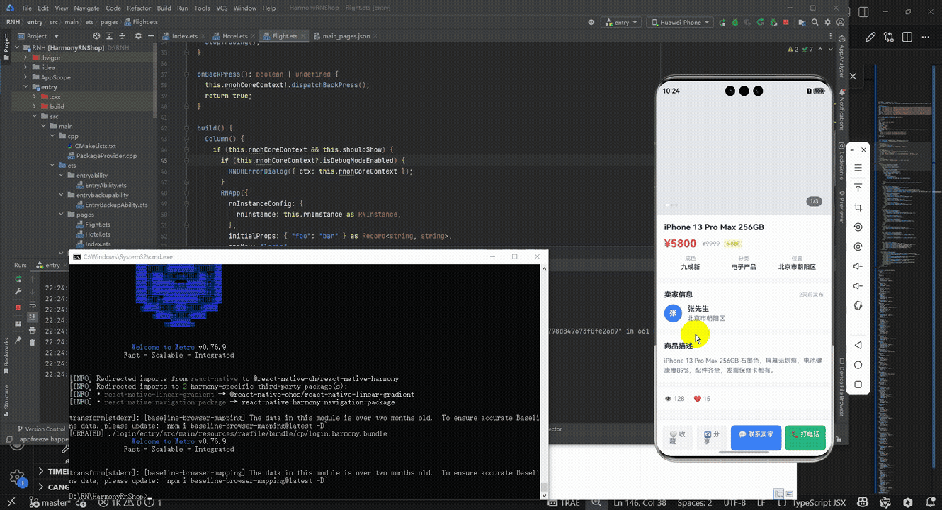
接下来通过打包命令npn run harmony将reactNative的代码打包成为bundle,这样可以进行在开源鸿蒙OpenHarmony中进行使用。

打包之后再将打包后的鸿蒙OpenHarmony文件拷贝到鸿蒙的DevEco-Studio工程目录去:

最后运行效果图如下显示:
本文探讨了React Native二手商品详情页的实现方案,重点分析了架构设计、状态管理和核心功能模块。系统采用单组件架构,通过ProductDetailApp组件管理全局状态,分离了图片轮播、商品信息、卖家详情等功能模块。实现了商品收藏、联系卖家和分享等核心交互功能,使用useState管理收藏状态和图片索引。文章还提出了性能优化建议,包括ScrollView优化、使用useReducer管理复杂状态,以及引入专业轮播组件。该实现方案结构清晰,注重用户体验,为移动端商品详情页开发提供了参考范例。
欢迎大家加入开源鸿蒙跨平台开发者社区,一起共建开源鸿蒙跨平台生态。

有“AI”的1024 = 2048,欢迎大家加入2048 AI社区
更多推荐


 2
2 0
0- 0


 已为社区贡献4条内容

所有评论(0)