雅思 simon 小作文
Simon小作文
-
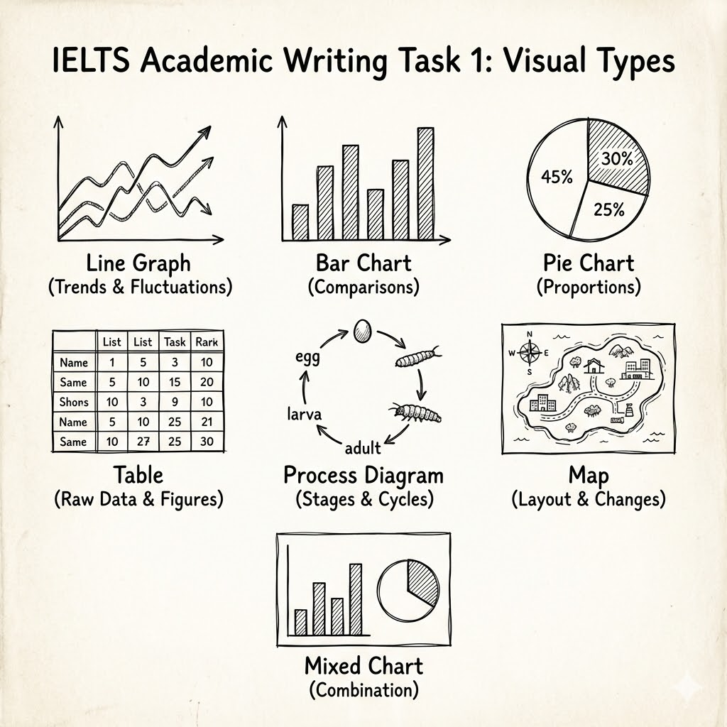
Question types-
Line graph
-
Bar chart
-
Pie chart
-
Table
-
Diagram - comparing
-
Diagram - process
-
-
Eassy structure:-
Introduction : One sentence, Paraphrase the question
-
Overview: 2 sentences, the main, general things
-
Details: 3+4 Details
-
Details:
why Details contain 2 paragraphs? This will make you organise or 'group' the information better.
-
-
Analysis task:-
Underlin example of paraphrasing in the introduction, comparing it with the question.
-
Look again at he 2 main points that I chose for the overview(paragraph 2).
-
Underline the numbers and years that I mentioned in paragraphs 3 and 4. How many numbers did I mentioln in the report?
-
Underline examples of 'comparing' language in the report
-
How manuy sentences did I write in each paragraph?
-
-
Vocabulary task:Watch the video lesson again. Near the end of the lesson, find the list of good vocabulary. Underline those phrases in the full repot on page 1 of this worksheet.
-
Extra task:Try to write your own report about the same line graph using what you remember from the lesson(but without looking at my answer).
Compare your finnished report with mine, and look for areas where you could improve.
Line graphs
-
The graph below shows electricity production (in terawatt hours) in France Between 1980 and 2012.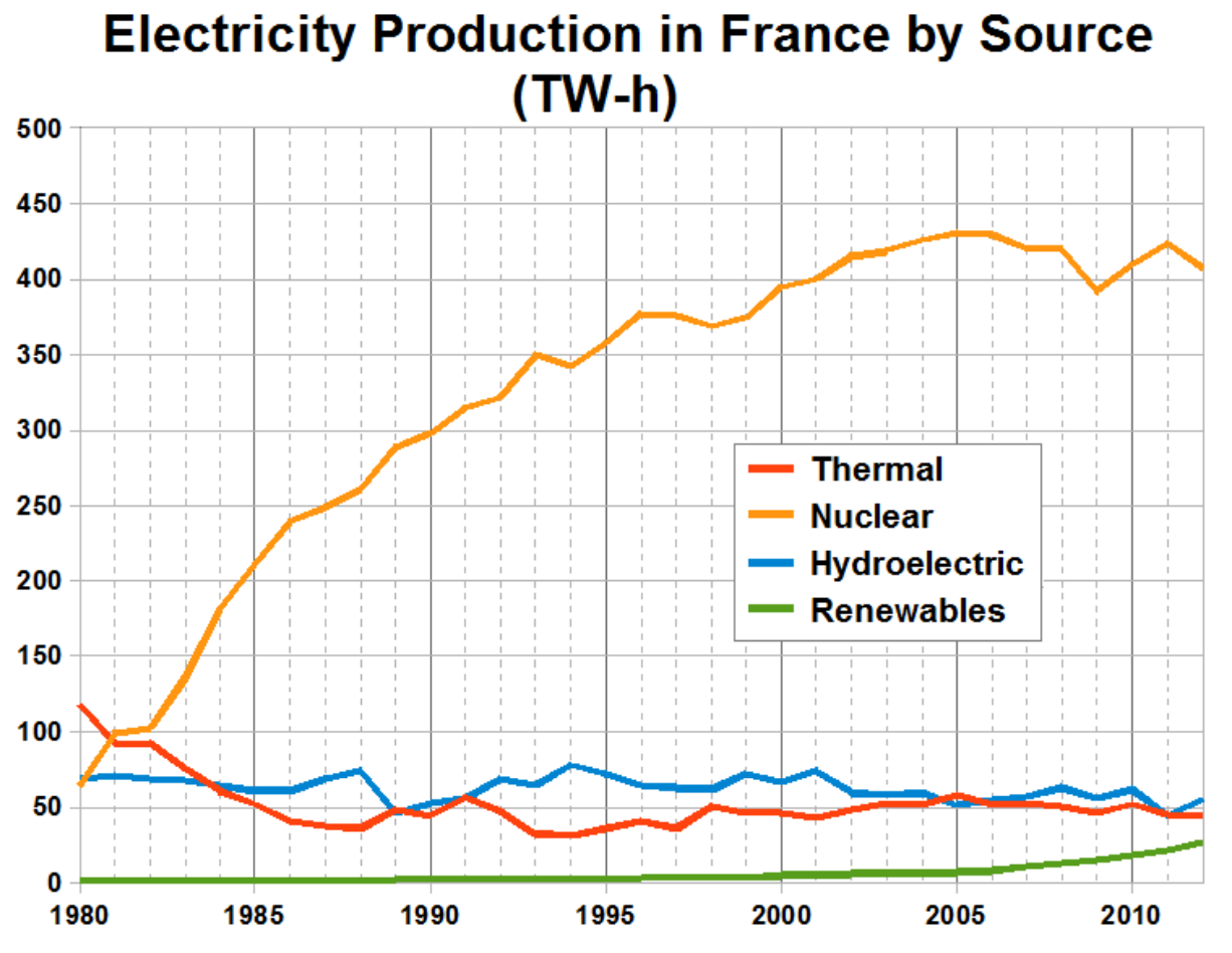
The line graph compares the amount of electricity produced in France using four different sources of power over a period of 32 years. It is clear that nuclear power was by far the most important means of electricity generation over the period shown. Renewables provided the lowest amount of electricity in each year. In 1980, thermal power stations were the the main source of electricity in France, generating around 120 terawatt hours of power. Nuclear and hycroelectric stations produced just under 75 terawatt hours of electricity each, and renewables provided a negligible amount. Just one year later, nuclear power ovettook thermal power as the primary source of electricity. Between 1980and 2005, electricity production from nuclear power rose dramatically to a peak of 430 terawatt hours. By contrast, the figure for thermal power fell to only 50 terawatt hours in 1985, and remined at this level for the rest of the period. Hydroelectric power generation remained relatively stable, at between 50 and 80 terawatt hours, for the whole 32-years period, but renewale electricity production saw only a smll rise to approximately 25 terawatt hours by 2012.
vocabulary: paraphrasing, comparing, describing changes-
amount of electricity produced
-
souurce of electricity / provided electricity/ generating electricity
-
means of electricity generation
-
over a period of / over the period shown
-
by far the most important / bar far the highest number...
-
a negiligible amount (very low)
-
nuclear power overtook thermal power
-
as the primary source of electricity
-
rose dramatically to a peak of
-
by contrast
-
the figure for
-
remained at this level, remained stable
-
saw only a small rise
-
-
The graph below shows the proportion of the population aged 65 and over between 1940 and 2040 in three different countries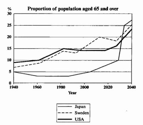
The line graph compares the percentage of people aged 65 or more in three countries over a period of 100 years. It is clear that the propotion of elederly people increases in each country between 1940 and 2040. Japan is expected to see the most drmatic changes in its elderly population. In 1940, around 9% of Americans were aged 65 or over, compared to about 7% of SWedish people and 5% of Japanese people. The proportions of elderly people in the USA and Sweden rose gradually over the next 50 years, reaching just under 15% in 1990. By contrast, the figures for Japan remained below 5% until the early 2000s. Looing into the future, a sudden increase in the percentage of elderly people is predicted for Japan, with a jump of over 15% in just 10 years form 2030 to 2040. By 2040, it is thought that around 27% of the Japanese population will be 6 years old or more, while the figure for Sweden and the USA will be slightly lower, at about 25% and 23% respectively.
-
The line graph shows the average annual expenditures on cell phone and residential phone services between 2001 and 2010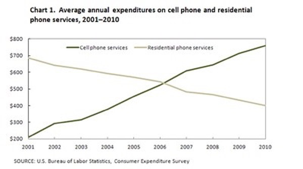
The line graph compares average yearly spending by Americans on mobile and landline(座机,固定电话) phone services from 2001 to 2010. It is clear that spending on landline phone fell steadily over the 10-year period, while mobile phone expenditure rose quickly. The year 2006 marks the point at which expenditure on mobile services overtook that for residential phone services. In 2001, US consumers spent an average of nearly $700 on residential phone services, compared to only around $200 on cell phone services. Over the following five years, average yearly spending on langlines dropped by nearly $200. By contrast, expenditure on mobiles rose by approximately $300. In the year 2006, the average American paid out the same amount of money on both types of phone service, spending just over $500 on each. By 2010, expenditure on mobile phones had reached around $750, while the figure for spending on residential services had fallen to just over half this amount.
-
The line graph below shows internet usage in different countries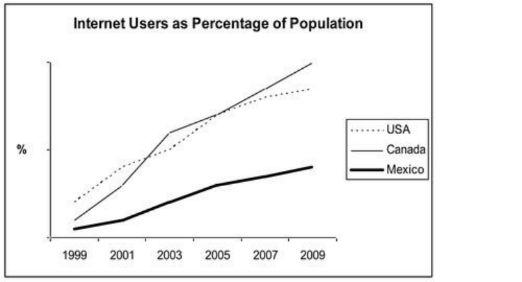
The line graph compares the percentage of people in three countries who used the Internet between 1999 and 2009. It is clear that the proportion of the population who used the Internet increased in each country over the period shown. Overall, a much larger percentage of Canadians and Americans had access to the Internet in comparison with Mexicans, and Canada experienced the fastest growth in Internet usage. In 1999, the proportion of people using the Internet in the USA was about 20%. The figures for Canda and Mexico were lower, at about 10% and 5% respectively. In 2005, Internet usage in both the USA and Canada rose to around 70% of the population, while the fiture for Mexico reached just over 25%. By 2009, the percentage of Internet users was highest in Canada. Almost 100% of Canadians used the Internet, compared to about 80% of Americans and only 40% of Mexicans.
Bar chat
-
The chart below shows global sales of the ope five mobile phone brands between 2009 and 2013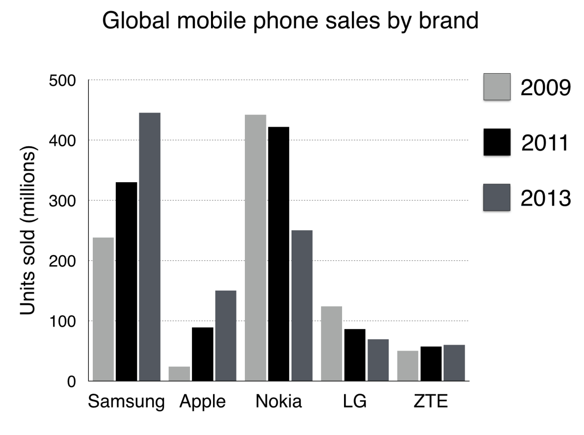
The bar chart compares the number of mobile phones sold worldwide by the five most popular manufactures in the years 2009, 2011, 2013. It is clear that Nokia sold the most mobile phones between 2009 and 2100, but Samsung became the best selling brand in 2013. Samsumg and Apple saw the biggest rises in sales ove the 5-year period. In 2009, Nokia sold close to 450 million mobile phones, which was almose double the number of handsets sold by the second monst successful manufacturer, Samsung. Over the following four years, however, Nokia's sales figures fell by approximately 200 million units, whereas Samsung saw sales rise by a similar amount. By 2013, Samsung had become the markwt leader with sales reaching 450 million units. The other three top selling mobile phones brands between 2009 and 2013 were LG, ZTE and Apple. In 2009, these companies sold around 125 million, 50 million and 25 million mobile hadsets respectively, but Apple over took the other two vendors in 2011. In 2013, purchases of Apple handsets reached 150 million units, while LG saw decline sales and the figures for ZTE rose only slightly.
vocabulary: paraphrasing, comparing, describing changes-
global sales -> sold worldwide
-
sales figures, purchases
-
most popular, best selling brand, top selling
-
second most successful manufacturer
-
market leader
-
mobiles phones, handsets, units
-
brands, manufactureres, companies, vendors
-
saw the biggest rises, saw decling sales
-
close to, almost, approximately, around
-
double the number
-
rise by a similar amount
-
respectively
-
overtook the other two vendors
-
-
The chart below shows the total number of Olympic medals(奖牌、勋章) won by twelve different countries.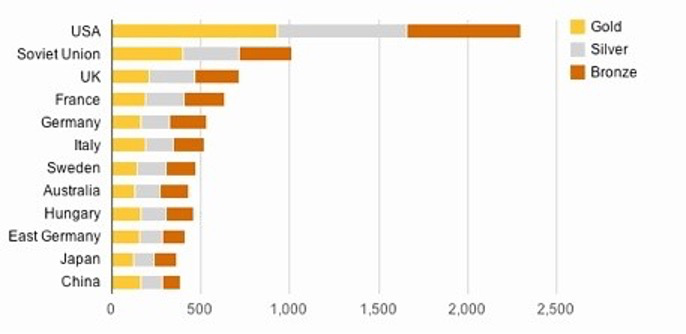
The bar chart compares twelve countries in terms of the overall number of medals that they have won at the Olymoic Games. It is clear that the USA is by far the most successful Olympic medal winning nation. It is also noticeable that the figures for gold, silver and bronze mdeals won by any particular country tend to be fairly similar. The USA has won a total of around 2300 Olympic medals, including approximately 900 gold medals, 750 silver and 650 bronze. In second place on the all-time medals chart is the Sovitet Union(苏联), with just over 1000 medals. Again, the number of gold medals won by this country is slightly higher than the number of silver or bronze medals. Only four other countries - the UK, France, Germany and Italy - have won more than 500 Olympic medals, all with similar proportions of each medal colour. Apart from(除了..外) the USA and the Soviet Union, China is the only other country with a noticeably higher proportion of gold medals(about 200) compared to silver and bronze (about 100 each).
-
电子游戏:
The bar graph shows the global sales (in billions of dollars) of different types of digital games between 2000 and 2006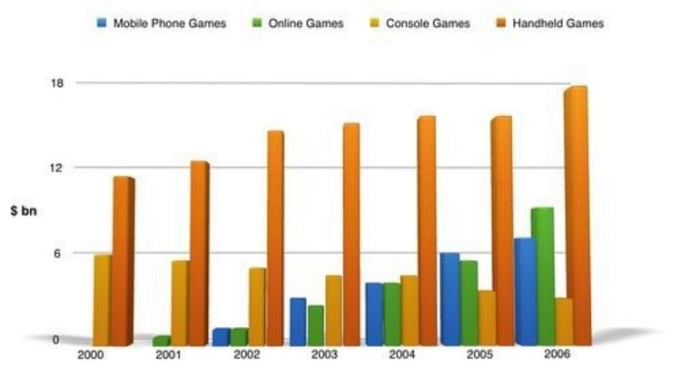
The bar chart compares the turnover(营业额) in dollars from sales of video games for four different platforms, namely mobile phones, online, consoles and handheld devices, from 2000 to 2006. It is clear that sales of games for three out of the four platforms rose each year, leading to a significant rise in total global turnover over the 7-year period. Sales figures for handheld games were at least twice as high as those for any other platform in almost every year. In 2000, worldwide sales of handheld games stood at((数字/数量)为... / 达到...) around $11 billion, while console games earned just under $6 billion. No figures are given for mobile or online games in that year. Over the next 3 years, sales of handheld video games rose by about $4 billion, but the figure for consoles decreased by $2 billion. Mobile phone and online games started to become popular, with sales reaching around $3 billion in 2003. In 2006, sales of handheld, online and mobile games reached peaks of 17, 9 and 7 billion dollars respectively. By contrast, turnover from console games dropped to(表数字下降) its lowest point, ar around $2.5 billion.
-
各地房价 ``
Pie chart
-
The charts below show household spending patterns in two countries between 1980 and 2008.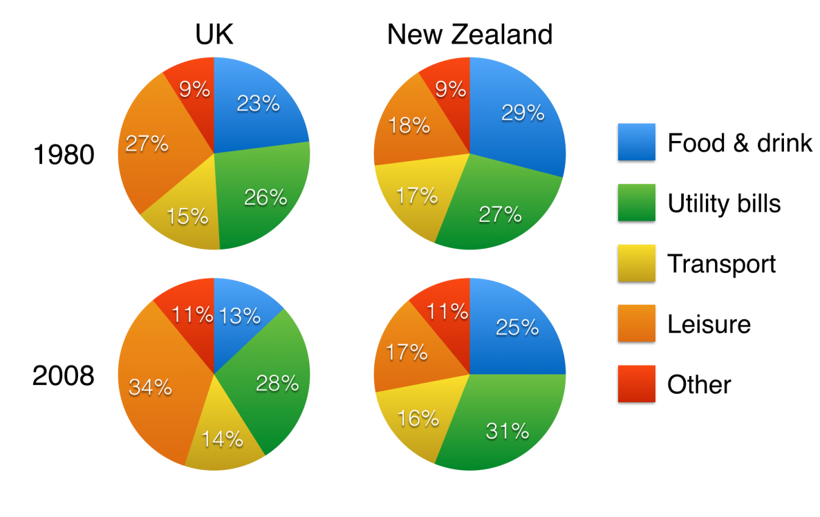
The pie charts compare five categories of household expenditure in the UK and New Zealand in the years 1980 and 2008. It is noticeable that the proportion of spending on food and drink fell in both countries over the 28-year period, while spending on utility bills rose. Also UK residents spend a significantly larger percentage of their household budgets on leisure than their New Zealand counterparts. In 1980, 29% of an average New Zealand househould budget went on food and drink, while the equivalent figure of a UK home was 23%. By 2008, exenditure on food and drink had fallen by 4% in New Zealand, and by a full 10% in the UK. By contrase, both countries saw an increase in expenditure on utility bills for the average home, from 27% to 31% in New Zealand and from 26% to 28% in the UK. Leisure activities accounted for the highest proportion of UK household spending in both years, but only the third highest proportion in New Zealand. In fact, in 2008, New Zealanders spent only half as much in relative terms on recreation(17%) as UK residents(34%). In both countries, transport costs and other costs took roughly 15% and 10% of household budgets respectively.
-
Tips-
Don't describe each country separately
-
Don't describe each year separately
-
Compare countries and years together
-
Mention all 5 categories(food & drin etc.)
-
Devide the categories into two groups for the two 'details' paragraphs
-
The category called 'Other' is not important
-
Don't write "Leisure was 34%"
-
Write "Households spent 34% of their money on leisure"
-
-
vocabulary: paraphrasing, comparing, describing changes-
spending, expenditure, spent, costs
-
proportion of sepnding
-
percentage of household budget
-
the equivalent figure for a UK home
-
fell, rose, saw an increase in
-
by 2008, expenditure had fallen
-
spent a significantly larger percentage
-
than their New Zealand counterparts
-
29% of an average household budget went on
-
while, by contrast
-
leisure accounted for eht highest proportion
-
spent half as much in relative terms
-
recreation finally instead of leisure
-
Table essay
-
The table below shows statistics about the top five countries for international tourism in 2012 and 2013.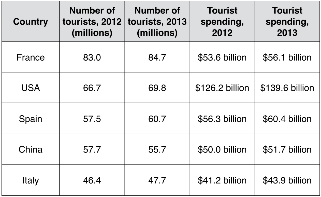
The table compares the five highest ranking countries in terms of the numbers of visits and the money spent by touries over a period of two years. It is clear that France was the world's most popular tourist destination in the years 2012 and 2013. However, the USA earned by far the most revenue from tourism over the same period. In 2012, 83 millions tourists visited Frande, and the USA was the second most visited country, with 66.7 million tourists. Spain and China each received just under 58 million visitors, while Italy was ranked fifth with 46.4 million tourists. 2013 saw a rise of between 1 and 4 million tourist visits to each country, with the exception of China, which received 2 million fewer visitors than in the previous year. Spending by tourists visiting the USA increased from $126.2 billion in 2012 to $139.6 billion in 2013, and these figures were well over twice as high as those for any other country. Spain received the second highest amounts of tourist revenue, rising from $56.3 billion to $60.4 billion, followed by France, China and Italy. Interestingly, despite falling numbers of tourists, Chinese revenue from toruism rose by $1.7 billion in 2013.
-
In table, you can't mention every number, I chose around 1o out of the total 20 numbers in the table, and that's enough.
-
vocabulary: paraphrasing, comparing, describing changes-
five highes ranking countries
-
the world's most popular tourist destination
-
earned by far the most
-
revenue from tourism
-
the second most visited country
-
received ... visitors
-
ranked fifth
-
2013 saw a rise of
-
fewer visitors than in the previous year
-
thest figures were well over twice as high as
-
amounts of tourist revenue
-
despite falling numbers
-
saw a rise, increased, rising from, rose by
-
2 different charts
-
The bar chart below shows the numbers of men and women attending various evening courses at an adult education centre in the year 2009. The pip chart gives information about the ages of these course participants.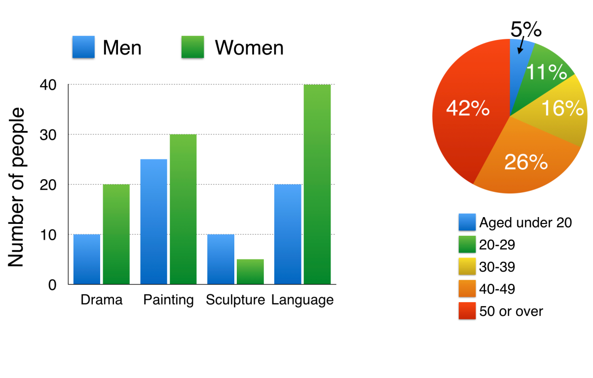
The bar chart compares the numbers of males and females who took four differents evening classes in 2009, and the pie chart shows the age profile of these attendees. It is clear that significantly more women than men attended evening classes at the education centre. We can also see that evening courses were much more popular among older adults. According to the bar chart, drama, painting and language courses all attracted more women than men to the eduction centre in 2009. Language classes had the highest number of participants overall, with 40 female and 20 male students, while painting was a pupolar choice among both genders, attracting 30 female and 25 male attendees. The only course with a higher number of males was sculpture, but this course was taken by a mere 15 poople in total. Looking at the age profile pie chart, we can see that majority of people attending evening lessons were over 40 years of age. To be precise, 42% of them were aged 50 or more, and 26% were aged between 40 and 49. Younger adults were in the minority, with only 11% of students aged 20 to 29, and only 5% aged under 20.
-
vocabulary: paraphrasing, comparing-
attending courses, who took classes
-
participants, attendees, students
-
males and females
-
courses attracted more women
-
a popular choice among both genders
-
significantly more, higher, highest
-
had the highest number, with (+ number)
-
was taken by a mere 15 people
-
according to the bar chart,
-
looking at the age profile pie chart,
-
the majority of people
-
were in the minority
-
To be precise
-
process
-
Language for process descriptions:“steps” language-
at the first stage in the process
-
The process begins with
-
secondly, finally
-
the second step involves
-
next, then, after that
-
at the following stage
passive verbs -
-
The diagrams below show how glass containers, such as bottles, are produced and recycled.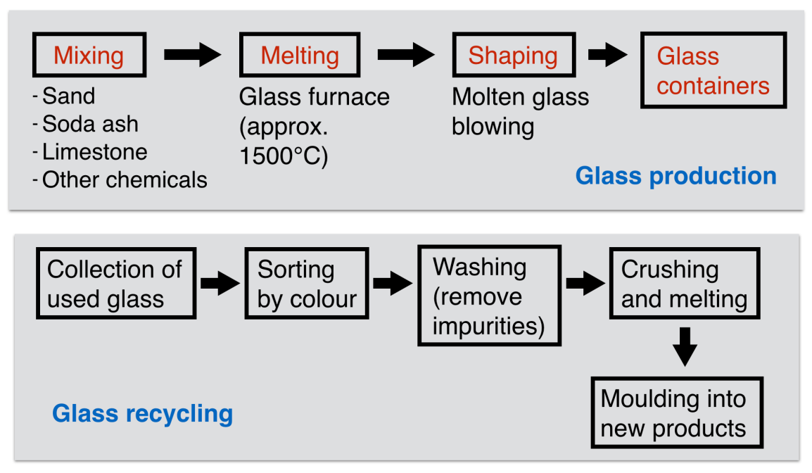
please note:-
no numbers
-
can't compare anything
-
can't describe trends (increase, decrease)
A diagram question would normally show pictures to help you understand the steps. I omitted pictures from the above question, so it would be more accurate to use the term "flow chart" instead of "diagram". However, I'll continue to use "diagram" because most IELTS questions of this type do include pictures.
The first diagram illustrates the process of glass container production, and the second diagram shows steps in the process of reculing used glass. We can see that glass is made using three main raw materials, and that the maufacturing process consists of four distinct stages. It requires five steps to turn used glass into new glass products. At the first stage in the production of glass, sand, soda ash, limestone and other chemicals are miexd together. Next, the mixture is heated in a glass furnace at approximately 1500℃ to produce molten glass. The molten glass can then be shaped, by lowing, to create the end products, namely glass containers. Glass recucling begins with the collection of used glass products. The collected glass is sorted according to its colour, and then washed in order to remove any impurities. At the fourth stage of recycling, the glass is crushed and melted, and the resulting molten glass can finally be moulded to create new items.
-
-
vocabulary: paraphrasing, steps, passive verbs-
steps / stages in the process of
-
consists of four distinct stages
-
it requires five steps
-
raw materials, end products
-
production, manufacturing
-
turn used glass into new products
-
at the first stage, next, then, begins with
-
are mixed, is heated, can be shaped
-
is sorted according to
-
can be moulded to create
-
are mixed --> this mixture
-
collection --> the collected glass
-
is melted --> the resulting molten glass
-
Comparsion
-
comparsion diagrams show:
-
changes to something e.g. an old design compared to a new design
-
or two alternative designs
-
or even two alternative locations on a map
-
-
The diagrams below show the existing ground floor plan of a house and a proposed plan for some building work.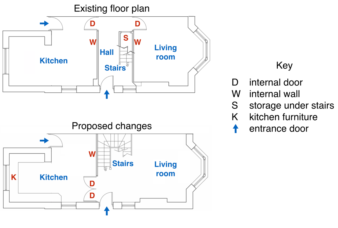
The two pictures compare the current layout of the ground floor of a house with a plan to redesign the same living space. We can see that the new design proposal involves making a number of changes to the ground floor of the house, mainly in the central hall area. There are no plans to change external walls or entrances. The most noticeable change from the existing to the proposed floor plan is that there will no longer be a separate hall area when the building work has been done. This will be achieved by removing the internal wall and door between the hall and living room, along with the current staircase and under-stair storage cupboard. With no separate hall area, the proposed living room will also contain the staircase to the first floor. To replace the current straight staircase, a new set of winding stairs will be installed in the corner of the living room. The internal door between the hall and kitchen will also be replaced with double doors connecting the kitchen with the new living room. Finally, the planned building work will also include the installation of some kitchen furniture.
-
vocabulary: paraphrasing, verbs, description of changes-
existing plan --> current layout
-
proposed plan --> plan to redesign
-
design proposal, planned building work
-
there will no longer be
-
ths will be achieved by removing
-
will also contain, will also include
-
will be installed , will be replaced
-
the design proposal involves
-
when the building work has been done
-
living space, central hall area, staircase
-
under-stair storage cupboard
-
a new set of winding stairs
-
the installation of some kitchen furniture
-
map
-
Chorleywood is a village near London whose population has increased steadily since the middle of the 19th century. The map below shows the development of the village.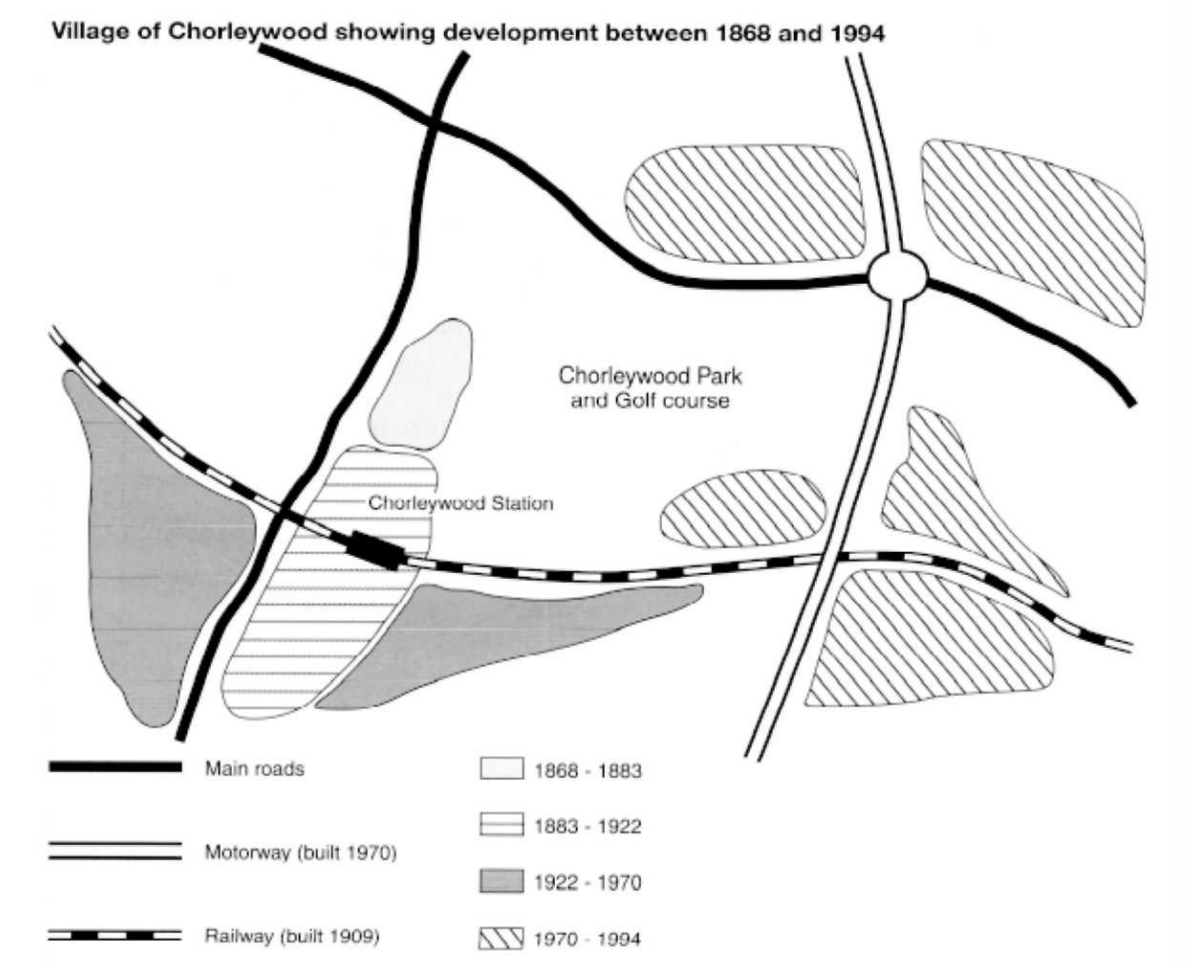
THe map shows the growth of a village called Chorleywood between 1868 and 1994. It is clear that the vilage grew as the transport infrastructure was improved. Four periods of development are shown on the map, and each of the populated areas is near to the main roads, the railway or the motorway. From 1868 to 1883, Chorelywood covered a small area next to one of the main roads. Chorelywood Park and Golf Course is now located next to the original village area. The village grew along the main road to the south between 1883 and 1922, and in 1909 a railway line was built crossing this area from west to east. Chroleywood station is in this part of the village. The expansion of Chorleywood continuted to the east and west alongside the railway line until 1970. At that time, a motorway was built to the east of the village, and from 1970 to 1994, further development of the village took place around motorway intersections with the railway and one of the main roads.
-
The two maps below show an island, before and after the construction of some tourist facilities.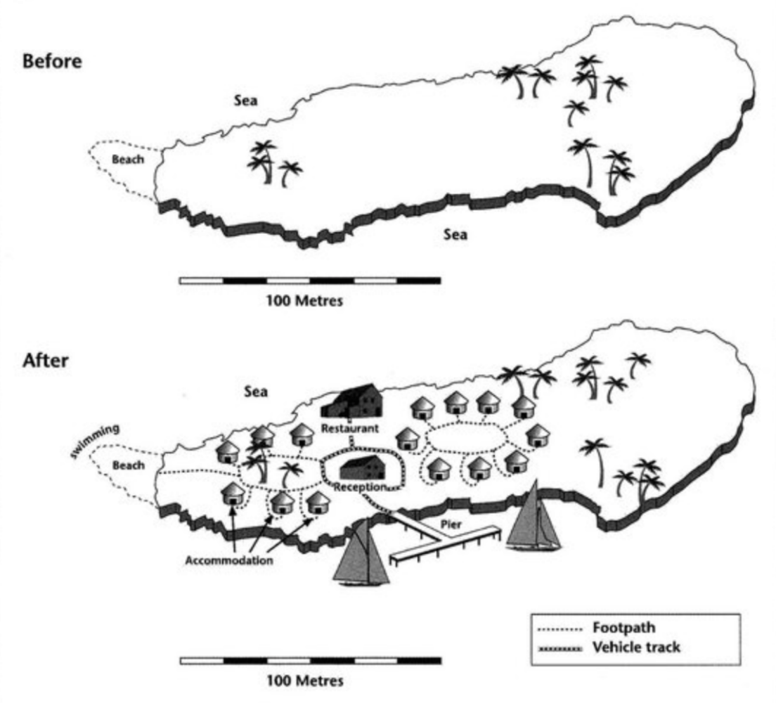
The diagrams illustrate some changes to a small island which has been developed for tourism. It is clear that the island has changed considerably with the introduction of tourism, and six new features can be seen in the second diagram. The main developments are that the island is accessible and visitors have somewhere to stay. Looking at the maps in more detail, we can see that small huts have been built to accommodate visitors to the island, and a restaurant to the north of the reception. Before these developments, the island was completely bare apart from a few trees. As well as the buildings mentioned above, the new ficilities on the island include a pier, where boats can dock. There is also a short road linking the pier with the recception and restaurant, and footpaths connect the huts. Finally, there is a designated swimming area for tourists off a beach on the western tip of the island.
-
The map below is of the town of Garlsdon. A new supermarket(s) is planned for the town. The map shows two possible sites for the supermarket.The map shows two potential locations(S1 and S2) for a new supermarket in a town called Garisdon. The main difference between the two sites is that S1 is outside the town, whereas S2 is in the town centre. The sites can also be compared in terms of access by road or rail, and their positions relative to three smaller towns. Looking at the information in more detail, S1 is in the countryside to the north west of Garlsdon, but it is close to the residential area of the town, S2 is also close to the housing area, which surrounds the town centre. There are main roads from Hindon, Bransdon and Cransdon to Garlsdon town centre, but this is a no traffic zone, so there would be no access to S2 by car. By contrast, S1 lies on the main road to Hindon, but it would be more diffcult to reach from Bransdon and Cransdon. Both supermarket sites are close to the railway that through Garlsdon from Hindon to Cransdon.

有“AI”的1024 = 2048,欢迎大家加入2048 AI社区
更多推荐

 13
13 0
0- 0


 已为社区贡献1条内容

所有评论(0)