50天50个小项目 (React19 + Tailwindcss V4) ✨| MobileTabNavigation(移动导航切换组件)
使用 React19 和 TailwindCSS 来创建一个仿手机界面的应用切换组件。这个组件模拟了真实手机中点击底部导航栏切换不同页面的动画效果,非常适合用于展示移动端 UI 设计或作为网页中的交互式演示。
📅 今天我们继续 50 个小项目挑战!——MobileTabNavigation组件
仓库地址:https://gitee.com/hhm-hhm/50days50projects.git
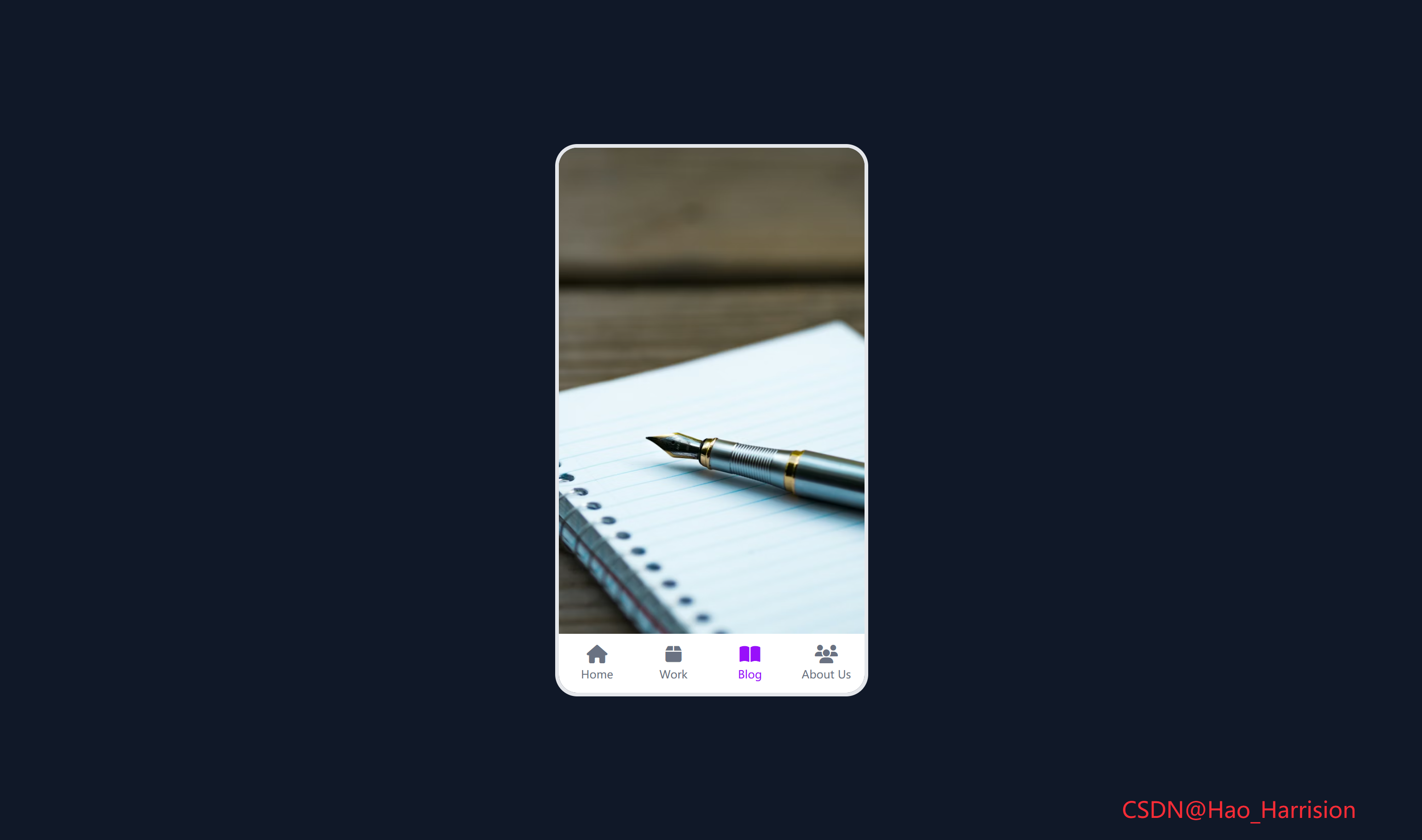
创建一个仿手机界面的应用切换组件。这个组件模拟了真实手机中点击底部导航栏切换不同页面的动画效果,非常适合用于展示移动端 UI 设计或作为网页中的交互式演示。
🌀 组件目标
- 动态渲染多个页面和导航项
- 实现页面切换的淡入淡出动画效果
- 模拟真实手机界面的交互体验
- 采用 Tailwind CSS 快速构建美观的响应式布局
🔧 MobileTabNavigation.tsx组件实现
import React, { useState } from 'react'

// 定义 Tab 类型
interface Tab {
    name: string
    iconClass: string // 注意:React 中不直接支持 <i class="fas ...">,需用其他方式渲染图标
    imageUrl: string
}

const MobileTabNavigation: React.FC = () => {
    const [currentTabIndex, setCurrentTabIndex] = useState<number>(0)

    const tabs: Tab[] = [
        {
            name: 'Home',
            iconClass: 'fa-home',
            imageUrl:
                'https://images.unsplash.com/photo-1480074568708-e7b720bb3f09?ixlib=rb-1.2.1&ixid=eyJhcHBfaWQiOjEyMDd9&auto=format&fit=crop&w=1053&q=80',
        },
        {
            name: 'Work',
            iconClass: 'fa-box',
            imageUrl:
                'https://images.unsplash.com/photo-1454165804606-c3d57bc86b40?ixlib=rb-1.2.1&ixid=eyJhcHBfaWQiOjEyMDd9&auto=format&fit=crop&w=1050&q=80',
        },
        {
            name: 'Blog',
            iconClass: 'fa-book-open',
            imageUrl:
                'https://images.unsplash.com/photo-1471107340929-a87cd0f5b5f3?ixlib=rb-1.2.1&ixid=eyJhcHBfaWQiOjEyMDd9&auto=format&fit=crop&w=1266&q=80',
        },
        {
            name: 'About Us',
            iconClass: 'fa-users',
            imageUrl:
                'https://images.unsplash.com/photo-1522202176988-66273c2fd55f?ixlib=rb-1.2.1&ixid=eyJhcHBfaWQiOjEyMDd9&auto=format&fit=crop&w=1351&q=80',
        },
    ]

    return (
        <div className="flex min-h-screen items-center justify-center bg-gray-900 p-4 font-sans">
            {/* 手机容器 */}
            <div className="relative h-[600px] w-[340px] overflow-hidden rounded-3xl border-4 border-gray-200">
                {/* 内容区域 - 使用绝对定位叠加 */}
                {tabs.map((tab, index) => (
                    <div
                        key={index}
                        className={`absolute inset-0 transition-opacity duration-300 ${
                            index === currentTabIndex
                                ? 'opacity-100'
                                : 'pointer-events-none opacity-0'
                        }`}>
                        <img
                            src={tab.imageUrl}
                            alt={tab.name}
                            className="h-full w-full object-cover"
                            style={{ height: 'calc(100% - 64px)' }}
                        />
                    </div>
                ))}

                {/* 底部导航 */}
                <nav className="absolute bottom-0 left-0 flex h-16 w-full bg-white">
                    <ul className="flex w-full">
                        {tabs.map((tab, index) => (
                            <li
                                key={index}
                                onClick={() => setCurrentTabIndex(index)}
                                className={`flex flex-1 cursor-pointer flex-col items-center justify-center p-2 transition-colors duration-200 ${
                                    index === currentTabIndex
                                        ? 'text-purple-600'
                                        : 'text-gray-500 hover:text-purple-500'
                                }`}>
                                {/* ⚠️ 注意:Font Awesome 需额外引入 */}
                                <i className={`fas ${tab.iconClass} text-xl`} />
                                <p className="mt-1 text-xs">{tab.name}</p>
                            </li>
                        ))}
                    </ul>
                </nav>
            </div>
            <div className="fixed right-20 bottom-5 z-100 text-2xl text-red-500">
                CSDN@Hao_Harrision
            </div>
        </div>
    )
}

export default MobileTabNavigation
🔄 关键差异总结
| 功能 | Vue 3 | React + TS |
|---|---|---|
| 响应式状态 | ref() |
useState() |
| 列表渲染 | v-for |
.map() |
| 事件绑定 | @click |
onClick |
| 动态类名 | :class 对象 |
模板字符串 + 三元 |
| 图标 | <i class="fas ..."> |
需额外引入 Font Awesome |
| Key 策略 | :key="index" |
key={index} |
✅ 使用前准备
-
引入 Font Awesome(任选其一):
- 全局 CDN(开发快速):在
index.html添加<link>; - React 组件(生产推荐):安装
@fortawesome包并改用<FontAwesomeIcon>。
- 全局 CDN(开发快速):在
-
确保 Tailwind 已配置:支持
h-[600px]、w-[340px]等任意值。
🔁 转换说明
1. 状态管理:ref → useState
| Vue | React |
|---|---|
const currentTabIndex = ref(0) |
const [currentTabIndex, setCurrentTabIndex] = useState(0) |
✅ 完全等价,React 使用解构赋值获取状态和更新函数。
2. 列表渲染:v-for → .map()
- Vue:
<div v-for="(tab, index) in tabs" :key="index"> - React:
{tabs.map((tab, index) => <div key={index}>...)}
✅ 注意:这里使用 index 作为 key 是可接受的,因为 tabs 是静态数组,不会增删或重排。
💡 如果
tabs是动态的(如从 API 获取且可能变化),应使用唯一 ID。但此处是硬编码,安全。
3. 事件处理:@click → onClick
onClick={() => setCurrentTabIndex(index)}✅ 使用箭头函数传递当前索引,符合 React 事件处理规范。
4. 条件类名:动态 class
Vue 使用对象语法:
:class="{ 'text-purple-600': index === currentTabIndex, ... }"React 中使用模板字符串或三元表达式:
className={`... ${index === currentTabIndex ? 'text-purple-600' : 'text-gray-500 hover:text-purple-500'} ...`}✅ 功能完全一致。
5. 样式与布局
- 所有 Tailwind 类名直接复用;
style={{ height: 'calc(100% - 64px)' }}用于精确控制图片高度(避开底部 64px 导航栏);pointer-events-none确保非激活 tab 不响应点击。
6. 图标处理(重要!)
⚠️ Font Awesome 在 React 中不能直接用 <i class="fas fa-home">,除非你:
方案 A:全局引入 Font Awesome CSS(简单)
在 main.tsx 或 index.html 中添加:
<!-- index.html -->
<link
  rel="stylesheet"
  href="https://cdnjs.cloudflare.com/ajax/libs/font-awesome/6.5.0/css/all.min.css"
/>
✅ 这样 <i className="fas fa-home" /> 就能正常工作。
方案 B:使用 React 组件(推荐生产环境)
安装官方包:
npm install @fortawesome/react-fontawesome
npm install @fortawesome/free-solid-svg-icons
然后改写图标部分:
import { FontAwesomeIcon } from '@fortawesome/react-fontawesome';
import { faHome, faBox, faBookOpen, faUsers } from '@fortawesome/free-solid-svg-icons';

// 在 tabs 中改用 icon 对象
const tabs = [
  { name: 'Home', icon: faHome, imageUrl: '...' },
  // ...
];

// 渲染时
<FontAwesomeIcon icon={tab.icon} className="text-xl" />
📌 本代码采用方案 A(兼容原 Vue 结构),但请确保已在项目中引入 Font Awesome CSS。
7. 过渡动画
transition-opacity duration-300实现淡入淡出;pointer-events-none防止隐藏层干扰交互;- 与 Vue 的
transition行为一致。
💡 优化建议(可选)
- 添加加载状态(
isLoading); - 使用
React.memo优化卡片性能; - 缓存已加载的宝可梦(避免重复请求);
- 支持搜索或分页。
🎨 TailwindCSS 样式重点讲解
| 类名 | 作用 |
|---|---|
flex |
启用 Flexbox 布局 |
min-h-screen |
设置最小高度为视口高度 |
items-center / justify-center |
居中对齐内容 |
bg-purple-300 |
设置背景颜色 |
p-4 |
设置内边距 |
font-sans |
使用无衬线字体 |
relative |
设置相对定位,作为子元素的定位上下文 |
h-[600px] w-[340px] |
固定手机容器尺寸 |
overflow-hidden |
隐藏超出容器的内容 |
rounded-3xl |
设置超大圆角,模拟手机外观 |
border-4 border-gray-200 |
添加边框,增强真实感 |
absolute inset-0 |
让页面内容铺满容器 |
transition-opacity duration-300 |
添加透明度过渡动画 |
opacity-100 / opacity-0 |
控制页面显隐 |
pointer-events-none |
禁用鼠标事件,避免隐藏页面干扰交互 |
object-cover |
图片保持比例并填充容器 |
bottom-0 left-0 |
将导航栏定位在底部 |
h-16 |
设置导航栏高度 |
bg-white |
设置导航栏背景色 |
flex-1 |
让导航项平均分配空间 |
cursor-pointer |
显示手型光标 |
transition-colors duration-200 |
颜色变化过渡效果 |
text-purple-600 / text-gray-500 |
设置文字颜色 |
hover:text-purple-500 |
鼠标悬停时的颜色变化 |
🦌 路由组件 + 常量定义
router/index.tsx 中 children数组中添加子路由
{
    path: '/',
    element: <App />,
    children: [
       ...
       {
                path: '/MobileTabNavigation',
                lazy: () =>
                    import('@/projects/MobileTabNavigation').then((mod) => ({
                        Component: mod.default,
                    })),
            },
    ],
 },
constants/index.tsx 添加组件预览常量
import demo38Img from '@/assets/pic-demo/demo-37.png'
省略部分....
export const projectList: ProjectItem[] = [
    省略部分....
      {
        id: 38,
        title: 'Mobile Tab Navigation',
        image: demo38Img,
        link: 'MobileTabNavigation',
    },
]
🚀 小结
通过这篇文章,我们使用 React19 和 TailwindCSS 创建了一个高度仿真的手机应用切换组件。通过简单的代码实现了流畅的页面切换动画和直观的交互体验。
想要让你的应用更强大?试试这些扩展功能:
✅ 添加顶部状态栏:模拟时间、信号、电量等信息
✅ 手势滑动切换:支持左右滑动切换页面
✅ 动态图标库:使用 @fortawesome/vue-fontawesome 等图标组件
✅ 暗色模式切换:支持夜间主题
✅ 页面预加载:优化图片加载体验
📅 明日预告: 我们将完成PasswordStrengthBackground组件,实现密码强度检测组件,密码强度越强背景图片越清晰反之越模糊。🚀
感谢阅读,欢迎点赞、收藏和分享 😊
原文链接:https://blog.csdn.net/qq_44808710/article/details/149736949
每天造一个轮子,码力暴涨不是梦!🚀

有“AI”的1024 = 2048,欢迎大家加入2048 AI社区
更多推荐

 0
0 0
0- 0


 已为社区贡献34条内容

所有评论(0)