【App开发】04:Android Studio第一个项目之页面开发
其他参考
官方文档:
探索 Android Studio | Android Developers
第四部分:页面开发
一、了解项目结构
1.1 项目视图
项目文件按不同的展示方式,分为多种项目视图,按如下方式切换不同的项目视图:
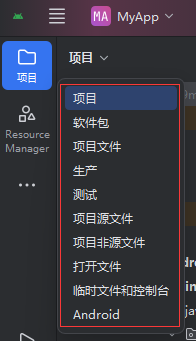
不同视图的功能如下:
| 视图名称 | 功能说明 |
|---|---|
| 项目 | 按 Android 项目的逻辑结构组织文件,将代码、资源、构建文件按模块(如app)和功能分组,是开发时最常用的视图,便于理解项目整体架构。 |
| 软件包 | 按Java/Kotlin 包结构展示文件,仅显示代码文件(如.kt、.java),以包名(如com.example.myapp)为层级,方便快速定位类文件。 |
| 项目文件 | 按本地文件系统结构展示所有文件(与电脑文件夹结构完全一致),包括隐藏文件(如.gradle、.idea),适合需要操作原始文件结构的场景。 |
| 生产 | 仅显示生产环境的代码和资源,过滤测试相关文件,专注于应用的业务逻辑开发。 |
| 测试 | 仅显示测试相关文件(包括androidTest和test目录下的测试代码),便于集中管理和编写测试用例。 |
| 项目源文件 | 仅显示源代码文件(如.kt、.java、.xml源文件),过滤构建脚本、配置文件等,专注于代码编辑。 |
| 项目非源文件 | 仅显示非源代码文件(如build.gradle、local.properties、资源文件之外的配置文件),方便管理项目的非代码文件。 |
| 打开文件 | 仅显示当前在编辑器中打开的文件,便于在多个打开的文件之间快速切换。 |
| 临时文件和控制台 | 显示临时生成的文件(如构建临时文件)和控制台输出(如 Logcat 日志、构建日志),用于调试和查看运行信息。 |
| Android | 按Android 开发专属逻辑组织文件,将资源(drawable、layout等)、清单文件(AndroidManifest.xml)、活动(Activity)等按 Android 组件和资源类型分组,是 Android 开发的专属优化视图。 |
其中,项目、Android两个项目视图最为常用。
1.2 项目结构
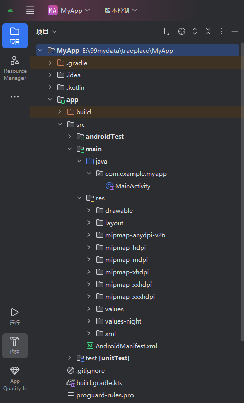
以前面章节新建的项目为例,查看一个项目包含哪些组成部分。新创建的项目,项目视图展现如下:
 |
接左方视图界面:
|
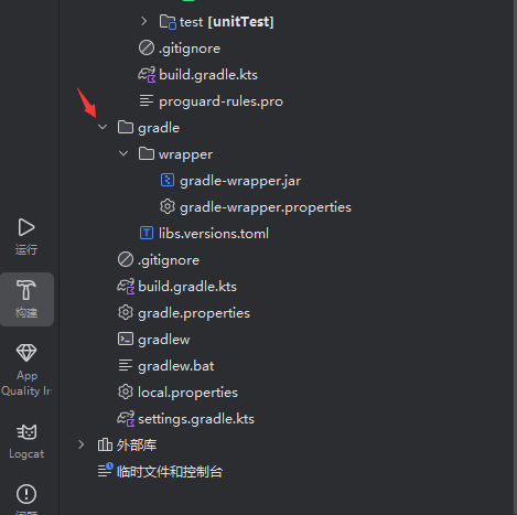
Android Studio 的项目结构可分为根目录和 **模块(默认创建的是app模块,可以创建更多模块),各目录 / 文件的作用如下:
1、根目录(项目级)
| 目录 / 文件 | 作用 |
|---|---|
settings.gradle.kts |
配置项目包含的模块(如include ':app'表示包含app模块)。 |
build.gradle.kts(项目级) |
配置整个项目的构建规则,如依赖仓库(Maven/Gradle)、Gradle 插件版本等。 |
gradle 文件夹 |
包含wrapper子目录,用于管理 Gradle 版本,确保不同环境使用统一的 Gradle 版本。 |
local.properties |
存储本地环境配置(如 Android SDK 路径),一般由 IDE 自动生成和维护。 |
.gitignore |
版本控制(Git)的 “忽略规则文件”,指定哪些文件 / 目录不提交到代码仓库。 |
.gradle/.idea |
IDE 的缓存和配置目录,用于存储构建缓存、项目设置等,通常无需手动操作。 |
2、app模块(应用级,核心开发目录)
app模块是 Android 应用的核心模块,包含代码、资源、构建配置等关键内容:
1). 构建与配置文件
| 目录 / 文件 | 作用 |
|---|---|
build.gradle.kts(模块级) |
配置当前模块的构建规则,如编译 SDK 版本、依赖库(第三方库 / AndroidX)、签名信息等。 |
proguard-rules.pro |
代码混淆规则文件,用于发布时混淆代码,防止反编译,保障应用安全。 |
2). 源代码与资源目录(src)
| 目录 / 文件 | 作用 |
|---|---|
main 目录 |
存放应用的主代码和资源,是开发的核心区域。 |
- java 目录 |
存放 Kotlin/Java 源代码,以包名(如com.example.myapp)组织,MainActivity是应用的 “主活动”(入口页面)。 |
- res 目录 |
存放应用资源,按类型分类: - - - - - - |
- AndroidManifest.xml |
应用 “清单文件”,配置应用的核心信息:组件(Activity、Service、BroadcastReceiver 等)、权限、应用名称、图标、版本号等。 |
androidTest 目录 |
存放安卓设备级的自动化测试代码(如 UI 测试),运行时依赖安卓设备 / 模拟器。 |
test 目录 |
存放本地单元测试代码(如业务逻辑测试),可在 JVM 环境直接运行,不依赖安卓设备。 |
二、Activity 的基本结构解析
Activity 是 Android 应用的界面容器,负责承载用户可见的界面和交互逻辑。以项目默认创建的MainActivity.kt为例,我们逐部分拆解:
2.1. 包声明与导入
kotlin
package com.example.myapp  // ① 包声明:定义类的命名空间,确保类的唯一性
import ...                // ② 导入语句:引入所需的依赖类(如AppCompatActivity、Bundle等)
- 包声明是每个 Kotlin 文件的开头,用于组织代码,避免类名冲突。
- 导入语句会自动引入 Android 开发所需的核心类(如
AppCompatActivity是 Activity 的增强版,兼容低版本 Android)。
2.2. 类定义与继承
kotlin
class MainActivity : AppCompatActivity() {  // ③ 类定义:继承自AppCompatActivity
    // Activity的核心逻辑都在这个类中
}
MainActivity是类名,你可以自定义(但需保持与 AndroidManifest.xml 中的声明一致)。: AppCompatActivity()表示该类继承自AppCompatActivity,这是 Android 推荐的 Activity 基类,支持兼容性特性(如 ActionBar、 Material Design 样式)。
2.3. 生命周期方法:onCreate()
Activity 有一套生命周期回调方法,其中onCreate()是最核心的 “初始化入口”:
kotlin
override fun onCreate(savedInstanceState: Bundle?) {
    super.onCreate(savedInstanceState)  // 必须调用父类的onCreate,完成基础初始化
    enableEdgeToEdge()  // Android 12+特性:让界面延伸到系统栏(状态栏/导航栏)下方
    setContentView(R.layout.activity_main)  // 设置界面布局(关联activity_main.xml)

    // 处理窗口边距,避免内容被系统栏遮挡(初学者可暂时忽略细节)
    ViewCompat.setOnApplyWindowInsetsListener(findViewById(R.id.main)) { v, insets ->
        val systemBars = insets.getInsets(WindowInsetsCompat.Type.systemBars())
        v.setPadding(systemBars.left, systemBars.top, systemBars.right, systemBars.bottom)
        insets
    }
}
onCreate()在 Activity首次创建时调用,用于初始化界面、绑定布局、设置事件监听等。setContentView(R.layout.activity_main)是 “界面与逻辑绑定” 的关键 —— 它指定了当前 Activity 要显示的布局文件(activity_main.xml)。
三、布局文件activity_main.xml
布局文件是 Activity 界面的 “可视化描述”,位于res/layout/activity_main.xml,作为项目的默认界面配置文件。
3.1 activity_main.xml结构拆解
逐行解析activity_main.xml的核心组成部分:
xml
<?xml version="1.0" encoding="utf-8"?>  <!-- ① XML声明:定义版本和编码 -->
<androidx.constraintlayout.widget.ConstraintLayout  <!-- ② 根布局:ConstraintLayout是灵活的约束式布局容器 -->
    xmlns:android="http://schemas.android.com/apk/res/android"  <!-- ③ 命名空间:Android系统属性 -->
    xmlns:app="http://schemas.android.com/apk/res-auto"  <!-- ③ 命名空间:支持库(如ConstraintLayout)属性 -->
    xmlns:tools="http://schemas.android.com/tools"  <!-- ③ 命名空间:仅工具预览生效的属性 -->
    android:id="@+id/main"  <!-- ④ 根布局ID:用于代码中引用或跨布局关联 -->
    android:layout_width="match_parent"  <!-- ④ 宽度:与父容器(屏幕)等宽 -->
    android:layout_height="match_parent"  <!-- ④ 高度:与父容器(屏幕)等高 -->
    tools:context=".MainActivity">  <!-- ④ 关联Activity:指定该布局属于MainActivity(工具预览用) -->

    <TextView  <!-- ⑤ 子组件:文本显示组件 -->
        android:layout_width="wrap_content"  <!-- 组件宽度:由内容自动包裹 -->
        android:layout_height="wrap_content"  <!-- 组件高度:由内容自动包裹 -->
        android:text="Hello World!"  <!-- 显示的文本内容 -->
        app:layout_constraintBottom_toBottomOf="parent"  <!-- 垂直约束:底部与父布局底部对齐 -->
        app:layout_constraintEnd_toEndOf="parent"  <!-- 水平约束:右端与父布局右端对齐 -->
        app:layout_constraintStart_toStartOf="parent"  <!-- 水平约束:左端与父布局左端对齐 -->
        app:layout_constraintTop_toTopOf="parent" />  <!-- 垂直约束:顶部与父布局顶部对齐 -->

</androidx.constraintlayout.widget.ConstraintLayout>
具体说明:
- XML 声明:
<?xml version="1.0" encoding="utf-8"?>是所有 XML 文件的标准开头,定义了 XML 版本和字符编码。 - 根布局(
ConstraintLayout):- 是 Android 推荐的灵活布局容器,通过 “约束关系” 定位子组件,适配不同屏幕尺寸。
- 一个布局文件有且只有一个根布局。
- 布局容器有不同种类,C
onstraintLayout是灵活布局容器,其他布局类型,请参考本文附录。
- 命名空间:
xmlns:android:用于 Android 系统自带的属性(如android:layout_width、android:text)。xmlns:app:用于 Android 支持库(如ConstraintLayout的约束属性app:layout_constraint...)。xmlns:tools:仅在开发工具(如 Android Studio 预览)中生效,不影响 APP 运行(如tools:context用于关联 Activity)。
- 布局属性:
layout_width/layout_height:组件的宽高,可选值:match_parent:与父容器尺寸一致;wrap_content:由内容自动决定尺寸;xx dp:固定尺寸(如20dp,dp是 Android 适配的长度单位)。
- 约束关系(
ConstraintLayout核心):每个组件需要通过水平 + 垂直约束确定位置。以上述TextView为例:- 水平方向:
app:layout_constraintStart_toStartOf="parent"(左端与父布局左端对齐)、app:layout_constraintEnd_toEndOf="parent"(右端与父布局右端对齐)→ 水平居中。 - 垂直方向:
app:layout_constraintTop_toTopOf="parent"(顶部与父布局顶部对齐)、app:layout_constraintBottom_toBottomOf="parent"(底部与父布局底部对齐)→ 垂直居中。最终TextView在屏幕正中央显示。
- 水平方向:
3.2 添加交互组件
1. 打开并理解布局结构
- 在 Android Studio 左侧 “Project” 面板中,展开
app → res → layout,双击activity_main.xml打开。 - 默认布局是
ConstraintLayout(一种灵活的布局容器,通过 “约束” 定义组件位置)。 - 可以切换查看视图:
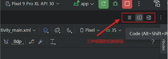
2. 添加第一个 UI 组件:TextView
我们先添加一个 “欢迎文本”,步骤如下:
- 打开
activity_main.xml的Design 视图(点击底部 “Design” 标签)。 - 从左侧 “Palette” 面板中,拖拽一个
TextView到布局中央。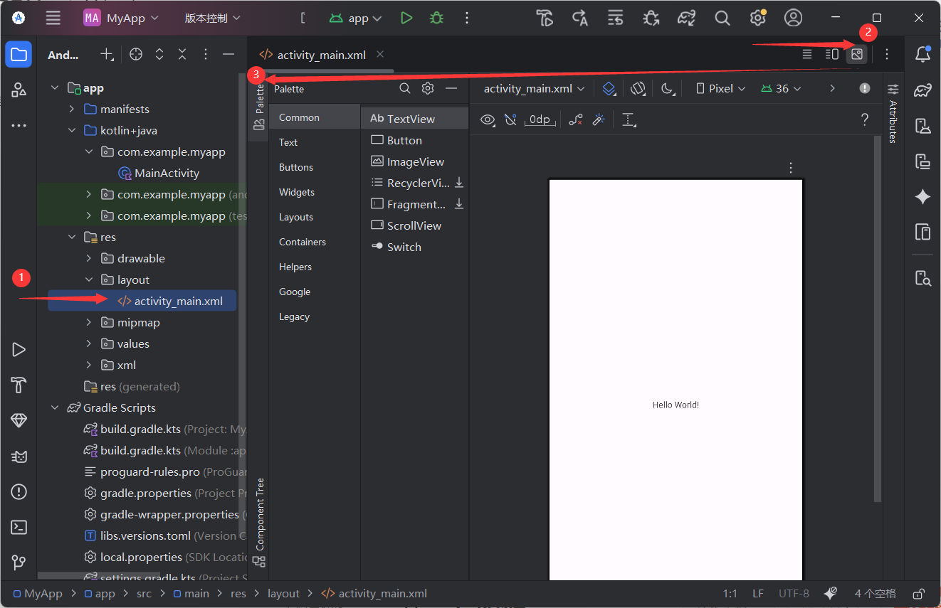
- 选中
TextView,在右侧 “Attributes” 面板中:- 设置
text为"Hello, Android 初学者!"; - 设置
textSize为24sp(字体大小,sp 是 Android 推荐的字体单位); - 点击 “Constraint” 栏的四个圆点,将
TextView约束到父布局的中心(确保界面适配不同屏幕)。
- 设置
3. 添加交互组件:Button
再添加一个按钮,实现 “点击后文本变化” 的交互:
- 从 “Palette” 中拖拽一个
Button到TextView下方。 - 在 “Attributes” 中设置
text为"点击我试试"。 - 同样通过 “Constraint” 将
Button约束到TextView下方(如:Button的顶部约束到TextView的底部)。
4. 切换到代码视图(可选)
点击底部 “Code” 标签,可查看布局的 XML 代码。添加组件后,代码大致如下:
xml
<?xml version="1.0" encoding="utf-8"?>
<androidx.constraintlayout.widget.ConstraintLayout
    xmlns:android="http://schemas.android.com/apk/res/android"
    xmlns:app="http://schemas.android.com/apk/res-auto"
    xmlns:tools="http://schemas.android.com/tools"
    android:layout_width="match_parent"
    android:layout_height="match_parent"
    tools:context=".MainActivity"
    android:id="@+id/main">

    <TextView
        android:id="@+id/welcomeText"
        android:layout_width="wrap_content"
        android:layout_height="wrap_content"
        android:text="Hello, Android 初学者!"
        android:textSize="24sp"
        app:layout_constraintBottom_toTopOf="@+id/actionButton"
        app:layout_constraintEnd_toEndOf="parent"
        app:layout_constraintStart_toStartOf="parent"
        app:layout_constraintTop_toTopOf="parent" />

    <Button
        android:id="@+id/actionButton"
        android:layout_width="wrap_content"
        android:layout_height="wrap_content"
        android:text="点击我试试"
        app:layout_constraintBottom_toBottomOf="parent"
        app:layout_constraintEnd_toEndOf="parent"
        app:layout_constraintStart_toStartOf="parent"
        app:layout_constraintTop_toBottomOf="@+id/welcomeText" />

</androidx.constraintlayout.widget.ConstraintLayout>
四、在MainActivity中与 UI 组件交互
现在回到MainActivity.kt,我们要让 “点击按钮” 触发文本变化,步骤如下:
4.1. 获取组件引用
在onCreate()中,通过findViewById获取布局中组件的实例:
kotlin
override fun onCreate(savedInstanceState: Bundle?) {
    super.onCreate(savedInstanceState)
    enableEdgeToEdge()
    setContentView(R.layout.activity_main)

    // 获取TextView和Button的引用
    val welcomeText = findViewById<TextView>(R.id.welcomeText)
    val actionButton = findViewById<Button>(R.id.actionButton)
}
4.2. 设置点击事件
给Button添加点击监听,实现 “点击后文本变化”:
kotlin
actionButton.setOnClickListener {
    welcomeText.text = "你成功触发了点击事件!"
}
完整的MainActivity.kt代码如下:
kotlin
package com.example.myapp

import android.os.Bundle
import androidx.appcompat.app.AppCompatActivity
import androidx.core.view.ViewCompat
import androidx.core.view.WindowInsetsCompat
import android.widget.Button
import android.widget.TextView

class MainActivity : AppCompatActivity() {
    override fun onCreate(savedInstanceState: Bundle?) {
        super.onCreate(savedInstanceState)
        enableEdgeToEdge()
        setContentView(R.layout.activity_main)

        // 获取UI组件引用
        val welcomeText = findViewById<TextView>(R.id.welcomeText)
        val actionButton = findViewById<Button>(R.id.actionButton)

        // 设置按钮点击事件
        actionButton.setOnClickListener {
            welcomeText.text = "你成功触发了点击事件!"
        }

        // 系统栏边距适配(初学者可暂时忽略)
        ViewCompat.setOnApplyWindowInsetsListener(findViewById(R.id.main)) { v, insets ->
            val systemBars = insets.getInsets(WindowInsetsCompat.Type.systemBars())
            v.setPadding(systemBars.left, systemBars.top, systemBars.right, systemBars.bottom)
            insets
        }
    }
}
五、运行测试
点击 Android Studio 顶部的 “运行” 按钮(绿色三角形),选择你的设备(或模拟器),即可在设备上看到效果:
- 界面显示 “Hello, Android 初学者!” 和 “点击我试试” 按钮;
- 点击按钮后,文本会变成 “你成功触发了点击事件!”。
六、总结与拓展
- Activity 结构:由包声明、类继承、生命周期方法(核心是
onCreate)组成,是界面逻辑的载体。 - 布局文件:通过
activity_main.xml定义界面组件,用ConstraintLayout等容器实现适配。 - 组件交互:在
MainActivity中通过findViewById获取组件,再设置点击、输入等事件。
附录
各种布局模式
在 Android 开发中,activity_main.xml支持多种布局模式(布局容器),每种布局有不同的定位逻辑和适用场景。
0. 主要布局类型概览
| 布局类型 | 特点 | 适用场景 |
|---|---|---|
| LinearLayout | 线性排列,水平或垂直 | 简单列表式布局 |
| RelativeLayout | 相对定位,灵活但复杂 | 元素间有相对关系的布局 |
| ConstraintLayout | 推荐,约束关系,性能好 | 复杂响应式布局 |
| FrameLayout | 层叠布局 | 重叠元素、碎片容器 |
| TableLayout | 表格形式 | 数据表格展示 |
| GridLayout | 网格布局 | 规整的网格状布局 |
- 优先选 ConstraintLayout:灵活度高,减少嵌套(嵌套过多会影响性能)。
- 简单线性排列用 LinearLayout:如 “标题 + 内容 + 按钮” 的垂直排列。
- 组件关系复杂用 RelativeLayout:但需注意过度使用会增加维护成本。
- 层叠效果用 FrameLayout:如 “图片 + 文字” 的组合。
- 网格排列用 GridLayout:如多列图片、按键布局。
各布局模式具体使用,详细介绍如下。
1. LinearLayout(线性布局)
特点:子视图按水平或垂直方向依次排列。
xml
<?xml version="1.0" encoding="utf-8"?>
<LinearLayout xmlns:android="http://schemas.android.com/apk/res/android"
    android:layout_width="match_parent"
    android:layout_height="match_parent"
    android:orientation="vertical"
    android:gravity="center"
    android:padding="16dp">

    <TextView
        android:layout_width="wrap_content"
        android:layout_height="wrap_content"
        android:text="标题"
        android:textSize="24sp"
        android:layout_marginBottom="16dp" />

    <EditText
        android:layout_width="match_parent"
        android:layout_height="wrap_content"
        android:hint="输入内容"
        android:layout_marginBottom="16dp" />

    <Button
        android:layout_width="wrap_content"
        android:layout_height="wrap_content"
        android:text="提交" />

</LinearLayout>
关键属性:
-
android:orientation="vertical|horizontal"- 排列方向 -
android:gravity- 子视图对齐方式 -
android:layout_weight- 权重分配(用于子视图)
2. RelativeLayout(相对布局)
特点:通过相对关系定位视图。
xml
<?xml version="1.0" encoding="utf-8"?>
<RelativeLayout xmlns:android="http://schemas.android.com/apk/res/android"
    android:layout_width="match_parent"
    android:layout_height="match_parent"
    android:padding="16dp">

    <TextView
        android:id="@+id/title"
        android:layout_width="wrap_content"
        android:layout_height="wrap_content"
        android:text="标题"
        android:textSize="24sp"
        android:layout_centerHorizontal="true" />

    <Button
        android:id="@+id/button"
        android:layout_width="wrap_content"
        android:layout_height="wrap_content"
        android:text="按钮"
        android:layout_below="@id/title"
        android:layout_centerHorizontal="true"
        android:layout_marginTop="16dp" />

    <ImageView
        android:layout_width="100dp"
        android:layout_height="100dp"
        android:src="@mipmap/ic_launcher"
        android:layout_above="@id/button"
        android:layout_alignParentRight="true" />

</RelativeLayout>
常用相对定位属性:
-
layout_below/layout_above- 在某个视图下方/上方 -
layout_toLeftOf/layout_toRightOf- 在某个视图左侧/右侧 -
layout_centerInParent- 在父容器中心 -
layout_alignParentTop- 与父容器顶部对齐
3. ConstraintLayout(约束布局)⭐ 推荐
特点:Google 推荐的现代布局,性能优秀,灵活性高。
xml
<?xml version="1.0" encoding="utf-8"?>
<androidx.constraintlayout.widget.ConstraintLayout
    xmlns:android="http://schemas.android.com/apk/res/android"
    xmlns:app="http://schemas.android.com/apk/res-auto"
    android:layout_width="match_parent"
    android:layout_height="match_parent"
    android:padding="16dp">

    <TextView
        android:id="@+id/title"
        android:layout_width="0dp"
        android:layout_height="wrap_content"
        android:text="欢迎使用我的应用"
        android:textSize="24sp"
        android:textAlignment="center"
        app:layout_constraintTop_toTopOf="parent"
        app:layout_constraintStart_toStartOf="parent"
        app:layout_constraintEnd_toEndOf="parent" />

    <EditText
        android:id="@+id/email_input"
        android:layout_width="0dp"
        android:layout_height="wrap_content"
        android:hint="输入邮箱"
        android:layout_marginTop="32dp"
        app:layout_constraintTop_toBottomOf="@id/title"
        app:layout_constraintStart_toStartOf="parent"
        app:layout_constraintEnd_toEndOf="parent" />

    <Button
        android:id="@+id/submit_button"
        android:layout_width="0dp"
        android:layout_height="wrap_content"
        android:text="登录"
        android:layout_marginTop="16dp"
        app:layout_constraintTop_toBottomOf="@id/email_input"
        app:layout_constraintStart_toStartOf="parent"
        app:layout_constraintEnd_toEndOf="parent" />

    <ProgressBar
        android:id="@+id/progress_bar"
        android:layout_width="wrap_content"
        android:layout_height="wrap_content"
        android:visibility="gone"
        app:layout_constraintBottom_toBottomOf="parent"
        app:layout_constraintEnd_toEndOf="parent"
        app:layout_constraintStart_toStartOf="parent" />

</androidx.constraintlayout.widget.ConstraintLayout>
关键约束属性:
-
app:layout_constraint[Source]_to[Target]Of="parent|@id/view_id" -
示例:
app:layout_constraintStart_toStartOf="parent" -
需要添加依赖:
implementation 'androidx.constraintlayout:constraintlayout:2.1.4'
4. FrameLayout(帧布局)
特点:所有子视图层叠在一起,适合碎片和重叠效果。
xml
<FrameLayout
    android:layout_width="match_parent"
    android:layout_height="match_parent">

    <ImageView
        android:layout_width="match_parent"
        android:layout_height="match_parent"
        android:src="@drawable/background"
        android:scaleType="centerCrop" />

    <TextView
        android:layout_width="wrap_content"
        android:layout_height="wrap_content"
        android:text="覆盖文字"
        android:textColor="#FFFFFF"
        android:textSize="18sp"
        android:layout_gravity="center" />

    <Button
        android:layout_width="wrap_content"
        android:layout_height="wrap_content"
        android:text="浮动按钮"
        android:layout_gravity="bottom|end"
        android:layout_margin="16dp" />

</FrameLayout>
5. TableLayout(表格布局)
特点:以表格形式排列视图。
xml
<TableLayout
    android:layout_width="match_parent"
    android:layout_height="wrap_content"
    android:stretchColumns="*">

    <TableRow>
        <TextView
            android:text="姓名"
            android:padding="8dp"
            android:background="#F0F0F0" />
        <TextView
            android:text="年龄"
            android:padding="8dp"
            android:background="#F0F0F0" />
        <TextView
            android:text="城市"
            android:padding="8dp"
            android:background="#F0F0F0" />
    </TableRow>

    <TableRow>
        <TextView android:text="张三" android:padding="8dp" />
        <TextView android:text="25" android:padding="8dp" />
        <TextView android:text="北京" android:padding="8dp" />
    </TableRow>

</TableLayout>
6.🎯 实际开发建议
布局选择指南
-
新项目首选:ConstraintLayout
-
性能最优
-
扁平化视图层次
-
响应式设计友好
-
-
简单布局:LinearLayout
-
学习成本低
-
代码简洁
-
适合列表式内容
-
-
特殊场景:
-
重叠效果:FrameLayout
-
数据表格:TableLayout
-
网格布局:GridLayout
-
若单一布局无法满足需求,可嵌套布局(如在 ConstraintLayout 中嵌套 LinearLayout),但需注意嵌套层数(建议不超过 3 层),避免性能问题。
最佳实践
-
避免嵌套过深:嵌套会降低性能
-
使用 match_parent 和 wrap_content 合理
-
添加适当的 margin 和 padding
-
考虑不同屏幕尺寸:
xml
<!-- 使用 dimens 资源 -->
android:padding="@dimen/standard_padding"

<!-- 在 res/values/dimens.xml 中 -->
<dimen name="standard_padding">16dp</dimen>

有“AI”的1024 = 2048,欢迎大家加入2048 AI社区
更多推荐

 43
43 0
0- 0


 已为社区贡献27条内容

所有评论(0)