Java-Spring入门指南(二十八)Android界面设计基础
本文介绍了Android界面设计的基础概念,重点讲解视图(View)与视图组(ViewGroup)的层级结构,并对比两种核心布局方式:LinearLayout线性布局和ConstraintLayout约束布局。文章通过登录界面实战案例,演示如何配置组件属性和编写交互逻辑,帮助开发者掌握从布局设计到效果预览的完整流程。内容涵盖字符串资源定义、XML布局编写和实时预览技巧,适合Android初学者快速
Java-Spring入门指南(二十八)Android界面设计基础:视图、布局与组件实战
- 前言
- 一、界面设计核心概念
- 二、LinearLayout与ConstraintLayout
-
- 2.1 LinearLayout(线性布局)
前言
- 上一篇我们完成了Android项目创建与模拟器配置,成功运行了基础页面。本节课将聚焦Android开发的核心——界面设计(UI设计),从“视图与视图组”的核心概念入手,逐步讲解LinearLayout、ConstraintLayout两种常用布局的使用,最终通过实战案例(登录界面),让你掌握“组件属性配置→交互逻辑编写→界面效果预览”的完整流程。
- 对于后端开发者,Android UI设计可类比SSM的“视图层开发”:视图组(ViewGroup)类似HTML的
<div>容器,视图(View)类似<p>、<button>等标签,布局文件则对应JSP页面,通过结构化配置实现页面展示。
我的个人主页,欢迎阅读其他文章
https://blog.csdn.net/2402_83322742?spm=1011.2415.3001.5343
我的Java-Spring入门指南专栏
欢迎指出不足
https://blog.csdn.net/2402_83322742/category_13040333.html?spm=1001.2014.3001.5482
一、界面设计核心概念
Android的UI界面由==“视图”和“视图组”==构成层级结构,所有组件最终形成一棵“视图树”,这是理解界面设计的基础。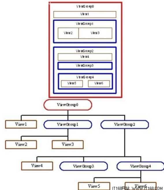
1.1 两者定义与区别
视图(View)是界面的“最小展示单元”,视图组(ViewGroup)是“容器单元”,用于包裹视图或其他视图组,控制子组件的排列方式。
| 类型 | 核心作用 | 常见实例 | 类比(前端/后端) |
|---|---|---|---|
| 视图(View) | 展示内容或接收用户交互 | TextView(文本)、Button(按钮)、EditText(输入框) | 类似HTML的<p>、<button>标签 |
| 视图组(ViewGroup) | 作为容器,管理子组件布局 | LinearLayout(线性布局)、ConstraintLayout(约束布局) | 类似HTML的<div>、SSM的视图容器 |
1.2 视图树层级结构
所有UI组件通过“视图组嵌套视图/视图组”形成层级,最顶层是ViewGroup,底层是View。以下图为例,整个界面的层级关系清晰可见: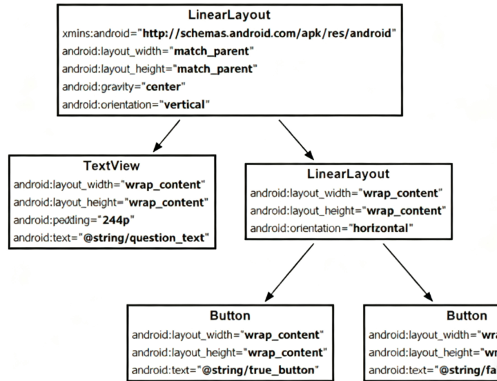
- 根节点:
ConstraintLayout(视图组),作为整个页面的容器。 - 子节点:
TextView(视图,显示文本)、Button(视图,交互按钮),直接依赖根节点。 - 特点:父组件控制子组件的位置和大小,修改父组件的布局属性,会影响所有子组件。
二、LinearLayout与ConstraintLayout
布局(Layout)是ViewGroup的具体实现,决定子组件的排列规则。入门阶段需重点掌握两种布局:LinearLayout(线性布局) 和 ConstraintLayout(约束布局),覆盖90%以上的基础界面场景。
2.1 LinearLayout(线性布局)
LinearLayou是最基础的布局,子组件只能水平(horizontal) 或 垂直(vertical) 排列,适合简单的线性界面(如列表、表单)。
2.1.1 核心属性配置
| 属性名 | 作用 | 可选值 |
|---|---|---|
orientation |
子组件排列方向 | horizontal(水平)、vertical(垂直) |
layout_width |
布局自身宽度 | match_parent(占满父组件)、wrap_content(适应内容) |
layout_height |
布局自身高度 | match_parent、wrap_content |
gravity |
子组件在布局内的对齐方式 | center(居中)、left(左对齐)、bottom(底部对齐)等 |
2.1.2 实战:垂直排列的文本与按钮
- 首先修改 res/values/strings.xml
- 在 res/values/strings.xml 中添加两个字符串资源
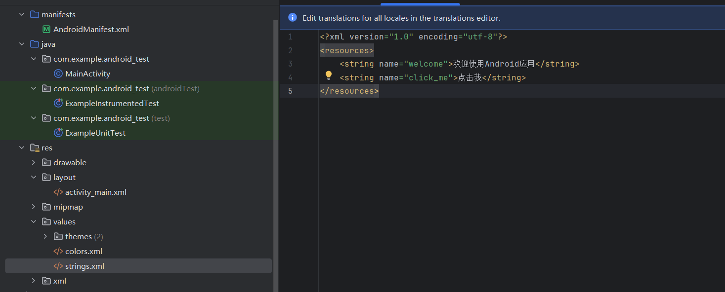
<?xml version="1.0" encoding="utf-8"?>
<resources>
    <string name="welcome">欢迎使用Android应用</string>
    <string name="click_me">点击我</string>
</resources>
在activity_main.xml中编写以下代码,实现“文本在上、按钮在下”的垂直布局:
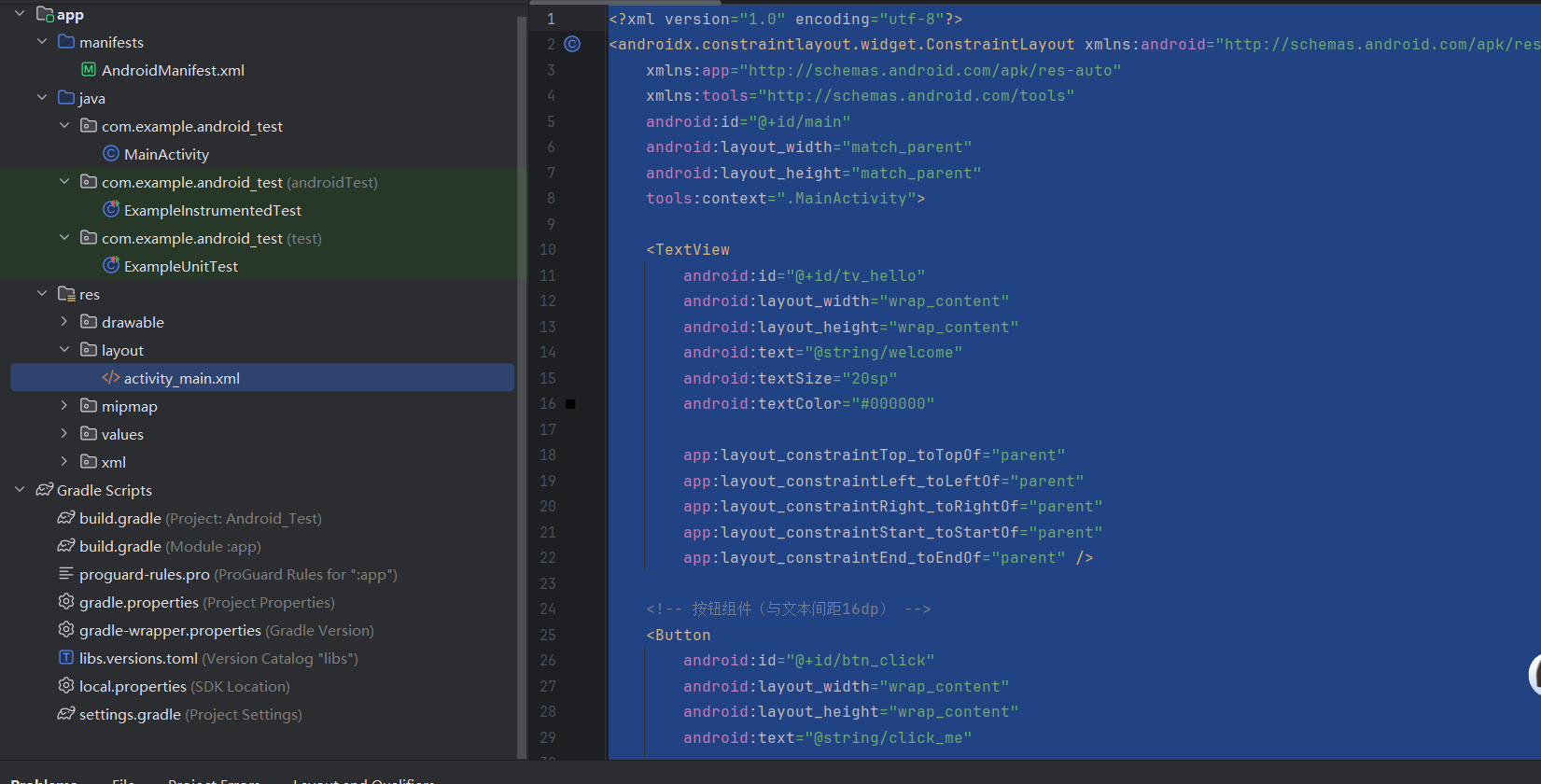
<?xml version="1.0" encoding="utf-8"?>
<androidx.constraintlayout.widget.ConstraintLayout xmlns:android="http://schemas.android.com/apk/res/android"
    xmlns:app="http://schemas.android.com/apk/res-auto"
    xmlns:tools="http://schemas.android.com/tools"
    android:id="@+id/main"
    android:layout_width="match_parent"
    android:layout_height="match_parent"
    tools:context=".MainActivity">

    <TextView
        android:id="@+id/tv_hello"
        android:layout_width="wrap_content"
        android:layout_height="wrap_content"
        android:text="@string/welcome"
        android:textSize="20sp"
        android:textColor="#000000"

        app:layout_constraintTop_toTopOf="parent"
        app:layout_constraintLeft_toLeftOf="parent"
        app:layout_constraintRight_toRightOf="parent"
        app:layout_constraintStart_toStartOf="parent"
        app:layout_constraintEnd_toEndOf="parent" />

    <!-- 按钮组件(与文本间距16dp) -->
    <Button
        android:id="@+id/btn_click"
        android:layout_width="wrap_content"
        android:layout_height="wrap_content"
        android:text="@string/click_me"

        app:layout_constraintTop_toBottomOf="@id/tv_hello"
        app:layout_constraintTop_margin="16dp"
        app:layout_constraintLeft_toLeftOf="@id/tv_hello"
        app:layout_constraintRight_toRightOf="@id/tv_hello" />
</androidx.constraintlayout.widget.ConstraintLayout>
2.1.3 预览与运行效果
- 预览:在Android Studio右侧“Design”面板可实时查看界面效果:
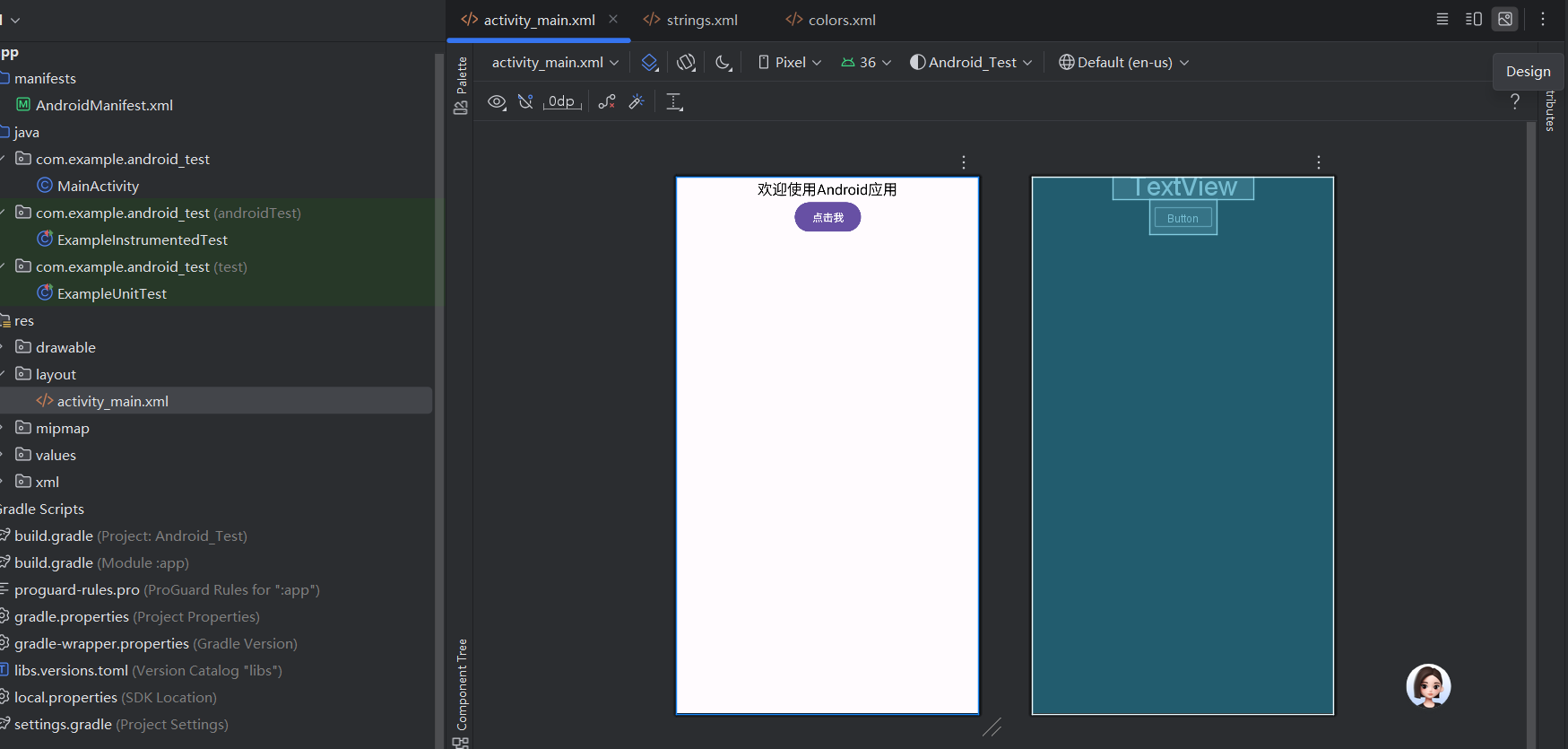
下面我们来详细讲解一下为什么要这样写?
2.1.4 Android布局文件基础
Android的界面布局通常用XML文件编写,位于res/layout目录下。每个布局文件描述了界面上有哪些控件(如文本、按钮),以及它们的大小、样式、位置等。
- 根标签:这里是
<androidx.constraintlayout.widget.ConstraintLayout>,表示整个界面的最外层容器(布局类型)。 android:layout_width和android:layout_height:几乎所有控件都有的属性,用于指定宽高。match_parent表示占满父容器,wrap_content表示大小刚好包裹内容(如文本多长,控件就多宽)。
2.1.5 ConstraintLayout(约束布局)
这是Android中最灵活的布局之一,核心是通过「约束关系」定位子控件(比如“控件A在控件B的下方”“控件C与父容器左边缘对齐”)。
- 优势:相比传统布局(如LinearLayout),能更轻松地实现复杂界面,减少布局嵌套。
2.1.6 命名空间xmlns
XML文件开头的xmlns:xxx是命名空间声明,用于区分不同来源的属性:
xmlns:android="http://schemas.android.com/apk/res/android":系统自带的基础属性(如android:text、android:id)。xmlns:app="http://schemas.android.com/apk/res-auto":用于自定义控件或支持库的属性(如约束布局的app:layout_constraintXXX)。xmlns:tools="http://schemas.android.com/tools":仅在设计时生效的属性(如tools:context指定关联的Activity,方便预览),运行时会被忽略。
2.1.7 控件与属性
布局中的<TextView>和<Button>是Android的基础控件:
(1)TextView(文本控件)
用于显示文字,核心属性:
android:id="@+id/tv_hello":给控件起唯一标识(@+id/xxx表示在资源中创建一个id),方便在代码中通过id找到它。android:text="@string/welcome":显示的文本内容。这里用@string/welcome引用了res/values/strings.xml中的字符串资源(而非直接写死文字),便于多语言适配(比如后续可添加英文翻译)。android:textSize="20sp":文字大小,单位sp(scaled pixels)会根据系统字体大小缩放,适合文本。android:textColor="#000000":文字颜色,这里是黑色(十六进制RGB值,#000000表示黑,#FFFFFF表示白)。
(2)Button(按钮控件)
用于用户点击交互,属性与TextView类似,额外注意:
android:text="@string/click_me":同样引用字符串资源,显示“点击我”。
2.1.8 约束布局的核心:约束规则
ConstraintLayout通过app:layout_constraintXXX属性定义控件的位置,核心是“控件的某条边与另一个控件/父容器的某条边对齐”。
2.1.9 TextView的约束(水平居中):
app:layout_constraintTop_toTopOf="parent"  <!-- 顶部与父容器顶部对齐 -->
app:layout_constraintLeft_toLeftOf="parent"  <!-- 左边与父容器左边对齐 -->
app:layout_constraintRight_toRightOf="parent"  <!-- 右边与父容器右边对齐 -->
这组约束让TextView在水平方向居中(左右都贴紧父容器,自然居中),顶部靠父容器顶部。
2.1.10 Button的约束(在TextView下方16dp):
app:layout_constraintTop_toBottomOf="@id/tv_hello"  <!-- 顶部与TextView的底部对齐 -->
app:layout_constraintTop_margin="16dp"  <!-- 与TextView底部的间距为16dp(dp是布局单位,适配不同屏幕密度) -->
app:layout_constraintLeft_toLeftOf="@id/tv_hello"  <!-- 左边与TextView左边对齐 -->
app:layout_constraintRight_toRightOf="@id/tv_hello"  <!-- 右边与TextView右边对齐 -->
这组约束让Button刚好在TextView正下方,间距16dp,且水平方向与TextView对齐(比如TextView是居中的,Button也会跟着居中)。
2.1.11 常用单位
dp(density-independent pixels):用于布局间距(如margin),会根据设备屏幕密度自动缩放,保证在不同手机上显示大小一致。sp(scaled pixels):用于文本大小,除了适配屏幕密度,还会跟随系统字体大小设置变化(比如用户调大系统字体,文字也会变大)。
2.1.12 ConstraintLayout(约束布局)
ConstraintLayout是Android官方推荐的布局,通过“约束关系”(如“按钮的左边对齐文本的右边”)控制子组件位置,支持任意排列,适合复杂界面(如首页、详情页)。
2.1.13 核心约束属性
约束的本质是“子组件与父布局/其他子组件的位置关联”,常用属性如下:
layout_constraintStart_toStartOf:组件的“左边缘”对齐目标的“左边缘”。layout_constraintEnd_toEndOf:组件的“右边缘”对齐目标的“右边缘”。layout_constraintTop_toTopOf:组件的“上边缘”对齐目标的“上边缘”。layout_constraintBottom_toBottomOf:组件的“下边缘”对齐目标的“下边缘”。
2.1.14 实战:居中对齐的文本与右侧按钮
修改activity_main.xml为约束布局,实现“文本居中、按钮在文本右侧”的效果:
<?xml version="1.0" encoding="utf-8"?>
<androidx.constraintlayout.widget.ConstraintLayout
    xmlns:android="http://schemas.android.com/apk/res/android"
    xmlns:app="http://schemas.android.com/apk/res-auto" <!-- 约束布局需添加此命名空间 -->
    android:layout_width="match_parent"
    android:layout_height="match_parent">

    <!-- 文本组件:居中显示 -->
    <TextView
        android:id="@+id/tv_hello"
        android:layout_width="wrap_content"
        android:layout_height="wrap_content"
        android:text="欢迎使用Android应用"
        android:textSize="20sp"
        <!-- 水平居中:左边缘对齐父布局左边缘,右边缘对齐父布局右边缘 -->
        app:layout_constraintStart_toStartOf="parent"
        app:layout_constraintEnd_toEndOf="parent"
        <!-- 垂直居中:上边缘对齐父布局上边缘,下边缘对齐父布局下边缘 -->
        app:layout_constraintTop_toTopOf="parent"
        app:layout_constraintBottom_toBottomOf="parent"/>

    <!-- 按钮组件:在文本右侧,与文本水平居中对齐 -->
    <Button
        android:id="@+id/btn_click"
        android:layout_width="wrap_content"
        android:layout_height="wrap_content"
        android:text="点击我"
        android:layout_marginStart="16dp" <!-- 与文本的间距 -->
        <!-- 左边缘对齐文本的右边缘 -->
        app:layout_constraintStart_toEndOf="@id/tv_hello"
        <!-- 垂直对齐文本的中心 -->
        app:layout_constraintTop_toTopOf="@id/tv_hello"
        app:layout_constraintBottom_toBottomOf="@id/tv_hello"/>

</androidx.constraintlayout.widget.ConstraintLayout>
2.2.3 运行效果
启动模拟器后,按钮会固定在文本右侧,且与文本水平居中,即使调整屏幕尺寸,约束关系也会保持:
我的个人主页,欢迎来阅读我的其他文章
https://blog.csdn.net/2402_83322742?spm=1011.2415.3001.5482
我的Java-Spring入门指南知识文章专栏
欢迎来阅读指出不足
https://blog.csdn.net/2402_83322742/category_13040333.html?spm=1001.2014.3001.5482
| 非常感谢您的阅读,喜欢的话记得三连哦 |


有“AI”的1024 = 2048,欢迎大家加入2048 AI社区
更多推荐

 51
51 0
0- 0


 已为社区贡献3条内容

所有评论(0)