一文搞定ArkUI文本输入场景:单行输入框/多行输入框、键盘避让
本文介绍了HarmonyOS中的输入框组件TextInput和TextArea的使用方法。TextInput是单行输入框,支持Normal、Password、Email等多种输入模式;TextArea是多行输入框,可自动换行显示。文章详细展示了如何设置输入框样式(边框、背景色、文字颜色等)、监听焦点变化以及实现键盘避让功能。通过代码示例和效果图,帮助开发者快速掌握这两种基础组件的使用方法,适用于构
·
输入框(TextInput/TextArea)
TextInput、TextArea是输入框组件,用于响应用户输入,比如评论区的输入、聊天框的输入、表格的输入等,也可以结合其它组件构建功能页面,例如登录注册页面。TextInput为单行输入框、TextArea为多行输入框。
单行输入框
TextInput()默认占满父组件宽度,呈胶囊形状。

根据具体使用场景不同,TextInput可以通过type属性设置输入类型:Normal基本输入模式、Password密码输入模式、Email邮箱输入模式等。
@Entry
@Component
struct Index {
  build() {
    Column({space:10}) {
      TextInput().width("90%")
        .type(InputType.Normal)

      TextInput().width("90%")
        .type(InputType.Password)

      TextInput().width("90%")
        .type(InputType.Email)

    }.width("100%")
    .height("100%")
  }
}
如下图所示:

多行输入框
TextArea多行文本输入框组件,当输入的文本内容超过组件宽度时会自动换行显示。高度未设置时,组件无默认高度,自适应内容高度。宽度未设置时,默认撑满最大宽度。

TextArea({
    text: $$this.introduce,					   //输入的文本
    placeholder: "请输入个人介绍300字以内"		//提示文字
})
.width("90%")
.height(100)
.borderWidth(1)
.borderRadius(0)
.maxLength(50)	//最大输入字符个数
.showCounter(true, {	//是否显示计数器
  highlightBorder: true	//达到计数最大值时,高亮边框和计数器
})
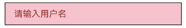
自定义样式
设置背景边框
TextInput支持自定义样式,如背景色、前景色、边框、轮廓等。
 TextInput({ placeholder: "请输入用户名" })
        .width("90%")
        .borderWidth(1)                 //边框宽度
        .borderRadius(0)                //边框圆角
        .backgroundColor(Color.Pink)    //背景色
        .fontColor(Color.Yellow)        //输入文字颜色
        .placeholderColor(Color.Brown)  //提示文字颜色
监听焦点变化
TextInput获取焦点时改变边框颜色,如下图所示

import { promptAction } from '@kit.ArkUI'

@Entry
@Component
struct Index {
  @State username: string = ''
  @State password: string = ''
  @State current: number = -1  //-1表示当前没有输入框获取焦点
  build() {
    Column({ space: 10 }) {
      // 用户名输入框
      TextInput({ placeholder: "请输入用户名", text: $$this.username })
        .width("90%")
        .borderWidth(1)
        .borderRadius(0)
        .borderColor(this.current === 0 ? Color.Red : Color.Gray)
        .onFocus(() => {
          this.current = 0
        })

      // 密码输入框
      TextInput({ placeholder: "请输入密码", text: $$this.password })
        .width("90%")
        .type(InputType.Password)
        .borderWidth(1)
        .borderRadius(0)
        .borderColor(this.current === 1 ? Color.Red : Color.Gray)
        .onFocus(() => {
          this.current = 1
        })

      Button("登录")
        .width("90%")
        .onClick(() => {
           console.log("用户名:", this.username)
           console.log("密码:", this.password)
        })
    }.width("100%")
    .height("100%")
  }
}
键盘避让
键盘抬起后,具有滚动能力的容器组件在横竖屏切换时,才会生效键盘避让,若希望无滚动能力的容器组件也生效键盘避让,建议在组件外嵌套一层具有滚动能力的容器组件。
// xxx.ets
@Entry
@Component
struct Index {
  placeHolderArr: string[] = ['1', '2', '3', '4', '5', '6', '7'];

  build() {
    Scroll() {
      Column() {
        ForEach(this.placeHolderArr, (placeholder: string) => {
          TextInput({ placeholder: 'TextInput ' + placeholder })
            .margin(30)
        })
      }
    }
    .height('100%')
    .width('100%')
  }
}
效果如下图所示

到此,关于输入框基本使用就介绍完了。撒花🎉🎉🎉
免费获取鸿蒙开发者认证

有“AI”的1024 = 2048,欢迎大家加入2048 AI社区
更多推荐
 5
5 0
0- 0


 已为社区贡献3条内容

所有评论(0)