使用matplotlib绘制漂亮的正态函数分布曲线
绘制效果先看下绘制效果。源代码# -*- coding: utf-8 -*-"""Created on Mon Dec 28 17:37:47 2020@author: Hao"""import mathimport matplotlib.pyplot as pltimport numpy as npimport scipy.statsdef normal_dis(x, mu=50, sigma=
·
绘制效果
先看下绘制效果。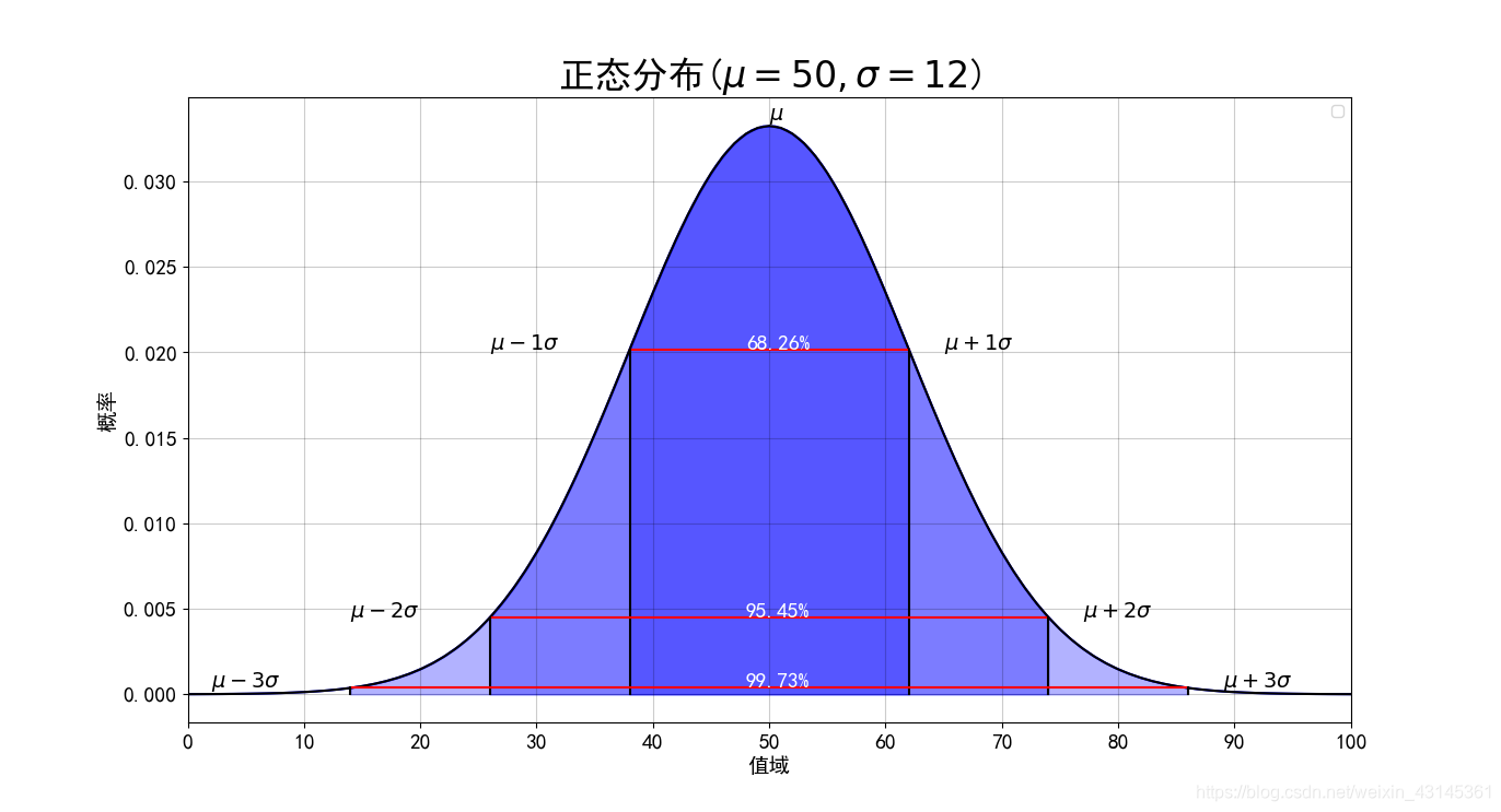
源代码
# -*- coding: utf-8 -*-
"""
Created on Mon Dec 28 17:37:47 2020

@author: Hao
"""

import math
import matplotlib.pyplot as plt
import numpy as np
import scipy.stats

def normal_dis(x, mu=50, sigma=5):
    '''
    x: 输入待计算的值
    μ: (mu, 读作:谬) 为数学期望,
    σ (sigma, 读作:西格玛)为标准差
    '''
    # k = 0.3989422804014327 / mu # 1.0 / math.sqrt(2 * math.pi)
    return 0.3989422804014327 / sigma * math.exp(- (x - mu) * (x - mu) / (2 * sigma * sigma))

# pyplot methods reference
# https://matplotlib.org/api/_as_gen/matplotlib.pyplot.html?highlight=plot#module-matplotlib.pyplot

# 支持中文
plt.rcParams['font.sans-serif'] = ['SimHei']  # 用来正常显示中文标签
plt.rcParams['axes.unicode_minus'] = False  # 用来正常显示负号

# mu 和 sigma
mu, sigma = 50, 12
# x_min, x_max = 0.0, 100.0
# x = np.linspace(x_min, x_max, 100)
# y = scipy.stats.norm.pdf(x, mu, sigma)

xs = [x for x in range(101)]
ys = [normal_dis(x, mu, sigma) for x in xs]
plt.plot(xs, ys, color='black')

# 填充函数区域
for i in range(1, 4):
    xs = np.linspace(mu - sigma * i, mu + sigma * i, 100)
    ys = scipy.stats.norm.pdf(xs, mu, sigma)
    plt.fill_between(xs, ys, 0, alpha=0.3, color='b')

# 绘制线条和文字
percents=['68.26%', '95.45%', '99.73%']
for i in range(1, 4):
    # 计算中间三个区间连线的两端坐标
    x1 = mu - sigma * i
    x2 = mu + sigma * i
    y1 = normal_dis(x1, mu, sigma)
    y2 = normal_dis(x2, mu, sigma)
    # 绘制三条线段,分别为左右1条和上下2条
    plt.plot([x1, x2], [y1, y2], color='r')
    plt.plot([x1, x1], [y1, 0], color='black')
    plt.plot([x2, x2], [y1, 0], color='black')
    # 绘制相应的文本
    plt.text(x1 - 12, y1, f"$\mu - {i}\sigma$", fontsize=14)
    plt.text(x2 + 3, y1, f"$\mu + {i}\sigma$", fontsize=14)
    plt.text((x1+x2)/2 - 2, y1, percents[i-1], fontsize=14, color='w')
# 绘制最上方的单个的 \mu
plt.text(mu, normal_dis(mu, mu, sigma) + 0.0003, f'$\mu$', fontsize=14, color='black')

#用plot函数绘制折线图,线条颜色设置为绿色
plt.title(f'正态分布($\mu=50, \sigma=12$)',fontsize=24)
#设置图表标题和标题字号
plt.tick_params(axis='both',which='major',labelsize=14)
#设置刻度的字号
plt.xlabel('值域',fontsize=14)
#设置x轴标签及其字号
plt.ylabel('概率',fontsize=14)
# 设置X轴的苦海无边为0至100
plt.xlim(0, 100)
# 设置X轴的显示的内容为 [0, 10, 20, ..., 100]
plt.xticks(range(0, 110, 10))
plt.legend()
plt.grid(color='black', alpha=0.2)
plt.show()

有“AI”的1024 = 2048,欢迎大家加入2048 AI社区
更多推荐


 6
6 0
0- 0


 已为社区贡献20条内容

所有评论(0)