弹性盒子布局详解(flex布局)
本文介绍了flex布局是什么,flex布局的属性以及属性的值,并提供了图案参考,在文章中还展示了使用flex布局进行水平居中的方法。
目录
一、Flex布局简介
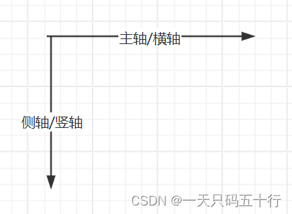
Flex布局,全称为Flexible Box或Flexbox,是一种弹性布局模型,主要用于在容器中排列项目。它可以用来设计复杂的网页布局,以适应各种屏幕尺寸和设备。
Flex布局中的元素称为Flex项目,其容器称为Flex容器。Flex容器中的项目默认沿着主轴(默认为水平方向)排列,也可以通过属性设置来改变主轴的方向。Flex项目可以自动调整大小以适应容器,并且可以通过设置属性来改变它们的对齐方式。
此外,Flex布局还提供了许多属性来控制Flex项目的排列、对齐和分布,例如justify-content、align-items和flex-wrap等。这些属性可以单独设置或组合使用,以实现复杂的网页布局。
总结起来,Flex布局是一种非常灵活和强大的布局模型,能够适应不同的屏幕尺寸和设备类型,是现代网页设计和开发中非常重要的一个工具。
| 属性 | 简介 |
|---|---|
| flex | 复合属性。设置或检索弹性盒模型对象的子元素如何分配空间。 |
| flex-grow | 设置或检索弹性盒的扩展比率。 |
| flex-shrink | 设置或检索弹性盒的收缩比率。在元素超过父盒子大小时生效。 |
| flex-basis | 设置或检索弹性盒伸缩基准值。 |
| flex-flow | 复合属性。设置或检索弹性盒模型对象的子元素排列方式。 |
| flex-direction | 该属性通过定义 flex 容器的主轴方向来决定 flex 子项在 flex 容器中的位置。 |
| flex-wrap | 该属性控制flex容器是单行或者多行,同时横轴的方向决定了新行堆叠的方向。 |
| align-content | 在弹性容器内的各项没有占用交叉轴上所有可用的空间时对齐容器内的各项(垂直)。 |
| align-items | 定义flex子项在flex容器的当前行的侧轴(纵轴)方向上的对齐方式。 |
| align-self | 定义flex子项单独在侧轴(纵轴)方向上的对齐方式。 |
| justify-content | 设置或检索弹性盒子元素在主轴(横轴)方向上的对齐方式。 |
| order | 设置或检索弹性盒模型对象的子元素出现的順序。 |
二、flex属性详解
所有属性都有下面两个值
| 值 | 描述 |
|---|---|
| initial | 设置该属性为它的默认值。 |
| inherit | 从父元素继承该属性。 |
2.1 flex-grow
语法:flex-grow: number|initial|inherit;
| 属性 | 描述 |
|---|---|
| number | 一个数字,规定项目相对于其他灵活的项目进行扩展的量。默认值是 0。 |
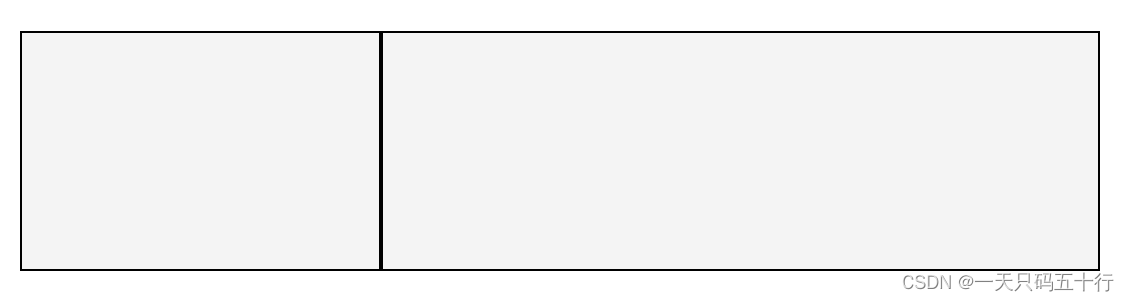
样例1:通过设置元素的flex-grow设置元素占父盒子的比例
<body>
    <div class="page">
      <div class="box1"></div>
      <div class="box2"></div>
    </div>
  </body>
  <style>
    .page {
      width: 900px;
      height: 200px;
      display: flex;
    }

    .box1 {
   flex-grow: 1;
    }
    .box2 {
    flex-grow: 2;
    }
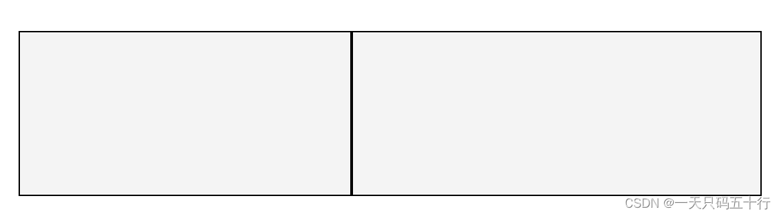
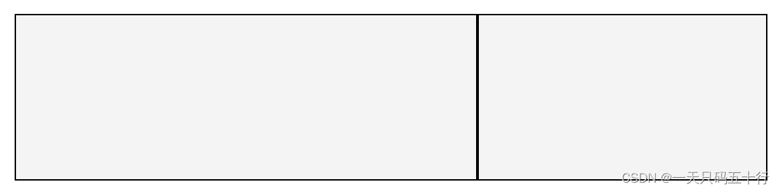
样例2:通过设置flex-grow填充剩余空间
<body>
    <div class="page">
      <div class="box1"></div>
      <div class="box2"></div>
    </div>
  </body>
  <style>
    .page {
      width: 900px;
      height: 200px;
      display: flex;
    }

    .box1 {
  width:400px;
    }
    .box2 {
    flex-grow:1 ;
    }
样例3:通过设置flex-grow让元素平分父盒子
  <body>
    <div class="page">
      <div class="box"></div>
      <div class="box"></div>
    </div>
  </body>
  <style>
    .page {
      width: 900px;
      height: 200px;
      display: flex;
    }

    .box {
      flex-grow: 1;
    }
  </style>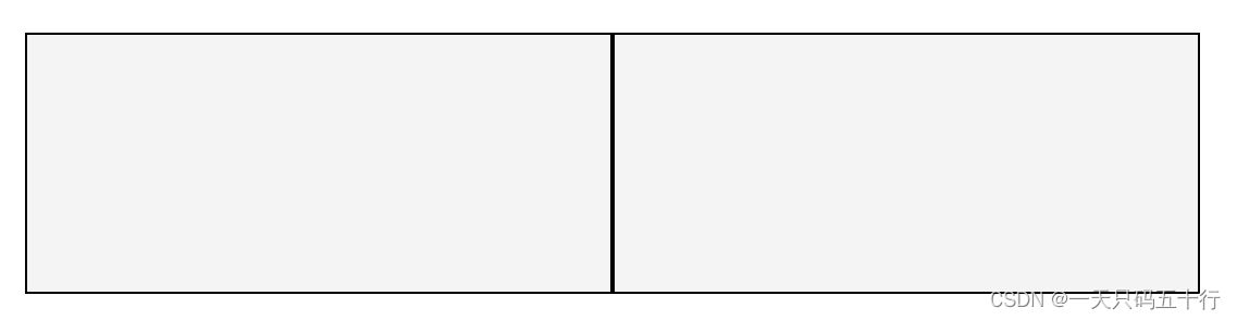
2.2 flex-shrink
语法:flex-shrink: number|initial|inherit;
样例1:两个元素总大小超过父盒子大小时设置其中一个大小不变,另一个收缩
  <body>
    <div class="page">
      <div class="box1"></div>
      <div class="box2"></div>
    </div>
  </body>
  <style>
    .page {
      width: 900px;
      height: 200px;
      display: flex;
    }

    .box1 {
      width: 600px;
    }
    .box2 {
      width: 600px;
      flex-shrink: 0;
    }
  </style>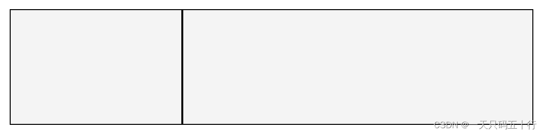
样例2:当不设置flex-shrink(默认为1)或设置flex-shrink: 1时,两个元素按照自身比例收缩
  <body>
    <div class="page">
      <div class="box1"></div>
      <div class="box2"></div>
    </div>
  </body>
  <style>
    .page {
      width: 900px;
      height: 200px;
    }

    .box1 {
      width: 800px;
    }
    .box2 {
      width: 500px;
      flex-shrink: 1;
    }
2.3 flex-basis
语法:flex-basis: number|auto|initial|inherit;
样例1:设置元素初始大小
  <body>
    <div class="page">
      <div class="box1"></div>
      <div class="box2"></div>
    </div>
  </body>
  <style>
    .page {
      width: 900px;
      height: 200px;
      display: flex;
    }

    .box1 {
      width: 50%;
    }
    .box2 {
      flex-basis: 300px;
    }
  </style>
样例2:元素大小根据内容自适应,超出的部分会因为flex-shrink收缩
<body>
    <div class="page">
      <div class="box1"></div>
      <div class="box2">字数补丁字数补丁字数补丁字数补丁字数补丁</div>
    </div>
  </body>
  <style>
    .page {
      width: 900px;
      height: 200px;
      display: flex;
    }

    .box1 {
      width: 890px;
    }
    .box2 {
      flex-basis: auto;
    }
  </style>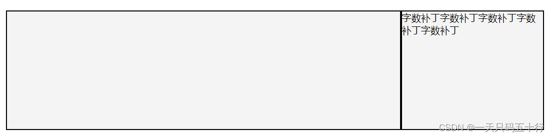
2.4 flex
语法:flex: flex-grow flex-shrink flex-basis|auto|initial|inherit;
flex属性是flex-grow,flex-shrink,flex-basis的综合属性
| 值 | 描述 |
|---|---|
| flex-grow | 一个数字,规定项目将相对于其他灵活的项目进行扩展的量。 |
| flex-shrink | 一个数字,规定项目将相对于其他灵活的项目进行收缩的量。 |
| flex-basis | 项目的长度。合法值:"auto"、"inherit" 或一个后跟 "%"、"px"、"em" 或任何其他长度单位的数字。 |
| auto | 与 1 1 auto 相同。 |
| none | 与 0 0 auto 相同。 |
样例1:通过设置flex:number让元素根据比例占满父盒子(写的时候比flex-grow快一丢丢)
<body>
    <div class="page">
      <div class="box1"></div>
      <div class="box2"></div>
    </div>
  </body>
  <style>
    .page {
      width: 900px;
      height: 200px;
      display: flex;
    }

    .box1 {
      flex: 1;
    }
    .box2 {
      flex: 2;
    }
  </style>
2.5 flex-direction
语法:flex-direction: row|row-reverse|column|column-reverse|initial|inherit;
| 值 | 描述 |
|---|---|
| row | 默认值。灵活的项目将水平显示,正如一个行一样。 |
| row-reverse | 与 row 相同,但是以相反的顺序。 |
| column | 灵活的项目将垂直显示,正如一个列一样。 |
| column-reverse | 与 column 相同,但是以相反的顺序。 |
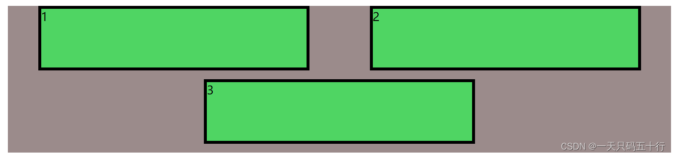
样例1:设置元素竖着排列
  <body>
    <div class="page">
      <div class="box1">1</div>
      <div class="box2">2</div>
      <div class="box2">3</div>
    </div>
  </body>
  <style>
    .page {
      width: 900px;
      height: 200px;
      display: flex;
      flex-direction: column;
    }

    .box1 {
      flex: 1;
    }
    .box2 {
      flex: 1;
    }
  </style>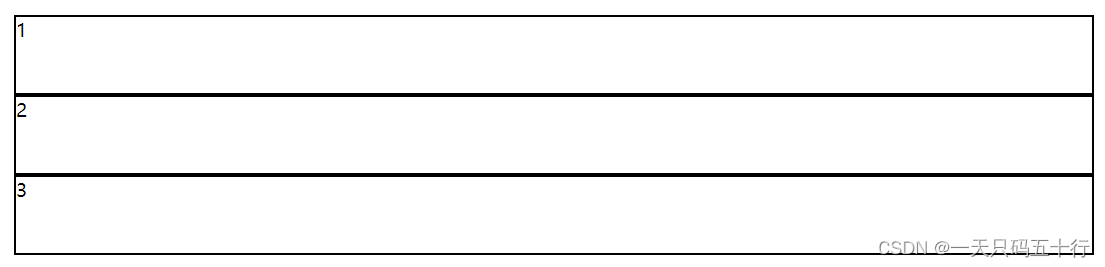
2.6 flex-wrap
语法:flex-wrap: nowrap|wrap|wrap-reverse|initial|inherit;
| 值 | 描述 |
|---|---|
| nowrap | 默认值。规定灵活的项目不拆行或不拆列。 |
| wrap | 规定灵活的项目在必要的时候拆行或拆列。 |
| wrap-reverse | 规定灵活的项目在必要的时候拆行或拆列,但是以相反的顺序。 |
样例1:元素大小超过父盒子时换行
  <body>
    <div class="page">
      <div class="box1">1</div>
      <div class="box2">2</div>
      <div class="box2">3</div>
    </div>
  </body>
  <style>
    .page {
      width: 900px;
      height: 200px;
      display: flex;
      flex-wrap: wrap;
    }

    .box1 {
      width: 40%;
    }
    .box2 {
      width: 40%;
    }
  </style>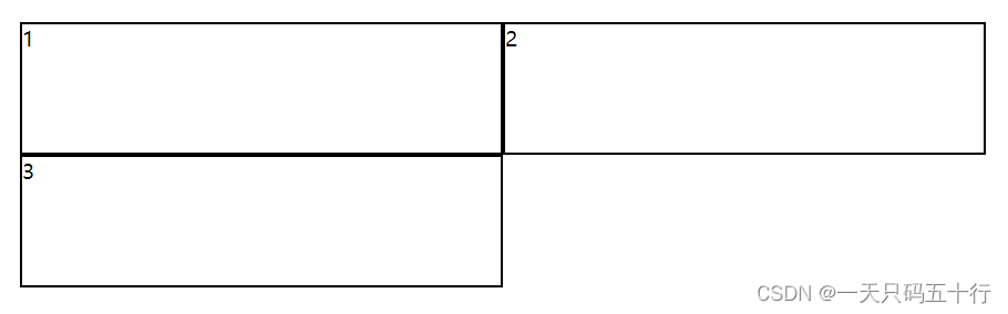
2.7 flex-flow
语法:flex-flow: flex-direction flex-wrap|initial|inherit
flex-direction与flex-wrap的简写,直接用就行
| 值 | 描述 |
|---|---|
| flex-direction | 控制排列方向 |
| flex-wrap | 控制是否换行 |
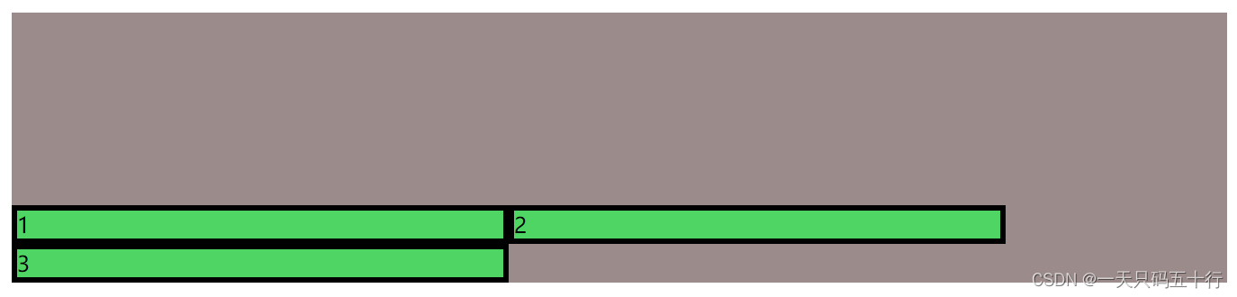
2.8 align-content
语法:align-content: stretch|center|flex-start|flex-end|space-between|space-around|initial|inherit;
需要开启wrap多行才会生效,如果flex-direction为column,主侧轴交换。
| 值 | 描述 |
|---|---|
| stretch |
默认值。元素被拉伸以适应容器。 各行将会伸展以占用剩余的空间。如果剩余的空间是负数,该值等效于'flex-start'。在其它情况下,剩余空间被所有行平分,以扩大它们的侧轴尺寸。 |
| center |
元素位于容器的中心。 各行向弹性盒容器的中间位置堆叠。各行两两紧靠住同时在弹性盒容器中居中对齐,保持弹性盒容器的侧轴起始内容边界和第一行之间的距离与该容器的侧轴结束内容边界与第最后一行之间的距离相等。(如果剩下的空间是负数,则各行会向两个方向溢出的相等距离。) |
| flex-start |
元素位于容器的开头。 各行向弹性盒容器的起始位置堆叠。弹性盒容器中第一行的侧轴起始边界紧靠住该弹性盒容器的侧轴起始边界,之后的每一行都紧靠住前面一行。 |
| flex-end |
元素位于容器的结尾。 各行向弹性盒容器的结束位置堆叠。弹性盒容器中最后一行的侧轴起结束界紧靠住该弹性盒容器的侧轴结束边界,之后的每一行都紧靠住前面一行。 |
| space-between |
元素位于各行之间留有空白的容器内。 各行在弹性盒容器中平均分布。如果剩余的空间是负数或弹性盒容器中只有一行,该值等效于'flex-start'。在其它情况下,第一行的侧轴起始边界紧靠住弹性盒容器的侧轴起始内容边界,最后一行的侧轴结束边界紧靠住弹性盒容器的侧轴结束内容边界,剩余的行则按一定方式在弹性盒窗口中排列,以保持两两之间的空间相等。 |
| space-around |
元素位于各行之前、之间、之后都留有空白的容器内。 各行在弹性盒容器中平均分布,两端保留子元素与子元素之间间距大小的一半。如果剩余的空间是负数或弹性盒容器中只有一行,该值等效于'center'。在其它情况下,各行会按一定方式在弹性盒容器中排列,以保持两两之间的空间相等,同时第一行前面及最后一行后面的空间是其他空间的一半。 |
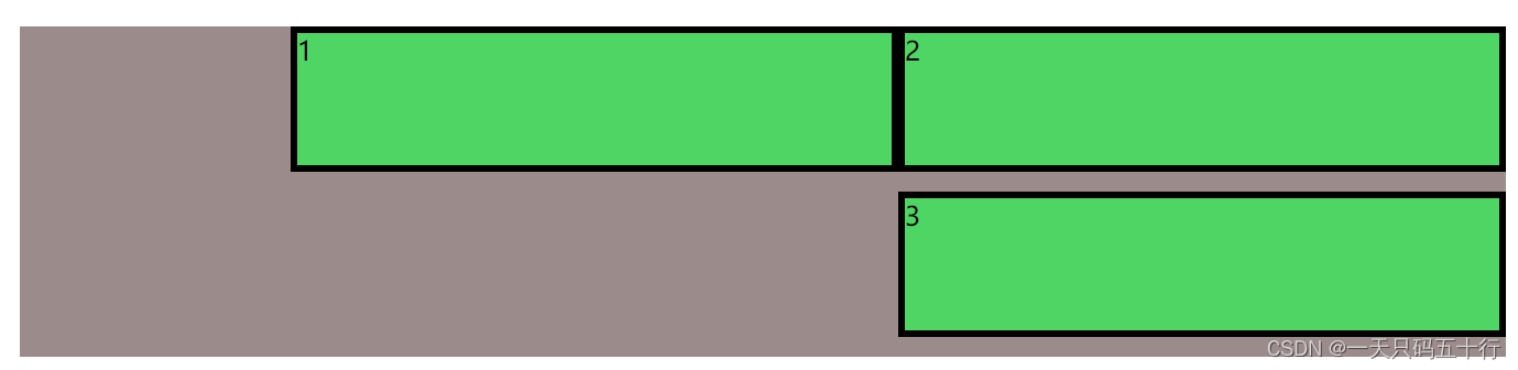
样例1:stretch
 <body>
    <div class="page">
      <div class="box1">1</div>
      <div class="box2">2</div>
      <div class="box2">3</div>
    </div>
  </body>
  <style>
    .page {
      width: 900px;
      height: 200px;
      display: flex;
      flex-flow: row wrap;
      align-content: stretch;
    }

    .box1 {
      width: 40%;
    }
    .box2 {
      width: 40%;
    }
  </style>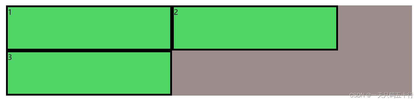
样例2:center
样例3:flex-start
样例4:flex-end
样例5:space-between
样例6:space-around
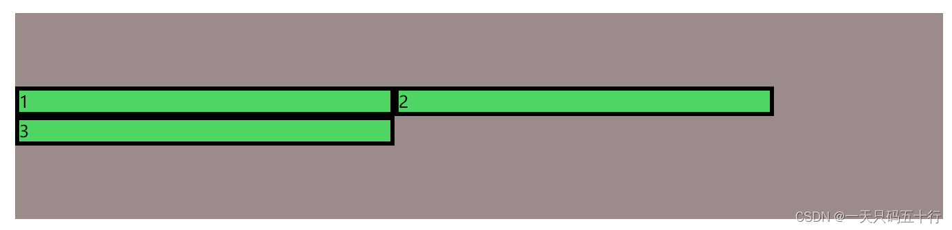
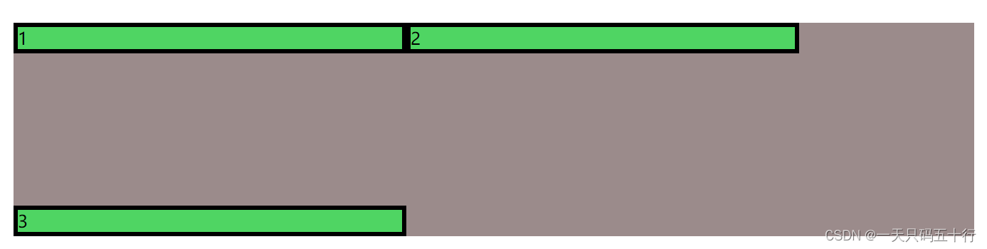
2.9 align-items
元素在侧轴/横轴分布方式。如果flex-direction为column,主侧轴交换。
语法:align-items: stretch|center|flex-start|flex-end|baseline|initial|inherit;
| 值 | 描述 |
|---|---|
| stretch |
默认值。元素被拉伸以适应容器。 如果指定侧轴大小的属性值为'auto',则其值会使项目的边距盒的尺寸尽可能接近所在行的尺寸,但同时会遵照'min/max-width/height'属性的限制。 |
| center |
元素位于容器的中心。 弹性盒子元素在该行的侧轴(纵轴)上居中放置。(如果该行的尺寸小于弹性盒子元素的尺寸,则会向两个方向溢出相同的长度)。 |
| flex-start |
元素位于容器的开头。 弹性盒子元素的侧轴(纵轴)起始位置的边界紧靠住该行的侧轴起始边界。 |
| flex-end |
元素位于容器的结尾。 弹性盒子元素的侧轴(纵轴)起始位置的边界紧靠住该行的侧轴结束边界。 |
| baseline |
元素位于容器的基线上。 如弹性盒子元素的行内轴与侧轴为同一条,则该值与'flex-start'等效。其它情况下,该值将参与基线对齐。 |
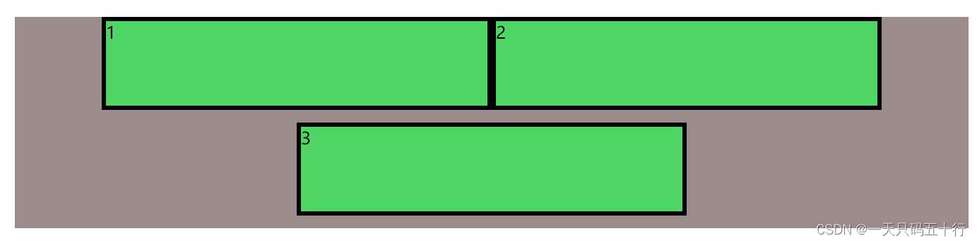
样例1:stretch
<body>
    <div class="page">
      <div class="box1">1</div>
      <div class="box2">2</div>
      <div class="box2">3</div>
    </div>
  </body>
  <style>
    .page {
      width: 900px;
      height: 200px;
      display: flex;
      align-items: stretch;
      flex-wrap: wrap;
    }

    .box1 {
      width: 40%;
    }
    .box2 {
      width: 40%;
    }
  </style>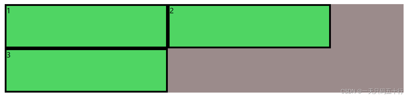
样例2:center
样例3:flex-start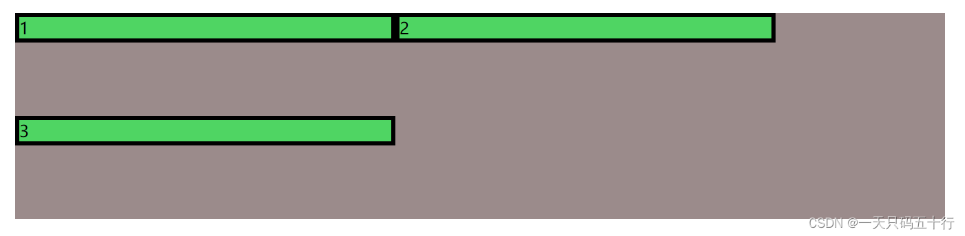
样例4:flex-end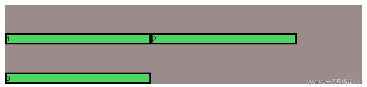
样例5:baseline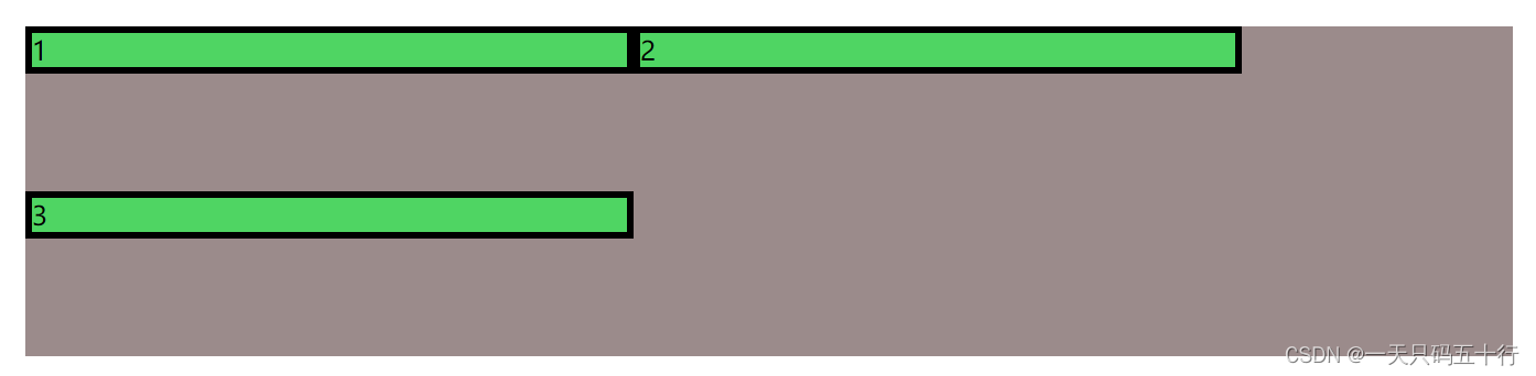
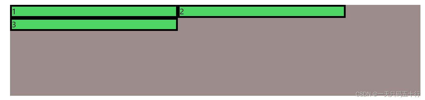
2.10 align-self
元素在侧轴/横轴分布方式。如果flex-direction为column,主侧轴交换。
语法:align-self: auto|stretch|center|flex-start|flex-end|baseline|initial|inherit;
| 值 | 描述 |
|---|---|
| auto | 默认值。元素继承了它的父容器的 align-items 属性。如果没有父容器则为 "stretch"。 |
| stretch |
元素被拉伸以适应容器。 如果指定侧轴大小的属性值为'auto',则其值会使项目的边距盒的尺寸尽可能接近所在行的尺寸,但同时会遵照'min/max-width/height'属性的限制。 |
| center |
元素位于容器的中心。 弹性盒子元素在该行的侧轴(纵轴)上居中放置。(如果该行的尺寸小于弹性盒子元素的尺寸,则会向两个方向溢出相同的长度)。 |
| flex-start |
元素位于容器的开头。 弹性盒子元素的侧轴(纵轴)起始位置的边界紧靠住该行的侧轴起始边界。 |
| flex-end |
元素位于容器的结尾。 弹性盒子元素的侧轴(纵轴)起始位置的边界紧靠住该行的侧轴结束边界。 |
| baseline |
元素位于容器的基线上。 如弹性盒子元素的行内轴与侧轴为同一条,则该值与'flex-start'等效。其它情况下,该值将 |
样例1:strech
  <body>
    <div class="page">
      <div class="box1">1</div>
      <div class="box1">2</div>
      <div class="box1">3</div>
    </div>
  </body>
  <style>
    .page {
      width: 900px;
      height: 200px;
      display: flex;
      flex-wrap: wrap;
    }

    .box1 {
      width: 40%;
      height: 40%;
      align-self:strech;
    }
  </style>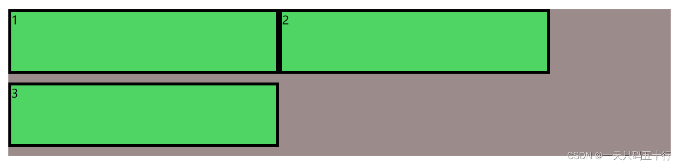
样例2:center
样例3:flex-start
样例4:flex-end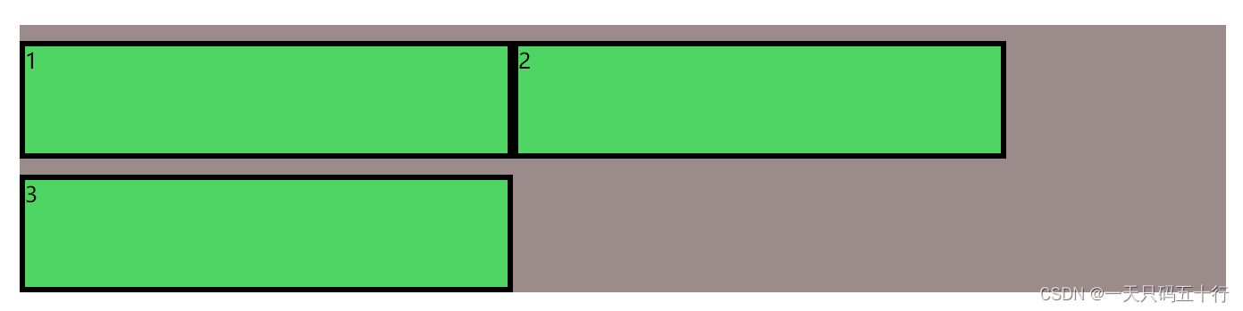
样例5:baseline
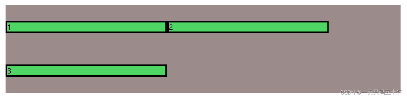
2.11 justify-content
语法:justify-content: flex-start|flex-end|center|space-between|space-around|initial|inherit;
元素在主轴/横轴排列方式,如果flex-direction为column,主侧轴交换。
| 值 | 描述 |
|---|---|
| flex-start | 默认值。从行首起始位置开始排列。 |
| flex-end | 从行尾位置开始排列。 |
| center | 居中排列。 |
| space-between | 均匀排列每个元素,首个元素放置于起点,末尾元素放置于终点。 |
| space-evenly | 均匀排列每个元素,每个元素之间的间隔相等。 |
| space-around | 均匀排列每个元素,每个元素周围分配相同的空间。 |
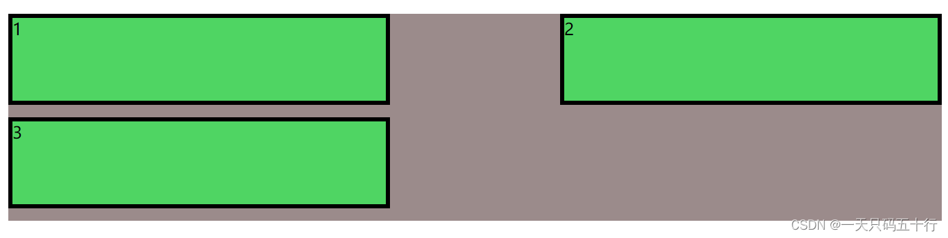
样例1:flex-start
  <body>
    <div class="page">
      <div class="box1">1</div>
      <div class="box1">2</div>
      <div class="box1">3</div>
    </div>
  </body>
  <style>
    .page {
      width: 900px;
      height: 200px;
      display: flex;
      flex-wrap: wrap;
      justify-content: flex-start;
    }

    .box1 {
      width: 40%;
      height: 40%;
    }
  </style>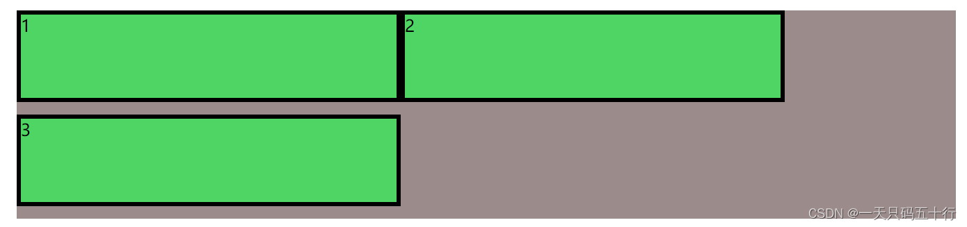
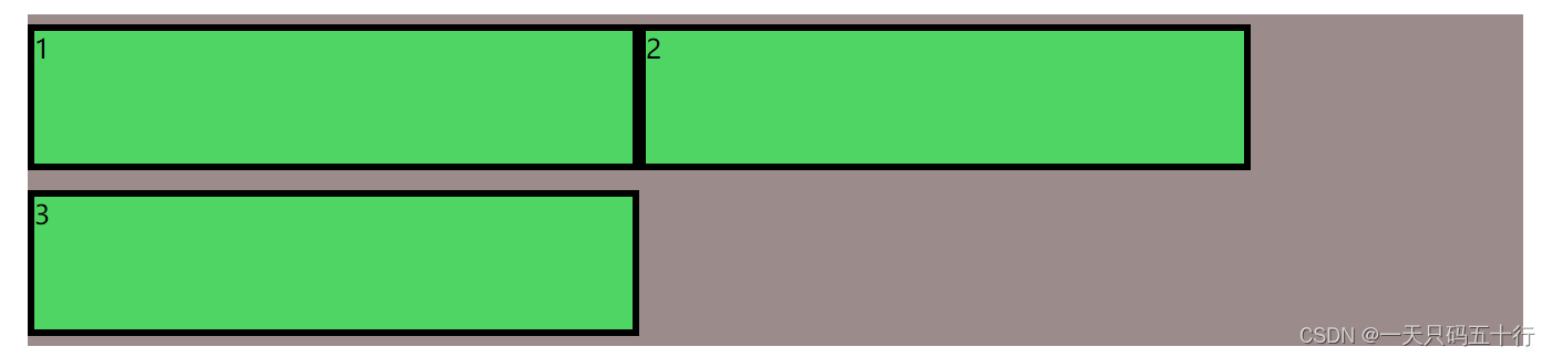
样例2:flex-end
样例3:center
样例4:space-between
样例5:space-evenly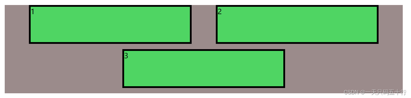
样例6:space-around
2.12 order
语法:order: number|initial|inherit;
改变元素顺序
| 值 | 描述 |
|---|---|
| number | 默认值是 0。规定灵活项目的顺序。 |
样例1:
  <body>
    <div class="page">
      <div class="box1">1</div>
      <div class="box2">2</div>
      <div class="box3">3</div>
    </div>
  </body>
  <style>
    .page {
      width: 900px;
      height: 200px;
      display: flex;
    }

    .box1 {
      flex: 1;
      order: 2;
    }
    .box2 {
      flex: 1;
      order: 3;
    }
    .box3 {
      flex: 1;
      order: 1;
    }
  </style>
三、居中布局方式
3.1 水平居中
当flex-direction为row
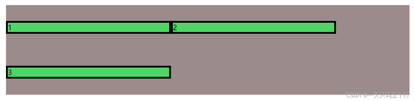
1.父盒子使用 justify-content: center
当flex-direction为column
1.元素使用 align-self: center;
2.父盒子使用 align-self: center;
3.父盒子使用 flex-wrap: wrap;align-content: center;
3.2 垂直居中
当flex-direction为row
1.父盒子使用 flex-wrap: wrap; align-content: center;
2.父盒子使用 align-items: center
3.元素使用 align-self: center;
当flex-direction为column
1.父盒子使用 justify-content: center;
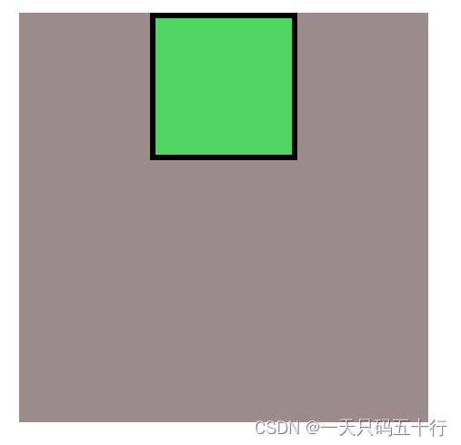
3.3 水平垂直居中
1.父盒子使用 justify-content: center; align-items: center;
<body>
<div class="page">
<div class="box1"></div>
</div>
</body>
<style>
.page {
width: 300px;
height: 300px;
display: flex;
justify-content: center;
align-items: center;
}
.box1 {
width: 100px;
height: 100px;
}
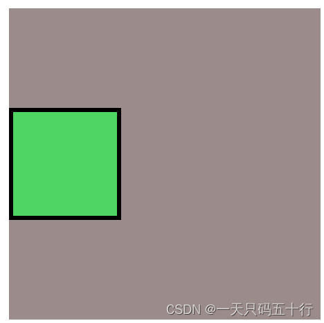
</style>2.父盒子使用 justify-content: center; 子盒子使用align-self: center;
  <body>
    <div class="page">
      <div class="box1"></div>
    </div>
  </body>
  <style>
    .page {
      width: 300px;
      height: 300px;
      display: flex;
      justify-content: center;
    }

    .box1 {
      align-self: center;
      width: 100px;
      height: 100px;
    }
  </style>
3.父盒子使用 justify-content: center;flex-wrap: wrap;align-content: center;
  <body>
    <div class="page">
      <div class="box1"></div>
    </div>
  </body>
  <style>
    .page {
      width: 300px;
      height: 300px;
      display: flex;
      justify-content: center;
      flex-wrap: wrap;
      align-content: center;
    }

    .box1 {
      width: 100px;
      height: 100px;
    }
  </style>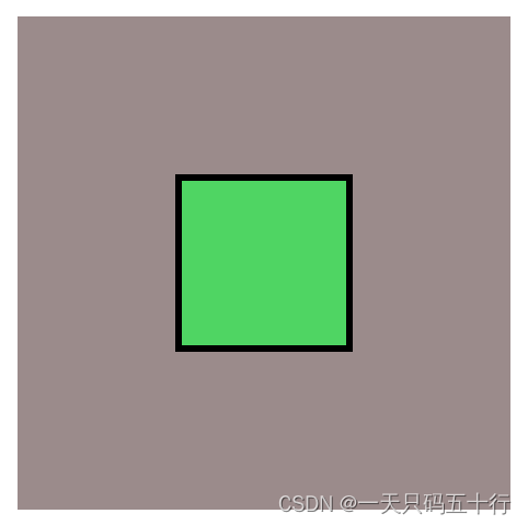
四、参考资料
1.文心一言:文心一言
2.菜鸟教程:菜鸟教程 - 学的不仅是技术,更是梦想!
如果觉得对您有所帮助,就点赞支持一下吧!

有“AI”的1024 = 2048,欢迎大家加入2048 AI社区
更多推荐

 26
26 0
0- 0


 已为社区贡献2条内容

所有评论(0)