Qt - 常用控件样式表(qss)
·
通用:
- color:设置字体颜色
- font:设置字体
- text-align: 设置字体水平对齐 left:靠左 center:居中 right:靠右
- padding:设置内边框距离
- margin:设置外边框距离
- background-image:设置背景图片(根据图片大小)
- border-image:设置背景图片(根据控件大小)
- background-color:设置背景颜色
- border-color:设置边框颜色
- border:设置边框 例:border:1px solid red;
- border-radius:设置边框圆角
参考文章:
QSS Subcontrol
QtCreator 的帮助里搜索 style sheets examples
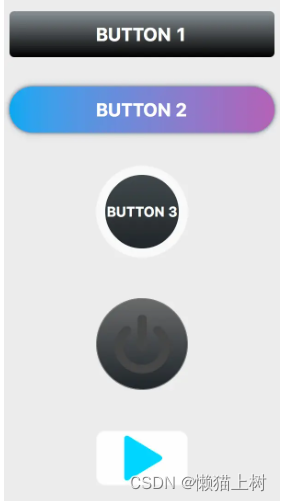
QPushButton
示例:
QPushButton#btn1 {
    height: 50px;
    background-color: qlineargradient(x1:1, y1:0, x2:1, y2:1, stop:0 #8a9195, stop: 1 balck);
    color: white;
    border-radius: 5px;
    font-size: 20px;
    font-weight:bold;
}

QPushButton#btn1:hover {
    background-color: qlineargradient(x1:1, y1:0, x2:1, y2:1, stop:0 #7d8488, stop: 1 balck);
}

QPushButton#btn1:pressed {
    background-color: qlineargradient(x1:1, y1:0, x2:1, y2:1, stop:0 #6a7073, stop: 1 balck);
}

QPushButton#btn2 {
    height: 50px;
    background-color: qlineargradient(x1:0, y1:0.5, x2:1, y2:0.5, stop:0 #47a7ed, stop: 1 #a967b2);
    color: white;
    border-radius: 25px;
    font-size: 20px;
    font-weight:bold;

}

QPushButton#btn2:hover {
    background-color: qlineargradient(x1:0, y1:0.5, x2:1, y2:0.5, stop:0 #459ee0, stop: 1 #995da1);
}

QPushButton#btn2:pressed {
    background-color: qlineargradient(x1:0, y1:0.5, x2:1, y2:0.5, stop:0 #4093d1, stop: 1 #87538e);
}

QPushButton#btn3 {
    background-color: qlineargradient(x1:1, y1:0, x2:1, y2:1, stop:0 #454b4f, stop: 1 #1d2225);
    color: white;
    border-radius: 50px;
    font-size: 15px;
    font-weight:bold;
    border: 10px solid #f9f9f9;
}

QPushButton#btn3:hover {
    border: 10px solid white;
    background-color: qlineargradient(x1:1, y1:0, x2:1, y2:1, stop:0 #35393c, stop: 1 #101214);
}

QPushButton#btn3:pressed {
    color: black;
    border: 10px solid black;
    background-color: white;
}

QPushButton#btn4 {
    background-color: qlineargradient(x1:1, y1:0, x2:1, y2:1, stop:0 #6a6b6b, stop: 1 #1f2429);
    color: white;
    border-radius: 50px;
    font-size: 15px;
    font-weight:bold;
    border: 1px solid gray;
    image: url("images/switch-off.png");
}

QPushButton#btn4:hover {
    image: url("images/switch-on.png");
}

QPushButton#btn4:pressed {
    image: url("images/switch-on.png");
    border: 1px solid black;
    background-color: qradialgradient(cx:0.5, cy:0.5, radius: 0.5, fx:0.5, fy:0.5, stop:0.5 #38372a, stop:1 #0a1012)
}
结果:
QComboBox下拉框
未下拉时,QComboBox的样式
QComboBox {
    border: 1px solid gray;   /* 边框 */
    border-radius: 3px;   /* 圆角 */
    padding: 1px 18px 1px 3px;   /* 字体填衬 */
    color: #000;
    font: normal normal 15px "Microsoft YaHei";
    background: transparent;
}
下拉后,整个下拉窗体样式
QComboBox QAbstractItemView {
    outline: 0px solid gray;   /* 选定项的虚框 */
    border: 1px solid yellow;   /* 整个下拉窗体的边框 */
    color: green;
    background-color: red;   /* 整个下拉窗体的背景色 */
    selection-background-color: lightgreen;   /* 整个下拉窗体被选中项的背景色 */
}
下拉后,整个下拉窗体每项的样式
QComboBox QAbstractItemView::item {
    height: 50px;   /* 项的高度(设置pComboBox->setView(new QListView());后,该项才起作用) */
}
下拉后,整个下拉窗体越过每项的样式
QComboBox QAbstractItemView::item:hover {
    color: #FFFFFF;
    background-color: lightgreen;   /* 整个下拉窗体越过每项的背景色 */
}
下拉后,整个下拉窗体被选择的每项的样式
QComboBox QAbstractItemView::item:selected {
    color: #FFFFFF;
    background-color: lightgreen;
}
QComboBox中的垂直滚动条
QComboBox QAbstractScrollArea QScrollBar:vertical {
    width: 10px;
    background-color: #d0d2d4;   /* 空白区域的背景色  灰色green */
}

QComboBox QAbstractScrollArea QScrollBar::handle:vertical {
    border-radius: 5px;   /* 圆角 */
    background: rgb(160,160,160);   /* 小方块的背景色深灰lightblue */
}

QComboBox QAbstractScrollArea QScrollBar::handle:vertical:hover {
    background: rgb(90, 91, 93);   /* 越过小方块的背景色yellow */
}
设置为可编辑(setEditable(true))editable时,编辑区域的样式
QComboBox:editable {
    background: green;
}
设置为非编辑(setEditable(false))!editable时,整个QComboBox的样式
QComboBox:!editable {
     background: blue;
}
设置为可编辑editable时,点击整个QComboBox的样式
QComboBox:editable:on {
    background: green;
}
设置为非编辑!editable时,点击整个QComboBox的样式
QComboBox:!editable:on {
     background: blue;
}
设置为可编辑editable时,下拉框的样式
QComboBox::drop-down:editable {
    background: lightblue;
}
设置为可编辑editable时,点击下拉框的样式
QComboBox::drop-down:editable:on {
    background: lightgreen;
}
设置为非编辑!editable时,下拉框的样式
QComboBox::drop-down:!editable {
    background: lightblue;
}
设置为非编辑!editable时,点击下拉框的样式
QComboBox::drop-down:!editable:on {
    background: lightgreen;
}
点击QComboBox
QComboBox:on {
}
下拉框样式
QComboBox::drop-down {
    subcontrol-origin: padding;   /* 子控件在父元素中的原点矩形。如果未指定此属性,则默认为padding。 */
    subcontrol-position: top right;   /* 下拉框的位置(右上) */
    width: 15px;   /* 下拉框的宽度 */
    border-left-width: 1px;   /* 下拉框的左边界线宽度 */
    border-left-color: darkgray;   /* 下拉框的左边界线颜色 */
    border-left-style: solid;   /* 下拉框的左边界线为实线 */
    border-top-right-radius: 3px;   /* 下拉框的右上边界线的圆角半径(应和整个QComboBox右上边界线的圆角半径一致) */
    border-bottom-right-radius: 3px;   /* 同上 */
}
下拉箭头样式
QComboBox::down-arrow {
    width: 15px;   /* 下拉箭头的宽度(建议与下拉框drop-down的宽度一致) */
    background: transparent;   /* 下拉箭头的的背景色 */
    padding: 0px 0px 0px 0px;   /* 上内边距、右内边距、下内边距、左内边距 */
    image: url(:/images/combobox_arrow_down.png);
}
点击下拉箭头
QComboBox::down-arrow:on {
    image: url(:/images/combobox_arrow_up.png);   /* 显示下拉箭头 */
}
QCheckBox
/**********复选框**********/
QCheckBox::indicator{
width:13px;
height:13px;
}

QCheckBox::indicator:unchecked{
image:url(:/qss/psblack/checkbox_unchecked.png);
}

QCheckBox::indicator:unchecked:disabled{
image:url(:/qss/psblack/checkbox_unchecked_disable.png);
}

QCheckBox::indicator:checked{
image:url(:/qss/psblack/checkbox_checked.png);
}

QCheckBox::indicator:checked:disabled{
image:url(:/qss/psblack/checkbox_checked_disable.png);
}

QCheckBox::indicator:indeterminate{
image:url(:/qss/psblack/checkbox_parcial.png);
}

QCheckBox::indicator:indeterminate:disabled{
image:url(:/qss/psblack/checkbox_parcial_disable.png);
}
结果:

QDateEdit
QDateTimeEdit
QDialog
QDialogButtonBox
QDockWidget
QDoubleSpinBox
QFrame
QGroupBox
QHeaderView
QLabel
QLineEdit
QListView
QListWidget
QMainWindow
QMenu
QMenuBar
QMessageBox
QProgressBar
QPushButton
QRadioButton
QScrollBar
QSizeGrip
QSlider
QSpinBox
QSplitter
QStatusBar
QTabBar
QTabWidget
QTableView
QTableWidget
QTextEdit
QTimeEdit
QToolBar
QToolButton
QToolBox
QToolTip
QTreeView
QTreeWidget
QWidget

有“AI”的1024 = 2048,欢迎大家加入2048 AI社区
更多推荐

 24
24 0
0- 0


 已为社区贡献1条内容

所有评论(0)