如何用echarts画一个好看的饼图
详细讲解echarts饼图各项属性,从而绘制出满意的饼图
前言
最近有个需求,需要绘制一个饼图,为此我根据这次需求来整理了一下关于 echarts 饼图绘制的一些知识点,在这次需求中我需要用到的属性我会详细讲解,其他的属性我会粗略地说一下(并加入其他博主的文章的跳转),综合案例在后续博客中更新。
注意: 有些属性只有新版示例中才有,老版本的无法生效,如:borderRadius 。
目录
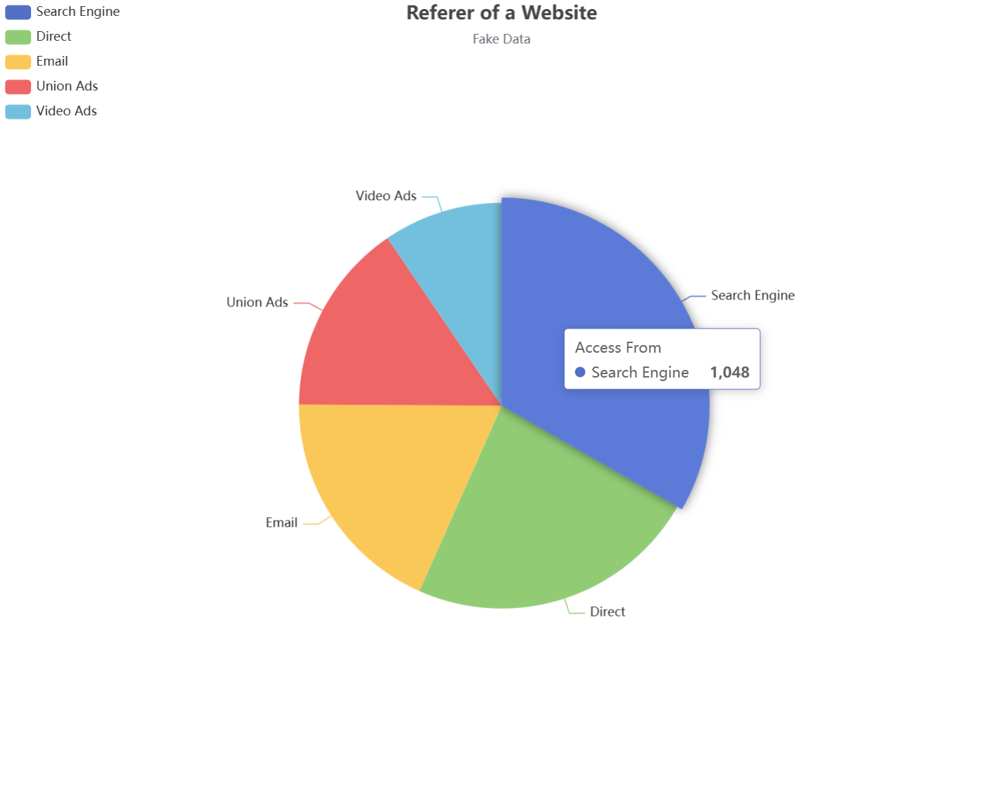
1. 先用echarts画一个饼图
直接在官网找一个最基础的饼图案例:
option = {
  title: {
    text: 'Referer of a Website',
    subtext: 'Fake Data',
    left: 'center'
  },
  tooltip: {
    trigger: 'item'
  },
  legend: {
    orient: 'vertical',
    left: 'left'
  },
  series: [
    {
      name: 'Access From',
      type: 'pie',
      radius: '50%',
      data: [
        { value: 1048, name: 'Search Engine' },
        { value: 735, name: 'Direct' },
        { value: 580, name: 'Email' },
        { value: 484, name: 'Union Ads' },
        { value: 300, name: 'Video Ads' }
      ],
      emphasis: {
        itemStyle: {
          shadowBlur: 10,
          shadowOffsetX: 0,
          shadowColor: 'rgba(0, 0, 0, 0.5)'
        }
      }
    }
  ]
};
然后你就得到了一个这样的最基础的饼图:
2. 分析一下饼图的结构及其属性值
接下来我们就可以来分析一下这个饼图的构造了,这样我们后续才好优化,其主要结构如下图:

那么就根据上图来说明一下饼图的属性值了,从最简单的 title 开始:
2.1 title
title
show是否显示标题,默认为truetext主标题subtext副标题x水平位置,可选值 left、right、centery垂直位置,可选值 top、center、bottom注意: 还可以用
left、right、top、bottom四个属性来精确设置 title 的位置,效果可参考position中的left、right、top、bottom。backgroundColor标题背景色borderWidth标题边框线宽borderColor标题边框颜色
必须先设置了 backgroundColor ,border 属性才会生效paddingitemGap主副标题纵向间隔,只能填数字textStyle主标题文本样式fontFamilyfontSizefontStylefontWeightcolorlineHeighttextBorderColor字体描边颜色textBorderWidth字体描边宽度,只填数字textShadowColor阴影颜色textShadowBlur阴影长度textShadowOffsetX阴影水平偏移textShadowOffsetY阴影垂直偏移
subtextStyle副标题文本样式
主标题与副标题的样式属性都一样,就不多做赘述
案例

  title: {
    text: '一个饼图',
    subtext: '不断优化中',
    x: 'center',
    y: 'top',
    itemGap: 13,
    textStyle: {
      fontFamily: "华文隶书",
      fontSize: 28,
      fontStyle: "italic",
      textBorderColor: "#01deff",
      textBorderWidth: 2,
      textShadowColor: "#d7f8fc",
      textShadowBlur: 3,
      textShadowOffsetX: 5,
      textShadowOffsetY: 5
    },
    subtextStyle: {
      fontSize: 18,
       fontFamily: "华文隶书",
       fontStyle: "italic",
      textBorderColor: "#01deff",
      textBorderWidth: 2,
    }
  },
2.2 legend
属性详解
这个就是左边那几个标识了,其由两部分组成,如下:
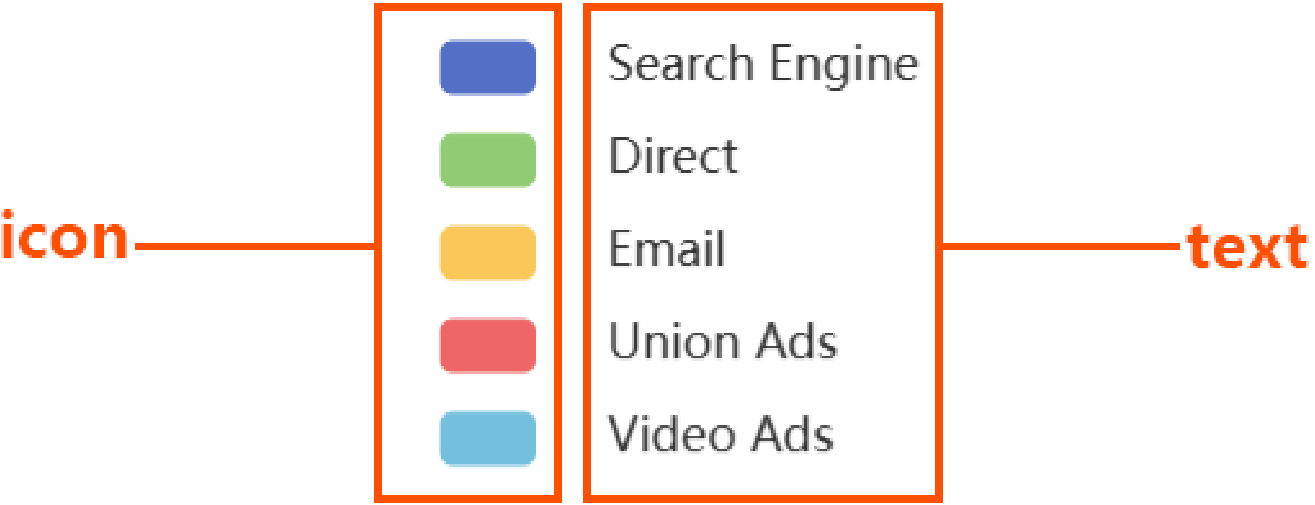
legend
orient图例的排列,vertical 垂直、horizontal 水平x水平位置,水平位置,可选值 left、right、centery垂直位置,可选值 top、center、bottom注意: 还可以用
left、right、top、bottom四个属性来精确设置 title 的位置,效果可参考position中的left、right、top、bottom。backgroundColor背景颜色borderColor边框颜色borderWidth边框宽度paddingitemGap图例之间的间距,只填数字icon图标类型:circle圆形rect矩形roundRect圆角矩形(默认)triangle三角形diamond菱形pin地图标记图标arrow箭头none无图标
itemHeight控制 icon 高度itemWidth控制 icon 宽度align调整 icon 相对于文本的位置(left——icon在文本左边、right、auto)textStyle设置文本样式,参考 title 章节的文本样式selected指定不显示在饼图中的数据
案例
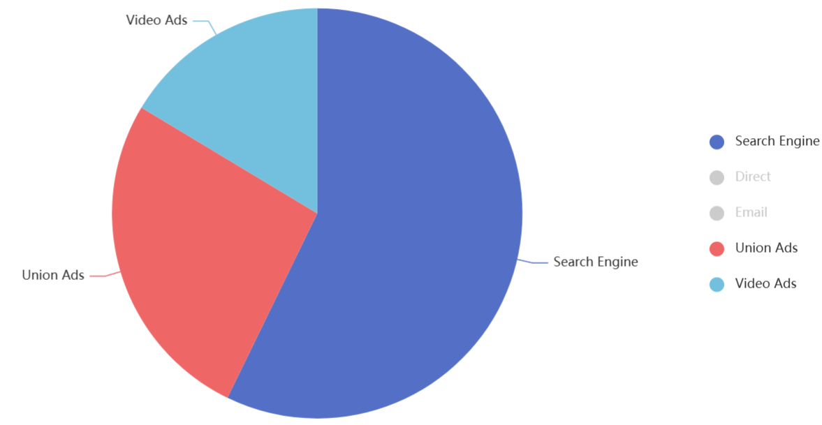
  legend: {
    orient: 'vertical',
    // left: 33,
    x: 'right',
    y: 'center',
    itemGap: 20,
    icon: 'circle',
    align: 'left',
    selected: {
          'Direct': false,
          'Email': false
    }
  },
legend 中的 formatter
formatter 可以自定义每个图例的文本内容,可用在 tooltip、legend、label 中,不过一般是用在 legend 中。
现在我有一个需求,我要让 legend 的文本的后面都加上一个 ○,如下:

	// name 对应的是 series.data 中的 name 属性
    formatter: function (name) {
      return name + '   ○';
    }
更详细的使用请见后续的综合案例。
2.4 label
label
show是否显示,默认为 truebackgroundColor背景颜色borderColor边框颜色borderWidth边框宽度borderRadius边框圆角padding内边距- …
因为这次需求中不需要管 label 长啥样,我直接 show: false 了,也就没去研究了,其余的属性可以见以下两篇博客:
https://www.hangge.com/blog/cache/detail_3130.html
https://blog.csdn.net/qq_38718629/article/details/126892957
2.5 tooltip
tooltip
show是否显示,默认 truetrigger触发类型item数据项图形触发,主要在散点图,饼图等无类目轴的图表中使用axis坐标轴触发,主要在柱状图,折线图等会使用类目轴的图表中使用none不触发
axisPointer轴指针属性,trigger: ‘axis’ 时使用,这里不做赘述showContent是否显示提示框浮层,默认 truealwaysShowContent是否永远显示提示框内容,默认(false)情况下在移出可触发提示框区域后一定时间后隐藏triggerOn提示框触发的条件mousemove鼠标悬浮时触发(默认)click鼠标点击时触发mousemove|click移动或点击时触发none无法触发
confine是否将 tooltip 框限制在图表的区域内,默认 falsebackgroundColor背景色paddingtextStyle设置文本样式,参考 title 章节的文本样式borderWidth边框宽度borderColor边框颜色使用默认的边框样式,它会根据饼图颜色来绘制边框
formatter见 legend 中的 formatter
2.6 series
这个是可操作属性最多的组成部分了,其属性值也是最多的。
series
nametooltip 的标题文字type图标类型,如:pie、category、lineroseType将普通饼图转换成南丁格尔图radius扇区圆心角展现数据的百分比,半径展现数据的大小area扇区圆心角的半径展现数据的大小(从大到小顺时针渲染)none普通饼图(默认)
radius饼图大小,可用 px、%注意:
- 如果只有一个属性值,则是实心饼图,属性值为饼图大小
- 如果有两个属性值,如:
['60%', '70%'],第一个值表示内圈大小,第二个表示外圈大小
center饼图圆心所在位置,可用 px、%,如:['40%', '50%']avoidLabelOverlap是否避免标签重叠,默认为 falsecolor饼图扇叶颜色,与data中的数据匹配data饼图渲染数据emphasis当鼠标悬浮时,饼图扇叶的变化focus在高亮图形时,是否淡出其它数据的图形已达到聚焦的效果none不淡出其它图形(默认)self只聚焦(不淡出)当前高亮的数据的图形seriesseries
blurScope在开启 focus 的时候,可以通过 blurScope 配置淡出的范围coordinateSystem淡出范围为坐标系(默认)series淡出范围为系列global淡出范围为全局
itemStyle饼图扇叶样式shadowColor阴影颜色shadowBlur阴影长度shadowOffsetX阴影水平偏移shadowOffsetY阴影垂直偏移borderRadius边框圆角borderColor边框颜色borderWidth边框宽度
注意: 可以在 emphasis 设置 itemStyle
案例
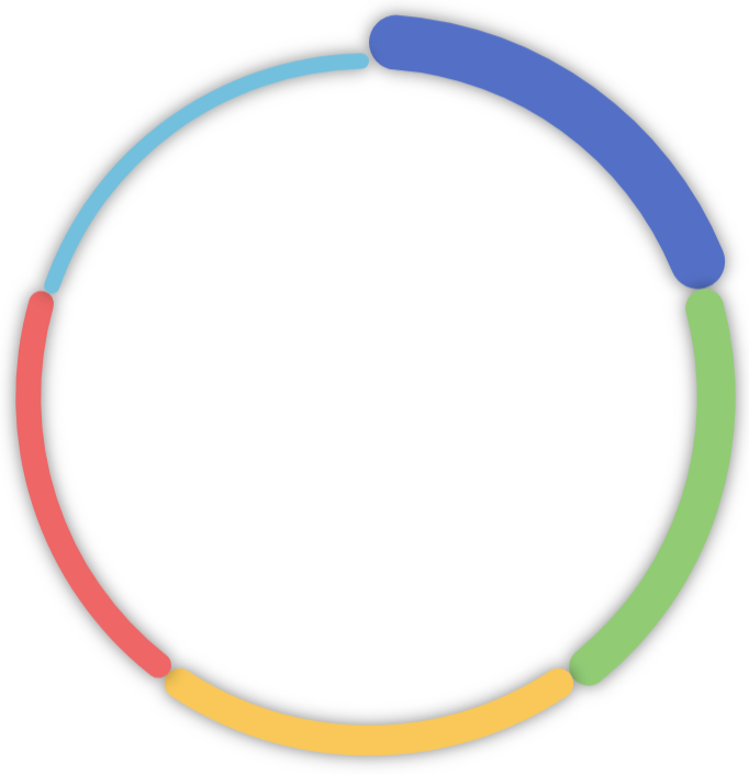
  series: [
    {
      name: 'Access From',
      type: 'pie',
      radius: ['60%', '70%'],
      center: ['50%', '50%'],
      roseType: 'area',
      data: [
        { value: 1048, name: 'Search Engine' },
        { value: 735, name: 'Direct' },
        { value: 580, name: 'Email' },
        { value: 484, name: 'Union Ads' },
        { value: 300, name: 'Video Ads' }
      ],
      label: {
        show: false
      },
      itemStyle: {
          borderRadius: '10%',
          shadowBlur: 10,
          shadowOffsetX: 0,
          shadowColor: 'rgba(0, 0, 0, 0.5)'
        },
    }
  ]
3. formatter 语法
看这篇文章:https://blog.csdn.net/qq_39442804/article/details/78202256 写得巨好
4. 补充:绘制一个折线图
效果图: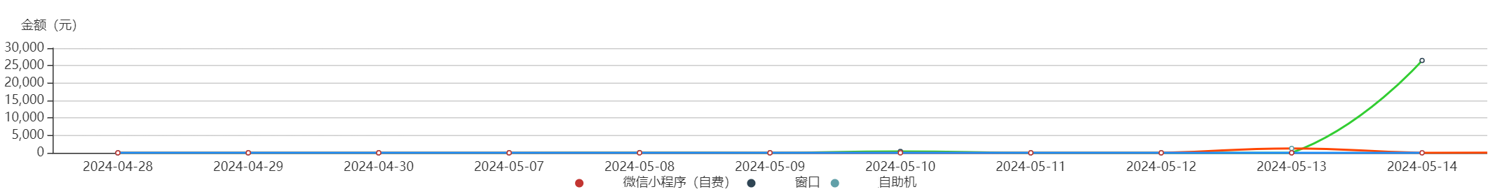
lineData数据结构:
{
    "data": [
        {
            "date": "2024-04-28",
            "channels": [
                {
                    "amount": 0,
                    "name": "微信小程序(自费)",
                    "count": 0
                },
                {
                    "amount": 0,
                    "name": "窗口",
                    "count": 0
                },
                {
                    "amount": 0.42,
                    "name": "自助机",
                    "count": 6
                }
            ]
        },
        {
            "date": "2024-04-29",
            "channels": [
                {
                    "amount": 14,
                    "name": "微信小程序(自费)",
                    "count": 5
                },
                {
                    "amount": 2.07,
                    "name": "窗口",
                    "count": 7
                },
                {
                    "amount": 0,
                    "name": "自助机",
                    "count": 0
                }
            ]
        }
    ]
}
代码:
<template>
  <div ref="chartContainer" :style="{width: '100%', height: '200px'}" />
</template>

<script>
import * as echarts from 'echarts'

export default {
  name: 'TransactionTrendCurve',
  props: ['lineData'],
  data () {
    return {
      seriesData: [],
      dates: [],
      chartInstance: null,
      colors: ['#1e90ff', '#32cd32', '#ff4500', '#9400d3', '#ff8c00', '#800080', '#adff2f', '#ff69b4', '#8a2be2', '#a52a2a'],
    }
  },
  watch: {
    lineData: {
      handler (newValue) {
        this.initChart(newValue)
      },
      immediate: true,
    },
  },
  mounted () {
    this.initChart()
  },
  beforeDestroy () {
    if (this.chartInstance) {
      this.chartInstance.dispose()
    }
  },
  methods: {
    initChart (newValue) {
      let lineData = {}
      if (newValue) {
        lineData = newValue
      } else {
        lineData = this.lineData
      }

      this.dates = []
      this.seriesData = []

      lineData.data.forEach(day => {
        this.dates.push(day.date)
        day.channels.forEach(channel => {
          let foundSeries = this.seriesData.find(s => s.name === channel.name)
          if (!foundSeries) {
            this.seriesData.push({
              name: channel.name,
              type: 'line',
              data: [],
              yAxisIndex: 0, // 添加y轴索引
            })
            foundSeries = this.seriesData[this.seriesData.length - 1]
          }
          foundSeries.data.push(channel.amount)
        })
      })

      this.chartInstance = this.$echarts.init(this.$refs.chartContainer)
      this.updateChart()
    },
    updateChart () {
      const option = {
        xAxis: {
          type: 'category',
          data: this.dates,
          min: 0,
          axisTick: {
            show: false,
          },
        },
        yAxis: [
          {
            name: '金额(元)',
            type: 'value',
          }
        ],
        legend: {
          data: this.seriesData.map(s => s.name),
          orient: 'horizontal',
          bottom: 0,
          icon: 'circle',
          itemHeight: 8,
        },
        grid: {
          left: 0,
          right: 0,
          bottom: '10%',
          containLabel: true,
        },
        tooltip: {
          trigger: 'axis',
        },
        series: this.assignColorsToSeries(),
      }
      this.chartInstance.setOption(option, true)
    },
    assignColorsToSeries () {
      return this.seriesData.map((data, index) => ({
        ...data,
        type: 'line',
        smooth: true,
        lineStyle: {
          color: this.colors[index % this.colors.length],
        },
        data: data.data,
      }))
    },
  },
}
</script>

有“AI”的1024 = 2048,欢迎大家加入2048 AI社区
更多推荐


 13
13 0
0- 0


 已为社区贡献10条内容

所有评论(0)