CSS 背景样式
background-color 背景颜色background-image 背景图片background-repeat 背景平铺方式background-position 背景位置background-attachment 背景固定模式background 简写background-size 背景大小background-origin 背景位置background-clip 背景剪切多背景图片CS
文章目录
CSS 背景样式
| 属性 | 说明 |
|---|---|
| background-color | 背景颜色 |
| background-image | 背景图片 |
| background-repeat | 背景图片重复方式 |
| background-position | 背景图位置 |
| background-attachment | 背景图固定模式 |
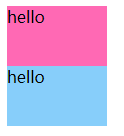
background-color 背景颜色
padding区域和border区域也会受背景颜色影响。
语法
background-color: 颜色值;
使用
<!DOCTYPE html>
<html>
	<head>
		<meta charset="utf-8" />
		<title></title>
		<style type="text/css">
			div {
				width: 100px;
				height: 60px;
			}

			#div1 {
				background-color: hotpink;
			}

			#div2 {
				background-color: #87CEFA;
			}
		</style>
	</head>
	<body>
		<div id="div1">hello</div>
		<div id="div2">hello</div>
	</body>
</html>
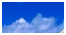
background-image 背景图片
语法
background-image: url(图片路径);
使用
div {
    width: 200px;
    height: 100px;
    background-image: url(img/a.png);
}
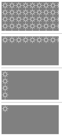
background-repeat 背景平铺方式
语法
background-repeat: 取值;
取值
| 属性值 | 说明 |
|---|---|
| repeat | 默认值,x、y平铺 |
| repeat-x | x平铺 |
| repeat-y | y平铺 |
| no-repeat | 不平铺 |
使用
<!DOCTYPE html>
<html>
	<head>
		<meta charset="utf-8" />
		<title></title>
		<style type="text/css">
			div {
				width: 200px;
				height: 100px;
				border: 1px solid silver;
				background-color: grey;
				background-image: url(img/ic_day.png);
			}

			#div2 {
				background-repeat: repeat-x
			}

			#div3 {
				background-repeat: repeat-y
			}

			#div4 {
				background-repeat: no-repeat
			}
		</style>
	</head>
	<body>
		<div id="div1"></div>
		<hr>
		<div id="div2"></div>
		<hr>
		<div id="div3"></div>
		<hr>
		<div id="div4"></div>
	</body>
</html>
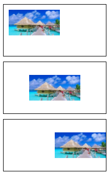
background-position 背景位置
语法
background-position: 像素值或关键字;
关键字
使用
<!DOCTYPE html>
<html>
    <head>
        <meta charset="utf-8" />
        <title></title>
        <style type="text/css">
            div {
                border: 1px solid black;
                width: 200px;
                height: 100px;
                background-image: url(img/a.png);
                background-repeat: no-repeat;
                background-size: 50% 50%;
                margin-top: 10px;
            }

            .box1 {
                background-position: 10px 10px;
            }

            .box2 {
                background-position: center center;
            }

            .box3 {
                background-position: center right;
            }
        </style>
    </head>
    <body>
        <body>
            <div class="box1"></div>
            <div class="box2"></div>
            <div class="box3"></div>
        </body>
    </body>
</html>
background-attachment 背景固定模式
语法
background-attachment: 取值;
取值
| 属性值 | 说明 |
|---|---|
| scroll | 默认值,跟随元素滚动 |
| fixed | 固定 |
background 简写
background: white url(images/a.png) no-repeat center center;
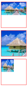
background-size 背景大小
在CSS2.1中,我们是不能使用CSS来控制背景图片大小的,背景图片的大小都是由图片实际大小决定的。
在CSS3中,我们可以使用background-size属性来定义背景图片的大小,这样可以使得同一张背景图片可以在不同的场景重复使用。
语法
background-size: 取值;
说明
background-size属性取值有两种:一种是长度值,如px、em、百分比等;另一种是使用关键字。
background-size关键字取值
| 属性值 | 说明 |
|---|---|
| cover | 覆盖,将背景图片等比例填满元素 |
| contain | 容纳,将背景图片等比例缩放在元素中 |
使用
<!DOCTYPE html>
<html>
	<head>
		<meta charset="utf-8" />
		<title></title>
		<style type="text/css">
			div {
				border: 1px solid red;
				width: 100px;
				height: 100px;
				margin-top: 10px;
				background-image: url(img/a.png);
				background-repeat: no-repeat;
			}

			.box1 {
				background-size: contain;
			}

			.box2 {
				background-size: cover;
			}

			.box3 {
				background-size: 50px 50px;
			}
		</style>
	</head>
	<body>
		<div class="box1"></div>
		<div class="box2"></div>
		<div class="box3"></div>
	</body>
</html>
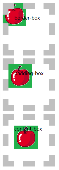
background-origin 背景位置
在CSS3中,我们可以使用background-origin属性来定义背景图片是从什么地方开始平铺的,也就是定义背景图片的位置。
background-origin往往都是配合background-position来使用的,其中background-origin定义background-position相对于什么位置来定位。
语法
background-origin: 取值;
background-origin取值
| 属性值 | 说明 |
|---|---|
| border-box | 从边框开始平铺 |
| padding-box | 从padding开始平铺,默认值 |
| content-box | 从内容区开始平铺 |
使用
<!DOCTYPE html>
<html>
	<head>
		<meta charset="utf-8" />
		<title></title>
		<style type="text/css">
			div {
				width: 100px;
				height: 100px;
				margin-top: 10px;
				padding: 20px;
				border: 20px dashed silver;
				background-image: url(img/apple.png);
				background-repeat: no-repeat;
			}

			.box1 {
				background-origin: border-box;
			}

			.box2 {
				background-origin: padding-box;
			}

			.box3 {
				background-origin: content-box;
			}
		</style>
	</head>
	<body>
		<div class="box1">border-box</div>
		<div class="box2">padding-box</div>
		<div class="box3">content-box</div>
	</body>
</html>
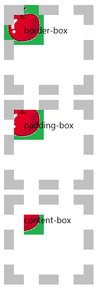
background-clip 背景剪切
语法
background-clip: 取值;
background-clip取值
| 属性值 | 说明 |
|---|---|
| border-box | 从边框开始剪切,默认值 |
| padding-box | 从padding开始剪切 |
| content-box | 从内容区开始剪切 |
使用
<!DOCTYPE html>
<html>
	<head>
		<meta charset="utf-8" />
		<title></title>
		<style type="text/css">
			div {
				width: 100px;
				height: 100px;
				margin-top: 10px;
				padding: 20px;
				border: 20px dashed silver;
				background-image: url(img/apple.png);
				background-repeat: no-repeat;
				background-origin: border-box;
			}

			.box1 {
				background-clip: border-box;
			}

			.box2 {
				background-clip: padding-box;
			}

			.box3 {
				background-clip: content-box;
			}
		</style>
	</head>
	<body>
		<div class="box1">border-box</div>
		<div class="box2">padding-box</div>
		<div class="box3">content-box</div>
	</body>
</html>
多背景图片
在CSS3中,我们可以为元素设置多背景图片。所谓“多背景图片”,指的是该元素的背景图片不止一张。
<!DOCTYPE html>
<html>
	<head>
		<meta charset="utf-8" />
		<title></title>
		<style type="text/css">
			div {
				width: 400px;
				height: 200px;
				border: 1px solid silver;
				background: url(img/frame1.png) bottom left no-repeat,
					url(img/frame2.png) top right no-repeat;
			}
		</style>
	</head>
	<body>
		<div></div>
	</body>
</html>
CSS精灵图
CSS精灵:将多个小图标合并制作到一张图片上, 使用background-position属性单独显示其中一个,这样的技术称为CSS精灵技术,也称为CSS雪碧图。
CSS精灵可以减少HTTP请求数,加快网页显示速度。
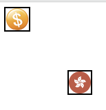
<style>
    .money {
        position: absolute;
        width: 34px;
        height: 32px;
        border: 1px solid black;
        background-image: url(images/sprites.png);
        background-position: -66px -488px;
    }

    .zjh {
        position: absolute;
        top: 100px;
        left: 100px;
        width: 32px;
        height: 32px;
        border: 1px solid black;
        background-image: url(images/sprites.png);
        background-position: 0 -980px;
    }
</style>

<body>
    <i class="money"></i>
    <i class="zjh"></i>
</body>

有“AI”的1024 = 2048,欢迎大家加入2048 AI社区
更多推荐

 3
3 0
0- 0


 已为社区贡献6条内容

所有评论(0)