【Python画图】单变量及多变量的分布图绘制
用分布图快速了解数据分布。
第3章 变量分布图
3.1 直方图
这里以经典的鸢尾花(iris)数据集为例,展示Seaborn、Proplot以及SciencePlots的直方图。
import matplotlib.pyplot as plt
import seaborn as sns
import numpy as np
import proplot as pplt
import scienceplots

plt.rcParams['font.family'] = 'Times New Roman'
plt.rcParams['font.size']   = 14
iris = sns.load_dataset("iris")
iris
| sepal_length | sepal_width | petal_length | petal_width | species | |
|---|---|---|---|---|---|
| 0 | 5.1 | 3.5 | 1.4 | 0.2 | setosa |
| 1 | 4.9 | 3.0 | 1.4 | 0.2 | setosa |
| 2 | 4.7 | 3.2 | 1.3 | 0.2 | setosa |
| 3 | 4.6 | 3.1 | 1.5 | 0.2 | setosa |
| 4 | 5.0 | 3.6 | 1.4 | 0.2 | setosa |
| ... | ... | ... | ... | ... | ... |
| 145 | 6.7 | 3.0 | 5.2 | 2.3 | virginica |
| 146 | 6.3 | 2.5 | 5.0 | 1.9 | virginica |
| 147 | 6.5 | 3.0 | 5.2 | 2.0 | virginica |
| 148 | 6.2 | 3.4 | 5.4 | 2.3 | virginica |
| 149 | 5.9 | 3.0 | 5.1 | 1.8 | virginica |
150 rows × 5 columns
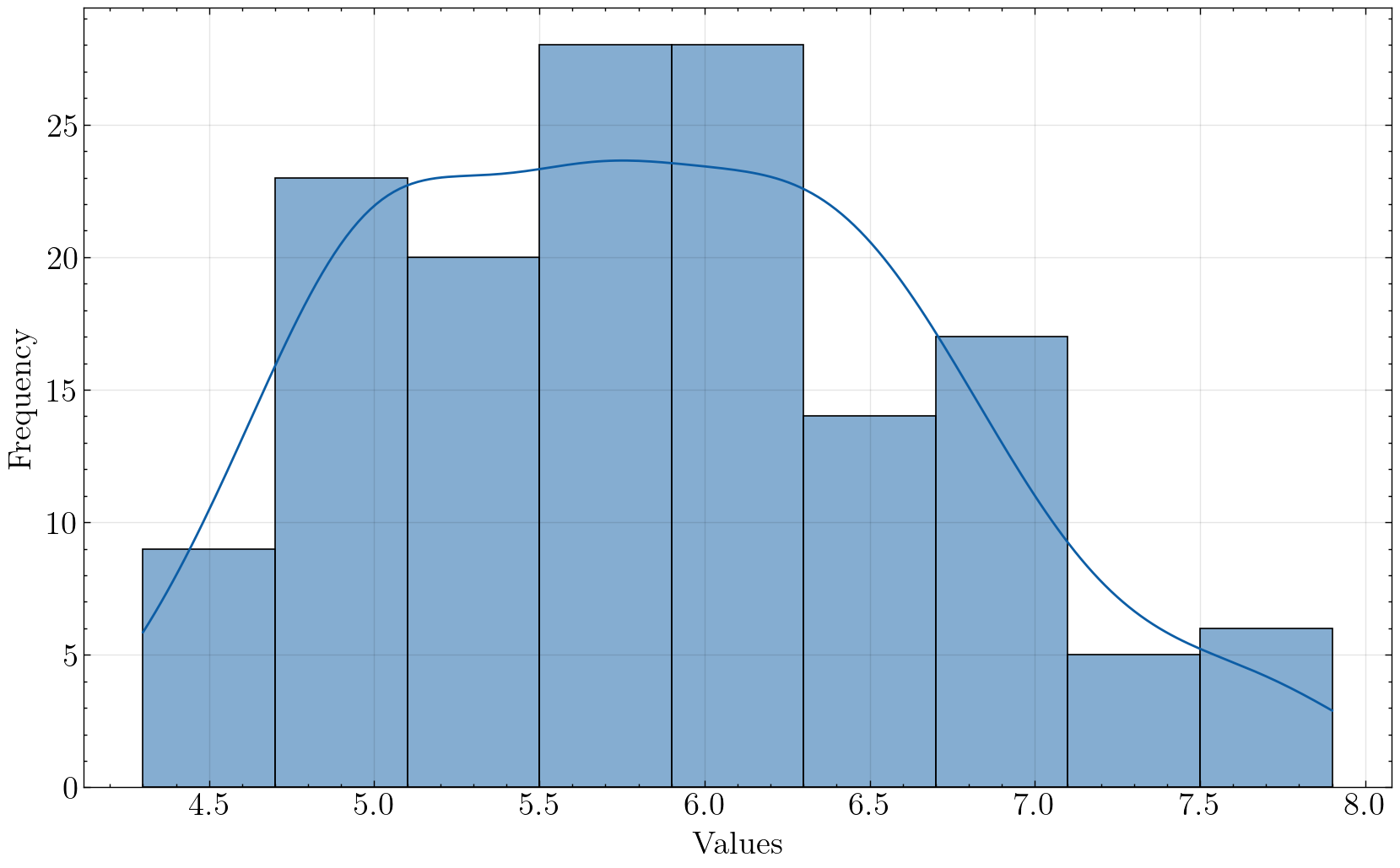
plt.figure(figsize=(10,6), dpi=100, facecolor="w")

plt.hist(iris["sepal_length"], bins=15, edgecolor='black')
plt.xlabel("sepal_length")
plt.ylabel("Frequency")

plt.savefig('./images/Hist_matplotlib.png', dpi=300, bbox_inches='tight')
plt.show()
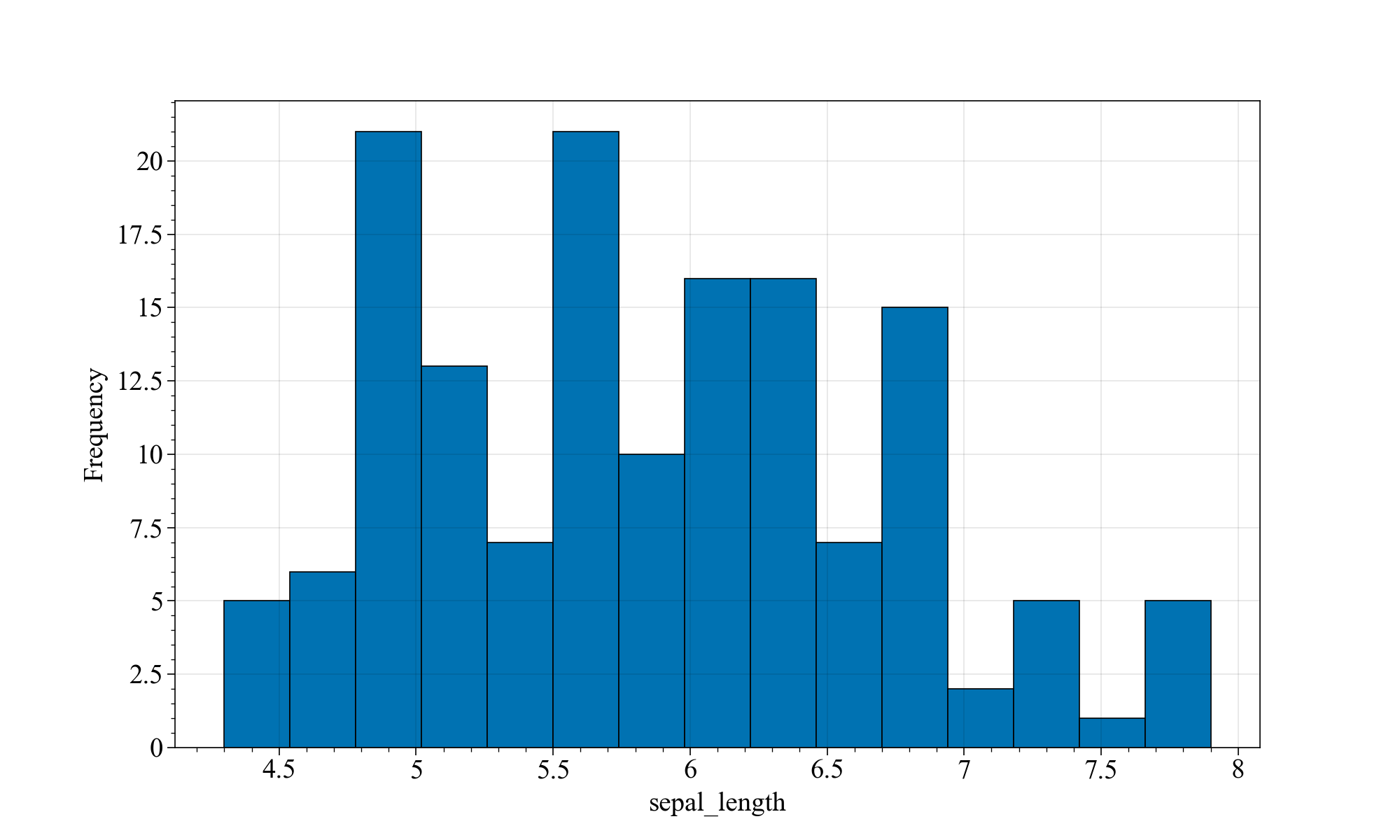
x轴为鸢尾花的萼片(sepal)长度,y轴为不同萼片长度范围内的鸢尾花的数量。
matplotlib能画个基本的直方图,但不够优雅~
接下来我们来试试Seaborn,这个可就有意思多了。
plt.figure(figsize=(10,6),dpi=100,facecolor="w")
sns.histplot(data=iris, x="sepal_length")

plt.savefig('./images/Hist_seaborn_original.png', dpi=300, bbox_inches='tight')
plt.show()
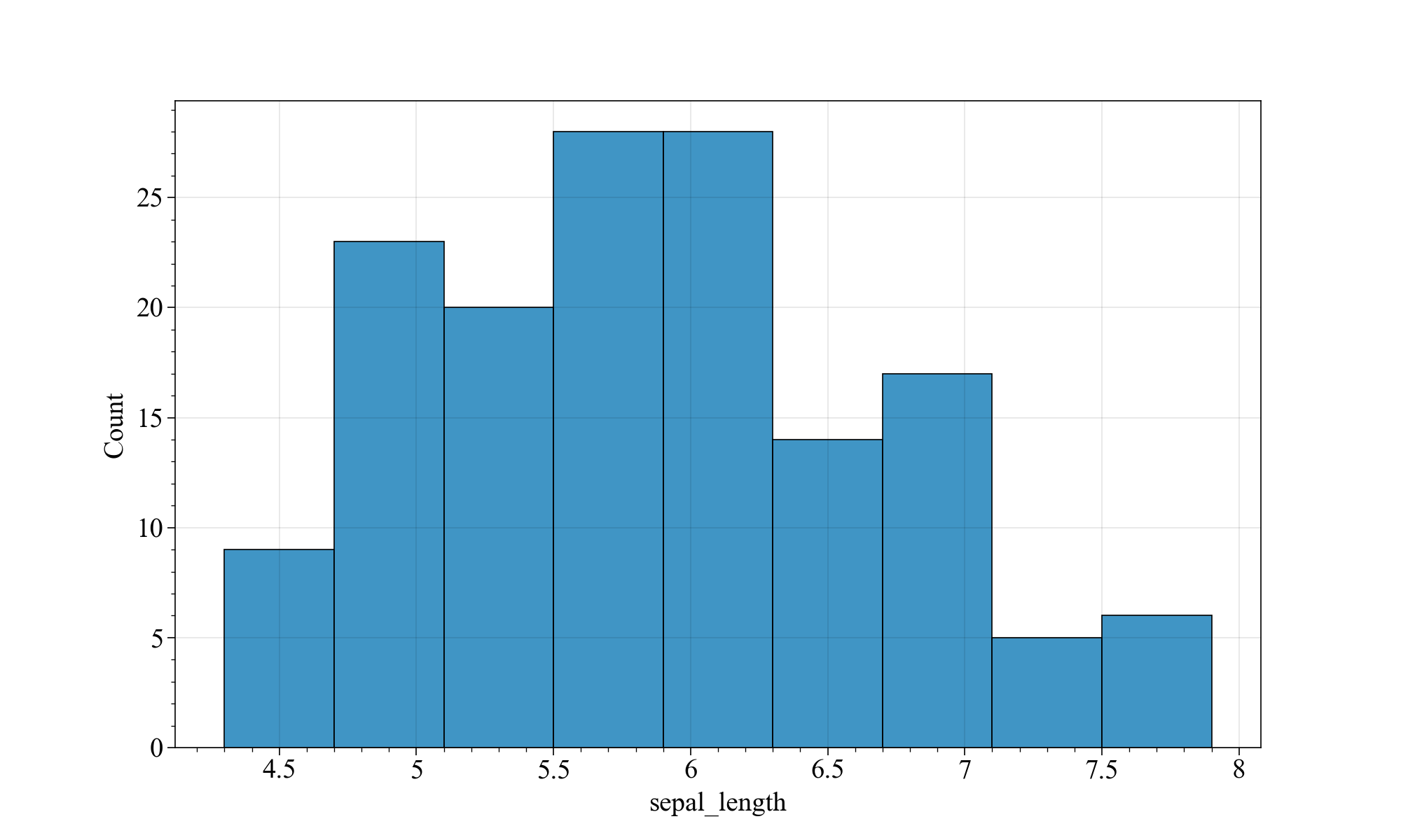
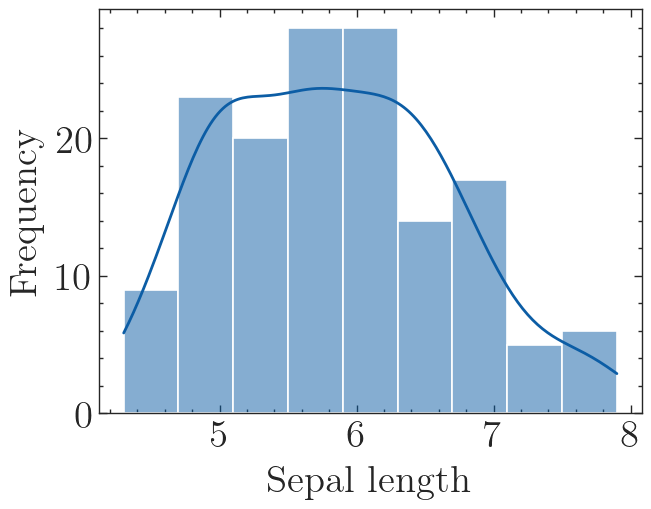
相当原始,和matplotlib一样,不够优雅。我们给他加点魔法(核密度估计曲线kde):
# 设置seaborn风格
custom_params = {"font.family"   : "Times New Roman", "font.scale": 1.5}
sns.set_style(style="ticks", rc=custom_params) #设置绘图风格

plt.figure(figsize=(10,6),dpi=100,facecolor="w")
sns.histplot(data=iris, x="sepal_length", bins=20, kde=True)

plt.savefig('./images/Hist_seaborn_kde.png', dpi=300, bbox_inches='tight')
plt.show()
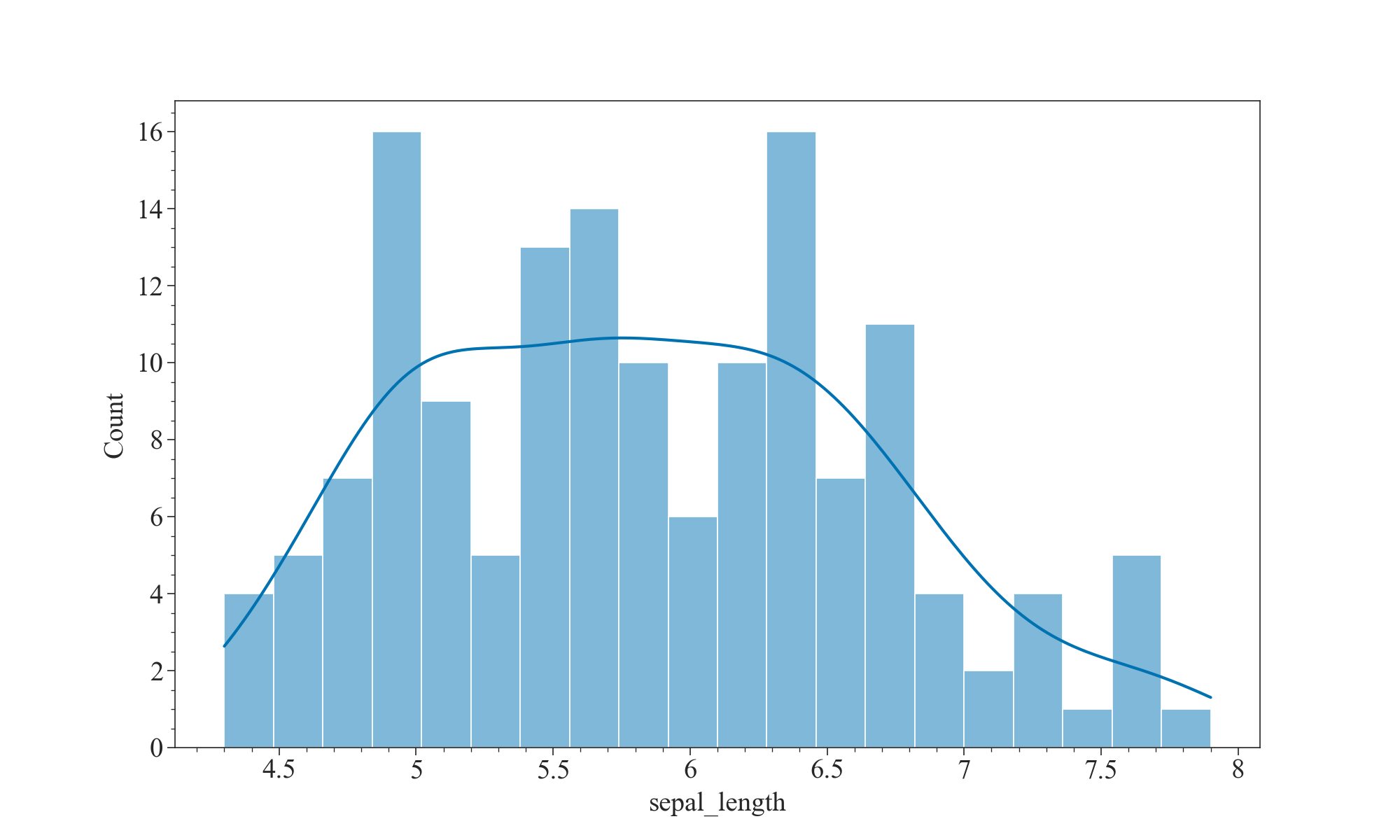
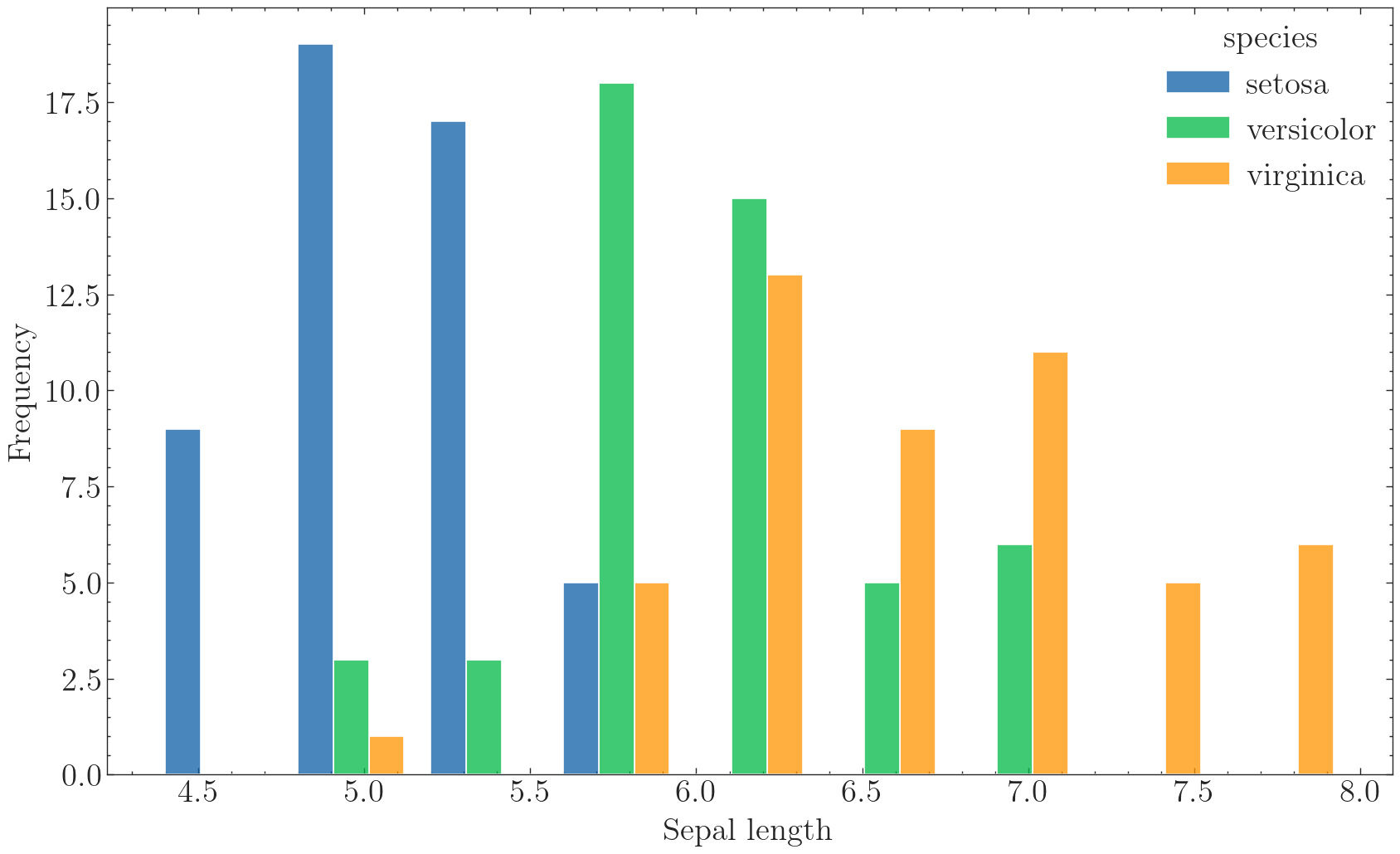
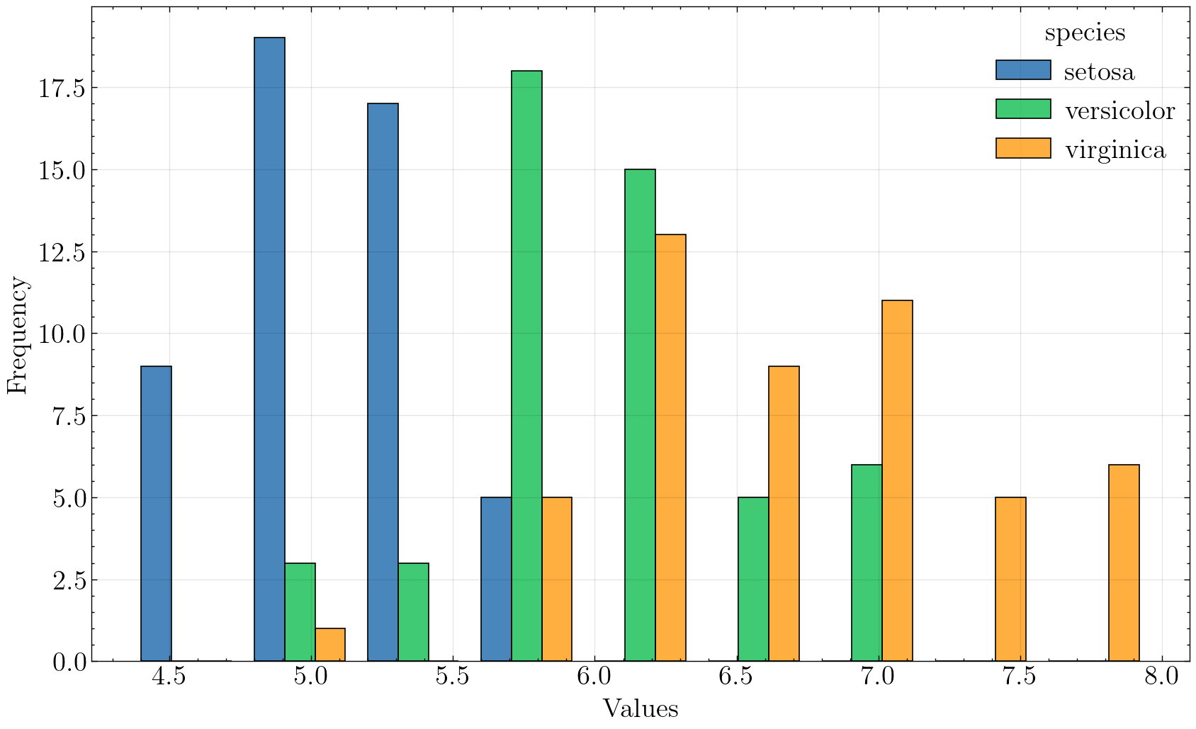
还可以分组查看萼片的长度分布情况:
plt.figure(figsize=(10,6),dpi=100,facecolor="w")
sns.histplot(data=iris, x="sepal_length", hue='species', multiple='dodge', shrink=.8)

plt.savefig('./images/Hist_seaborn_group.png', dpi=300, bbox_inches='tight')
plt.show()
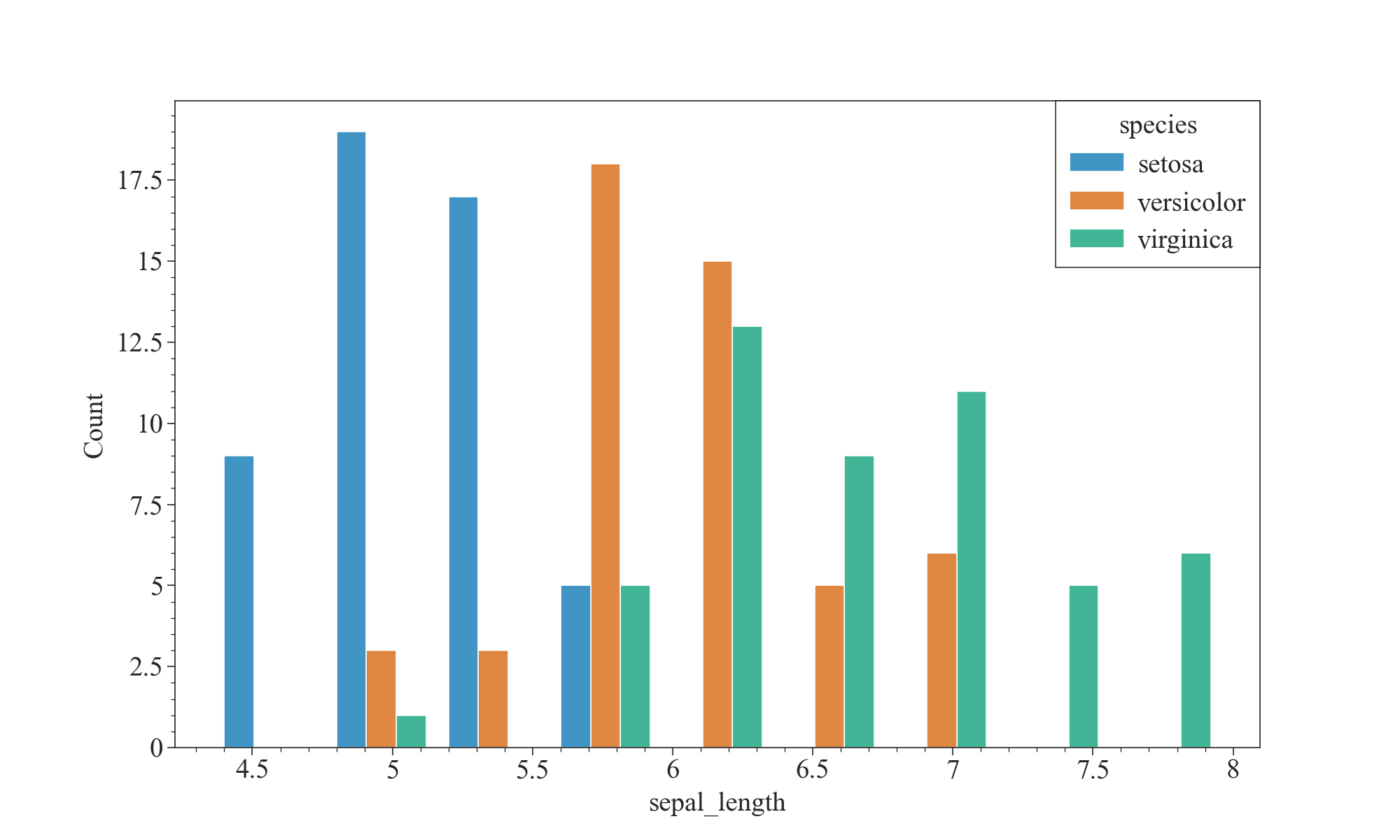
如上图,我们可以发现,山鸢尾花(setosa)的萼片长度比其他两种要短,杂色鸢尾花(Versicolor)的萼片长度适中,维吉尼亚鸢尾花(Virginica)的萼片长度普遍更长。这也是分辨鸢尾花种类的一个重要特征。
咳咳,扯远了,来看看Proplot的直方图:
fig, ax = pplt.subplots(refwidth=4, refaspect=(3, 2))
ax.format(suptitle='Distribution', xlabel='sepal length', ylabel='count')
res = ax.hist(
    iris['sepal_length'], pplt.arange(4, 8, 0.2), filled=True, alpha=0.8, edgecolor='k',
            histtype='bar', cycle='Set3')

plt.savefig('./images/_histplot_group.png', dpi=300, bbox_inches='tight')
plt.show()
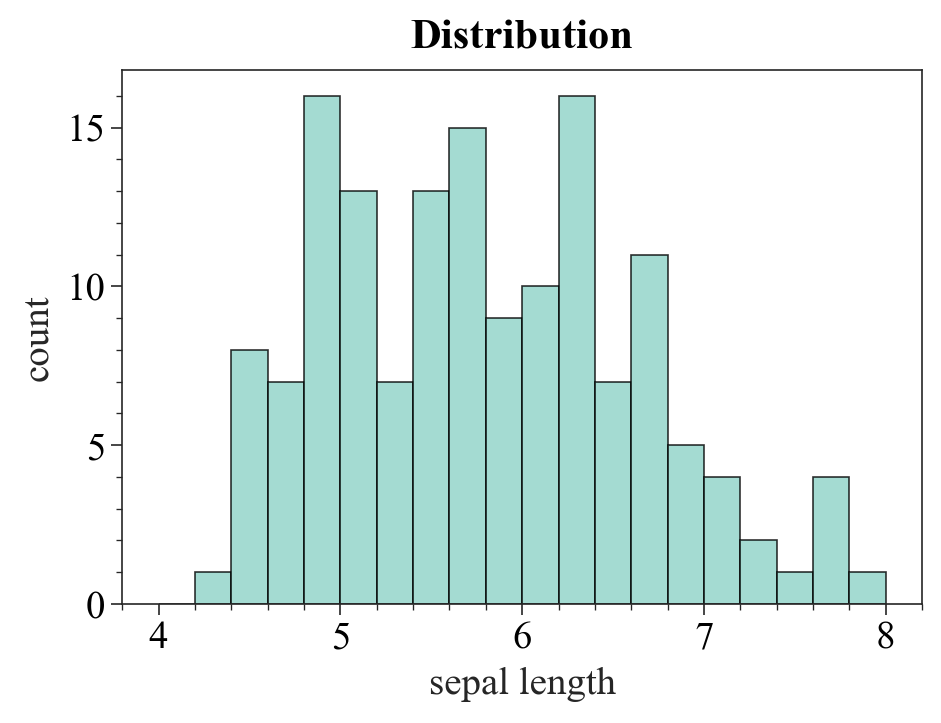
emmmm,挺素的。下一位:SciencePlots
bins = np.arange(4,8,0.5)
with plt.style.context(['science']):
    fig,ax = plt.subplots(figsize=(10,6),dpi=100,facecolor="w")
    hist = ax.hist(x=iris['sepal_length'], bins=bins,color='#5698c3',
                   edgecolor='w',rwidth = 0.8)
    ax.set_xlabel('Values', )
    ax.set_ylabel('Frequency')

plt.savefig('./images/Hist_matplotlib_SciencePlots.png', dpi=300, bbox_inches='tight')
plt.show()
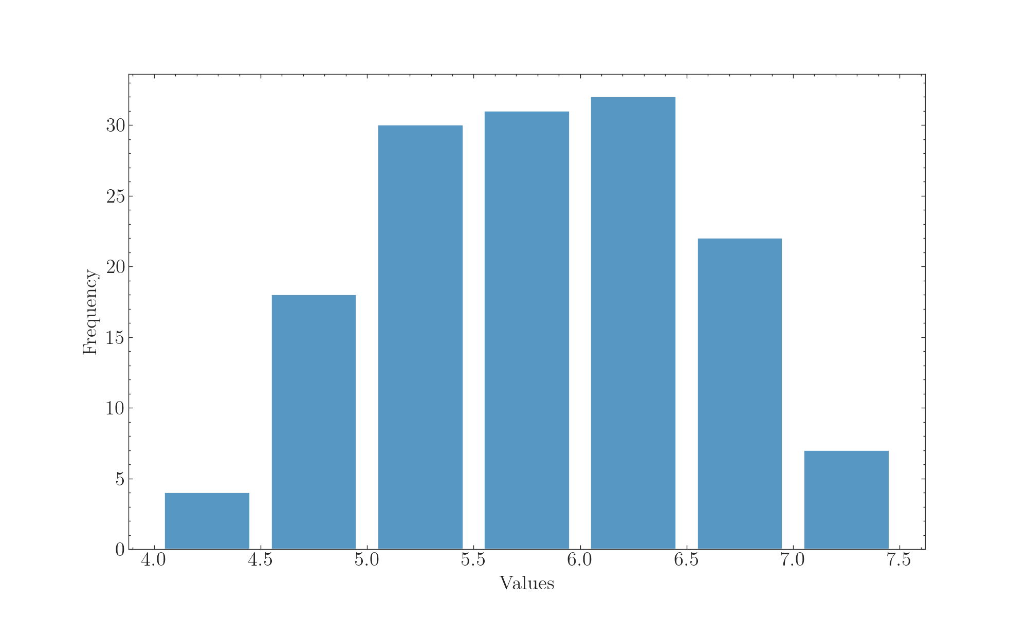
不错,很严谨!再来看看Seaborn + SciencePlots的组合:
# plt.style.use('science')
with plt.style.context(['science']):
    fig, ax = plt.subplots(figsize=(10,6),dpi=100,facecolor="w")
    sns.histplot(data=iris, x="sepal_length", hue='species', multiple='dodge', shrink=.8)
    ax.set(xlabel='Sepal length', ylabel='Frequency')
    ax.set_xlim(4, 8)
    ax.set_ylim(0, 30)
    ax.autoscale(tight=False)

    plt.savefig('./images/Hist_seaborn_SciencePlots1.png', dpi=300, bbox_inches='tight')
    plt.show()
也挺好看的,但是要注意,SciencePlots在这里必须得和返回对象为matplotlib.axes.Axes的画图函数配合使用,不然会报错。
plt.style.use('science')

# with plt.style.context(['science']):
plt.figure(figsize=(10, 6), dpi=100)
fig, ax = plt.subplots()
sns.histplot(data=iris, x="sepal_length", kde=True)
ax.set(xlabel='Sepal length', ylabel='Frequency')
ax.set_xlim(4, 8)
ax.set_ylim(0, 30)
ax.autoscale(tight=False)

plt.savefig('./images/Hist_seaborn_SciencePlots2.png', dpi=300, bbox_inches='tight')
plt.show()
<Figure size 1000x600 with 0 Axes>
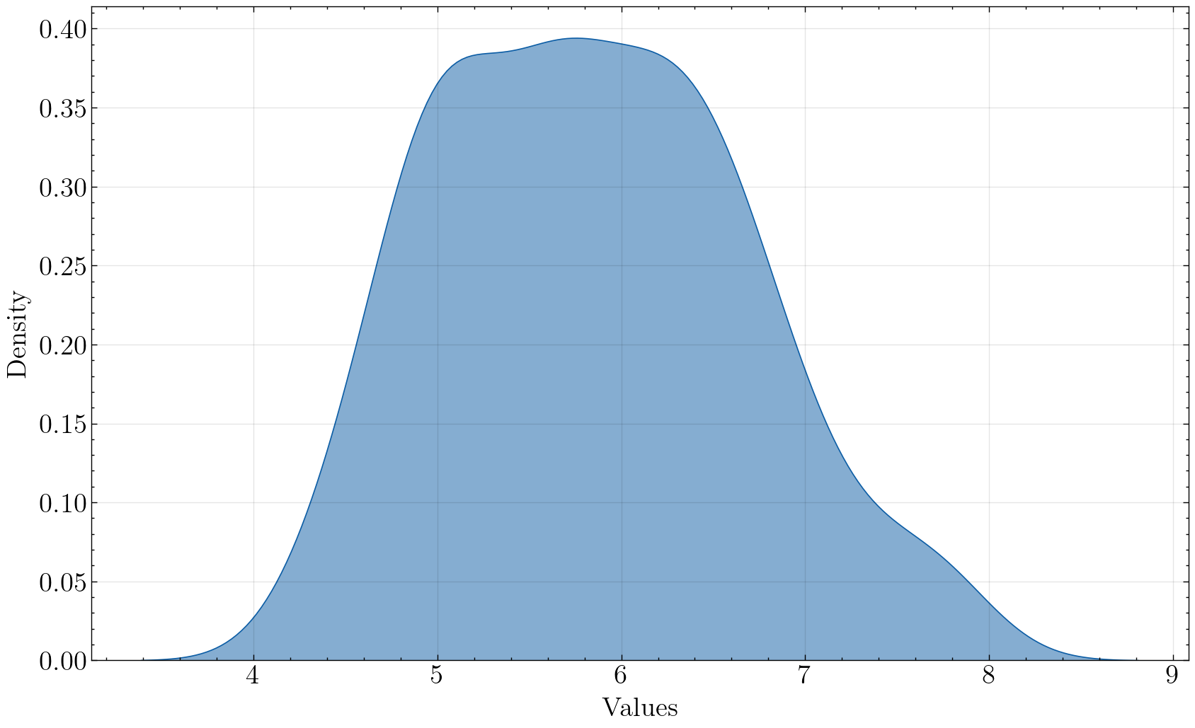
3.2 密度图
密度图可以查看分布情况,也可以用于比较两组数据的分布情况。
画密度图的方法有很多,常用的方法为Seaborn的kdeplot,或者Seaborn的histplot + kde=True。这里展示一个简单的例子:
import matplotlib.pyplot as plt
import seaborn as sns
import numpy as np
import proplot as pplt
import scienceplots

plt.rcParams['font.family'] = 'Times New Roman'
plt.rcParams['font.size']   = 14
iris = sns.load_dataset("iris")
with plt.style.context(['science']):
fig, ax = plt.subplots(figsize=(10,6), dpi=100, facecolor="w")
# hist = ax.hist(x=iris['sepal_length'], bins=bins,color='#5698c3',
# edgecolor='w',rwidth = 0.8)
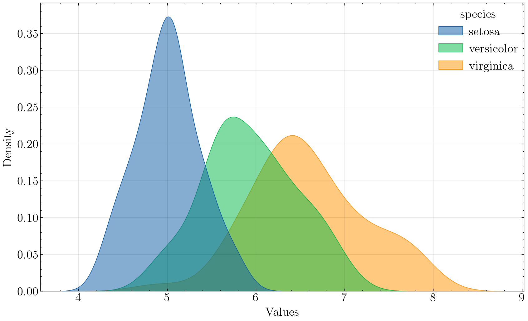
ax = sns.kdeplot(data=iris, x='sepal_length', hue='species', fill=True, alpha=.5)
ax.set_xlabel('Sepal length')
ax.set_ylabel('Density')
plt.savefig('./images/Kdeplot_Seaborn.png', dpi=300, bbox_inches='tight')
plt.show()

可以非常明显地看出不同种类的鸢尾花的萼片长度分布情况,平均长度: s e t o s a < v e r s i c o l o r < v i r g i n a c a setosa < versicolor < virginaca setosa<versicolor<virginaca。
注意,Seaborn的kdeplot函数默认采用的是高斯核函数,如果想要用其他核函数的话可以参考KDEpy库。(一般高斯核也够用了)
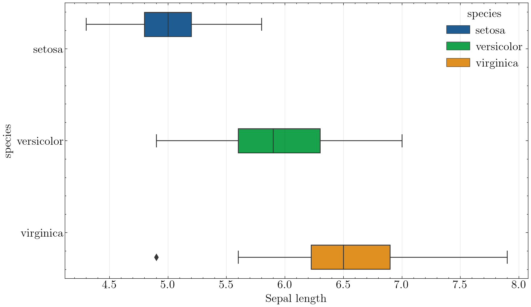
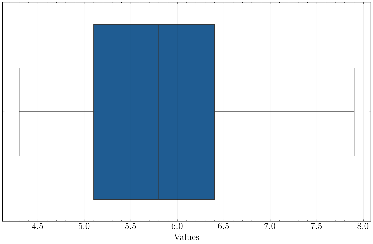
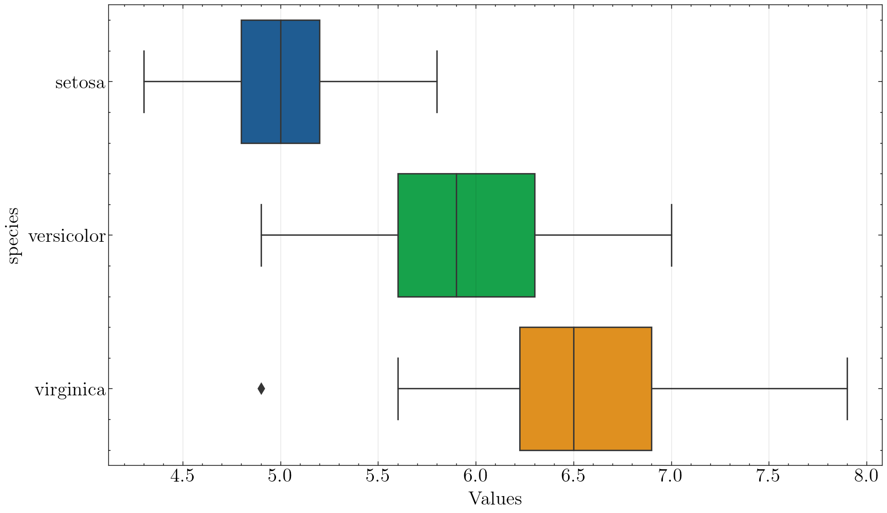
3.3 箱线图
箱线图可以很好地看出分布情况,同时也可以看出中位数、上四分位数和下四分位数。
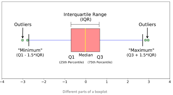
如图所示,箱线图的这个箱子的下边缘和上边缘分别是第1(25%)和第3(75%)分位数,箱子中间的线为该数据的中位数,箱子上下边缘之差称为IQR(Interquartile range)。
箱子往两边延伸出的两根实线末端分别是数据的最大值和最小值,超过实线末端的称为异常值或离群值。
with plt.style.context(['science']):
    fig, ax  = plt.subplots(figsize=(10,6), dpi=100, facecolor="w")
    ax = sns.boxplot(data=iris, x='sepal_length', y='species', hue='species')

    ax.set_xlabel('Sepal length')

    plt.savefig('./images/Seaborn_boxplot.png', dpi=300, bbox_inches='tight')
    plt.show()
3.4 常用分布函数封装
需要用到分布函数的情况有:数据探索阶段、验证阶段(验证测试集分布与训练集分布是否差异过大)等。那么,我们可以封装一些常用的分布函数,把画图、调参、存储这些琐碎但重要的细节都封装好,以后调用只需输入几个参数,减少花在调整细节上的时间。
PS:科研论文绘图更多时候需要的是“定制化”,很难一个模板走天下,这个时候建议大家直接看matplotlib或者Seaborn等的官方文档,有更加详细的参数解释和例子,这里就不多介绍了。
import matplotlib.pyplot as plt
import seaborn as sns
import scienceplots
import pandas as pd
from pandas import DataFrame

# plt.rcParams['font.family'] = 'Times New Roman'
# plt.rcParams['font.size']   = 14

def univariate_histplot(data:DataFrame, x:str, hue=None, figsize=(10,6), style=['science'], kde=True, kind='hist',
                        plot_dpi=100, saveflag=False, save_dir='./', save_dpi=300, save_type='png'):
    """
    单变量直方图函数。第一次画的

    Args:
    data: Dataframe, 必需参数,且必须为DataFrame。
    x: 变量名,str, 必需参数。
    hue: 分组的变量名,str, 一般为类别,如性别、种类等。默认为空。
    figsize: 图片尺寸,默认为(10, 6)。
    style: list, 画图的风格,默认为['science'],可以改为['science', 'ieee']
    kde: bool, 是否添加核密度估计曲线,默认为True.
    kind: str, 图像类型,hist为直方图,kde为密度图,box为箱线图。
    plot_dpi: int, 画图时的dpi。
    saveflag: bool, 是否保存图片,默认为False。
    save_dir: str, 保存路径。
    save_dpi: int, 保存的图片dpi,越高越清晰,图片所占空间也就越大。
    save_type: str, 保存的图片类型,默认为'png'.

    """

    if not isinstance(data, DataFrame):
        raise TypeError("Input 'data' must be a pandas DataFrame")

    cols = data.columns
    if x not in cols:
        raise ValueError("Input 'x' must be a column name in data")
    if hue and hue not in cols:
        raise ValueError("Input 'hue' must be a column name in data")
    if not save_dir.endswith('/'):
        save_dir = save_dir + '/'
    if kind not in ['hist', 'kde', 'box']:
        raise ValueError("Input 'kind' must be 'hist' or 'kde' or 'box")

    with plt.style.context(style):
        fig, ax = plt.subplots(figsize=figsize, dpi=plot_dpi, facecolor="w")
        if hue:
            if kind == 'hist':
                ax = sns.histplot(data=data, x=x, hue=hue, multiple='dodge', shrink=.8)
            if kind == 'kde':
                ax = sns.kdeplot(data=data, x=x, hue=hue, fill=True, alpha=.5)
            if kind == 'box':
                ax = sns.boxplot(data=data, x=x, y=hue)
        else:
            if kind == 'hist':
                ax = sns.histplot(data=data, x=x, kde=kde)
            if kind == 'kde':
                ax = sns.kdeplot(data=data, x=x, fill=True, alpha=.5)
            if kind == 'box':
                ax = sns.boxplot(data=data, x=x)

        ax.set_xlabel('Values') # 画完图后不能再有参数出现
        if kind == 'hist':
            ax.set_ylabel('Frequency')
        elif kind == 'box':
            pass
        else:
            ax.set_ylabel('Density')

        if saveflag:
            if hue:
                save_path = save_dir + kind + '_' + x + '_' + hue + '_' + style[-1] + '.' + save_type
            else:
                save_path = save_dir + kind + '_' + x + '_' + style[-1] + '.' + save_type
            plt.savefig(save_path, dpi=save_dpi, bbox_inches='tight')
            print(f'Plot has been saved to {save_path} .')

        plt.show()
来测试一下:
univariate_histplot(iris, x='sepal_length', saveflag=True, save_dir='./images/')
Plot has been saved to ./images/hist_sepal_length_science.png .
univariate_histplot(iris, x='sepal_length', hue='species', saveflag=True, save_dir='./images/')
Plot has been saved to ./images/hist_sepal_length_species_science.png .
univariate_histplot(iris, x='sepal_length', kind='kde', saveflag=True, save_dir='./images')
Plot has been saved to ./images/kde_sepal_length_science.png .
univariate_histplot(iris, x='sepal_length', hue='species', kind='kde', saveflag=True, save_dir='./images')
Plot has been saved to ./images/kde_sepal_length_species_science.png .
univariate_histplot(iris, x='sepal_length', kind='box', saveflag=True, save_dir='./images')
Plot has been saved to ./images/box_sepal_length_science.png .
univariate_histplot(iris, x='sepal_length', kind='box', hue='species', saveflag=True, save_dir='./images')
Plot has been saved to ./images/box_sepal_length_species_science.png .
OK,各种模式都很成功。
3.5 多变量分布图
接下来我们来画多个变量的分布图,先从2个到多个变量。这种图的作用一般在于查看多个变量之间的分布情况,以及多个变量之间的相关性如何。
3.5.1 两个变量
对于两个变量的之间的分布图,可以用seaborn的jointplot函数,它默认画的是散点图,但是可以指定kind参数。
# 这里需要重启一下jupyter内核
import matplotlib.pyplot as plt
import seaborn as sns

iris = sns.load_dataset('iris')
sns.set_theme(style="ticks")
# plt.style.reload_library()
# plt.style.use('grid')

plt.figure(figsize=(15, 15), dpi=100, facecolor='w')
sns.jointplot(data=iris,x="sepal_length", hue='species', y="sepal_width")

plt.savefig('./images/Seaborn_jointplot.png', dpi=300, bbox_inches='tight')
plt.show()
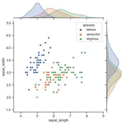
好消息:图很好看。
坏消息:由于jointplot返回的不是axes对象,用不了SciencePlots那严谨的绘图风格。
再来画个蜂窝图:
plt.figure(figsize=(15, 15), dpi=100, facecolor='w')
sns.jointplot(data=iris, x="sepal_length", y="sepal_width", kind='hex')

plt.savefig('./images/Seaborn_jointplot_hex.png', dpi=300, bbox_inches='tight')
plt.show()
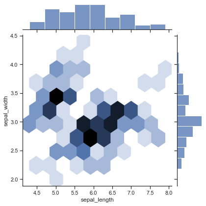
蜂窝图中颜色越深的地方说明该区域的样本数量多,分布越集中。
更多jointplot函数的用法参见Seaborn官方文档:jointplot。
3.5.2 多个变量
当变量个数较多时,可以用matplotlib画多个子图,每个子图两两变量进行画图,但可想而知工作量较大,不太推荐。
这里推荐使用Seaborn的pairplot和heatmap函数。
先来看看pairplot:
plt.figure(figsize=(18, 15), dpi=100, facecolor='w')
sns.pairplot(iris, hue="species")
plt.savefig('./images/Seaborn_pairplot.png', dpi=300, bbox_inches='tight')
plt.show()
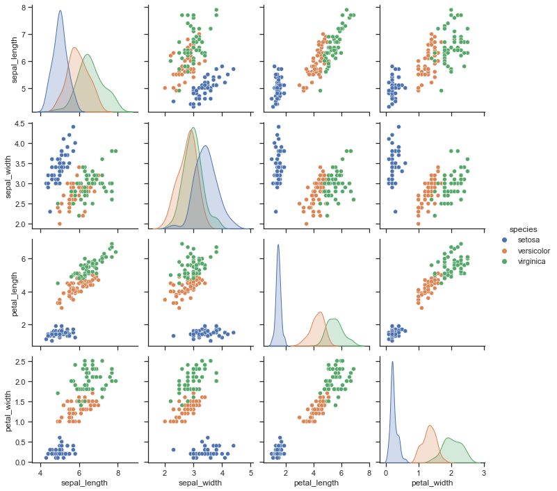
emmmm, pairplot这个函数返回的是PairGrid对象,不是matplotlib.axes.Axes对象,还是没法用SciencePlots。不过这个函数已经封装地很好了,一行代码搞定,就不再封装了~
再来看看热力图函数heatmap。热力图函数主要用来可视化不同变量之间的相关性强弱。
# 计算相关系数二维矩阵
corr = iris.corr()
corr
<ipython-input-6-c5cd6f9fda0c>:2: FutureWarning: The default value of numeric_only in DataFrame.corr is deprecated. In a future version, it will default to False. Select only valid columns or specify the value of numeric_only to silence this warning.
  corr = iris.corr()
| sepal_length | sepal_width | petal_length | petal_width | |
|---|---|---|---|---|
| sepal_length | 1.000000 | -0.117570 | 0.871754 | 0.817941 |
| sepal_width | -0.117570 | 1.000000 | -0.428440 | -0.366126 |
| petal_length | 0.871754 | -0.428440 | 1.000000 | 0.962865 |
| petal_width | 0.817941 | -0.366126 | 0.962865 | 1.000000 |
plt.figure(figsize=(10, 6), dpi=100, facecolor='w')
sns.heatmap(corr, annot=True, fmt=".1f")
plt.savefig('./images/Seaborn_heatmap.png', dpi=300, bbox_inches='tight')
plt.show()
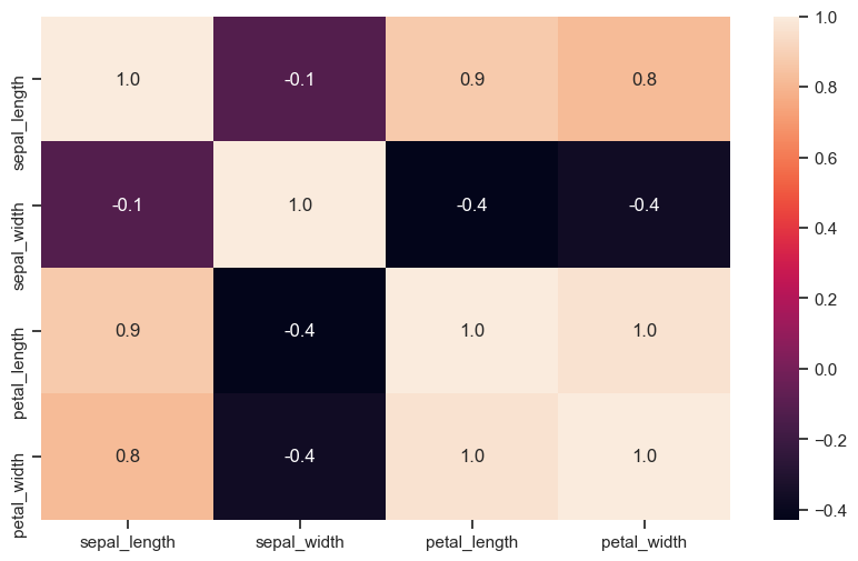
太丑了,换个颜色。
plt.figure(figsize=(10, 8), dpi=100, facecolor='w')
sns.heatmap(corr, annot=True, fmt=".1f", cmap='Blues')
plt.savefig('./images/Seaborn_heatmap2.png', dpi=300, bbox_inches='tight')
plt.show()
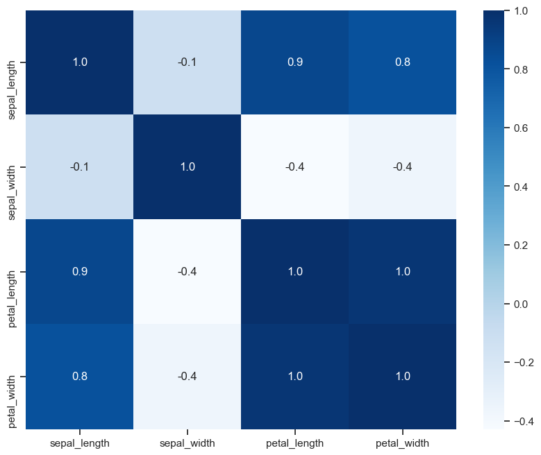
优雅,实在是太优雅了!
这个热力图能用SciencePlots,但是不太推荐,刻度线太细了,看着反而有点奇怪,不如直接设置Seaborn的风格参数。
参考资料:
[1] 《Datawhale 科研论文配图绘制指南–基于Python》
[2] matplotlib 官方文档
[3] Seaborn 官方文档
[4] Pandas 官方文档
[5] SciencePlots官方仓库及文档

有“AI”的1024 = 2048,欢迎大家加入2048 AI社区
更多推荐

 3
3 0
0- 0


 已为社区贡献5条内容

所有评论(0)