一些css/css3特效以及边框流光特效实现
一些css的边框特效
·
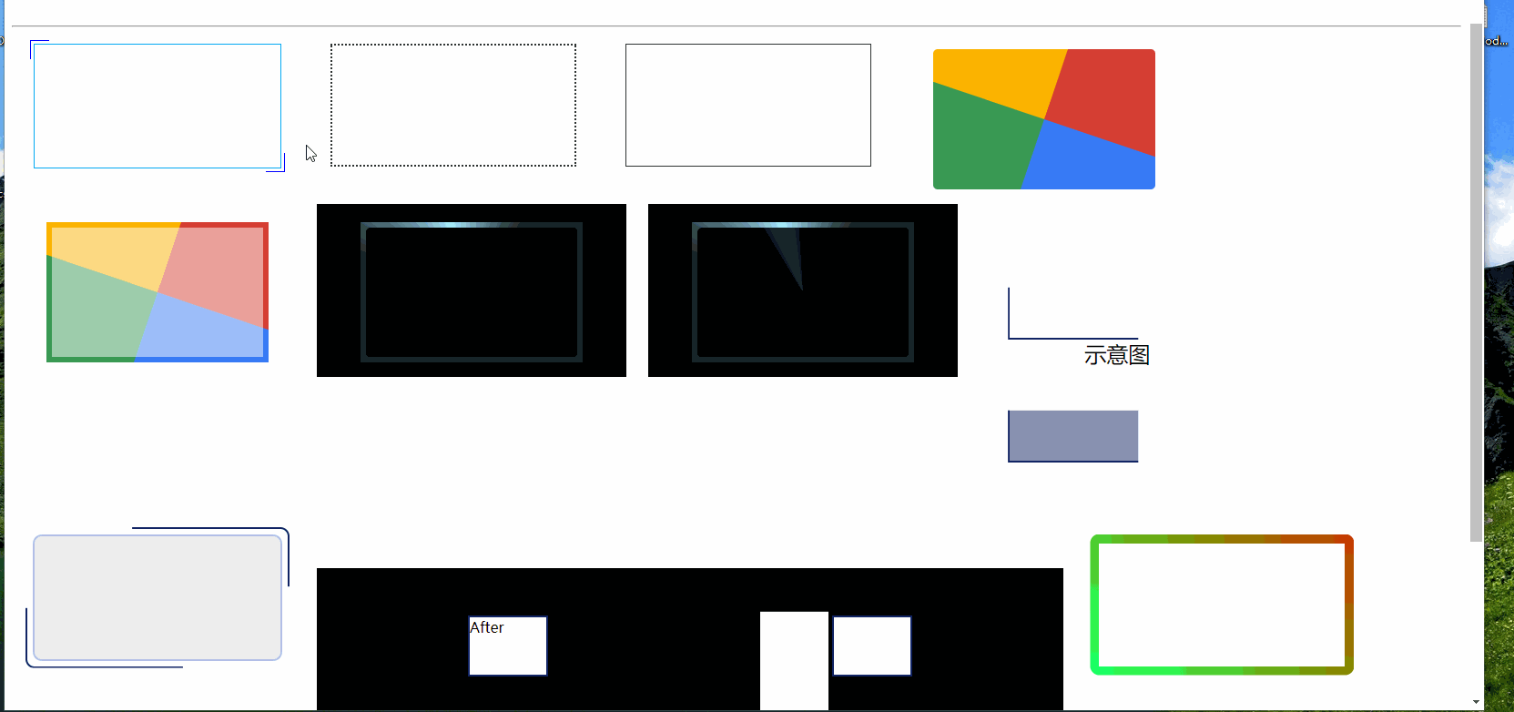
就是做一个一条线在周围转啊转的效果
我的效果: 大概思路是四条线,在周围一直走。
写在前面
兄弟们,别光收藏,点个赞👍👍👍啊🤣,beiwei(csdn居然认为这个词语是敏感词😑)求赞
如果你想要的更多边框特效,这里还有
有趣的CSS | css-border特效(转动边框,彩虹边框,渐变边框)和css变量⇲
参考:传送门⇲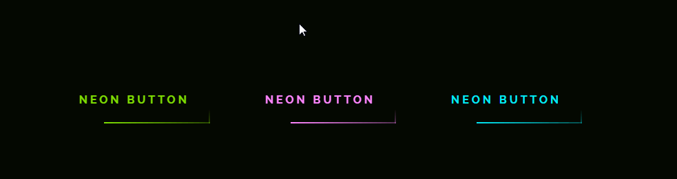
上面的效果大家f12就知道怎么做了
写在后面
另外还有下面这种效果。传送门⇲
另外鼠标划入特效。传送门
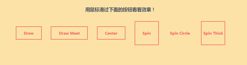

以上特效,大家f12均可查看实现方式,甚至有的可以下载源码。
下面我把我做的边框流光特效实现贴出来,以便日后 ctrl CV
<li v-for="(item,index) in indoorParams" :key="index">
  //其他代码。。。
  <div class="animate-border">
    <i></i>
    <i></i>
  </div>
</li>
<style lang="scss">
ol li{
  /* border: 1px solid rgba(32,254,255,.3); */
  /* 宽高和相对定位是一定要给的,因为这会影响.animate-border子元素的定位 */
  position: relative;
  width: 3rem;
  height: 5rem;
  overflow: hidden;
  /* 利用伪元素和两个i元素产生4条线 */
  .animate-border{
    position: absolute;
    top: 0;
    width: 100%;
    height: 100%;
    &::before, &::after{
      content: "";
      position: absolute;
      width: 100%;
      height: 1px;
    }
    i {
      position: absolute;
      display: inline-block;
      height: 100%;
      width: 1px;
    }
    &::before{
      top: 0;
      left: -100%;
      background-image: linear-gradient(90deg,transparent,#03e9f4);
      /* name  duration timing-function delay iteration-count diraction */
      animation: one 4s linear infinite;
    }
    i:nth-child(1){
      top: -100%;
      right: 0;
      background-image: linear-gradient(180deg,transparent,#03e9f4);
      animation: two 4s linear 1s infinite;
    }
    &::after{
      bottom: 0;
      right: -100%;
      background-image: linear-gradient(-90deg,transparent,#03e9f4);
      animation: three 4s linear 2s infinite;
    }
    i:nth-child(2){
      bottom: -100%;
      left: 0;
      background-image: linear-gradient(360deg,transparent,#03e9f4);
      animation: four 4s linear 3s infinite;
    }
  }
}
@keyframes one {
  0% {
    left: -100%;
  }
  50%, 100% {
      left: 100%;
  }
}

@keyframes two {
  0% {
    top: -100%;
  }
  50%, 100% {
      top: 100%;
  }
}

@keyframes three {
  0% {
    right: -100%;
  }
  50%, 100% {
    right: 100%;
  }
}

@keyframes four {
  0% {
    bottom: -100%;
  }
  50%, 100% {
    bottom: 100%;
  }
}
</style>
以上。

有“AI”的1024 = 2048,欢迎大家加入2048 AI社区
更多推荐


 50
50 0
0- 0


 已为社区贡献3条内容

所有评论(0)